-
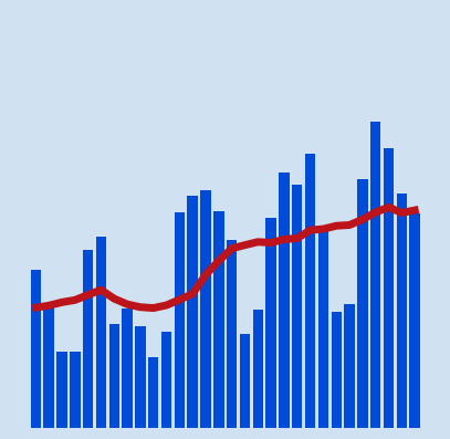 The daily counts of confirmed cases or deaths from COVID-19 can fluctuate greatly from day to day. This can be down to time factors such as week day vs weekend or delays in testing or gathering and collating results. A rolling average is a calculated average of different subsets of the full data set. It is used to …
Read More -
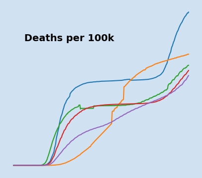 The total number of cases of COVID-19 and deaths from COVID-19 in a country will vary based on a number of factors. It does not seem right to compare absolute numbers in different countries, where the populations of those countries varies greatly. This article will show how to take the absolute numbers and express the …
Read More -
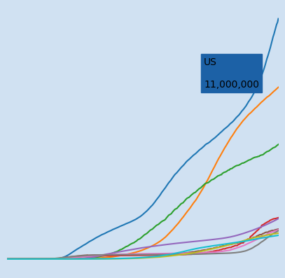
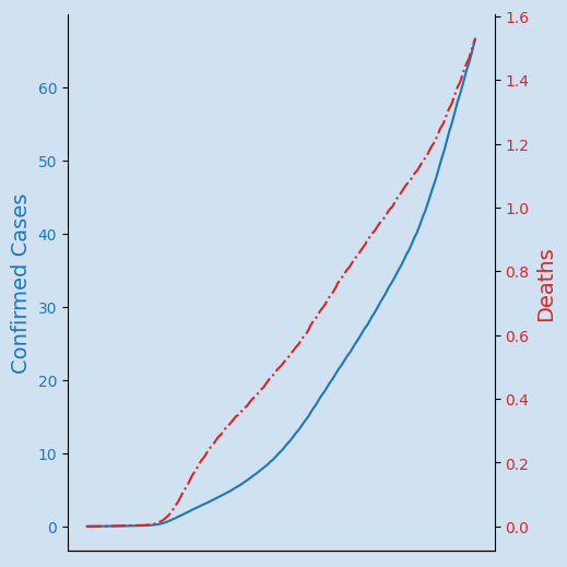 Display two sets of data on the same chart when the data ranges are different, such as the confirmed cases of COVID-19 and deaths from COVID-19. COVID-19 is the disease caused by a new coronavirus (SARS-CoV-2) that the World Health Organisation (WHO) declared a pandemic in March 2020. This article will show how to …
Read More -
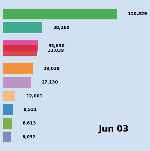 COVID-19 is the disease caused by a new coronavirus called SARS-CoV-2. World Health Organisation (WHO) first learned of the virus on 31 December 2019. The WHO declared the coronavirus outbreak a pandemic in March 2020. This article will show how to create a bar chart race depicting the countries with the highest …
Read More -
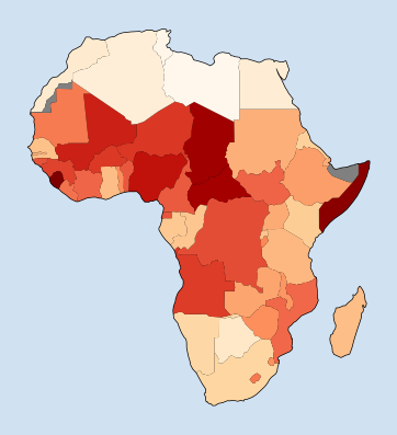 Geographical maps can be a great way to present a global view of where data applies to different countries and regions. There are a number of third-party tools and libraries that can be used to help create these maps such as Basemap, Cartopy as well as Geopandas and Geoplot. This article will show how to use Geopandas …
Read More -
 COVID-19 is the disease caused by a new coronavirus called SARS-CoV-2. World Health Organisation (WHO) first learned of the virus on 31 December 2019. The WHO declared the coronavirus outbreak a pandemic in March 2020. This article will show how to create an interactive line chart with plotly, showing the changes in …
Read More -
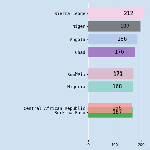
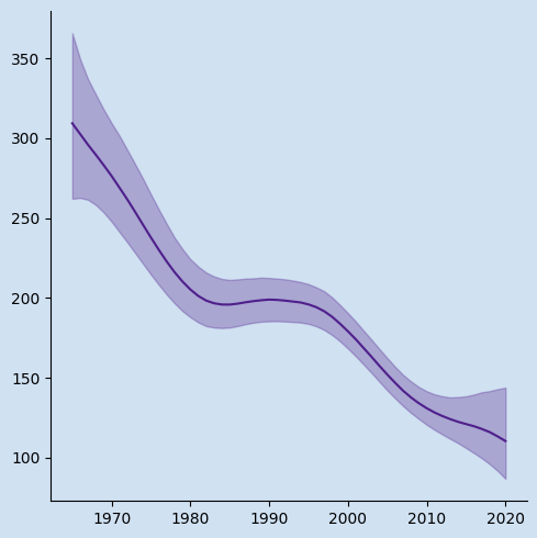 Under five mortality rate is an estimate for each particular country for that year based on the available information. The accuracy of this value varies from country to country and is dependent on the availability of quality data. The data produced is composed of the median value as well as upper and lower bound limits …
Read More -
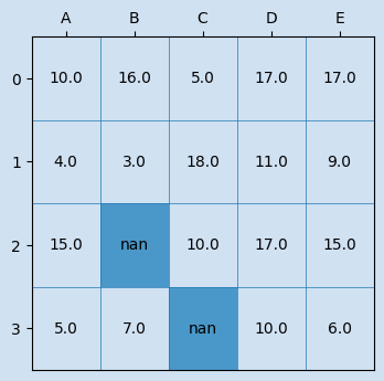 The Where method of Pandas Dataframe is used to replace data in a dataframe where the condition is false. It can return a new dataframe or modify the data in the original dataframe, thereby saving memory and object creation.
Read More -
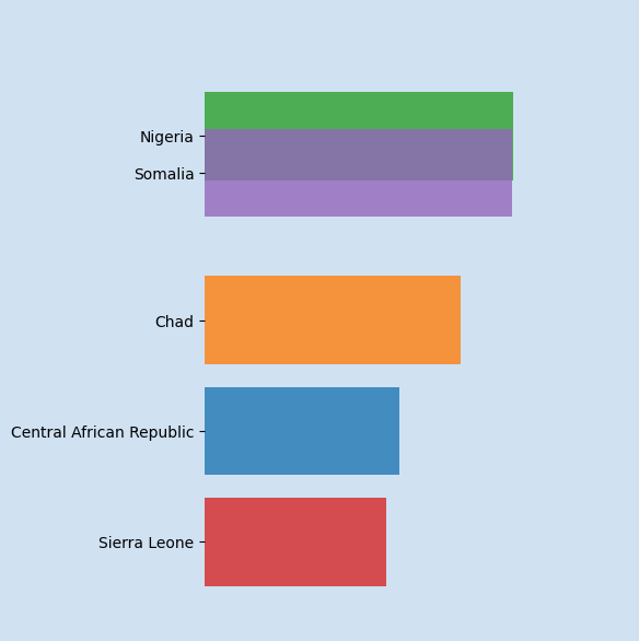
 A Bar Chart Race is an animation where the bars representing the data change in place on the chart to represent change over time. This is the second article to improve on the bar chart race to include changing categories over time while maintaining the color associated with each category.
Read More -
 Bar charts present categories of data as rectangular bars with the heights or widths proportional to the values they represent. Horizontal bar charts are used in this article in which the length of the rectangular represents the value for each category. A standard or static bar chart represents one set of data and a …
Read More