Create a Bar Chart Race with Matplotlib - part 1

Bar charts present categories of data as rectangular bars with the heights or widths proportional to the values they represent. Horizontal bar charts are used in this article in which the length of the rectangular represents the value for each category. A standard or static bar chart represents one set of data and a series of bar charts can be used to show the changes over time.
A Bar Chart Race is an animation where the bars representing the data change in place on the chart to represent change over time. It can be a very effective way to visualise the changes in the top section of a data set over time. Bar Chart Race tend to be limited to the top 5 or top 10 to be more effective in communicating a message.
This article will show how to create a Bar Chart race using Matplotlib. It will demonstrate the changes in the countries with the highest Under Five Mortality Rates between 2015 and 2019. This year range is selected as the five countries have remained the same, just their relative position has changed.
The next article will show how to create the Bar Chart race for the ten highest countries since records began. This deals with adding new countries and maintaining the same color for a country throughout the animation.
Outline
- Load the data.
- Filter to the data concerned.
- Display a bar chart.
- Display a series of bar charts over time.
- Display different colors for each country.
- Add Intermediate data for smooth transition.
- Create animation with
FuncAnimation
Load the data
Details on downloading and loading the data into a dataframe is described in "Pandas - Load data from Excel file and Display Chart". The following loads the data from a local file and filters to the median values.
 1# Load the excel worksheet into a dataframe
 2u5mr_df = pd.read_excel(
 3    "/tmp/data/Under-five-mortality-rate_2020.xlsx",
 4    sheet_name = 'Country estimates (both sexes)',
 5    header = 14)
 6
 7# Drop the last two rows
 8u5mr_df.drop(u5mr_df.tail(2).index, inplace = True)
 9
10# Rename the columns to Years
11u5mr_df.columns = [x[:-2] if x.endswith('.5') else x for x in u5mr_df.columns]
12
13# Rename 'Uncertainty.Bounds*' column to 'Uncertainty.Bounds'
14u5mr_df = u5mr_df.rename(columns={'Uncertainty.Bounds*': 'Uncertainty.Bounds'})
15
16# Filter to the Median values
17u5mr_med_df = u5mr_df[u5mr_df['Uncertainty.Bounds'] == 'Median']
18
19# Review the data
20u5mr_med_df.iloc[[0,1,2,3,-4,-3,-2,-1], [0,1,2,3,4,5,6,-4,-3,-2,-1]]
21"""
22    ISO.Code Country.Name Uncertainty.Bounds  1950  1951  1952        1953       2016       2017       2018       2019
231        AFG  Afghanistan             Median   NaN   NaN   NaN         NaN  67.572190  64.940759  62.541196  60.269399
244        ALB      Albania             Median   NaN   NaN   NaN         NaN   9.419110   9.418052   9.525133   9.682407
257        DZA      Algeria             Median   NaN   NaN   NaN         NaN  24.792098  24.319482  23.805926  23.256168
2610       AND      Andorra             Median   NaN   NaN   NaN         NaN   3.369056   3.218925   3.085839   2.966929
27574      VNM     Viet Nam             Median   NaN   NaN   NaN         NaN  21.220796  20.843125  20.405423  19.935167
28577      YEM        Yemen             Median   NaN   NaN   NaN         NaN  56.823614  56.966430  58.460003  58.356138
29580      ZMB       Zambia             Median   NaN   NaN   NaN  234.418232  66.510929  64.337901  63.294182  61.663465
30583      ZWE     Zimbabwe             Median   NaN   NaN   NaN         NaN  59.538505  58.234924  55.856832  54.612967
31"""
Identify the countries of interest
The countries that are in the top five with the highest Under Five Mortality Rates changes over time. The following function returns a list of countries the top range over a specified period. This shows that the following countries have been the five with the highest Under Five Mortality Rates from 2015 to 2019:
- Nigeria
- Somalia
- Chad
- Central African Republic
- Sierra Leone
 1def get_countries_for_range(df, start, end, lowest = False, num = 10):
 2    '''Get a list of names of countries that are in the top number
 3    for each of the years over the specified range.
 4
 5    Keyword arguments:
 6    df       -- dateframe of all the mortality rates for all the countries
 7    start    -- First year in the range (inclusive)
 8    end      -- Last year in the range (inclusive)
 9    lowest   -- boolean flag to specify either contries with the lowest rate
10                or highest rate (default is False)
11    num      -- number of countries in the top or bottom data set (default is 10)
12
13    return: A list of unique country names that have been in the top num during the time period
14    '''
15    fields = ['Country.Name'] + [str(x) for x in range(start, end + 1)]
16    sel_df = u5mr_med_df[fields].set_index('Country.Name')
17    countries = list(sel_df.apply(lambda x: x.sort_values(ascending = lowest).head(num), axis = 0).index)
18    return countries
19
20
21get_countries_for_range(u5mr_med_df, 2015, 2019, lowest = False, num = 5)
22"""
23['Central African Republic', 'Nigeria', 'Somalia', 'Chad', 'Sierra Leone']
24"""
Get the data for the top five countries from 2015 to 2019
The function above is used to get the top five countries, which is then used to filter the data down to the year range for these countries.
 1countries = get_countries_for_range(u5mr_med_df, 2015, 2019, lowest = False, num = 5)
 2highest_df = (u5mr_med_df[u5mr_med_df['Country.Name'].isin(countries)]
 3              [['Country.Name', '2015', '2016', '2017', '2018', '2019']])
 4
 5"""
 6                 Country.Name        2015        2016        2017        2018         2019
 797   Central African Republic  126.714463  121.593307  117.470988  114.222380   110.053912
 8100                      Chad  129.406257  125.604878  121.508350  117.664883   113.790418
 9376                   Nigeria  126.833543  125.040170  122.798947  120.037728   117.202078
10466              Sierra Leone  138.342774  123.232842  118.222181  113.544491   109.236528
11481                   Somalia  132.720296  128.428442  124.393442  120.326222   116.972096
12"""
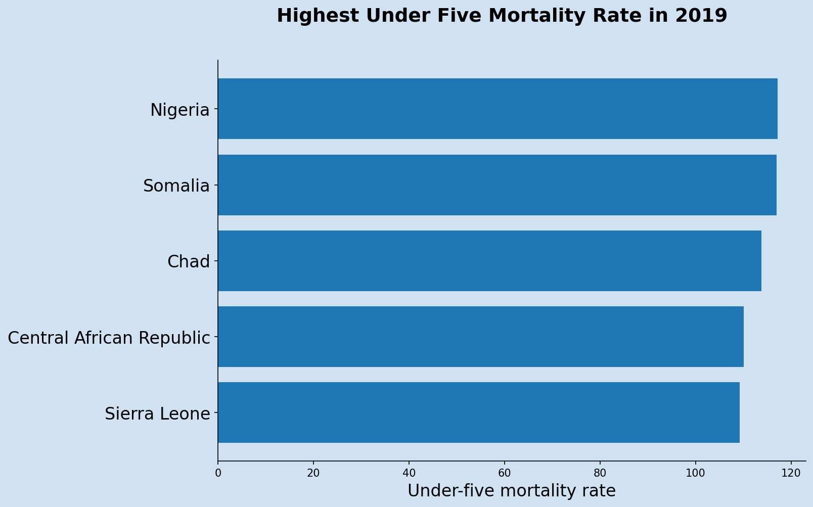
Display a bar chart for 2019
Start with displaying a bar chart for a single year for the top five countries. The following displays a bar chart for 2019.
 1top_df = highest_df[['Country.Name', '2019']].sort_values(by = '2019', ascending = False)
 2
 3fig, ax = plt.subplots(figsize = (10,7), facecolor=plt.cm.Blues(.2))
 4ax.set_facecolor(plt.cm.Blues(.2))
 5
 6fig.suptitle('Highest Under Five Mortality Rate in 2019',
 7             fontsize = 18,
 8             fontweight = 'bold')
 9
10countries = list(top_df['Country.Name'])
11y_pos = np.arange(len(countries))
12u5mr = list(top_df['2019'])
13
14ax.barh(y_pos, u5mr, align='center')
15ax.set_yticks(y_pos)
16ax.invert_yaxis()
17ax.set_xlabel('Under-five mortality rate', fontsize = 16)
18
19# Display highest on top
20ax.set_yticklabels(countries, fontsize = 16)
21
22# Hide the right and top spines
23ax.spines['right'].set_visible(False)
24ax.spines['top'].set_visible(False)
25
26plt.show
Display a series of bar charts for 2015 to 2019
The data is transposed into wide format to display the data for each year in a sequence. A bar chart race could then be created by displaying the sequence of bar charts over time.
 1wide_df = highest_df.set_index('Country.Name').T
 2# Remove the column name
 3wide_df.rename_axis(None, axis = 1, inplace = True)
 4wide_df
 5
 6"""
 7      Central African Republic        Chad     Nigeria  Sierra Leone     Somalia
 82015                126.714463  129.406257  126.833543    138.342774  132.720296
 92016                121.593307  125.604878  125.040170    123.232842  128.428442
102017                117.470988  121.508350  122.798947    118.222181  124.393442
112018                114.222380  117.664883  120.037728    113.544491  120.326222
122019                110.053912  113.790418  117.202078    109.236528  116.972096
13"""
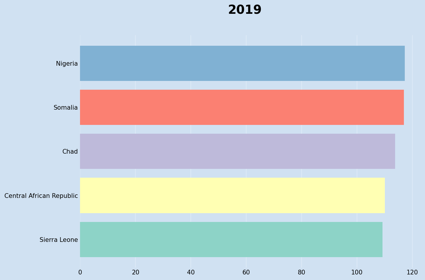
Display a single bar chart with color for country
Display a single row in a bar chart with a different color for each country.
 1sel_year = wide_df.loc['2019'].sort_values()
 2
 3fig, ax = plt.subplots(figsize = (10, 7), dpi = 144, facecolor = plt.cm.Blues(.2))
 4fig.suptitle('2019', fontsize = 18,  fontweight = 'bold')
 5ax.barh(y = sel_year.index,
 6        width = sel_year.values,
 7        color = plt.cm.Set1(range(5)))
 8ax.set_facecolor(plt.cm.Blues(.2))
 9ax.tick_params(labelsize = 8, length = 0)
10ax.grid(True, axis = 'x', color=plt.cm.Blues(.1))
11ax.set_axisbelow(True)
12[spine.set_visible(False) for spine in ax.spines.values()]
13plt.show()
Display a series of bar charts from 2015 to 2019
Create a series of bar charts for the year range and display the top 5 for each year. The default is for the color to stay with the order in the data series. This is confusing as it is difficult to see the countries change position.
 1fig, axs = plt.subplots(nrows = 1, ncols = 5, figsize = (15, 5), tight_layout = True)
 2dates = list(wide_df.index)
 3for ax, date in zip(axs, dates):
 4    sel_year = wide_df.loc[date].sort_values()
 5    ax.barh(y = sel_year.index,
 6            width = sel_year.values,
 7            color = plt.cm.Set1(range(5)))
 8    ax.set_title(date, fontsize = 'larger')
 9    ax.set_facecolor(plt.cm.Blues(.2))
10    ax.tick_params(labelsize = 8, length = 0)
11    ax.grid(True, axis = 'x', color=plt.cm.Blues(.1))
12    ax.set_axisbelow(True)
13    [spine.set_visible(False) for spine in ax.spines.values()]

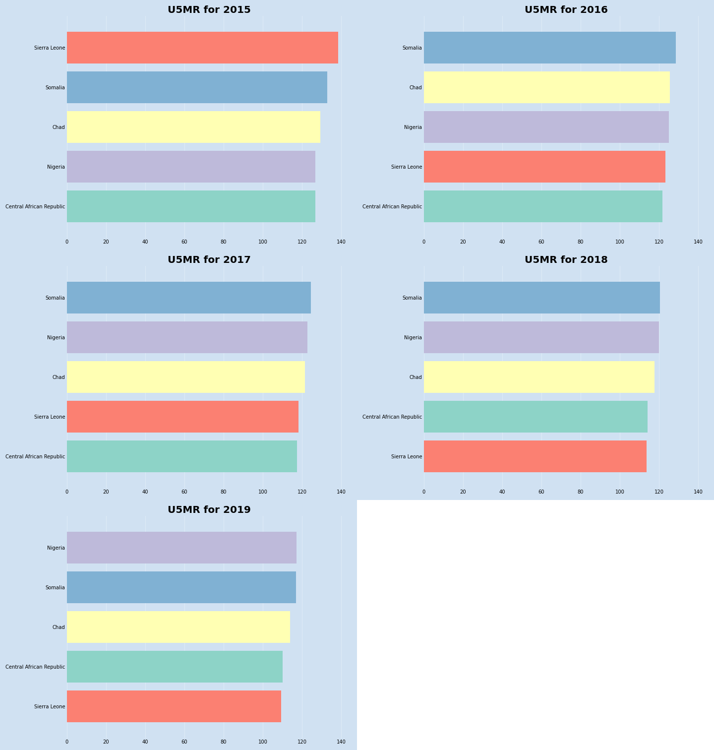
Display a series of bar charts from 2015 to 2019 with color per country
The dataframe rank function is used to order the results so that the color
for each country stays the same. The tick_label needs to be set to display
the country name rather than the ranking. In this series of charts the countries
retain the same color and it is much easier to see them changing positions.
 1fig, axs = plt.subplots(nrows = 1, ncols = 5, figsize = (15, 5), tight_layout = True)
 2dates = list(wide_df.index)
 3for ax, date in zip(axs, dates):
 4    sel_year = wide_df.loc[date]
 5    ax.barh(y = sel_year.rank(method='first').values,
 6            tick_label = sel_year.index,
 7            width = sel_year.values,
 8            color = plt.cm.Set1(range(5)))
 9    ax.set_title(date, fontsize = 'larger')
10    ax.set_facecolor(plt.cm.Blues(.2))
11    ax.tick_params(labelsize = 8, length = 0)
12    ax.grid(True, axis = 'x', color=plt.cm.Blues(.1))
13    ax.set_axisbelow(True)
14    [spine.set_visible(False) for spine in ax.spines.values()]

Abrupt transition
This sequence of bar charts can be combined in a sequence, but the transition from one year to the next is a bit abrupt.
Initial bar chart race without smooth transition
Smooth transition
Intermediary data points need to be created to create a smooth transition from one year to the next. This is done with the following steps:
- Convert the index to datetime
- Expand the rows to add intermediary rows
- Create ranking dataframe
- Fill in the expanded rows with incremental values
- Modify duplicate rankings as category data can be hidden
- Create an animation with a series of these charts
First convert the year values in the index to datetime values for the last day of the year.
 1wide_df.index = [f"{x}-12-31" for x in wide_df.index]
 2wide_df.index = pd.to_datetime(wide_df.index)
 3
 4"""
 5            Central African Republic        Chad     Nigeria  Sierra Leone     Somalia
 62015-12-31                126.714463  129.406257  126.833543    138.342774  132.720296
 72016-12-31                121.593307  125.604878  125.040170    123.232842  128.428442
 82017-12-31                117.470988  121.508350  122.798947    118.222181  124.393442
 92018-12-31                114.222380  117.664883  120.037728    113.544491  120.326222
102019-12-31                110.053912  113.790418  117.202078    109.236528  116.972096
11"""
The data can be expanded using dataframe asfreq method. The following code inserts new rows at 2-monthly intervals between each data row.
 1expanded_df = wide_df.asfreq('2M')
 2
 3expanded_df.tail(7)
 4"""
 5            Central African Republic        Chad     Nigeria  Sierra Leone     Somalia
 62018-12-31                114.222380  117.664883  120.037728    113.544491  120.326222
 72019-02-28                       NaN         NaN         NaN           NaN         NaN
 82019-04-30                       NaN         NaN         NaN           NaN         NaN
 92019-06-30                       NaN         NaN         NaN           NaN         NaN
102019-08-31                       NaN         NaN         NaN           NaN         NaN
112019-10-31                       NaN         NaN         NaN           NaN         NaN
122019-12-31                110.053912  113.790418  117.202078    109.236528  116.972096
13"""
A dataframe for rank needs to be created for ordering the countries. Use axis = 1 to
rank across the row and use ascending = False to rank the countries in reverse order
so the country with the highest mortality rate is number 1.
 1rank_df = expanded_df.rank(axis = 1, method = 'first', ascending = False)
 2
 3rank_df.tail(7)
 4"""
 5            Central African Republic  Chad  Nigeria  Sierra Leone  Somalia
 62018-12-31                       4.0   3.0      2.0           5.0      1.0
 72019-02-28                       NaN   NaN      NaN           NaN      NaN
 82019-04-30                       NaN   NaN      NaN           NaN      NaN
 92019-06-30                       NaN   NaN      NaN           NaN      NaN
102019-08-31                       NaN   NaN      NaN           NaN      NaN
112019-10-31                       NaN   NaN      NaN           NaN      NaN
122019-12-31                       4.0   3.0      1.0           5.0      2.0
13"""
The missing data is filled in using dataframe interpolate method.
 1expanded_df = expanded_df.interpolate()
 2
 3expanded_df.tail(7)
 4"""
 5            Central African Republic        Chad     Nigeria  Sierra Leone     Somalia
 62018-12-31                114.222380  117.664883  120.037728    113.544491  120.326222
 72019-02-28                113.527635  117.019139  119.565120    112.826497  119.767201
 82019-04-30                112.832890  116.373395  119.092512    112.108503  119.208180
 92019-06-30                112.138146  115.727650  118.619903    111.390509  118.649159
102019-08-31                111.443401  115.081906  118.147295    110.672516  118.090138
112019-10-31                110.748657  114.436162  117.674686    109.954522  117.531117
122019-12-31                110.053912  113.790418  117.202078    109.236528  116.972096
13"""
 1rank_df = rank_df.interpolate()
 2
 3rank_df.tail(7)
 4"""
 5            Central African Republic  Chad   Nigeria  Sierra Leone   Somalia
 62018-12-31                       4.0   3.0  2.000000           5.0  1.000000
 72019-02-28                       4.0   3.0  1.833333           5.0  1.166667
 82019-04-30                       4.0   3.0  1.666667           5.0  1.333333
 92019-06-30                       4.0   3.0  1.500000           5.0  1.500000
102019-08-31                       4.0   3.0  1.333333           5.0  1.666667
112019-10-31                       4.0   3.0  1.166667           5.0  1.833333
122019-12-31                       4.0   3.0  1.000000           5.0  2.000000
13"""

Missing country in intermediary data
It can be seen in the ranking dataframe that two countries (Nigeria and Somalia) have the same rank in the middle row. Both have a rank of 1.5 as Nigeria is transitioning from 2 to 1 and Somalia is transitioning from 1 to 2. This results in the bar for Somalia over writing the bar for Nigeria so that Nigeria is not displayed at all in the middle transition bar chart.
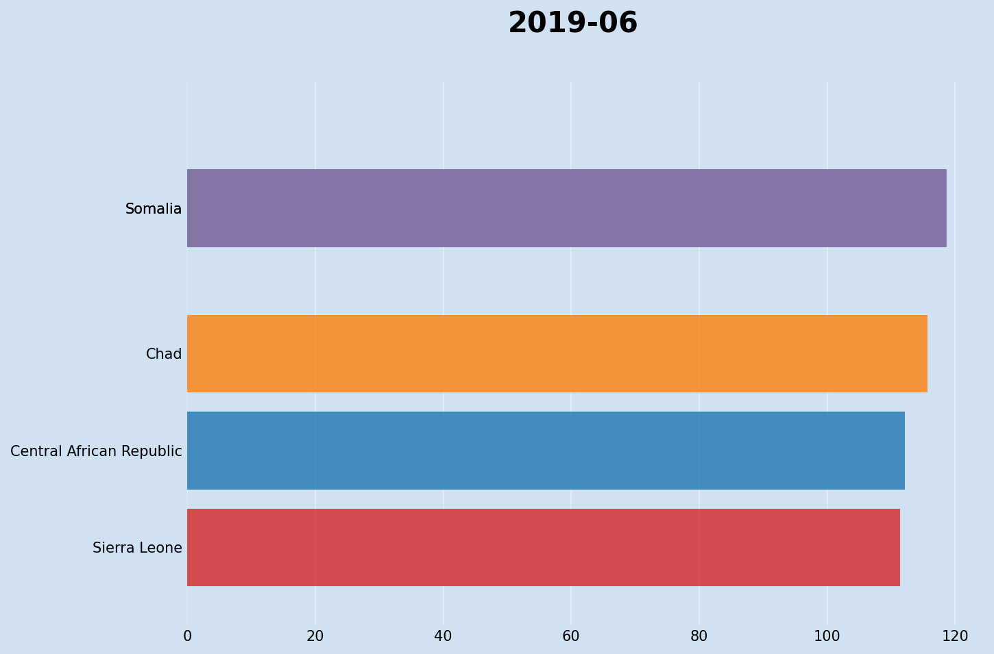
The duplicates in the rankings dataframe are incremented to ensure all the countries are consistently displayed. The alpha of the color is also set so that the bars have a little transparency so they are seen moving over each other.
 1# Increment duplicate ranks from the same row
 2rank_df = rank_df.where(~rank_df.apply(pd.Series.duplicated, axis=1), rank_df*1.01)
 3
 4"""
 5            Central African Republic  Chad   Nigeria  Sierra Leone   Somalia
 62018-12-31                       4.0   3.0  2.000000           5.0  1.000000
 72019-02-28                       4.0   3.0  1.833333           5.0  1.166667
 82019-04-30                       4.0   3.0  1.666667           5.0  1.333333
 92019-06-30                       4.0   3.0  1.500000           5.0  1.515000
102019-08-31                       4.0   3.0  1.333333           5.0  1.666667
112019-10-31                       4.0   3.0  1.166667           5.0  1.833333
122019-12-31                       4.0   3.0  1.000000           5.0  2.000000
13"""

Creating animation
The animation is created by generating a bar chart for each of the rows in the expanded dataframe using the rankings dataframe for bar positions, then combining these images into a sequence. This can be achieved using the FuncAnimation function in Matplotlib. FuncAnimation generates an animation by repeatedly calling a function to clear the previous bars and draw the bars for the next set of data. It is important to clear the bars from the previous chart on each interation of the function being called.
There are a number of parameters required in FuncAnimation:
- fig - the figure object.
- func = the function to plot the data on the axes.
- frames = the number of frames, pass in the number of rows in the expanded dataframe.
- interval = the delay in milliseconds between frames, default is 200.
 1def clear_chart():
 2    ax.clear()
 3    ax.set_facecolor(plt.cm.Blues(.2))
 4    ax.tick_params(labelsize = 10) #, length = 0)
 5    ax.grid(True, axis = 'x', color = plt.cm.Blues(.1))
 6    ax.set_axisbelow(True)
 7    [spine.set_visible(False) for spine in ax.spines.values()]
 8    ax.set_ylim(5.8, 0.2)
 9    ax.set_xlim(0, 140)
10
11
12
13def update(i):
14    clear_chart()
15    ax.barh(y = rank_df.iloc[i],
16            tick_label = expanded_df.iloc[i].index,
17            width = expanded_df.iloc[i].values,
18            height = 0.8,
19            color = plt.cm.Set1(range(5)),
20            alpha = 0.8)
21
22    cur_year = expanded_df.index[i].strftime('%Y')
23    ax.set_title(f'Under Five Mortality Rate - {cur_year}',
24                 fontsize = 22,
25                 fontweight = 'bold')
26
27
28fig, ax = plt.subplots(figsize = (10,7),
29                       facecolor = plt.cm.Blues(.2),
30                       dpi = 150,
31                       tight_layout = True)
32u5mr_anim = anim.FuncAnimation(
33    fig = fig,
34    func = update,
35    frames = len(expanded_df),
36    interval = 300)
Save the animation as a gif file.
1u5mr_anim.save("u5mr_2015_2019_.gif")
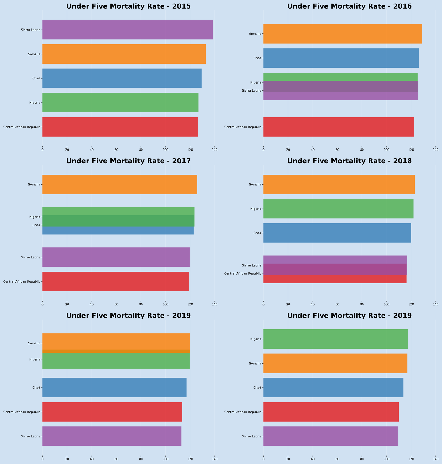
The animation can also be saved as an MP4 movie file.
1u5mr_anim.save("u5mr_2015_2019_.mp4")
Conclusion
There is a bit of work in creating an animated chart such as a bar chart race. The first step is to format the data into a series of datasets that change over time. This series needs to be expanded to introduce intermediary stages to allow for a smooth transition between states. Once the data is configured and expanded, the Matplotlib FuncAnimation is great for creating the animation. The concept is simply to iterate over the data and use a function to create the same chart for the data at that index. This function can be modified to change the colors, titles, annotations and layout of the chart and these changes will be used to create the animation. FuncAnimation can be used to save the animation as a html video, a gif file or an mp4 movie file.
One issue that was not addressed here is dealing with new categories (countries) being added to the animation and the current countries being removed. This will be covered in the next article, as well as adding the Under Five Mortality Rate numbers to the bars on the chart.