Create a Pie or Donut chart with SwiftUI Charts in iOS 17
A pie chart is a circular graph that represents data as slices of a whole. Each slice, or “wedge”, represents a portion or percentage of the whole data set. Pie charts can be used to show the composition of a categorical data set, where each category’s size is proportional to its percentage of the whole. This article shows how to create a pie chart and a donut chart and how to customise the appearance of these charts using swift charts.
I have not written an article for a while as I was distracted and I'm training for my first marathon at the end of October. Earlier this year, my brother passed away from cancer and I decided to run the Dublin city Marathon to raise money for the Irish Cancer Society. Here is my fund raising page if you would like to donate to this worthy cause.
In the meantime, iOS 17 has come out and Apple has enhanced the charting capabilities of swift charts. In this article information from the Irish Cancer societies annual report is used to explore the creation and customisation of Pie charts and donut charts in Swift charts.
Related articles on Swift Charts:
- Create a line chart with SwiftUI Charts in iOS 16
- Customise a line chart with SwiftUI Charts in iOS 16
- Create a bar chart with SwiftUI Charts in iOS 16
- Visualise the Matthew Effect with Swift Charts
- Display top section of Bar Charts with Swift Charts
- Add horizontal scroll to charts with SwiftUI Charts in iOS 16
Charts before Swift Charts:
Bar chart of the data
Start with a bar chart using Swift Charts, which was introduced in 2022 with iOS 16. The data used in this article is from the Irish Cancer Society Annual Report 2022. The breakdown of the income data in the following tables is used for the pie and donut charts.
First the date is defined as an array of IncomeData that contains a category and an
amount. Swift Chart iterates over the array and creates a BarMark for each item.
Income for Irish Cancer Society from different sources in 2021 and 2022
| Income | 2021 | 2022 |
|---|---|---|
| Donations and legacies | €22.0m | €19.8m |
| Trading activities | €2.5m | €4.2m |
| Charitable activities | €1.7m | €2.4m |
| Other and investment | €0.4m | €0.2m |
| ======================= | ========== | ========== |
| Total income | €26.6m | €26.6m |
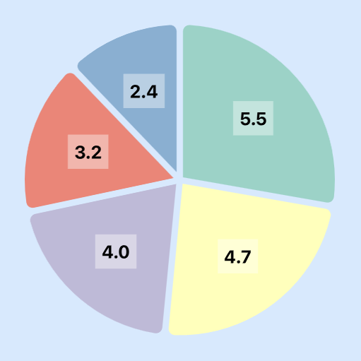
Breakdown of income in Donations and legacies in 2022
| Income | 2022 |
|---|---|
| Legacies | €2.4m |
| Individual giving | €3.2m |
| Philanthropy and corporate partnerships | €4.0m |
| Daffodil Day | €4.7m |
| Other national campaigns and donations | €5.5m |
| ============================================ | ========== |
| Total Donations and legacies | €19.8m |
Income Data
 1struct IncomeData: Identifiable, Equatable {
 2    var category: String
 3    var amount: Double
 4    var id = UUID()
 5}
 6
 7let totalIncomeData: [IncomeData] = [
 8    .init(category: "Donations and legacies", amount: 19.8),
 9    .init(category: "Trading activities", amount: 4.2),
10    .init(category: "Charitable activities", amount: 2.4),
11    .init(category: "Other and investment", amount: 0.2)
12]
13
14let donationsIncomeData: [IncomeData] = [
15    .init(category: "Legacies", amount: 2.4),
16    .init(category: "Other national campaigns and donations", amount: 5.5),
17    .init(category: "Daffodil Day", amount: 4.7),
18    .init(category: "Philanthropy and corporate partnerships", amount: 4.0),
19    .init(category: "Individual giving", amount: 3.2)
20]
BarChartView
 1struct BarChartView: View {
 2    var body: some View {
 3        VStack {
 4            GroupBox ( "Bar Chart - 2022 Income (€ million)") {
 5                Chart(totalIncomeData) {
 6                    BarMark(
 7                        x: .value("Category", $0.category),
 8                        y: .value("Amount", $0.amount)
 9                    )
10                }
11            }
12            .frame(height: 300)
13
14            GroupBox ("2022 Donations and legacies (€ million)") {
15                Chart(donationsIncomeData) {
16                    BarMark(
17                        x: .value("Category", $0.category),
18                        y: .value("Amount", $0.amount)
19                    )
20                }
21            }
22            .frame(height: 300)
23
24            Spacer()
25        }
26        .padding()
27    }
28}

Use SectorMark to create a Pie Chart
The reason to start with the Bar chart is that is is easy to convert it to a Pie
chart by replacing BarMark with SectorMark for each item in the array. The size
of each sector is calculated as a percentage of the whole automatically. The sectors
in the pie chart start at 12 o'clock and move in a clockwise direction.
BarAndPieChartView
 1struct BarAndPieChartView: View {
 2    var body: some View {
 3        VStack {
 4            GroupBox ( "Bar Chart - 2022 Donations and legacies (€ million)") {
 5                Chart(donationsIncomeData) {
 6                    BarMark(
 7                        x: .value("Amount", $0.amount),
 8                        stacking: .normalized
 9                    )
10                    .foregroundStyle(by: .value("category", $0.category))
11                }
12            }
13            .frame(height: 200)
14
15            GroupBox ( "Pie Chart - 2022 Donations and legacies (€ million)") {
16                Chart(donationsIncomeData) {
17                    SectorMark(
18                        angle: .value("Amount", $0.amount)
19                    )
20                    .foregroundStyle(by: .value("category", $0.category))
21                }
22            }
23            .frame(height: 500)
24
25            Spacer()
26        }
27        .padding()
28    }
29}

Add Spaces and rounded corners
A space can be added between the sectors of a pie chart by specifying a value for
angularInset, which takes an optional CGFloat. The angularInset specifies the
space that the inner lines of a Sector can be set. It is not clear what units this
value is in and the documentation states "A radius for the corners of the sector." -
which I believe should be the description for the cornerRadius. I found that the
angularInset can be set to any value between 0.0 and 8.2, well it can be set to any
value but only values between 0.0 and 8.8 have any impact on the Pie Chart.
The cornerRadius modifier is used to apply a rounded corner to the outer curve of
the sector.
RoundedSectorSpaceView
 1struct RoundedSectorSpaceView: View {
 2    var body: some View {
 3        VStack {
 4            GroupBox ( "2022 Donations and Legacies (€ million)") {
 5                Chart(donationsIncomeData) {
 6                    SectorMark(
 7                        angle: .value("Amount", $0.amount),
 8                        angularInset: 3.0
 9                    )
10                    .cornerRadius(6.0)
11                    .foregroundStyle(by: .value("category", $0.category))
12                }
13            }
14            .frame(height: 500)
15
16            Spacer()
17        }
18        .padding()
19    }
20}

Create Donut chart
A donut chart (or doughnut chart) a variation of the pie chart and is often used to
display data in a way that emphasizes the parts of a whole and their relationships.
Donut charts are popular in data analysis, business presentations, and reports. A Pie
chart can easily be displayed as a Donut chart in Swift Charts by specifying an
innerRadius for each SectorMark. This is a MarkDimension and can be set as a size
in points, or a .ratio or .inset relative to the outer radius.
View
 1struct DonutChartView: View {
 2    var body: some View {
 3        VStack {
 4            GroupBox ( "2022 Donations and Legacies (€ million)") {
 5                Chart(donationsIncomeData) {
 6                    SectorMark(
 7                        angle: .value("Amount", $0.amount),
 8                        innerRadius: .ratio(0.6),
 9                        angularInset: 3.0
10                    )
11                    .cornerRadius(6.0)
12                    .foregroundStyle(by: .value("category", $0.category))
13                }
14            }
15            .frame(height: 500)
16
17            Spacer()
18        }
19        .padding()
20    }
21}

Use custom colors
The default colors in Swift Charts are great, but sometimes it can be good to use a
set of colors customised to the App. Like other charts, there are a number of ways to
set the colors. One way is to set the color for each SectorMark, but this can be
tricky to use when different charts will have different number of categories. An
alternative is to specify an array or colors as shown below. Then use
chartForegroundStyleScale to bind the categories to the range of colors. Here just
10 colors are set as Pie charts with more than 5 or so sectors are difficult to
interpret. The good news is that even if a chart is created with more than 10
categories, the colors simply roll around to the first color again.
chartColors
 1let chartColors: [Color] = [
 2    Color(red: 0.55, green: 0.83 , blue: 0.78),
 3    Color(red: 1.00, green: 1.00 , blue: 0.70),
 4    Color(red: 0.75, green: 0.73 , blue: 0.85),
 5    Color(red: 0.98, green: 0.50 , blue: 0.45),
 6    Color(red: 0.50, green: 0.69 , blue: 0.83),
 7    Color(red: 0.99, green: 0.71 , blue: 0.38),
 8    Color(red: 0.70, green: 0.87 , blue: 0.41),
 9    Color(red: 0.99, green: 0.80 , blue: 0.90),
10    Color(red: 0.85, green: 0.85 , blue: 0.85),
11    Color(red: 0.74, green: 0.50 , blue: 0.74),
12    Color(red: 0.80, green: 0.92 , blue: 0.77),
13    Color(red: 1.00, green: 0.93 , blue: 0.44)
14]
PieChartColorsView
 1struct PieChartColorsView: View {
 2    var body: some View {
 3        VStack {
 4            GroupBox ( "2022 Donations and Legacies (€ million)") {
 5                Chart(donationsIncomeData) {
 6                    SectorMark(
 7                        angle: .value("Amount", $0.amount),
 8                        angularInset: 3.0
 9                    )
10                    .cornerRadius(6.0)
11                    .foregroundStyle(by: .value("category", $0.category))
12                }
13                // Set color for each data in the chart
14                .chartForegroundStyleScale(
15                    domain: donationsIncomeData.map  { $0.category },
16                    range: chartColors
17                )
18
19                // Position the Legend
20                .chartLegend(position: .top, alignment: .center)
21            }
22            .frame(height: 500)
23
24            Spacer()
25        }
26        .padding()
27    }
28}

Make donut chart interactive
The advantage of a touch screen is the ability for Apps to come to life when they are
touched. Charts can display more information when sections of the chart are touched.
chartAngleSelection is used in Pie and Donut charts to identify where in the
chart data has been selected. This is similar to chartXSelection or
chartYSelection in line or bar charts. chartAngleSelection can be a little
confusing to use at first. There is a commented out section of the code below to
display the currently selected angle in a Text view to help understand what is
happening. The selected angle is automatically converted from an angle to a value
representing the cumulative sum of the amounts to that point. A state variable is
used to bind to the current selected angle and a computed property is used to convert
this value to the appropriate incomeData sector of the chart.
InteractiveDonutView
 1struct InteractiveDonutView: View {
 2    @State private var selectedAmount: Double? = nil
 3    let cumulativeIncomes: [(category: String, range: Range<Double>)]
 4
 5    init() {
 6        var cumulative = 0.0
 7        self.cumulativeIncomes = donationsIncomeData.map {
 8            let newCumulative = cumulative + Double($0.amount)
 9            let result = (category: $0.category, range: cumulative ..< newCumulative)
10            cumulative = newCumulative
11            return result
12        }
13    }
14
15    var selectedCategory: IncomeData? {
16        if let selectedAmount,
17           let selectedIndex = cumulativeIncomes
18            .firstIndex(where: { $0.range.contains(selectedAmount) }) {
19            return donationsIncomeData[selectedIndex]
20        }
21        return nil
22    }
23
24    var body: some View {
25        VStack {
26            GroupBox ( "2022 Donations and Legacies (€ million)") {
27                Chart(donationsIncomeData) {
28                    SectorMark(
29                        angle: .value("Amount", $0.amount),
30                        innerRadius: .ratio(selectedCategory == $0 ? 0.5 : 0.6),
31                        outerRadius: .ratio(selectedCategory == $0 ? 1.0 : 0.9),
32                        angularInset: 3.0
33                    )
34                    .cornerRadius(6.0)
35                    .foregroundStyle(by: .value("category", $0.category))
36
37                    .opacity(selectedCategory == $0 ? 1.0 : 0.9)
38                }
39                // Set color for each data in the chart
40                .chartForegroundStyleScale(
41                    domain: donationsIncomeData.map  { $0.category },
42                    range: chartColors
43                )
44
45                // Position the Legend
46                .chartLegend(position: .bottom, alignment: .center)
47
48                // Select a sector
49                .chartAngleSelection(value: $selectedAmount)
50
51                // Display data for selected sector
52                .chartBackground { chartProxy in
53                    GeometryReader { geometry in
54                        let frame = geometry[chartProxy.plotFrame!]
55                        VStack(spacing: 0) {
56                            Text(selectedCategory?.category ?? "")
57                                .multilineTextAlignment(.center)
58                                .font(.body)
59                                .foregroundStyle(.secondary)
60                                .frame(width: 120, height: 80)
61                            Text("€\(selectedCategory?.amount ?? 0, specifier: "%.1f") M")
62                                .font(.title.bold())
63                                .foregroundColor((selectedCategory != nil) ? .primary : .clear)
64                        }
65                        .position(x: frame.midX, y: frame.midY)
66                    }
67                }
68
69            }
70            .frame(height: 500)
71
72//            // Testing chartAngleSelection
73//            Text("SelectedAmount")
74//            Text(selectedAmount?.formatted() ?? "none")
75
76            Spacer()
77        }
78        .padding()
79    }
80}

Pie or Donut chart with sorted data
The convention of displaying data in a Pie chart is to arrange the sectors from largest to smallest. It would have been good to have some property in the pie chart to sort the data, but there does not appear to be one. The work around is to create a copy of the data and sort it before creating the Pie/Donut chart. In a production app, the data would likely be in a model, which could possibly return the data in a sorted manner. This shows the largest sector on the top right at 12 o'clock, with the next sector following in a clockwise direction.
DonutChartSortedView
 1struct DonutChartSortedView: View {
 2    @State private var selectedAmount: Double? = nil
 3    let cumulativeIncomes: [(category: String, range: Range<Double>)]
 4
 5    var donationsIncomeDataSorted = donationsIncomeData
 6
 7    init() {
 8        donationsIncomeDataSorted.sort {
 9            $0.amount > $1.amount
10        }
11
12        var cumulative = 0.0
13        self.cumulativeIncomes = donationsIncomeDataSorted.map {
14            let newCumulative = cumulative + Double($0.amount)
15            let result = (category: $0.category, range: cumulative ..< newCumulative)
16            cumulative = newCumulative
17            return result
18        }
19    }
20
21    var selectedCategory: IncomeData? {
22        if let selectedAmount,
23           let selectedIndex = cumulativeIncomes
24            .firstIndex(where: { $0.range.contains(selectedAmount) }) {
25            return donationsIncomeDataSorted[selectedIndex]
26        }
27        return nil
28    }
29
30    var body: some View {
31        VStack {
32            GroupBox ( "2022 Donations and Legacies (€ million)") {
33                Chart(donationsIncomeDataSorted) {
34                    SectorMark(
35                        angle: .value("Amount", $0.amount),
36                        innerRadius: .ratio(selectedCategory == $0 ? 0.5 : 0.6),
37                        outerRadius: .ratio(selectedCategory == $0 ? 1.0 : 0.9),
38                        angularInset: 3.0
39                    )
40                    .cornerRadius(6.0)
41                    .foregroundStyle(by: .value("category", $0.category))
42
43                    .opacity(selectedCategory == $0 ? 1.0 : 0.8)
44                }
45                // Set color for each data in the chart
46                .chartForegroundStyleScale(
47                    domain: donationsIncomeDataSorted.map  { $0.category },
48                    range: chartColors
49                )
50
51                // Position the Legend
52                .chartLegend(position: .top, alignment: .center)
53
54                // Select a sector
55                .chartAngleSelection(value: $selectedAmount)
56
57                .chartBackground { chartProxy in
58                    GeometryReader { geometry in
59                        let frame = geometry[chartProxy.plotFrame!]
60                        VStack(spacing: 0) {
61                            Text(selectedCategory?.category ?? "")
62                                .multilineTextAlignment(.center)
63                                .font(.body)
64                                .foregroundStyle(.secondary)
65                                .frame(width: 120, height: 80)
66                            Text("\(selectedCategory?.amount ?? 0, specifier: "%.1f")")
67                                .font(.title.bold())
68                                .foregroundColor((selectedCategory != nil) ? .primary : .clear)
69                        }
70                        .position(x: frame.midX, y: frame.midY)
71                    }
72                }
73
74            }
75            .frame(height: 500)
76
77            Spacer()
78        }
79        .padding()
80    }
81}

Add Text onto the Pie chart
Finally, annotations can be used on Pie/Donut charts in a similar mechanism to other Swift Charts. Here an overlay is added for each sector displaying the value for each sector.
DonutWithLabelsView
 1struct DonutWithLabelsView: View {
 2    @State private var selectedAmount: Double? = nil
 3    let cumulativeIncomes: [(category: String, range: Range<Double>)]
 4
 5    var donationsIncomeDataSorted = donationsIncomeData
 6
 7    init() {
 8        donationsIncomeDataSorted.sort {
 9            $0.amount > $1.amount
10        }
11
12        var cumulative = 0.0
13        self.cumulativeIncomes = donationsIncomeDataSorted.map {
14            let newCumulative = cumulative + Double($0.amount)
15            let result = (category: $0.category, range: cumulative ..< newCumulative)
16            cumulative = newCumulative
17            return result
18        }
19    }
20
21    var selectedCategory: IncomeData? {
22        if let selectedAmount,
23           let selectedIndex = cumulativeIncomes
24            .firstIndex(where: { $0.range.contains(selectedAmount) }) {
25            return donationsIncomeDataSorted[selectedIndex]
26        }
27        return nil
28    }
29
30    var body: some View {
31        VStack {
32            GroupBox ( "2022 Donations and Legacies (€ million)") {
33                Chart(donationsIncomeDataSorted) { income in
34                    let amountStr = "\(income.amount)"
35                    SectorMark(
36                        angle: .value("Amount", income.amount),
37                        innerRadius: .ratio(selectedCategory == income ? 0.5 : 0.6),
38                        outerRadius: .ratio(selectedCategory == income ? 1.0 : 0.9),
39                        angularInset: 3.0
40                    )
41                    .cornerRadius(6.0)
42                    .foregroundStyle(by: .value("category", income.category))
43                    .opacity(selectedCategory == income ? 1.0 : 0.8)
44                    .annotation(position: .overlay) {
45                        Text(amountStr)
46                            .font(selectedCategory == income ? .title : .headline)
47                            .fontWeight(.bold)
48                            .padding(5)
49                            .background(Color.white.opacity(0.4))
50                    }
51                }
52                // Set color for each data in the chart
53                .chartForegroundStyleScale(
54                    domain: donationsIncomeDataSorted.map  { $0.category },
55                    range: chartColors
56                )
57
58                // Position the Legend
59                .chartLegend(position: .top, alignment: .center)
60
61                // Select a sector
62                .chartAngleSelection(value: $selectedAmount)
63
64                .chartBackground { chartProxy in
65                    GeometryReader { geometry in
66                        let frame = geometry[chartProxy.plotFrame!]
67                        VStack(spacing: 0) {
68                            Text(selectedCategory?.category ?? "")
69                                .multilineTextAlignment(.center)
70                                .font(.body)
71                                .foregroundStyle(.secondary)
72                                .frame(width: 120, height: 80)
73                            Text("\(selectedCategory?.amount ?? 0, specifier: "%.1f")")
74                                .font(.title.bold())
75                                .foregroundColor((selectedCategory != nil) ? .primary : .clear)
76                        }
77                        .position(x: frame.midX, y: frame.midY)
78                    }
79                }
80
81            }
82            .frame(height: 500)
83
84            Spacer()
85        }
86        .padding()
87    }
88}

Conclusion
Pie charts are useful for visualizing data with a small number of categories and are commonly used in presentations and reports to make data more accessible and understandable. Pie Charts seemed a bit of an omission from Swift Charts when they were released in iOS 16 and this has now been rectified in iOS 17. A donut chart is a variation on a pie chart where the centre of the pie is removed.
Creating pie charts is similar to other Swift Charts with use of the SectorMark that was added in iOS 17. Each sector represents a category of the data and they are arranged clockwise from 12 o'clock. A Donut chart can be created by specifying an innerRadius to cut out the inner part of the pie chart. This center space can be used to display additional information. The pie/Donut chart can be customised like other Swift Charts, such as changing the colors, moving or hiding the legend. The Pie and Donut charts are a great addition to Swift Charts.
The source code for PieChartApp is available on GitHub.