Display a line chart with a range
Under five mortality rate is an estimate for each particular country for that year based on the available information. The accuracy of this value varies from country to country and is dependent on the availability of quality data. The data produced is composed of the median value as well as upper and lower bound limits for each year. An indication of the accuracy of the data can be shown by displaying the upper and lower bounds on a line chart.
Accurate data over time is not available for some countries and Unicef have a process of applying statistical models to estimate the Under Five Mortality Rates based on available data. The Lower and Upper values refer to the lower bound and upper bound of 90% uncertainty intervals.
This article shows how to display the median as well as the lower and upper bounds.
Load the data
Details on downloading and loading the data into a dataframe is described in "Pandas - Load data from Excel file and Display Chart". The following loads the data from a local file and adds an multi-index on Country and Bounds.
 1# Load the excel worksheet into a dataframe
 2u5mr_df = pd.read_excel(
 3    "/tmp/data/Under-five-mortality-rate_2020.xlsx",
 4    engine = "openpyxl",
 5    sheet_name = 'Country estimates (both sexes)',
 6    header = 14)
 7
 8# Drop the last two rows
 9u5mr_df.drop(u5mr_df.tail(2).index, inplace = True)
10
11# Drop ISO.Code column
12u5mr_df.drop(['ISO.Code'], axis = 1, inplace = True)
13
14# Rename 'Uncertainty.Bounds*' column to 'Uncertainty.Bounds'
15u5mr_df = u5mr_df.rename(columns={'Uncertainty.Bounds*': 'Uncertainty.Bounds'})
16
17# Set multiindex to Country and Bounds
18u5mr_df.set_index(['Country.Name', 'Uncertainty.Bounds'], inplace=True)
19
20# Convert year column names to datetime
21u5mr_df.columns = [pd.to_datetime(f'{x[:-2]}-12-31') for x in u5mr_df.columns]
22
23# Review the data
24print(u5mr_df.shape)
25u5mr_df.iloc[[0,1,2,3,-4,-3,-2,-1], [0,1,2,3,4,5,6,-4,-3,-2,-1]]
26
27"""
28                                 1960-12-31  1961-12-31  1962-12-31  2016-12-31  2017-12-31  2018-12-31  2019-12-31
29Country.Name Uncertainty.Bounds
30Afghanistan  Lower                      NaN         NaN  299.425519   57.068054   53.744798   50.640922   47.442070
31             Median                     NaN         NaN  344.629498   67.572190   64.940759   62.541196   60.269399
32             Upper                      NaN         NaN  399.287713   78.646207   76.832873   75.405564   74.616041
33Albania      Lower                      NaN         NaN         NaN    9.075629    9.044506    9.067390    9.068154
34Zambia       Upper               229.757846  224.353213  219.461322   76.133459   75.733787   77.098449   77.575507
35Zimbabwe     Lower               129.144390  125.263606  121.661598   50.834193   48.083920   44.136918   41.076802
36             Median              151.084581  146.858820  142.639204   59.538505   58.234924   55.856832   54.612967
37             Upper               177.879631  173.725419  168.219351   69.425121   69.987570   70.076887   71.709892
38"""
Display the changes over time for one country
Nigeria has the highest mediam Under Five Mortality Rate in 2019. This code creates a line chart showing the changes over time.
 1country = 'Nigeria'
 2years = u5mr_df.columns
 3median = u5mr_df.loc[(['Nigeria'], ['Median']), :].iloc[0]
 4
 5title = f'Changes in Under 5 Mortality Rate\n\n {c}'
 6
 7fig, ax = plt.subplots(figsize = (8,5), facecolor = plt.cm.Blues(.2))
 8fig.suptitle(title, fontsize = 'xx-large',  fontweight = 'bold')
 9
10ax.set_facecolor(plt.cm.Blues(.2))
11ax.plot(years, median, label = 'Median')
12ax.set_ylabel('Under-five mortality rate', fontsize = 'large')
13ax.set_xlabel('Year', fontsize=14)
14ax.spines['right'].set_visible(False)
15ax.spines['top'].set_visible(False)
16
17plt.show()

Display upper, lower and median data for a single country
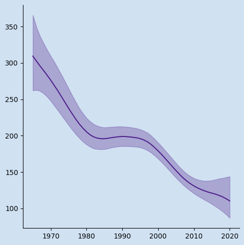
Extract the data for Nigeria into a separate dataframe. Use the data from this dataframe to plot the lower, upper and median bound values over time. This shows that while the median value is going down, the spread between the lower and upper bounds is widening. The 90% confidence interval for Under Five Mortality in Nigeria in 2019 is from 92 to 152. This is an extraordinarily wide range and shows that there is not much confidence in the median value of 117.
This code adds plot lines for upper, median and lower bounds. This displays each result in a separate color by default.
 1country = 'Nigeria'
 2
 3df_c = u5mr_df.loc[([country]), :]
 4years = df_c.columns
 5lower = df_c.loc[(slice(None), 'Lower'), :].iloc[0]
 6median = df_c.loc[(slice(None), 'Median'), :].iloc[0]
 7upper = df_c.loc[(slice(None), 'Upper'), :].iloc[0]
 8
 9title = f'Changes in Under 5 Mortality Rate\n\n {c}'
10
11fig, ax = plt.subplots(figsize = (8,5), facecolor = plt.cm.Blues(.2))
12fig.suptitle(title, fontsize = 'xx-large',  fontweight = 'bold')
13
14ax.set_facecolor(plt.cm.Blues(.2))
15ax.plot(years, upper, label = 'Upper')
16ax.plot(years, median, label = 'Median')
17ax.plot(years, lower, label = 'Lower')
18ax.legend(bbox_to_anchor = (0.9, 0.9),
19          loc = 'upper right',
20          frameon = False,
21          fontsize = 'medium')
22ax.set_ylabel('Under-five mortality rate', fontsize = 'large')
23ax.set_xlabel('Year', fontsize=14)
24# Hide the right and top spines
25ax.spines['right'].set_visible(False)
26ax.spines['top'].set_visible(False)
27
28plt.show()
29
30
31print(df_c.iloc[:, [13,14,15,-3,-2,-1]])
32"""
33                                 1963-12-31  1964-12-31  1965-12-31  2017-12-31  2018-12-31  2019-12-31
34Country.Name Uncertainty.Bounds
35Nigeria      Lower                      NaN  274.178909  274.741658  101.806684   97.303293   92.166854
36             Median                     NaN  323.283445  316.175804  122.798947  120.037728  117.202078
37             Upper                      NaN  380.916122  364.765834  150.074233  151.521302  152.451394
38"""

Display shading around median data for a single country
This displays the same information as above, but changes the area between the upper and lower bounds to be shaded in the same color as the median values. The functionality to plot the line on the axis is split out into its own function. The axes fill_between method is used color the area between the lower and upper bounds.
 1def update_axis(ax, df, country):
 2    clr = plt.cm.Purples(0.9)
 3    ax.set_facecolor(plt.cm.Blues(.2))
 4    ax.set_title(country, fontsize = 14, fontweight = 'bold')
 5    x = df.columns
 6    y_l = df.loc[(slice(None), 'Lower'), :].iloc[0]
 7    y_m = df.loc[(slice(None), 'Median'), :].iloc[0]
 8    y_u = df.loc[(slice(None), 'Upper'), :].iloc[0]
 9    ax.plot(x, y_m, label = 'Median', color = clr)
10    ax.fill_between(x, y_l, y_u, alpha=0.3, edgecolor=clr, facecolor=clr)
11    ax.set_ylabel('Under-five mortality rate', fontsize = 'medium')
12    ax.set_xlabel('Year', fontsize = 'medium')
13    ax.tick_params(axis='both', labelsize='small')
14    ax.spines['right'].set_visible(False)
15    ax.spines['top'].set_visible(False)
16
17fig, ax1 = plt.subplots(1, 1, figsize = (8, 5), facecolor = plt.cm.Blues(.2))
18title = f'Changes in Under 5 Mortality Rate'
19fig.suptitle(title, fontsize = 'xx-large',  fontweight = 'bold')
20
21country = 'Nigeria'
22df_c = u5mr_df.loc[([country]), :]
23update_axis(ax1, df_c, country)
24
25plt.show()

Display data for four countries
The update_axis function above can be used to display multiple plots, such as for the
four countries with highest under five mortality rates in 2019.
 1fig, axs = plt.subplots(2, 2,
 2                        sharex=True, sharey=True,
 3                        figsize = (10, 7),
 4                        facecolor = plt.cm.Blues(.2))
 5fig.tight_layout(pad = 5.0)
 6title = f'Changes in Under 5 Mortality Rate'
 7fig.suptitle(title, fontsize = 'xx-large',  fontweight = 'bold')
 8
 9countries = (u5mr_df.xs('Median', level='Uncertainty.Bounds')
10             .sort_values(by = u5mr_df.columns[-1], ascending = False)
11             .head(4).index)
12
13for i, ax in enumerate(axs.flatten()):
14    df_c = u5mr_df.loc[([countries[i]]), :]
15    update_axis(ax, df_c, countries[i])
16
17plt.show()

The same data can be extracted and displayed by changing the sort order to ascending. Countries that are doing better and have much lower under five mortality rates tend to haver much better records, so the 90% confidence interval is also much narrower.

Display data for male and female data
List the worksheets in an excel file
Use Pandas.ExcelFile to find out what sheets are in an Excel file. This shows that the file contains six worksheets with the third and fifth containing the data for Females and Males respectively.
 1u5mr_xl = pd.ExcelFile(u5mr_file)
 2u5mr_xl.sheet_names
 3
 4
 5# output
 6'''
 7['Country estimates (both sexes)',
 8 'Regional & global (both sexes)',
 9 'Country estimates (Female)',
10 'Regional & global (Female)',
11 'Country estimates (Male)',
12 'Regional & global (Male)']
13 '''
The use of the multi-index on the dataframe makes is much easier to extract the data for a particular country and then plot the bounds values. The following put the full process into three functions.
- Open the specified spreadsheet into a dataframe
 1def load_dataset(file, sheet):
 2    # Load the excel worksheet into a dataframe
 3    df = pd.read_excel(
 4        file,
 5        engine = "openpyxl",
 6        sheet_name = sheet,
 7        header = 14)
 8
 9    # Drop the last two rows
10    df.drop(df.tail(2).index, inplace = True)
11
12    # Drop ISO.Code column
13    df.drop(['ISO.Code'], axis = 1, inplace = True)
14
15    # Rename 'Uncertainty.Bounds*' column to 'Uncertainty.Bounds'
16    df = df.rename(columns={'Uncertainty.Bounds*': 'Uncertainty.Bounds'})
17
18    # Set multiindex to Country and Bounds
19    df.set_index(['Country.Name', 'Uncertainty.Bounds'], inplace=True)
20
21    # Convert year column names to datetime
22    df.columns = [pd.to_datetime(f'{x[:-2]}-12-31') for x in df.columns]
23
24    print(f'df.shape = {df.shape}')
25    return df
- Plot the data on an axis
 1def update_axis(ax, df, country, lbl, clr = plt.cm.Purples(0.9)):
 2    ax.set_facecolor(plt.cm.Blues(.2))
 3    ax.set_title(country, fontsize = 'xx-large', fontweight = 'bold')
 4    x = df.columns
 5    y_l = df.loc[(slice(None), 'Lower'), :].iloc[0]
 6    y_m = df.loc[(slice(None), 'Median'), :].iloc[0]
 7    y_u = df.loc[(slice(None), 'Upper'), :].iloc[0]
 8    ax.plot(x, y_m, label = lbl, color = clr)
 9    ax.fill_between(x, y_l, y_u, alpha=0.3, edgecolor=clr, facecolor=clr)
10    ax.set_ylabel('Under-five mortality rate', fontsize = 'medium')
11    ax.set_xlabel('Year', fontsize = 'medium')
12    ax.tick_params(axis='both', labelsize='small')
13    ax.spines['right'].set_visible(False)
14    ax.spines['top'].set_visible(False)
15
16    ax.legend(bbox_to_anchor = (0.9, 0.9),
17          loc = 'upper right',
18          frameon = False,
19          fontsize = 'medium')
- Load the data and display the data from different spreadsheets.
 1f_u5mr_df = load_dataset(
 2    "/tmp/data/Under-five-mortality-rate_2020.xlsx",
 3    "Country estimates (Female)")
 4
 5m_u5mr_df = load_dataset(
 6    "/tmp/data/Under-five-mortality-rate_2020.xlsx",
 7    "Country estimates (Male)")
 8
 9fig, (ax1, ax2, ax3) = plt.subplots(1, 3, sharex=True, sharey=True,
10                               figsize = (12, 5),
11                               facecolor = plt.cm.Blues(.2))
12fig.tight_layout(pad = 5.0)
13title = f'Changes in Under 5 Mortality Rate - females'
14fig.suptitle(title, fontsize = 'xx-large',  fontweight = 'bold')
15
16country = 'Nigeria'
17df_c = f_u5mr_df.loc[([country]), :]
18update_axis(ax1, df_c, country, 'Female')
19update_axis(ax3, df_c, country, 'Female')
20
21df_c = m_u5mr_df.loc[([country]), :]
22update_axis(ax2, df_c, country, 'Male', clr = plt.cm.Greens(0.9))
23update_axis(ax3, df_c, country, 'Male', clr = plt.cm.Greens(0.9))
24
25plt.show()

Conclusion
A single line graph does not give a true picture for some information such as Under Five Mortality Rates as the gathering of the data is challenging in many countries. This data contains upper and lower bound data for 90% confidence interval. The addition of a shaded area above and below the median values provides a lot more information on the data. It can be seen that the poorer countries with higher child mortality rates also have a much greater spread from lower to upper bounds. Countries with lower child mortality rates tend to also have a narrower confidence intervals. Data is probably more accurate due to better record keeping.
Under-five mortality rate:
is the probability of dying between birth and exactly 5 years of age, expressed per 1,000 live births.