Display world map with country data
Geographical maps can be a great way to present a global view of where data applies to different countries and regions. There are a number of third-party tools and libraries that can be used to help create these maps such as Basemap, Cartopy as well as Geopandas and Geoplot. This article will show how to use Geopandas to display a world map showing countries with higher Under Five Mortality Rates in darker colors.
Load the data
Details on downloading and loading the Under Five Mortality Rate data into a
dataframe is described in
"Pandas - Load data from Excel file and Display Chart".
The following loads the data from a local file and filters on the Median values
for each country. The ISO.Code field contains the international standard three-letter
code for countries in the world.
 1# Load the excel worksheet into a dataframe
 2u5mr_df = pd.read_excel(
 3    "/tmp/data/Under-five-mortality-rate_2020.xlsx",
 4    engine = "openpyxl",
 5    sheet_name = 'Country estimates (both sexes)',
 6    header = 14,
 7    nrows = 585)
 8
 9# Rename 'Uncertainty.Bounds*' column to 'Uncertainty.Bounds'
10u5mr_df = u5mr_df.rename(columns={'Uncertainty.Bounds*': 'Uncertainty.Bounds'})
11
12# Convert year column names to datetime
13u5mr_df.columns = [x[:-2] if x.endswith('.5') else x for x in u5mr_df.columns]# u5mr_df.columns = [pd.to_datetime(f'{x[:-2]}-12-31') if x.endswith('.5') else x for x in u5mr_df.columns]
14
15# Filter to the Median values
16u5mr_med_df = u5mr_df[u5mr_df['Uncertainty.Bounds'] == 'Median']
17
18# Review the data
19u5mr_med_df.iloc[[0,1,2,3,-4,-3,-2,-1], [0,1,2,3,12,-3,-2,-1]]
20
21"""
22(195, 73)
23    ISO.Code Country.Name Uncertainty.Bounds  1950        1959       2017       2018       2019
241        AFG  Afghanistan             Median   NaN         NaN  64.940759  62.541196  60.269399
254        ALB      Albania             Median   NaN         NaN   9.418052   9.525133   9.682407
267        DZA      Algeria             Median   NaN  240.344776  24.319482  23.805926  23.256168
2710       AND      Andorra             Median   NaN         NaN   3.218925   3.085839   2.966929
28574      VNM     Viet Nam             Median   NaN         NaN  20.843125  20.405423  19.935167
29577      YEM        Yemen             Median   NaN         NaN  56.966430  58.460003  58.356138
30580      ZMB       Zambia             Median   NaN  208.929172  64.337901  63.294182  61.663465
31583      ZWE     Zimbabwe             Median   NaN  155.256789  58.234924  55.856832  54.612967
32"""
Load Geopandas
Geopandas and Geoplot are required to create these charts. These can be installed
with pip install geopandas and pip install geoplot. Geopandas requires the
Geospatial Data Abstraction Library (GDAL) library to be installed - good instructions
here on How to install GDAL. Geopandas has a dataset for the contours of all the
countries, as well as some information like population estimates, that can be used to
plot the world map and colour countries based on population. The following code loads
the 'naturalearth_lowres' dataset and plots a map with countries colored based on
country population, the darker greens represent higher population. This shows that
China and India dominate this map.
 1import geopandas
 2import geoplot
 3import mapclassify
 4
 5world = geopandas.read_file(
 6    geopandas.datasets.get_path('naturalearth_lowres')
 7)
 8fig, ax = plt.subplots(figsize = (10,4), facecolor = plt.cm.Blues(.2))
 9fig.suptitle('Country Populations',
10             fontsize = 'xx-large',
11             fontweight = 'bold')
12ax.set_facecolor(plt.cm.Blues(.2))
13world.plot(column = 'pop_est',
14           cmap = 'Greens',
15           ax = ax,
16           legend = True)
17
18plt.show()

Explore 'naturalearth_lowres' dataset
The 'naturalearth_lowres' dataset is loaded into a Geodataframe, which is a specialised
form of a Pandas Dataframe. So all of the functions and properties of Dataframe apply
to geodataframe. A geodataframe always contains one geoseries called geometry that
holds spatial status.
In the world geodataframe loaded from naturalearth_lowres dataset there are 6 columns and 177 rows.
 1type(world)
 2"""
 3<class 'geopandas.geodataframe.GeoDataFrame'>
 4"""
 5
 6world.shape
 7"""
 8(177, 6)
 9"""
10
11world.columns
12"""
13Index(['pop_est', 'continent', 'name', 'iso_a3', 'gdp_md_est', 'geometry'], dtype='object')
14"""
15
16world.index
17"""
18RangeIndex(start=0, stop=177, step=1)
19"""
20
21world.iloc[[0,1,2,3,-4,-3,-2,-1], :]
22"""
23      pop_est      continent                 name iso_a3 gdp_md_est                                           geometry
240      920938        Oceania                 Fiji    FJI     8374.0  MULTIPOLYGON (((180.00000 -16.06713, 180.00000...
251    53950935         Africa             Tanzania    TZA   150600.0  POLYGON ((33.90371 -0.95000, 34.07262 -1.05982...
262      603253         Africa            W. Sahara    ESH      906.5  POLYGON ((-8.66559 27.65643, -8.66512 27.58948...
273    35623680  North America               Canada    CAN  1674000.0  MULTIPOLYGON (((-122.84000 49.00000, -122.9742...
28173    642550         Europe           Montenegro    MNE    10610.0  POLYGON ((20.07070 42.58863, 19.80161 42.50009...
29174   1895250         Europe               Kosovo    -99    18490.0  POLYGON ((20.59025 41.85541, 20.52295 42.21787...
30175   1218208  North America  Trinidad and Tobago    TTO    43570.0  POLYGON ((-61.68000 10.76000, -61.10500 10.890...
31176  13026129         Africa             S. Sudan    SSD    20880.0  POLYGON ((30.83385 3.50917, 29.95350 4.17370, ...
32"""
Show countries with population greater than 200 million
 1world[(world.pop_est > 200000000)]
 2"""
 3        pop_est      continent                      name iso_a3  gdp_md_est                                           geometry
 44     326625791  North America  United States of America    USA  18560000.0  MULTIPOLYGON (((-122.84000 49.00000, -120.0000...
 58     260580739           Asia                 Indonesia    IDN   3028000.0  MULTIPOLYGON (((141.00021 -2.60015, 141.01706 ...
 629    207353391  South America                    Brazil    BRA   3081000.0  POLYGON ((-53.37366 -33.76838, -53.65054 -33.2...
 798   1281935911           Asia                     India    IND   8721000.0  POLYGON ((97.32711 28.26158, 97.40256 27.88254...
 8102   204924861           Asia                  Pakistan    PAK    988200.0  POLYGON ((77.83745 35.49401, 76.87172 34.65354...
 9139  1379302771           Asia                     China    CHN  21140000.0  MULTIPOLYGON (((109.47521 18.19770, 108.65521 ...
10"""
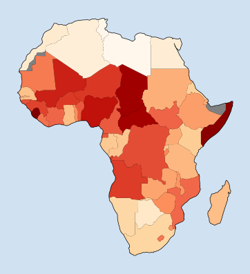
Plot the relative population of countries in Africa. This is done by filtering the dataframe on the continent of 'Africa'
 1fig, ax = plt.subplots(figsize = (6,5), facecolor = plt.cm.Blues(.2))
 2fig.suptitle('Africa Populations',
 3             fontsize = 'xx-large',
 4             fontweight = 'bold')
 5ax.set_facecolor(plt.cm.Blues(.2))
 6ax = world[world.continent == 'Africa'].plot(
 7    column = 'pop_est',
 8    cmap = 'Greens',
 9    ax = ax,
10    legend = True)
11
12plt.show()

Map of Africa showing country color based on population
Display country color based on Under Five Mortality Rates in 2019
A global map of the Under Five Mortality Rates can be plotted by merging the Under five mortality rates dataframe with the world geodataframe. The merge is done on the ISO country code. There is a discrepancy in the dataframes in that there are 195 countries in the Under Five Mortality Rates dataframe and only 177 countries in the world geodataframe.
 1# Countries in ufmr dataframe that are not in the world geodataframe
 2u5mr_med_df[~u5mr_med_df['ISO.Code'].isin(list(world['iso_a3']))][['ISO.Code', 'Country.Name']]
 3"""
 4    ISO.Code                      Country.Name
 510       AND                           Andorra
 616       ATG               Antigua and Barbuda
 737       BHR                           Bahrain
 843       BRB                          Barbados
 985       CPV                        Cabo Verde
10112      COM                           Comoros
11118      COK                      Cook Islands
12151      DMA                          Dominica
13187      FRA                            France
14208      GRD                           Grenada
15271      KIR                          Kiribati
16313      MDV                          Maldives
17319      MLT                             Malta
18322      MHL                  Marshall Islands
19328      MUS                         Mauritius
20334      FSM  Micronesia (Federated States of)
21337      MCO                            Monaco
22358      NRU                             Nauru
23379      NIU                              Niue
24382      NOR                            Norway
25391      PLW                             Palau
26436      KNA             Saint Kitts and Nevis
27439      LCA                       Saint Lucia
28442      VCT  Saint Vincent and the Grenadines
29445      WSM                             Samoa
30448      SMR                        San Marino
31451      STP             Sao Tome and Principe
32463      SYC                        Seychelles
33469      SGP                         Singapore
34526      TON                             Tonga
35541      TUV                            Tuvalu
36"""
Show countries that are in the world geodataframe, but not in the Under Five Mortality Rates dataframe.
 1# list all countries in World not in ufmr
 2world[~world['iso_a3'].isin(list(u5mr_med_df['ISO.Code']))][['iso_a3', 'name']]
 3"""
 4    iso_a3                    name
 52      ESH               W. Sahara
 620     FLK            Falkland Is.
 721     -99                  Norway
 822     GRL               Greenland
 923     ATF  Fr. S. Antarctic Lands
1043     -99                  France
1145     PRI             Puerto Rico
12134    NCL           New Caledonia
13140    TWN                  Taiwan
14159    ATA              Antarctica
15160    -99               N. Cyprus
16167    -99              Somaliland
17174    -99                  Kosovo
18"""
There are five countries in the world dataframe with iso_a3 code set to "-99". Three of these are disputed or don't yet have an ISO designation. France and Norway have ISO codes of "FRA" and "NOR" respectively and are updated in the geodataframe with the following.
1# Update ISO codes for France and Norway
2world.loc[world.name == 'France', 'iso_a3'] = 'FRA'
3world.loc[world.name == 'Norway', 'iso_a3'] = 'NOR'
Merge the data from Under Five Mortality Rates with the world geodataframe.
The merge is done with an left join on the ISO country code. This reduces the
number of countries to 166 that have both mortality information and geometry information.
Use of a 'left' join keeps all the countries in the original world geodataframe with
the appropriate geometry data. The 11 countries (such as Greenland) that only appear
in the world geodataframe will have NaN for all of the under five mortality rate
data.
1u5mr_world_df = world.merge(u5mr_med_df,
2                            left_on = 'iso_a3',
3                            right_on = 'ISO.Code',
4                            how = 'left')
5u5mr_world_df.shape
6"""
7(177, 79)
8"""
Create a plot showing the under five mortality rates per country for year 2019.
The data in the geopandas.geodataframe can be displayed in a number of ways and it can
be confusing to know which parameter to set. This code creates the same plot in four
different ways. The first three use the plot function on the geodataframe, which uses
matplotlib to generate the plot. The first plot sets a scheme of 'quantiles' for the
choropleth classification scheme, which colors the countries based on discrete intervals.
When choropleth classification scheme of 'quantiles' is used the legend is of type
matplotlib.pyplot.legend so the legend_kwds parameters are different. The default
scheme is None, in which case the legend is of type matplotlib.pyplot.colorbar.
This is used in chart 2 and 3, with the colorbar being changed from vertical to
horizontal. Finally, the fourth plot is rendered using the choropleth function
in geoplot module.
 1u5mr_year = u5mr_world_df['2019']
 2fig, axs = plt.subplots(
 3    nrows = 2,
 4    ncols = 2,
 5    figsize = (12,5),
 6    facecolor = plt.cm.Blues(.2))
 7fig.suptitle('National Under Five Mortality Rates in 2019',
 8             fontsize = 'xx-large',
 9             fontweight = 'bold')
10for ax in axs.flatten():
11    ax.set_facecolor(plt.cm.Blues(.2))
12
13ax1 = axs[0][0]
14u5mr_world_df.plot(
15    ax = ax1,
16    color = 'white',
17    edgecolor = 'black'
18)
19
20u5mr_world_df.plot(
21    column = u5mr_year,
22    scheme = 'quantiles',
23    k = 6,
24    cmap = 'OrRd',
25    ax = ax1,
26    legend = True,
27    legend_kwds = {'title': "UFMR per 1000",
28                   'title_fontsize': 'small',
29                   'frameon': False,
30                   'loc': 'lower center',
31                   'bbox_to_anchor': (-0.2, 0.1, 0.5, 1),
32                   'fontsize': 'xx-small',
33                  },
34)
35[spine.set_visible(False) for spine in ax1.spines.values()]
36ax1.xaxis.set_visible(False)
37ax1.yaxis.set_visible(False)
38
39
40ax2 = axs[0][1]
41u5mr_world_df.plot(
42    ax = ax2,
43    color = 'white',
44    edgecolor = 'black'
45)
46
47u5mr_world_df.plot(
48    column = u5mr_year,
49    cmap = 'OrRd',
50    ax = ax2,
51    legend = True,
52    legend_kwds = {'label': "UFMR per 1000"},
53)
54[spine.set_visible(False) for spine in ax2.spines.values()]
55ax2.xaxis.set_visible(False)
56ax2.yaxis.set_visible(False)
57
58ax3 = axs[1][0]
59u5mr_world_df.plot(
60    ax = ax3,
61    color = 'white',
62    edgecolor = 'black'
63)
64
65u5mr_world_df.plot(
66    column = u5mr_year,
67    cmap = 'OrRd',
68    ax = ax3,
69    legend = True,
70    legend_kwds = {'label': "UFMR per 1000",
71                   'orientation': 'horizontal',
72                   'shrink': 0.7,
73                  },
74)
75[spine.set_visible(False) for spine in ax3.spines.values()]
76ax3.xaxis.set_visible(False)
77ax3.yaxis.set_visible(False)
78
79
80gplt.choropleth(
81    u5mr_world_df,
82    hue = u5mr_year,
83#     scheme = scheme,
84    cmap = 'OrRd',
85    ax = axs[1][1],
86    legend = True
87)
88
89plt.show()

Display country color based on Under Five Mortality Rates in 1985
A function can be created to wrap up the creation of a world map for a particular year
based on option 2 above. A color of gray is added to handle missing data using
misssing_kwds parameter. This is valuable when dealing with earlier years where
there is no data available for many countries and displaying white or no color can
be misleading.
 1def create_map_for_year(year, title):
 2    u5mr_year = u5mr_world_df[year]
 3    fig, ax = plt.subplots(
 4        nrows = 1,
 5        ncols = 1,
 6        figsize = (15,6),
 7        facecolor = plt.cm.Blues(.2))
 8    fig.suptitle(title,
 9                 fontsize = 'xx-large',
10                 fontweight = 'bold')
11    ax.set_facecolor(plt.cm.Blues(.2))
12
13    u5mr_world_df.plot(
14        ax = ax,
15        color = 'white',
16        edgecolor = 'black'
17    )
18
19    u5mr_world_df.plot(
20        column = u5mr_year,
21        cmap = 'OrRd',
22        ax = ax,
23        legend = True,
24        legend_kwds = {'label': "UFMR per 1000",
25                      'shrink': 0.7},
26        missing_kwds = {'facecolor':'Gray'},
27    )
28    [spine.set_visible(False) for spine in ax.spines.values()]
29    ax.xaxis.set_visible(False)
30    ax.yaxis.set_visible(False)
31    return fig
Use the function to create a map for 1985.
1fig = create_map_for_year('1985', 'National Under Five Mortality Rates in 1985')
2plt.show()

Display changes over the decades
The function is modified to plot a map for an axis.
 1def plot_ax_for_year(ax, year):
 2    u5mr_year = u5mr_world_df[year]
 3    ax.set_title(year,
 4                 fontsize = 'xx-large',
 5                 fontweight = 'bold')
 6    ax.set_facecolor(plt.cm.Blues(.2))
 7
 8    u5mr_world_df.plot(
 9        ax = ax,
10        color = 'white',
11        edgecolor = 'black'
12    )
13
14    u5mr_world_df.plot(
15        column = u5mr_year,
16        cmap = 'OrRd',
17        ax = ax,
18        legend = True,
19        legend_kwds = {'label': "UFMR per 1000",
20                      'shrink': 0.7},
21        missing_kwds = {'facecolor':'Gray'},
22    )
23    [spine.set_visible(False) for spine in ax.spines.values()]
24    ax.xaxis.set_visible(False)
25    ax.yaxis.set_visible(False)
26    return ax
Create a plot with maps through the decades
 1fig, axs = plt.subplots(
 2    nrows = 4,
 3    ncols = 2,
 4    figsize = (15,15),
 5    facecolor = plt.cm.Blues(.2))
 6fig.suptitle('Changes in national Under Five Mortality Rates over time',
 7             fontsize = 'xx-large',
 8             fontweight = 'bold')
 9years = [f'{x}' for x in range(1950, 2020, 10)] + ['2019']
10for i, ax in enumerate(axs.flatten()):
11    ax = plot_ax_for_year(ax, years[i])
12fig.tight_layout(pad=2)
13plt.show()

Conclusion
Geographical maps are a great way to present a global view of where data applies to different countries and regions. Geopandas and Geoplot are used to plot world maps with countries colored based on data of interest. The world maps produced here show the changes over time on Under Five Mortality Rates. This helps visualise particular regions of the world that are consistently doing worse off in addressing child mortality.
Use of Matplotlib creates nice static images, but one drawback of these is precisely that they are static. This data could be more informative if either the maps could be more interactive or displayed as an animation.
Under-five mortality rate:
is the probability of dying between birth and exactly 5 years of age, expressed per 1,000 live births.