Daily counts and rolling average of COVID-19 numbers
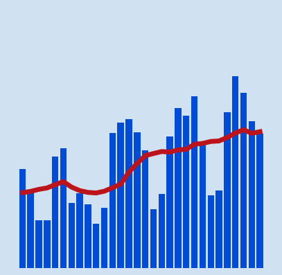
The daily counts of confirmed cases or deaths from COVID-19 can fluctuate greatly from day to day. This can be down to time factors such as week day vs weekend or delays in testing or gathering and collating results. A rolling average is a calculated average of different subsets of the full data set. It is used to smooth out fluctuations in the data.
Data sources:
The data used in this article is retrieved from the Johns Hopkins University who
have made the data available on GitHub. More information about COVID-19 and the
coronavirus is available from Coronavirus disease (COVID-19) advice for the
public.
Load COVID-19 data into dataframes
There are two sets of data to load the global confirmed cases and the global deaths.
- time_series_covid19_deaths_global.csv
- time_series_covid19_confirmed_global.csv
The data can be loaded directly from the GitHub page as in the code below. The data is cleaned to remove unwanted fields and group the data by country with the following function.
 1def load_clean_covid_data(csv_path):
 2    df = pd.read_csv(csv_path)
 3
 4    # 1. Drop unwanted columns
 5    df.drop(['Province/State', 'Lat', 'Long'], axis = 1, inplace = True)
 6
 7    # 2. Group by Country
 8    df = df.groupby('Country/Region').sum()
 9
10    # 3. Convert column headings to datetime
11    df.columns = pd.to_datetime(df.columns)
12
13    # 4. Remove the column name
14    df.rename_axis(None, axis = 0, inplace = True)
15
16    return df
Load the data for Confirmed cases and the data for Deaths from COVID-19 into dataframes.
 1
 2confirmed_df = load_clean_data('https://raw.githubusercontent.com/CSSEGISandData/COVID-19/master/csse_covid_19_data/csse_covid_19_time_series/time_series_covid19_confirmed_global.csv')
 3confirmed_df.shape
 4"""
 5(191, 333)
 6"""
 7
 8confirmed_df.iloc[[0,1,2,-3,-2,-1], [0,1,2,-3,-2,-1]]
 9"""
10             2020-01-22  2020-01-23  2020-01-24  2020-12-17  2020-12-18  2020-12-19
11Afghanistan           0           0           0       49378       49621       49681
12Albania               0           0           0       51424       52004       52542
13Algeria               0           0           0       93933       94371       94781
14Yemen                 0           0           0        2087        2087        2087
15Zambia                0           0           0       18504       18575       18620
16Zimbabwe              0           0           0       11866       12047       12151
17"""
18
19
20deaths_df = load_clean_data('https://raw.githubusercontent.com/CSSEGISandData/COVID-19/master/csse_covid_19_data/csse_covid_19_time_series/time_series_covid19_deaths_global.csv')
21deaths_df.shape
22"""
23(191, 333)
24"""
25
26deaths_df.iloc[[0,1,2,-3,-2,-1], [0,1,2,-3,-2,-1]]
27"""
28             2020-01-22  2020-01-23  2020-01-24  2020-12-17  2020-12-18  2020-12-19
29Afghanistan           0           0           0        2025        2030        2047
30Albania               0           0           0        1055        1066        1074
31Algeria               0           0           0        2640        2647        2659
32Yemen                 0           0           0         606         606         606
33Zambia                0           0           0         369         373         373
34Zimbabwe              0           0           0         314         316         318
35"""
Get the top 10 countries
Get the names of the top ten countries based on the highest deaths for the latest date.
 1top_countries = list(deaths_df
 2                 .iloc[:, -1]
 3                 .sort_values(ascending = False)
 4                 .head(10)
 5                 .index)
 6
 7top_countries
 8"""
 9['US',
10 'Brazil',
11 'India',
12 'Mexico',
13 'Italy',
14 'United Kingdom',
15 'France',
16 'Iran',
17 'Russia',
18 'Spain']
19"""
Display the deaths for a country over time
The data in time_series_covid19_deaths_global.csv is the cumulative number of deaths from COVID-19 recorded in each country every day. This is displayed in a line chart.
 1c = 'US'
 2data = deaths_df.loc[c]
 3date = deaths_df.columns[-1].strftime('%b %d %Y')
 4
 5bg_color = 'rgba(208, 225, 242, 1.0)'
 6line_color = 'rgba(75, 152, 201, 1.0)'
 7grid_color = 'rgba(75, 152, 201, 0.3)'
 8
 9fig = go.Figure()
10fig.add_trace(go.Scatter(
11    x = data.index,
12    y = data,
13    name = 'US',
14    hovertemplate = [f"""<b>{c}</b><br>
15<br>Deaths: {x:,.0F}
16<extra></extra>
17""" for x in data] ))
18
19fig.update_layout(
20    # Set figure title
21    title = dict(
22        text = f'Deaths from COVID-19 in <b>"{c}"</b> <br> {date}',
23        xref = 'container',
24        yref = 'container',
25        x = 0.5,
26        y = 0.9,
27        xanchor = 'center',
28        yanchor = 'middle',
29        font = dict(family = 'Droid Sans', size = 28)
30    ),
31    # set x-axis
32    xaxis = dict(
33        title = 'Date',
34        linecolor = line_color,
35        linewidth = 2,
36        gridcolor = grid_color,
37        showticklabels = True,
38        ticks = 'outside',
39    ),
40    # set y-axis
41    yaxis = dict(
42        title = 'Number of deaths',
43        rangemode = 'tozero',
44        linecolor = line_color,
45        linewidth = 2,
46        gridcolor = grid_color,
47        showticklabels = True,
48        ticks = 'outside',
49    ),
50    # set the plot bacground color
51    plot_bgcolor = bg_color,
52    paper_bgcolor = bg_color,
53)
54
55fig.show()
Total deaths from COVID-19 in US - December 19 2020
Display daily counts for a single country
Reduce the dataset by selecting the data for the top 10 countries. The daily count is easily got using pandas.DataFrame.diff function. This calculates the diference of data elements from another element in the dataframe. The default is to calculate the difference between the element in the previous row, but an axis parameter of 1 or columns can be used to calculate the difference between the element in the previous column.
 1top_df = deaths_df.loc[top_countries]
 2top_daily_df = top_df.diff(axis=1)
 3
 4top_daily_df.iloc[:, -10:]
 5"""
 6                2020-12-10  2020-12-11  2020-12-12  2020-12-13  2020-12-14  2020-12-15  2020-12-16  2020-12-17  2020-12-18  2020-12-19
 7US                  2920.0      3283.0      2354.0      1389.0      1484.0      2984.0      3668.0      3345.0      2814.0      2571.0
 8Brazil               770.0       672.0       686.0       279.0       433.0       964.0       936.0      1092.0       823.0       706.0
 9India                413.0       443.0       391.0       336.0       354.0       387.0       355.0       338.0       347.0       341.0
10Mexico               671.0       693.0       685.0       249.0       345.0       801.0       670.0       718.0       762.0       627.0
11Italy                887.0       761.0       649.0       484.0       491.0       846.0       680.0       683.0       674.0       553.0
12United Kingdom       516.0       424.0       520.0       144.0       233.0       506.0       612.0       532.0       490.0       537.0
13France               296.0       628.0        -1.0       344.0       376.0       791.0       290.0       261.0       612.0       189.0
14Iran                 284.0       231.0       222.0       247.0       251.0       223.0       213.0       212.0       178.0       175.0
15Russia               549.0       601.0       553.0       481.0       442.0       564.0       584.0       574.0       602.0       574.0
16Spain                325.0       280.0         0.0         0.0       389.0       388.0       195.0       181.0       149.0         0.0
17"""
Table: Deaths from COVID-19 in previous 7 days in countries with highest deaths on December 19 2020
| Country | Dec 13 | Dec 14 | Dec 15 | Dec 16 | Dec 17 | Dec 18 | Dec 19 |
|---|---|---|---|---|---|---|---|
| US | 1,389 | 1,484 | 2,984 | 3,668 | 3,345 | 2,814 | 2,571 |
| Brazil | 279 | 433 | 964 | 936 | 1,092 | 823 | 706 |
| India | 336 | 354 | 387 | 355 | 338 | 347 | 341 |
| Mexico | 249 | 345 | 801 | 670 | 718 | 762 | 627 |
| Italy | 484 | 491 | 846 | 680 | 683 | 674 | 553 |
| United Kingdom | 144 | 233 | 506 | 612 | 532 | 490 | 537 |
| France | 344 | 376 | 791 | 290 | 261 | 612 | 189 |
| Iran | 247 | 251 | 223 | 213 | 212 | 178 | 175 |
| Russia | 481 | 442 | 564 | 584 | 574 | 602 | 574 |
| Spain | 0 | 389 | 388 | 195 | 181 | 149 | 0 |
The daily counts is plotted for a single country.
 1c = 'US'
 2data = top_daily_df.loc[c]
 3date = top_daily_df.columns[-1].strftime('%b %d %Y')
 4
 5bg_color = 'rgba(208, 225, 242, 1.0)'
 6line_color = 'rgba(75, 152, 201, 1.0)'
 7grid_color = 'rgba(75, 152, 201, 0.3)'
 8
 9fig = go.Figure()
10fig.add_trace(go.Scatter(
11    x = data.index,
12    y = data,
13    name = 'US',
14    hovertemplate = [f"""<b>{c}</b><br>
15<br>Deaths: {x:,.0F}
16<extra></extra>
17""" for x in data] ))
18
19fig.update_layout(
20    # Set figure title
21    title = dict(
22        text = f'Daily deaths from COVID-19 in <b>"{c}"</b> <br> {date}',
23        xref = 'container',
24        yref = 'container',
25        x = 0.5,
26        y = 0.9,
27        xanchor = 'center',
28        yanchor = 'middle',
29        font = dict(family = 'Droid Sans', size = 28)
30    ),
31    # set x-axis
32    xaxis = dict(
33        title = 'Date',
34        linecolor = line_color,
35        linewidth = 2,
36        gridcolor = grid_color,
37        showticklabels = True,
38        ticks = 'outside',
39    ),
40    # set y-axis
41    yaxis = dict(
42        title = 'Number of deaths',
43        rangemode = 'tozero',
44        linecolor = line_color,
45        linewidth = 2,
46        gridcolor = grid_color,
47        showticklabels = True,
48        ticks = 'outside',
49    ),
50    # set the plot bacground color
51    plot_bgcolor = bg_color,
52    paper_bgcolor = bg_color,
53)
54
55fig.show()
Daily deaths from COVID-19 in US - December 19 2020
Display rolling average on daily counts
The daily counts fluctuate greatly from day to day and it can be difficult to see the overall trend. A rolling average calculates an average of different subsets of the full data set. It is used to smooth out fluctuations in the data. In this case the pandas.Series.rolling function is used to create a number of rolling average to determine the best value to use.
Here is an example of calculating the rolling average of 3 days for the latest 20 days on the number of deaths from COVID-19 in the US. The chart is used to determine the best number of days to set for the rolling window. Rolling window sizes of 3, 5, 7 and 10 were compared. The different results can be switched on and off in the Plotly chart and areas of the chart can be zoomed in on. These results show that 7 is the best number to select for the rolling window size. This is likely due to daily fluctuations based on weekday that are smoothed out when taking the week on average.
 1c = 'US'
 2data = top_daily_df.loc[c].tail(20)
 3rolling = data.rolling(3).mean()
 4
 5data
 6"""
 7['1153.0', '2588.0', '2775.0', '2843.0', '2594.0', '2257.0', '1122.0',
 8'1419.0', '2520.0', '3064.0', '2920.0', '3283.0', '2354.0', '1389.0',
 9'1484.0', '2984.0', '3668.0', '3345.0', '2814.0', '2571.0']
10"""
11
12rolling
13"""
14['NAN', 'NAN', '2172.0', '2735.3', '2737.3', '2564.7', '1991.0',
15'1599.3', '1687.0', '2334.3', '2834.7', '3089.0', '2852.3', '2342.0',
16'1742.3', '1952.3', '2712.0', '3332.3', '3275.7', '2910.0']
17"""
 1c = 'US'
 2data = top_daily_df.loc[c]
 3date = top_daily_df.columns[-1].strftime('%b %d %Y')
 4r3 = data.rolling(3).mean()
 5r5 = data.rolling(5).mean()
 6r7 = data.rolling(7).mean()
 7r10 = data.rolling(10).mean()
 8
 9bg_color = 'rgba(208, 225, 242, 1.0)'
10line_color = 'rgba(75, 152, 201, 1.0)'
11grid_color = 'rgba(75, 152, 201, 0.3)'
12
13fig = go.Figure()
14for d, n in zip([data, r3, r5, r7, r10], [1, 3, 5, 7, 10]):
15    fig.add_trace(go.Scatter(
16        x = d.index,
17        y = d,
18        name = f'rolling window = "{n}"',
19        hovertemplate = [f"""<b>{c}</b>
20    <br>Rolling window = {n}<br>
21    <br>Deaths: {x:,.0F}
22    <extra></extra>
23    """ for x in d] ))
24
25fig.update_layout(
26    # Set figure title
27    title = dict(
28        text = f'Daily deaths from COVID-19 in <b>"{c}"</b> <br> {date}',
29        xref = 'container',
30        yref = 'container',
31        x = 0.5,
32        y = 0.9,
33        xanchor = 'center',
34        yanchor = 'middle',
35        font = dict(family = 'Droid Sans', size = 28)
36    ),
37    # set x-axis
38    xaxis = dict(
39        title = 'Date',
40        linecolor = line_color,
41        linewidth = 2,
42        gridcolor = grid_color,
43        showticklabels = True,
44        ticks = 'outside',
45    ),
46    # set y-axis
47    yaxis = dict(
48        title = 'Number of deaths',
49        rangemode = 'tozero',
50        linecolor = line_color,
51        linewidth = 2,
52        gridcolor = grid_color,
53        showticklabels = True,
54        ticks = 'outside',
55    ),
56    # set the plot bacground color
57    plot_bgcolor = bg_color,
58    paper_bgcolor = bg_color,
59)
60
61fig.show()
Daily deaths from COVID-19 in US showing means for different rolling window sizes - December 19 2020
Identify the best rolling average window size
It can be easier to identify the better rolling window size by plotting the different options on separate plots. This confirms that the best rolling window setting is for 7 days. The 7-day rolling average smooths out the daily fluctuations and makes it easier to see trends in the data. This confirmed by creating a number of charts for different countries.
 1c = 'US'
 2data = top_daily_df.loc[c]
 3date = top_daily_df.columns[-1].strftime('%b %d %Y')
 4r3 = data.rolling(3).mean()
 5r5 = data.rolling(5).mean()
 6r7 = data.rolling(7).mean()
 7r10 = data.rolling(10).mean()
 8r20 = data.rolling(10).mean()
 9
10bg_color = 'rgba(208, 225, 242, 1.0)'
11line_color = 'rgba(75, 152, 201, 1.0)'
12grid_color = 'rgba(75, 152, 201, 0.3)'
13
14fig = make_subplots(
15    rows = 3,
16    cols = 2,
17    subplot_titles = (
18        "Daily Data",
19        "Rolling Window 3",
20        "Rolling Window 5",
21        "Rolling Window 7",
22        "Rolling Window 10",
23        "Rolling Window 20"))
24
25fig.add_trace(go.Scatter(x = data.index, y = data), row = 1, col = 1)
26fig.add_trace(go.Scatter(x = r3.index, y = r3), row = 1, col = 2)
27fig.add_trace(go.Scatter(x = r5.index, y = r5), row = 2, col = 1)
28fig.add_trace(go.Scatter(x = r7.index, y = r7), row = 2, col = 2)
29fig.add_trace(go.Scatter(x = r10.index, y = r10), row = 3, col = 1)
30fig.add_trace(go.Scatter(x = r20.index, y = r20), row = 3, col = 2)
31
32fig.update_layout(
33    showlegend=False
34)
35
36fig.show()
Deaths from COVID-19 in US showing different rolling averages in multiple subplots
Deaths from COVID-19 in UK showing different rolling averages in multiple subplots
Display rolling averages for top ten countries
Display the 7-day rolling average of Deaths from COVID-19 for the top ten countries with the highest deaths on December 19 2020.
 1date = top_daily_df.columns[-1].strftime('%b %d %Y')
 2
 3bg_color = 'rgba(208, 225, 242, 1.0)'
 4line_color = 'rgba(75, 152, 201, 1.0)'
 5grid_color = 'rgba(75, 152, 201, 0.3)'
 6
 7fig = go.Figure()
 8for i, row in top_daily_df.iterrows():
 9    r7 = row.rolling(7).mean()
10    fig.add_trace(go.Scatter(
11        x = r7.index,
12        y = r7,
13        name = i,
14        hovertemplate = [f"""<b>{r7.name}</b>
15    <br>Deaths: {x:,.0F}
16    <extra></extra>
17    """ for x in r7]))
18
19fig.update_layout(
20    # Set figure title
21    title = dict(
22        text = f'7-day daily average of deaths from COVID-19 in top ten countries<br> {date}',
23        xref = 'container',
24        yref = 'container',
25        x = 0.5,
26        y = 0.9,
27        xanchor = 'center',
28        yanchor = 'middle',
29        font = dict(family = 'Droid Sans', size = 24)
30    ),
31    # set x-axis
32    xaxis = dict(
33        title = 'Date',
34        linecolor = line_color,
35        linewidth = 2,
36        gridcolor = grid_color,
37        showticklabels = True,
38        ticks = 'outside',
39    ),
40    # set y-axis
41    yaxis = dict(
42        title = '7-day daily average of deaths',
43        rangemode = 'tozero',
44        linecolor = line_color,
45        linewidth = 2,
46        gridcolor = grid_color,
47        showticklabels = True,
48        ticks = 'outside',
49    ),
50    # set the plot bacground color
51    plot_bgcolor = bg_color,
52    paper_bgcolor = bg_color,
53)
54
55fig.show()
7-day average of Deaths per day from COVID-19 in countries with highest deaths
A similar plot can be created for confirmed cases for the same ten countries with highest deaths.
7-day average of Confirmed Cases per day of COVID-19 in countries with highest deaths
Display rolling averages and the daily counts
Display the 7-day rolling average of Deaths from COVID-19 as well as the actual daily counts in the same chart. The daily counts are shown as bars and the rolling average is a line. The results for the countries with the highest deaths is displayed. The plots are separated per country. There is a lot of data collected to date and sections of the charts can be chosen to zoom in on a particular time period. Another approach is to just plot the data for the most recent 30 days to give a picture of what the current trend is.
 1date = top_daily_df.columns[-1].strftime('%b %d %Y')
 2
 3bg_color = 'rgba(208, 225, 242, 1.0)'
 4line_color = 'rgba(75, 152, 201, 1.0)'
 5grid_color = 'rgba(75, 152, 201, 0.3)'
 6
 7fig = make_subplots(
 8    rows = 5,
 9    cols = 2,
10    shared_xaxes = True,
11    subplot_titles = (top_daily_df.index)
12    )
13
14j = 0
15for i, row in top_daily_df.iterrows():
16    r7 = row.rolling(7).mean()
17    fig.add_trace(go.Bar(x = row.index, y = row, name = i), row = j%5+1, col = j%2+1)
18    fig.add_trace(go.Scatter(x = r7.index, y = r7, name = i), row = j%5+1, col = j%2+1)
19
20    j += 1
21
22
23fig.update_xaxes(dict(
24        linecolor = line_color,
25        gridcolor = grid_color,
26    ))
27
28fig.update_yaxes(dict(
29        rangemode = 'tozero',
30        linecolor = line_color,
31        gridcolor = grid_color,
32    ))
33
34fig.update_layout(
35    # Set figure title
36    title = dict(
37        text = f'Daily deaths from COVID-19 in <b>"{c}"</b> <br> {date}',
38        xref = 'container',
39        yref = 'container',
40        x = 0.5,
41        y = 0.95,
42        xanchor = 'center',
43        yanchor = 'middle',
44        font = dict(family = 'Droid Sans', size = 22)
45    ),
46    showlegend=False,
47    # set the plot bacground color
48    plot_bgcolor = bg_color,
49    paper_bgcolor = bg_color,
50)
51
52fig.show()
Daily counts and 7-day average of Deaths from COVID-19 in countries with highest deaths
Daily counts and 7-day average of Deaths from COVID-19 for latest 30 days
Similar charts can be created for the daily counts and rolling average of confirmed cases.
Daily counts and 7-day average of Confirmed Cases of COVID-19 in countries with highest deaths
Daily counts and 7-day average of Confirmed Cases of COVID-19 for latest 30 days
Conclusion
Once again calculations can be applied to a whole dataset easily with Pandas. The
diff function is used to easily convert the running totals to daily differences and
the rolling function is used to group a subset of data together and calculate a
running average. The running average helps smooth the day to day fluctuations in the
data and makes it easier to spot a trend.
Plotly is an open-source graphing library for Python that produces interactive charts.