Add data with a secondary y axis
Display two sets of data on the same chart when the data ranges are different, such as the confirmed cases of COVID-19 and deaths from COVID-19. COVID-19 is the disease caused by a new coronavirus (SARS-CoV-2) that the World Health Organisation (WHO) declared a pandemic in March 2020. This article will show how to create an interactive line chart with plotly, showing the changes in confirmed cases and deaths over time.
The data used in this article is retrieved from the Johns Hopkins University who have made the data available on GitHub. More information about COVID-19 and the coronavirus is available from Coronavirus disease (COVID-19) advice for the public. Plotly is an open-source graphing library for Python that produces interactive charts.
Load the data into a Pandas dataframe
The data is available on John Hopkins GitHub page. There are two sets of data to load the global confirmed cases and the global deaths.
- time_series_covid19_deaths_global.csv
- time_series_covid19_confirmed_global.csv
The data can be loaded directly from the GitHub page as in the code below. The data is cleaned to remove unwanted fields and group the data by country with the following function.
 1def load_clean_data(csv_path):
 2    df = pd.read_csv(csv_path)
 3
 4    # 1. Drop unwanted columns
 5    df.drop(['Province/State', 'Lat', 'Long'], axis = 1, inplace = True)
 6
 7    # 2. Group by Country
 8    df = df.groupby('Country/Region').sum()
 9
10    # 3. Transpose data to put dates in a single column
11    df = df.T
12    df.index = pd.to_datetime(df.index)
13
14    # 4. Remove the column name
15    df.rename_axis(None, axis = 1, inplace = True)
16
17    return df
Load the data for Confirmed cases and the data for Deaths from COVID-19.
 1
 2confirmed_df = load_clean_data('https://raw.githubusercontent.com/CSSEGISandData/COVID-19/master/csse_covid_19_data/csse_covid_19_time_series/time_series_covid19_confirmed_global.csv')
 3confirmed_df.shape
 4"""
 5(314, 191)
 6"""
 7
 8confirmed_df.iloc[[0,1,2,-3,-2,-1], [0,1,2,-3,-2,-1]]
 9"""
10            Afghanistan  Albania  Algeria  Yemen  Zambia  Zimbabwe
112020-01-22            0        0        0      0       0         0
122020-01-23            0        0        0      0       0         0
132020-01-24            0        0        0      0       0         0
142020-11-28        45966    36790    81212   2160   17589      9822
152020-11-29        46215    37625    82221   2177   17608      9822
162020-11-30        46498    38182    83199   2191   17647      9950
17"""
18
19
20deaths_df = load_clean_data('https://raw.githubusercontent.com/CSSEGISandData/COVID-19/master/csse_covid_19_data/csse_covid_19_time_series/time_series_covid19_deaths_global.csv')
21deaths_df.shape
22"""
23(314, 191)
24"""
25
26deaths_df.iloc[[0,1,2,-3,-2,-1], [0,1,2,-3,-2,-1]]
27"""
28            Afghanistan  Albania  Algeria  Yemen  Zambia  Zimbabwe
292020-01-22            0        0        0      0       0         0
302020-01-23            0        0        0      0       0         0
312020-01-24            0        0        0      0       0         0
322020-11-28         1752      787     2393    615     357       275
332020-11-29         1763      798     2410    617     357       275
342020-11-30         1774      810     2431    619     357       276
35"""
Global confirmed cases of COVID-19
Show the total global number of confirmed cases of COVID-19 as the numbers changes over time. Plotly is used to display an interactive line chart. An annotation is added to show the current total number on the latest date.
 1def hov_text(ary_x, ary_y, name):
 2    '''Create the hover text for each data point
 3
 4    Keyword arguments:
 5    ary_x    -- list of all the x data points
 6    ary_y    -- list of all the y data points
 7    name     -- name to display before each value
 8
 9    return: A list of hover texts for the selected data
10            with format to display
11    '''
12    txt = [f'''
13<b>{ary_x[i].strftime('%B %d %Y')}</b><br><br>
14{name}: <b>{ary_y[i]:,.0F}</b><br>
15<extra></extra>
16''' for i in range(len(ary_x))]
17    return txt
 1total_confirmed = confirmed_df.sum(axis = 1)
 2
 3bg_color = 'rgba(208, 225, 242, 1.0)'
 4line_color = 'rgba(75, 152, 201, 1.0)'
 5grid_color = 'rgba(75, 152, 201, 0.3)'
 6
 7fig = go.Figure()
 8fig.add_trace(go.Scatter(x = total_confirmed.index,
 9                         y = total_confirmed,
10                         name = 'Confirmed',
11                         hovertemplate = hov_text(total_confirmed.index,
12                                                  total_confirmed,
13                                                  'Confirmed Cases')))
14
15fig.update_traces(
16    hoverinfo = 'text+name',
17    mode = 'lines'
18)
19
20fig.update_layout(
21    # Set figure title
22    title = dict(
23        text = f'<b>Global confirmed cases from COVID-19</b>',
24        xref = 'container',
25        yref = 'container',
26        x = 0.5,
27        y = 0.9,
28        xanchor = 'center',
29        yanchor = 'middle',
30        font = dict(family = 'Droid Sans', size = 28)
31    ),
32    # set legend
33    legend = dict(
34        orientation = 'h',
35        traceorder = 'normal',
36        font_size = 12,
37        x = 0.0,
38        y = -0.3,
39        xanchor = 'left',
40        yanchor = 'top'
41    ),
42    # set x-axis
43    xaxis = dict(
44        title = 'Date',
45        linecolor = line_color,
46        linewidth = 2,
47        gridcolor = grid_color,
48        showticklabels = True,
49        ticks = 'outside',
50    ),
51    # set y-axis
52    yaxis = dict(
53        title = 'Number of confirmed cases',
54        rangemode = 'tozero',
55        linecolor = line_color,
56        linewidth = 2,
57        gridcolor = grid_color,
58        showticklabels = True,
59        ticks = 'outside',
60    ),
61    showlegend = False,
62    # set the plot bacground color
63    plot_bgcolor = bg_color,
64    paper_bgcolor = bg_color,
65)
66
67# Add text for current date and total
68fig.add_annotation(
69    text = f"{total_confirmed.index[-1].strftime('%B %d')}<BR> {total_confirmed[-1]:,.0F}",
70    xref = 'paper',
71    yref = 'paper',
72    x = 0.5,
73    y = 1.0,
74    showarrow = False,
75    bgcolor = 'rgba(180, 210, 233, 1.0)',
76    borderpad = 10,
77    font = dict(family = 'Droid Sans', size = 28)
78)
79
80fig.show()
Global confirmed cases from COVID-19
Global deaths from COVID-19
Show the total global number of deaths from COVID-19 as the numbers changes over time. The code is similar to the last chart except the data source and titles.
 1total_deaths = deaths_df.sum(axis = 1)
 2
 3bg_color = 'rgba(208, 225, 242, 1.0)'
 4line_color = 'rgba(75, 152, 201, 1.0)'
 5grid_color = 'rgba(75, 152, 201, 0.3)'
 6
 7fig = go.Figure()
 8fig.add_trace(go.Scatter(x = total_deaths.index,
 9                         y = total_deaths,
10                         name = 'Deaths',
11                         hovertemplate = hov_text(total_deaths.index,
12                                                  total_deaths,
13                                                 'Deaths')))
14
15fig.update_traces(
16    hoverinfo = 'text+name',
17    mode = 'lines'
18)
19
20fig.update_layout(
21    # Set figure title
22    title = dict(
23        text = f'<b>Global deaths from COVID-19</b>',
24        xref = 'container',
25        yref = 'container',
26        x = 0.5,
27        y = 0.9,
28        xanchor = 'center',
29        yanchor = 'middle',
30        font = dict(family = 'Droid Sans', size = 28)
31    ),
32    # set legend
33    legend = dict(
34        orientation = 'h',
35        traceorder = 'normal',
36        font_size = 12,
37        x = 0.0,
38        y = -0.3,
39        xanchor = 'left',
40        yanchor = 'top'
41    ),
42    # set x-axis
43    xaxis = dict(
44        title = 'Date',
45        linecolor = line_color,
46        linewidth = 2,
47        gridcolor = grid_color,
48        showticklabels = True,
49        ticks = 'outside',
50    ),
51    # set y-axis
52    yaxis = dict(
53        title = 'Number of deaths',
54        rangemode = 'tozero',
55        linecolor = line_color,
56        linewidth = 2,
57        gridcolor = grid_color,
58        showticklabels = True,
59        ticks = 'outside',
60    ),
61    showlegend = False,
62    # set the plot bacground color
63    plot_bgcolor = bg_color,
64    paper_bgcolor = bg_color,
65)
66
67# Add text for current date and total
68fig.add_annotation(
69    text = f"{total_deaths.index[-1].strftime('%B %d')}<BR> {total_deaths[-1]:,.0F}",
70    xref = 'paper',
71    yref = 'paper',
72    x = 0.5,
73    y = 1.0,
74    showarrow = False,
75    bgcolor = 'rgba(180, 210, 233, 1.0)',
76    borderpad = 10,
77    font = dict(family = 'Droid Sans', size = 28)
78)
79
80fig.show()
Global deaths from COVID-19
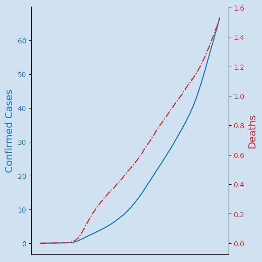
Show Confirmed cases and deaths from COVID-19 on a single graph
Just showing the data for confirmed cases and deaths on the same chart does not work well as there is such a difference in scale between the number ranges. The number of deaths looks flat relative to the total number of cases, but these numbers are growing.
Global deaths from COVID-19
One solution is to plot the Deaths data using a second y axis so that each set of data will use the full vertical space available. These y axes are also marked with color associated with the data that uses the axis.
The code to generate this chart is wrapped up in a function that takes the two dataframes and the chart title and returns a plotly graph figure.
 1def plot_confirmed_and_deaths(df1, df2, region):
 2    bg_color = 'rgba(208, 225, 242, 1.0)'
 3    line_color = 'rgba(75, 152, 201, 1.0)'
 4    grid_color = 'rgba(75, 152, 201, 0.3)'
 5
 6    # Linechart with secondary y axis
 7    fig = make_subplots(specs=[[{"secondary_y": True}]])
 8
 9    fig.add_trace(
10        go.Scatter(
11            x = df1.index,
12            y = df1,
13            name = 'Confirmed Cases',
14            hovertemplate = hov_text(df1.index,
15                                     df1,
16                                     'Confirmed Cases')),
17        secondary_y = False)
18
19    fig.add_trace(
20        go.Scatter(
21            x = df2.index,
22            y = df2,
23            name = 'Deaths',
24            line = dict(dash = 'dashdot'),
25            hovertemplate = hov_text(df2.index,
26                                     df2,
27                                     'Deaths')),
28        secondary_y = True)
29
30    fig.update_layout(
31        # Set figure title
32        title = dict(
33            text = f'Confirmed cases and deaths from COVID-19<BR><b>{region}</b>',
34            xref = 'container',
35            yref = 'container',
36            x = 0.5,
37            y = 0.9,
38            xanchor = 'center',
39            yanchor = 'middle',
40            font = dict(family = 'Droid Sans', size = 28)
41        ),
42        # set legend
43        legend = dict(
44            orientation = 'v',
45            traceorder = 'normal',
46            font_size = 12,
47            x = 0.1,
48            y = 0.9,
49            xanchor = "left",
50            yanchor = "top"
51        ),
52        # set x-axis
53        xaxis = dict(
54            title = 'Date',
55            linecolor = line_color,
56            linewidth = 2,
57            gridcolor = grid_color,
58            showticklabels = True,
59            ticks = 'outside',
60        ),
61        # set y-axis
62        yaxis = dict(
63            title = 'Number of Confirmed Cases',
64            color = 'rgba(80, 80, 250, 1.0)',
65            rangemode = 'tozero',
66            linecolor = 'rgba(80, 80, 250, 1.0)',
67            linewidth = 2,
68            gridcolor = 'rgba(80, 80, 250, 0.3)',
69            showticklabels = True,
70            ticks = 'outside'
71        ),
72        # set the plot bacground color
73        plot_bgcolor = bg_color,
74        paper_bgcolor = bg_color,
75    )
76
77    # set the secondary y-axis
78    fig.update_yaxes(
79        title_text = 'Number of Deaths',
80        color = 'rgba(237, 34, 13, 1.0)',
81        range = [0, (df2[-1] * 1.08)],
82        linecolor = 'rgba(237, 34, 13, 1.0)',
83        linewidth = 2,
84        gridcolor = 'rgba(237, 34, 13, 0.3)',
85        showticklabels = True,
86        ticks = 'outside',
87        secondary_y = True
88    )
89
90    return fig
This plot_confirmed_and_deaths function is used to create the line plot showing both
confirmed cases and deaths from COVID-19 globally.
1df1 = confirmed_df.sum(axis = 1)
2df2 = deaths_df.sum(axis = 1)
3
4f = plot_confirmed_and_deaths(df1, df2, 'Global')
5f.show()
Global deaths from COVID-19
Display data for selected country
The same function can be used to create a chart for any country.
1country = 'US'
2f = plot_confirmed_and_deaths(
3    confirmed_df[country],
4    deaths_df[country],
5    country)
6f.show()
Global deaths from COVID-19 in United States
Global deaths from COVID-19 in United Kingdom
Global deaths from COVID-19 in Ireland
Global deaths from COVID-19 in Brazil
Conclusion
Pandas dataframe is great for loading data from csv files and filtering the data to an area of interest quickly. Plotly is great to create interactive charts. It is informative to see the rise in the number of deaths from COVID-19 in relation to the rise in the total number of cases detected. This relationship is easier to see when the data can be shown on a single graph. A secondary y-axis is used to display the deaths as the scales are so different. All of the loading, cleaning and creation of the chart can be wrapped up in a couple of functions to create a pipeline to generate these charts for countries of interest. The interactive charts allows the viewer to zoom in on a particular date range and select or deselect data to focus on an area of interest.