Create a Bar Chart Race with Matplotlib - part 2
A Bar Chart Race is an animation where the bars representing the data change in place on the chart to represent change over time. This is the second article to improve on the bar chart race to include changing categories over time while maintaining the color associated with each category.
How to create a basic Bar Chart Race is described in "How to create a Bar Chart race - part 1". In this article the bar chart race will built upon in the following areas:
- Handle a larger range of data where the countries change.
- Keep the color for each country constant.
- Improve the bar chart race by displaying the current value on the bar.
- Wrap up in functions to create other bar chart races.
Load the data
Details on downloading and loading the data into a dataframe is described in "Pandas - Load data from Excel file and Display Chart". The following loads the data from a local file and filters to the median values.
 1# Load the excel worksheet into a dataframe
 2u5mr_df = pd.read_excel(
 3    "/tmp/data/Under-five-mortality-rate_2020.xlsx",
 4    sheet_name = 'Country estimates (both sexes)',
 5    header = 14)
 6
 7# Drop the last two rows
 8u5mr_df.drop(u5mr_df.tail(2).index, inplace = True)
 9
10# Rename the columns to Years
11u5mr_df.columns = [x[:-2] if x.endswith('.5') else x for x in u5mr_df.columns]
12
13# Rename 'Uncertainty.Bounds*' column to 'Uncertainty.Bounds'
14u5mr_df = u5mr_df.rename(columns={'Uncertainty.Bounds*': 'Uncertainty.Bounds'})
15
16# Filter to the Median values
17u5mr_med_df = u5mr_df[u5mr_df['Uncertainty.Bounds'] == 'Median']
18
19# Review the data
20u5mr_med_df.iloc[[0,1,2,3,-4,-3,-2,-1], [0,1,2,3,4,5,6,-4,-3,-2,-1]]
21"""
22    ISO.Code Country.Name Uncertainty.Bounds  1950  1951  1952        1953       2016       2017       2018       2019
231        AFG  Afghanistan             Median   NaN   NaN   NaN         NaN  67.572190  64.940759  62.541196  60.269399
244        ALB      Albania             Median   NaN   NaN   NaN         NaN   9.419110   9.418052   9.525133   9.682407
257        DZA      Algeria             Median   NaN   NaN   NaN         NaN  24.792098  24.319482  23.805926  23.256168
2610       AND      Andorra             Median   NaN   NaN   NaN         NaN   3.369056   3.218925   3.085839   2.966929
27574      VNM     Viet Nam             Median   NaN   NaN   NaN         NaN  21.220796  20.843125  20.405423  19.935167
28577      YEM        Yemen             Median   NaN   NaN   NaN         NaN  56.823614  56.966430  58.460003  58.356138
29580      ZMB       Zambia             Median   NaN   NaN   NaN  234.418232  66.510929  64.337901  63.294182  61.663465
30583      ZWE     Zimbabwe             Median   NaN   NaN   NaN         NaN  59.538505  58.234924  55.856832  54.612967
31"""
Identify the countries of interest
First get the countries that are in the top 10 for all years in the dataset. Use a lambda expression to apply a sort to each row and combining the results of the top 10 in each row. This consists of the following 41 countries.
 1Afghanistan            Angola                             Bangladesh
 2Benin                  Burkina Faso                       Cambodia
 3Cameroon               Central African Republic           Chad
 4Cote d'Ivoire          Democratic Republic of the Congo   Egypt
 5Ethiopia               Gambia                             Ghana
 6Guinea                 Guinea-Bissau                      Haiti
 7Iraq                   Jordan                             Liberia
 8Libya                  Malawi                             Mali
 9Mauritania             Mozambique                         Nepal
10Niger                  Nigeria                            Oman
11Pakistan               Peru                               Republic of Korea
12Rwanda                 Senegal                            Sierra Leone
13Somalia                South Sudan                        Togo
14Turkey                 Yemen
1fields = ['Country.Name'] + [str(x) for x in range(1950, 2020)]
2sel_df = u5mr_med_df[fields].set_index('Country.Name')
3countries = list(sel_df.apply(
4    lambda x: x.sort_values(ascending = False).head(10),
5    axis = 0).index)
Create a color map for these countries.
The original bar chart animation showed changes in the same 5 countries from 2015 to 2019. The bar chart race is an animation of a sequence of bar charts in which the color of the bars is associated with the country for the value on the bar. Each bar chart is generated independently of the previous bar charts, so the color of the countries will change as new countries are added to the chart and other countries are removed. This is confusing in the final animated result.
A color-map is created assigning a color to each of the 41 countries to address this issue. There is no predefined color palette for more than 20 colors. The palette is created by joining colors from multiple palettes together.
1# Colours
2cols = plt.cm.tab20.colors + plt.cm.Dark2.colors + plt.cm.Set3.colors + plt.cm.tab20b.colors
3
4m = zip(countries, cols)
5color_dict = {x[0]:x[1] for x in m}
6color_dict

Get the data for these 41 countries of interest
Extract the data for the top 41 countries and transpose the data into wide format. Change the index to the last day of the year for each year and convert to datetime format.
 1# Get the data for the countries of interest
 2data_df = (u5mr_med_df.drop(['ISO.Code', 'Uncertainty.Bounds'], axis=1)
 3           [u5mr_med_df['Country.Name'].isin(countries)]).copy()
 4
 5# Set index to "Country.Name" and Transpose the dataframe
 6wide_df = data_df.set_index('Country.Name').T
 7
 8# Remove the column name
 9wide_df.rename_axis(None, axis=1, inplace=True)
10
11# Set index to datetime for end of year
12wide_df.index = pd.to_datetime([f"{x}-12-31" for x in wide_df.index])
13
14wide_df.iloc[[0,1,2,3,-4,-3,-2,-1], [0,1,2,3,-3,-2,-1]]
15"""
16            Afghanistan     Angola  Bangladesh       Benin        Togo      Turkey      Yemen
171950-12-31          NaN        NaN  345.207382  349.108392  317.200927         NaN        NaN
181951-12-31          NaN        NaN  335.272222  345.669180  311.993315         NaN        NaN
191952-12-31          NaN        NaN  325.617440  342.068496  307.047255         NaN        NaN
201953-12-31          NaN        NaN  316.000124  338.513583  302.123318  299.282646        NaN
212016-12-31    67.572190  84.211894   35.680942   97.416395   73.515650   12.148032  56.823614
222017-12-31    64.940759  80.622302   33.921226   95.133079   71.317235   11.396633  56.966430
232018-12-31    62.541196  77.672320   32.266390   92.773521   69.115785   10.696923  58.460003
242019-12-31    60.269399  74.686710   30.753860   90.286429   66.904696   10.046388  58.356138
25"""
Expand the data set for smooth animation
Expand the dataset with rows every two months and creating a ranking dataframe
with rankings for the countries for each year. Fill in the newly created rows
in the dataframes using interpolate function. Increment any duplicate rankings
for a given row to avoid bars disappearing from the bar chart animation.
 1# Expand the dataset
 2expanded_df = wide_df.asfreq('2M')
 3
 4# Create a ranking dataframe
 5rank_df = expanded_df.rank(axis = 1, method = 'first', ascending = False)
 6
 7expanded_df = expanded_df.interpolate()
 8rank_df = rank_df.interpolate()
 9
10# Remove duplicate ranking
11rank_df = rank_df.where(~rank_df.apply(pd.Series.duplicated, axis=1), rank_df*1.01)
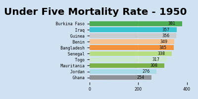
Display bar chart for a single year
Displaying a bar chart for a single year showing the ten countries with the highest Under Five Mortality Rate for that year.
 1fig, ax = plt.subplots(nrows = 1,
 2                       ncols = 1,
 3                       figsize = (10, 7),
 4                       facecolor = plt.cm.Blues(.2),
 5                       tight_layout = True)
 6bar_num = 10
 7i = 138
 8sel_df = expanded_df.iloc[:, list(rank_df.iloc[i] <= bar_num)]
 9ax.barh(y = rank_df.iloc[:, list(rank_df.iloc[i] <= bar_num)].iloc[i],
10        tick_label = sel_df.columns,
11        width = sel_df.iloc[i],
12        color = [color_dict[col] for col in sel_df.columns],
13        alpha = 0.8)
14cur_year = expanded_df.index[i].strftime('%Y-%m')
15ax.set_title(f'Under Five Mortality Rate - {cur_year}',
16             fontsize = 'xx-large',
17             fontweight = 'bold')
18ax.set_ylim(10.8, 0.2)
19ax.set_facecolor(plt.cm.Blues(.2))
20ax.tick_params(labelsize = 'medium')
21ax.grid(True, axis = 'x', color=plt.cm.Blues(.1))
22ax.set_axisbelow(True)
23[spine.set_visible(False) for spine in ax.spines.values()]
24plt.show()

Display bar chart with mortality rate on the bars
It can be helpful to see the under five mortality rate on the bar chart as the data is changing. This is done by adding an annotation to each of the bars. The mortality rate is displayed inside of the right edge of the bar. This could be displayed anywhere and works quite well outside to the right of the bar.
 1fig, ax = plt.subplots(nrows = 1,
 2                       ncols = 1,
 3                       figsize = (10, 7),
 4                       facecolor = plt.cm.Blues(.2),
 5                       tight_layout = True)
 6bar_num = 10
 7i = 138
 8sel_df = expanded_df.iloc[:, list(rank_df.iloc[i] <= bar_num)]
 9bars = ax.barh(y = rank_df.iloc[:, list(rank_df.iloc[i] <= bar_num)].iloc[i],
10               tick_label = sel_df.columns,
11               width = sel_df.iloc[i],
12               color = [color_dict[col] for col in sel_df.columns],
13               alpha = 0.8)
14
15cur_year = expanded_df.index[i].strftime('%Y-%m')
16ax.set_title(f'Under Five Mortality Rate - {cur_year}',
17             fontsize = 'xx-large',
18             fontweight = 'bold')
19ax.set_ylim(10.8, 0.2)
20ax.set_facecolor(plt.cm.Blues(.2))
21ax.tick_params(labelsize = 'medium')
22ax.grid(True, axis = 'x', color=plt.cm.Blues(.1))
23ax.set_axisbelow(True)
24[spine.set_visible(False) for spine in ax.spines.values()]
25
26for bar in bars:
27    width = bar.get_width()
28    ax.annotate(f'{width:.0F}',
29                xy = (width , bar.get_y() + bar.get_height() / 2),
30                xytext = (-25, 0),
31                textcoords = "offset points",
32                fontsize = 'xx-large',
33                fontweight = 'bold',
34                ha = 'right',
35                va = 'center')

Display a random sample of bar charts for different year
The expanded dataframe now has 415 rows, the final animation is created by generating 415 bar charts and creating a sequence of these charts. It is helpful to take a random sample of the dataset to validate that the bar charts are displayed as expected. The random rows are selected using the dataframe sample function.
 1sample_num = 5
 2d_df = expanded_df.sample(n=sample_num, random_state=1)
 3r_df = rank_df.loc[d_df.index]
 4
 5fig, axs = plt.subplots(nrows = 1,
 6                        ncols = sample_num,
 7                        figsize = (15, 5),
 8                        facecolor = plt.cm.Blues(.2),
 9                        tight_layout = True)
10
11for i, ax in enumerate(axs.flatten()):
12    sel_df = d_df.iloc[:, list(r_df.iloc[i] <= bar_num)]
13    bars = ax.barh(y = r_df.iloc[:, list(r_df.iloc[i] <= bar_num)].iloc[i],
14                   tick_label = sel_df.columns,
15                   width = sel_df.iloc[i],
16                   color = [color_dict[col] for col in sel_df.columns],
17                   alpha = 0.8)
18
19    cur_year = d_df.index[i].strftime('%Y-%m')
20    ax.set_title(f'{cur_year}',
21                 fontsize = 'large',
22                 fontweight = 'bold')
23    ax.set_ylim(10.8, 0.2)
24    ax.set_facecolor(plt.cm.Blues(.2))
25    ax.tick_params(labelsize = 'medium')
26    ax.grid(True, axis = 'x', color=plt.cm.Blues(.1))
27    ax.set_axisbelow(True)
28    [spine.set_visible(False) for spine in ax.spines.values()]
29
30    for bar in bars:
31        width = bar.get_width()
32        ax.annotate(f'{width:.0F}',
33                    xy = (width , bar.get_y() + bar.get_height() / 2),
34                    xytext = (-5, 0),
35                    textcoords = "offset points",
36                    fontsize = 'medium',
37                    fontweight = 'bold',
38                    ha = 'right',
39                    va = 'center')
40
41plt.show()

Create bar chart race of highest U5MR over the years
The animation is created by using the FuncAnimation function in Matplotlib. As there are 415 rows in the expladed dataset, this animation can take some time to generate. Note that defining the functions is instantaneous, the time is required when saving the animation to either gif, html or mp4.
 1def update(i):
 2    ax.clear()
 3
 4    p = expanded_df.columns.map(len).max()
 5    bar_num = 10
 6    sel_df = expanded_df.iloc[:, list(rank_df.iloc[i] <= bar_num)]
 7    bars = ax.barh(y = rank_df.iloc[:, list(rank_df.iloc[i] <= bar_num)].iloc[i],
 8                   tick_label = [x.rjust(p, ' ') for x in sel_df.columns],
 9                   width = sel_df.iloc[i],
10                   color = [color_dict[col] for col in sel_df.columns],
11                   alpha = 0.8)
12    plt.setp(ax.get_xticklabels(), fontsize='x-small')
13    plt.setp(ax.get_yticklabels(), fontsize='small', fontfamily = 'monospace')
14
15    cur_year = expanded_df.index[i].strftime('%Y')
16    ax.set_title(f'Under Five Mortality Rate - {cur_year}',
17                 fontsize = 'larger',
18                 fontweight = 'bold',
19                 loc = 'center')
20    ax.set_ylim(10.8, 0.2)
21    ax.set_facecolor(plt.cm.Blues(.2))
22    ax.grid(True, axis = 'x', color=plt.cm.Blues(.1))
23    ax.set_axisbelow(True)
24    [spine.set_visible(False) for spine in ax.spines.values()]
25
26    for bar in bars:
27        width = bar.get_width()
28        ax.annotate(f'{width:.0F}',
29                    xy = (width , bar.get_y() + bar.get_height() / 2),
30                    xytext = (-20, 0),
31                    textcoords = "offset points",
32                    fontsize = 'small',
33                    ha = 'right',
34                    va = 'center')
35
36fig, ax = plt.subplots(figsize = (8, 5),
37                       facecolor = plt.cm.Blues(.2),
38                       dpi = 150,
39                       tight_layout = True)
40
41u5mr_anim = anim.FuncAnimation(
42    fig = fig,
43    func = update,
44    frames = len(expanded_df),
45    interval = 300)
Generate the gif file.
1u5mr_anim.save('U5MR_bar_chart_race_all_years.gif')

MP4 file of bar chart race from 1950 to 2019
Wrap up bar chart race creation in functions
There are a number of steps in preparing the data and then expanding, ranking and finally generating the bar chart race. The following wraps this up in a series of functions so these can be used to create a bar chart race from a similar dataset. Three functions are created; one to prepare the data in wide format; one to expand the data; and the final function to create the animation.
- prepare_data - Function to get the appropriate data and convert to wide format.
 1def prepare_data(df, highest = True):
 2    # Get all the countries in the top 10 for the years
 3    fields = ['Country.Name'] + [str(x) for x in range(1950, 2020)]
 4    sel_df = df[fields].set_index('Country.Name')
 5    countries = list(sel_df.apply(
 6        lambda x: x.sort_values(ascending = not highest).head(10),
 7        axis = 0).index)
 8
 9    # Create color map for countries
10    cols = plt.cm.tab20.colors + plt.cm.Dark2.colors + plt.cm.Set3.colors + plt.cm.tab20b.colors
11    color_dict = {x[0]:x[1] for x in zip(countries, cols)}
12
13    # Get the data for the countries of interest
14    data_df = (df.drop(['ISO.Code', 'Uncertainty.Bounds'], axis=1)
15               [df['Country.Name'].isin(countries)]).copy()
16
17    # Set index to "Country.Name" and Transpose the dataframe
18    wide_df = data_df.set_index('Country.Name').T
19
20    # Remove the column name
21    wide_df.rename_axis(None, axis=1, inplace=True)
22
23    # Convert index to datetime
24    wide_df.index = pd.to_datetime([f"{x}-12-31" for x in wide_df.index])
25
26    return wide_df, color_dict
- expand_data - Function to expand the data and create a ranking dataframe.
 1def expand_data(df, highest = True):
 2    e_df = df.asfreq('2M')
 3
 4    # Create ranking dataset
 5    r_df = e_df.rank(axis = 1, method = 'first', ascending = highest)
 6
 7    # Interpolate
 8    e_df = e_df.interpolate()
 9    r_df = r_df.interpolate()
10
11    # Remove duplicate ranks from the same row
12    r_df = r_df.where(~r_df.apply(pd.Series.duplicated, axis=1), r_df*1.01)
13
14    return e_df, r_df
- create_animation - Function to create the animation with the dataframes.
 1def create_animation(expanded_df, rank_df, color_dict, highest = True):
 2    def update2(i):
 3        ax.clear()
 4
 5        p = expanded_df.columns.map(len).max()
 6        bar_num = 10
 7        sel_df = expanded_df.iloc[:, list(rank_df.iloc[i] <= bar_num)]
 8        bars = ax.barh(y = rank_df.iloc[:, list(rank_df.iloc[i] <= bar_num)].iloc[i],
 9                       tick_label = [x.rjust(p, ' ') for x in sel_df.columns],
10                       width = sel_df.iloc[i],
11                       color = [color_dict[col] for col in sel_df.columns],
12                       alpha = 0.8)
13
14        plt.setp(ax.get_xticklabels(), fontsize='small')
15        plt.setp(ax.get_yticklabels(), fontsize='medium', fontfamily = 'monospace')
16
17        cur_year = expanded_df.index[i].strftime('%Y')
18        ax.set_title(f'Under Five Mortality Rate - {cur_year}',
19                     fontsize = 'larger',
20                     fontweight = 'bold',
21                     loc = 'right')
22        ax.set_ylim(10.8, 0.2)
23        if not highest:
24            ax.set_ylim(0.2, 10.8)
25        ax.set_facecolor(plt.cm.Blues(.2))
26        ax.grid(True, axis = 'x', color=plt.cm.Blues(.1))
27        ax.set_axisbelow(True)
28        [spine.set_visible(False) for spine in ax.spines.values()]
29
30
31        h_offset = -20 if highest else 2
32        h_align = 'right' if highest else 'left'
33        for bar in bars:
34            width = bar.get_width()
35            dislpay_value = f'{width:.0F}' if highest else f'{width:.1F}'
36            ax.annotate(dislpay_value,
37                        xy = (width , bar.get_y() + bar.get_height() / 2),
38                        xytext = (h_offset, 0),
39                        textcoords = "offset points",
40                        fontsize = 'small',
41                        ha = h_align,
42                        va = 'center')
43
44    fig, ax = plt.subplots(figsize = (8, 3),
45                           facecolor = plt.cm.Blues(.2),
46                           dpi = 150,
47                           tight_layout = True)
48
49    data_anim = anim.FuncAnimation(
50        fig = fig,
51        func = update2,
52        frames = len(expanded_df),
53        interval = 200)
54
55    return data_anim
Finally, call these functions to create a bar chart race for countries with
either the highest or lowest Under Five Mortality Rates over time. Setting
highest = False creates a bar chart race for the countries with the lowest Under
Five Mortality Rates from 1950 to 2019.
 1highest = False
 2# 1. Prepare the data
 3df, col_dict = prepare_data(u5mr_med_df, highest)
 4
 5# 2. Expand the data
 6e_df, r_df = expand_data(df)
 7
 8# 3. Create animation
 9data_anim = create_animation(e_df, r_df, col_dict, highest)
10
11# 4. Save animation as gif
12data_anim.save('Bar_chart_race_U5MR_lowest_countries.gif')

MP4 version available here - MP4 file for bar chart race showing the countries with lowest under five mortality rate from 1950 to 2019
Display U5MR bar chart race for selected countries
The same functions can also be used to compare changes to specific countries over the years.
 1highest = False
 2# 1. Prepare the data
 3df, col_dict = prepare_data(selected_df, highest)
 4
 5# 2. Expand the data
 6e_df, r_df = expand_data(df)
 7
 8# 3. Create animation
 9data_anim = create_animation(e_df, r_df, col_dict, highest)
10
11# 4. Save animation as gif
12data_anim.save('Bar_chart_race_U5MR_selected_countries.gif')

MP4 version available here - MP4 file for Bar chart race showing under five mortality rate changes for selected countries
Conclusion
The creation of a Bar Chart Race using Matplotlib was improved to handle the countries changing over time. The main challenge is to keep consistent bar colors for each country and this was achieved by creating a color map for all of the countries that appear in the bar chart race. A bar chart race is an animated sequence of bar charts, so the size and number of the charts has an impact on the final size of the gif or mp4 file. The current value for each country is displayed on the bar and this makes it easier to see changes over time.
It was noted that the position of the y-axis changes to accomodate the labels for the countries. This was resolved by right-padding the string for the country name with white space and setting the font to a constant width.