Countries with highest confirmed cases of Covid-19 with Plotly
COVID-19 is the disease caused by a new coronavirus called SARS-CoV-2. World Health Organisation (WHO) first learned of the virus on 31 December 2019. The WHO declared the coronavirus outbreak a pandemic in March 2020. This article will show how to create an interactive line chart with plotly, showing the changes in confirmed cases over time.
The data used in this article is retrieved from the Johns Hopkins University who have made te data available on GitHub. More information about COVID-19 and the coronavirus is available from Coronavirus disease (COVID-19) advice for the public.
Plotly is an open-source graphing library for Python that produces interactive charts.
Load the data into a Pandas dataframe
The data is available on John Hopkins GitHub page. The data for the daily deaths from corona virus is in time_series_covid19_deaths_global.csv file. This file can either be downloaded and loaded into a dataframe or it can be loaded directly from GitHub as in the code below. Load and review the data.
 1confirmed_path = 'https://raw.githubusercontent.com/CSSEGISandData/COVID-19/master/csse_covid_19_data/csse_covid_19_time_series/time_series_covid19_confirmed_global.csv'
 2confirmed_df = pd.read_csv(confirmed_path)
 3confirmed_df.shape
 4"""
 5(271, 315)
 6"""
 7
 8confirmed_df.iloc[[0,1,2,-3,-2,-1], [0,1,2,-3,-2,-1]]
 9"""
10    Province/State Country/Region        Lat  11/25/20  11/26/20  11/27/20
110              NaN    Afghanistan  33.939110     45490     45716     45839
121              NaN        Albania  41.153300     34944     35600     36245
132              NaN        Algeria  28.033900     78025     79110     80168
14268            NaN          Yemen  15.552727      2124      2137      2148
15269            NaN         Zambia -13.133897     17535     17553     17569
16270            NaN       Zimbabwe -19.015438      9508      9623      9714
17"""
The data in the Country/Region is further broken down by Province/State for some
countries such as China or United Kingdom. A single row is created for each country
by grouping the data by Country/Region and summing up the number. the columns
'Province/State', 'Lat', 'Long' are removed from the dataset.
 1# Drop columns 'Province/State', 'Lat', 'Long'
 2confirmed_df.drop(['Province/State', 'Lat', 'Long'], axis = 1, inplace = True)
 3
 4country_df = confirmed_df.groupby('Country/Region').sum()
 5country_df.shape
 6"""
 7(271, 312)
 8"""
 9
10country_df.iloc[[0,1,2,-3,-2,-1], [0,1,2,-3,-2,-1]]
11"""
12    Country/Region  1/22/20  1/23/20  11/25/20  11/26/20  11/27/20
130      Afghanistan        0        0     45490     45716     45839
141          Albania        0        0     34944     35600     36245
152          Algeria        0        0     78025     79110     80168
16268          Yemen        0        0      2124      2137      2148
17269         Zambia        0        0     17535     17553     17569
18270       Zimbabwe        0        0      9508      9623      9714
19"""
Display confirmed cases in top ten countries on the latest date
Sort the data by the values in the last column in descending order. A bar chart is created using Plotly with the top ten values. This displays an interactive chart that displays the value for each country when the bar is hovered over.
 1Top_10 = (country_df
 2          .sort_values(by=country_df.columns[-1], ascending=False)
 3          [[country_df.columns[-1]]]
 4          .head(10))
 5bg_color = 'rgba(208, 225, 242, 1.0)'
 6
 7fig = go.Figure(
 8    data = [go.Bar(x = list(Top_10.iloc[:, 0]),
 9                   y = list(Top_10.index),
10                   hovertemplate = "%{y}: <br><br>Confirmed: %{x:,.0f}<extra></extra>",
11                   orientation = 'h')]
12)
13
14fig.update_layout(
15    # Set default font
16        font = dict(
17        family = "Droid Sans",
18        size = 16
19    ),
20    # Set figure title
21    title = dict(
22        text = "<b>Top ten countries with highest confirmed cases of covid-19</b>",
23        xref = 'container',
24        yref = 'container',
25        x = 0.5,
26        y = 0.91,
27        xanchor = 'center',
28        yanchor = 'middle',
29        font = dict(family = 'Droid Sans', size = 24)
30    ),
31    # set x-axis
32    xaxis = dict(
33        title = dict(
34            text = 'Number of confirmed cases',
35            font = dict(family = 'Droid Sans', size = 18)
36        ),
37        showgrid = False,
38        linecolor = bg_color,
39        linewidth = 2,
40        showticklabels = True,
41    ),
42    # set y-axis
43    yaxis = dict(
44        showgrid = False,
45        linecolor = bg_color,
46        linewidth = 4,
47    ),
48    # set the plot bacground color
49    plot_bgcolor = bg_color,
50    # set the hover background color
51    hoverlabel = dict(
52        bgcolor = 'rgba(75, 152, 201, 0.2)',
53        font_size = 16
54    ),
55    paper_bgcolor = bg_color,
56)
57
58# Add annotation for the latest date
59fig.add_annotation(
60    xref = "paper",
61    yref = "paper",
62    x = 0.9,
63    y = 0.2,
64    text = f"<b>{pd.to_datetime(Top_10.columns[0]).strftime('%b %d %Y')}</b>",
65    showarrow = False,
66    font = dict(family = 'Droid Sans', size = 40))
67
68fig.update_traces(marker_color = 'rgb(75, 152, 201)')
69fig['layout']['yaxis']['autorange'] = "reversed"
70
71fig.show()
Top ten countries with highest confirmed cases of COVID-19
Display confirmed cases in US
Display a line chart showing the changes in the number of confirmed case over time for
a specific country. Start with the US as this has highest number of confirmed cases
in the world. The index is converted to datetime format so the axis is displayed
better.
 1us_data = country_df.loc['US']
 2# Convert the index to datetime format
 3us_data.index = pd.to_datetime(us_data.index)
 4
 5def hov_text(ary_x, ary_y):
 6    '''Create the hover text for each data point
 7
 8    Keyword arguments:
 9    ary_x    -- list of all the x data points
10    ary_y    -- list of all the y data points
11
12    return: A list of hover texts for the selected country
13            with format to display
14    '''
15    txt = [f'''
16<b>{ary_x[i].strftime('%b %d %Y')}</b><br><br>
17Confirmed Cases: <b>{ary_y[i]:,.0F}</b><br>
18<extra></extra>
19''' for i in range(len(ary_x))]
20    return txt
21
22bg_color = 'rgba(208, 225, 242, 1.0)'
23line_color = 'rgba(75, 152, 201, 1.0)'
24grid_color = 'rgba(75, 152, 201, 0.3)'
25
26fig = go.Figure()
27fig.add_trace(go.Scatter(x = us_data.index,
28                         y = us_data,
29                         name = 'US',
30                         hovertemplate = hov_text(us_data.index, us_data)))
31
32fig.update_traces(
33    hoverinfo = 'text+name',
34    mode = 'lines'
35)
36
37fig.update_layout(
38    # Set figure title
39    title = dict(
40        text = f'<b>Confirmed cases of COVID-19 in US</b>',
41        xref = 'container',
42        yref = 'container',
43        x = 0.5,
44        y = 0.9,
45        xanchor = 'center',
46        yanchor = 'middle',
47        font = dict(family = 'Droid Sans', size = 28)
48    ),
49    # set legend
50    legend = dict(
51        orientation = "h",
52        traceorder = 'normal',
53        font_size = 12,
54        x = 0.0,
55        y = -0.3,
56        xanchor = "left",
57        yanchor = "top"
58    ),
59    # set x-axis
60    xaxis = dict(
61        title = 'Date',
62        linecolor = line_color,
63        linewidth = 2,
64        gridcolor = grid_color,
65        showticklabels = True,
66        ticks = 'outside',
67    ),
68    # set y-axis
69    yaxis = dict(
70        title = 'Number of confirmed cases',
71        linecolor = line_color,
72        linewidth = 2,
73        gridcolor = grid_color,
74        showticklabels = True,
75        ticks = 'outside',
76    ),
77    # set the plot bacground color
78    plot_bgcolor = bg_color,
79    paper_bgcolor = bg_color,
80)
81
82fig.show()
Confirmed cases of COVID-19 in US
Create a function to display confirmed cases for any country
The code above can be wrapped up in a function to create a chart for any country specified.
 1def hov_text(ary_x, ary_y):
 2    '''Create the hover text for each data point
 3
 4    Keyword arguments:
 5    ary_x    -- list of all the x data points
 6    ary_y    -- list of all the y data points
 7
 8    return: A list of hover texts for the selected country
 9            with format to display
10    '''
11    txt = [f'''
12<b>{ary_x[i].strftime('%b %d %Y')}</b><br><br>
13Confirmed Cases: <b>{ary_y[i]:,.0F}</b><br>
14<extra></extra>
15''' for i in range(len(ary_x))]
16    return txt
17
18
19def plot_confirmed_cases_for_country(df, country):
20    sel_data = df.loc[country]
21    # Convert the index to datetime format
22    sel_data.index = pd.to_datetime(sel_data.index)
23
24    bg_color = 'rgba(208, 225, 242, 1.0)'
25    line_color = 'rgba(75, 152, 201, 1.0)'
26    grid_color = 'rgba(75, 152, 201, 0.3)'
27
28    fig = go.Figure()
29    fig.add_trace(go.Scatter(x = sel_data.index,
30                             y = sel_data,
31                             name = 'US',
32                             hovertemplate = hov_text(sel_data.index, sel_data)))
33
34    fig.update_traces(
35        hoverinfo = 'text+name',
36        mode = 'lines'
37    )
38
39    fig.update_layout(
40        # Set figure title
41        title = dict(
42            text = f'<b>Confirmed cases of COVID-19 in {country}</b>',
43            xref = 'container',
44            yref = 'container',
45            x = 0.5,
46            y = 0.9,
47            xanchor = 'center',
48            yanchor = 'middle',
49            font = dict(family = 'Droid Sans', size = 28)
50        ),
51        # set legend
52        legend = dict(
53            orientation = "h",
54            traceorder = 'normal',
55            font_size = 12,
56            x = 0.0,
57            y = -0.3,
58            xanchor = "left",
59            yanchor = "top"
60        ),
61        # set x-axis
62        xaxis = dict(
63            title = 'Date',
64            linecolor = line_color,
65            linewidth = 2,
66            gridcolor = grid_color,
67            showticklabels = True,
68            ticks = 'outside',
69        ),
70        # set y-axis
71        yaxis = dict(
72            title = 'Number of confirmed cases',
73            linecolor = line_color,
74            linewidth = 2,
75            gridcolor = grid_color,
76            showticklabels = True,
77            ticks = 'outside',
78        ),
79        # set the plot bacground color
80        plot_bgcolor = bg_color,
81        paper_bgcolor = bg_color,
82    )
83
84    return fig
Call this function with the dataframe and the country name to create the plot.
1fig = plot_confirmed_cases_for_country(country_df, 'China')
2fig.show()
Confirmed cases of COVID-19 in China
Display confirmed cases for top ten countries
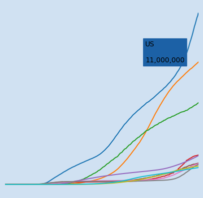
Get the ten country names for the countries with the highest confirmed cases on the latest date.
1top_countries = (country_df
2                 .sort_values(by = country_df.columns[-1], ascending = False)
3                 .head(10)
4                 .index)
5
6"""
7['US',   'India',          'Brazil', 'France',    'Russia',
8'Spain', 'United Kingdom', 'Italy',  'Argentina', 'Colombia']
9"""
Transpose the data so that the date is the index and each row represents all the data
for that date. Set the index to be datetime format.
 1wide_df = country_df.T
 2wide_df.index = pd.to_datetime(wide_df.index)
 3
 4wide_df.shape
 5"""
 6(311, 191)
 7"""
 8
 9wide_df.iloc[[0,1,2,-3,-2,-1], [0,1,2,-3,-2,-1]]
10"""
11Country/Region  Afghanistan  Albania  Algeria  Yemen  Zambia  Zimbabwe
122020-01-22                0        0        0      0       0         0
132020-01-23                0        0        0      0       0         0
142020-01-24                0        0        0      0       0         0
152020-11-25            45490    34944    78025   2124   17535      9508
162020-11-26            45716    35600    79110   2137   17553      9623
172020-11-27            45839    36245    80168   2148   17569      9714
18"""
The data is extracted for the top ten countries and displayed on a line chart.
 1def hov_text(ary_x, ary_y, country):
 2    '''Create the hover text for each data point
 3
 4    Keyword arguments:
 5    ary_x    -- list of all the x data points
 6    ary_y    -- list of all the y data points
 7    country  -- name of country
 8
 9    return: A list of hover texts for the selected country
10            with format to display
11    '''
12    txt = [f'''
13<b>{country}<b><br><br>
14Date: <b>{ary_x[i].strftime('%b %d %Y')}</b><br>
15Confirmed Cases: <b>{ary_y[i]:,.0F}</b><br>
16<extra></extra>
17''' for i in range(len(ary_x))]
18    return txt
19
20bg_color = 'rgba(208, 225, 242, 1.0)'
21line_color = 'rgba(75, 152, 201, 1.0)'
22grid_color = 'rgba(75, 152, 201, 0.3)'
23
24df = wide_df[top_countries]
25
26fig = go.Figure()
27for c in top_countries:
28    fig.add_trace(go.Scatter(x = df.index,
29                             y = df[c],
30                             name = c,
31                             hovertemplate = hov_text(df.index, df[c], c)))
32
33fig.update_traces(
34    hoverinfo = 'text+name',
35    mode = 'lines'
36)
37
38fig.update_layout(
39    # Set figure title
40    title = dict(
41        text = f'<b>Confirmed cases of COVID-19 in top ten countries</b>',
42        xref = 'container',
43        yref = 'container',
44        x = 0.5,
45        y = 0.9,
46        xanchor = 'center',
47        yanchor = 'middle',
48        font = dict(family = 'Droid Sans', size = 28)
49    ),
50    # set legend
51    legend = dict(
52        orientation = "h",
53        traceorder = 'normal',
54        font_size = 12,
55        x = 0.0,
56        y = -0.3,
57        xanchor = "left",
58        yanchor = "top"
59    ),
60    # set x-axis
61    xaxis = dict(
62        title = 'Date',
63        linecolor = line_color,
64        linewidth = 2,
65        gridcolor = grid_color,
66        showticklabels = True,
67        ticks = 'outside',
68    ),
69    # set y-axis
70    yaxis = dict(
71        title = 'Number of confirmed cases',
72        linecolor = line_color,
73        linewidth = 2,
74        gridcolor = grid_color,
75        showticklabels = True,
76        ticks = 'outside',
77    ),
78    showlegend = True,
79    # set the plot bacground color
80    plot_bgcolor = bg_color,
81    paper_bgcolor = bg_color,
82)
83
84fig.show()
Confirmed cases of COVID-19 for top ten countries
Conclusion
Pandas and Plotly are a powerful combination to load data, clean data and create interactive charts. Johns Hopkins University has done the hard work of collecting the COVID-19 data and making it available. The data can be loaded directly from the csv file in GitHub. Plotly is used to create bar charts and line charts to display information on countries with the highest confirmed cases of COVID-19.