How to create a Bar Chart in SwiftUI
Bar Chart present categories of data as rectangular bars with the heights or widths proportional to the values they represent. This article shows how to create a vertical bar chart in which the height of the rectangle represents the value for each category.
- How to create a Bar Chart in SwiftUI
- Add Axes to a Bar Chart in SwiftUI
- Hide Bar Chart Axes in SwiftUI
- Bar Chart with multiple data sets in SwiftUI
- Horizontal Bar Chart in SwiftUI
Starting Chart Layout
SwiftUI is great for exploring different layouts and seeing the results in the live preview. It is easy to extract sections into sub views so that each section is small and maintainable. Start with a view that will contain a BarChartView and possibly other text or data. This BarChartView contains a title and a chart area, these are represented by text and a rounded rectangle.
 1struct ChartView1: View {
 2    var body: some View {
 3        VStack {
 4            Text("Sample Bar Chart")
 5                .font(.title)
 6
 7            BarChartView(
 8                title: "the chart title")
 9                .frame(width: 300, height: 300, alignment: .center)
10
11            Spacer()
12        }
13    }
14}
 1struct BarChartView: View {
 2    var title: String
 3
 4    var body: some View {
 5        GeometryReader { gr in
 6            let headHeight = gr.size.height * 0.10
 7            VStack {
 8                ChartHeaderView(title: title, height: headHeight)
 9                ChartAreaView()
10            }
11        }
12    }
13}
1struct ChartHeaderView: View {
2    var title: String
3    var height: CGFloat
4
5    var body: some View {
6        Text(title)
7            .frame(height: height)
8    }
9}
1struct ChartAreaView: View {
2    var body: some View {
3        ZStack {
4            RoundedRectangle(cornerRadius: 5.0)
5                .fill(Color(#colorLiteral(red: 0.8906477705, green: 0.9005050659, blue: 0.8208766097, alpha: 1)))
6        }
7    }
8}

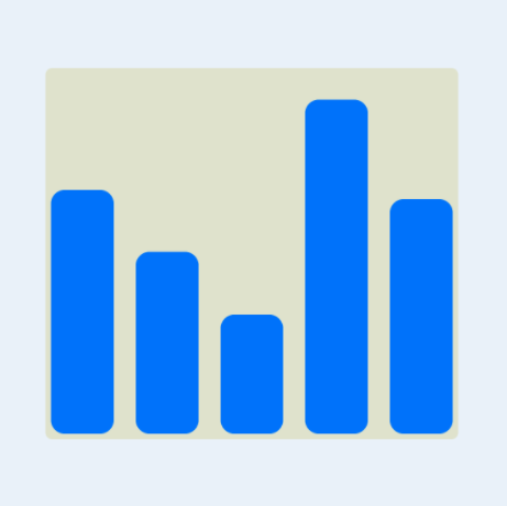
Add bars to ChartAreaView
Define sample data for categories such as days of the week with values for the number of steps taken each day. This is defined as a list of items in the main view with each item containing a (name, value) pair. In a real app, this would be data retrieved from a model via a ViewModel.
Sample data for daily Step Count
| Day | Steps |
|---|---|
| Mon | 898 |
| Tue | 670 |
| Wed | 725 |
| Thu | 439 |
| Fri | 1232 |
| Sat | 771 |
| Sun | 365 |
 1struct DataItem: Identifiable {
 2    let name: String
 3    let value: Double
 4    let id = UUID()
 5}
 6
 7struct ChartView2: View {
 8
 9    let chartData: [DataItem] = [
10        DataItem(name: "Mon", value: 898),
11        DataItem(name: "Tue", value: 670),
12        DataItem(name: "Wed", value: 725),
13        DataItem(name: "Thu", value: 439),
14        DataItem(name: "Fri", value: 1232),
15        DataItem(name: "Sat", value: 771),
16        DataItem(name: "Sun", value: 365)
17    ]
18
19    var body: some View {
20        VStack {
21            Text("Sample Bar Chart")
22                .font(.title)
23
24            BarChartView(
25                title: "Daily step count", data: chartData)
26                .frame(width: 350, height: 500, alignment: .center)
27
28            Spacer()
29        }
30    }
31}
The BarChartView is updated to require data as a parameter and this is passed on to
the ChartAreaView.
 1struct BarChartView: View {
 2    var title: String
 3    var data: [DataItem]
 4
 5    var body: some View {
 6        GeometryReader { gr in
 7            let headHeight = gr.size.height * 0.10
 8            VStack {
 9                ChartHeaderView(title: title, height: headHeight)
10                ChartAreaView(data: data)
11            }
12        }
13    }
14}
The ChartAreaView is updated to require a list of DataItem's. GeometryReader
is used to determine the available height for the bars. The maximum value in the data
is got and passed on to each BarView. The main chart area keeps the original
rounded rectangle and is overlaid with a series of bars in a horizontal stack, one
for each DataItem.
 1struct ChartAreaView: View {
 2    var data: [DataItem]
 3
 4    var body: some View {
 5        GeometryReader { gr in
 6            let fullBarHeight = gr.size.height * 0.90
 7            let maxValue = data.map { $0.value }.max()!
 8
 9            ZStack {
10                RoundedRectangle(cornerRadius: 5.0)
11                    .fill(Color(#colorLiteral(red: 0.8906477705, green: 0.9005050659, blue: 0.8208766097, alpha: 1)))
12
13                VStack {
14                    HStack(spacing:0) {
15                        ForEach(data) { item in
16                            BarView(
17                                name: item.name,
18                                value: item.value,
19                                maxValue: maxValue,
20                                fullBarHeight: Double(fullBarHeight))
21                        }
22                    }
23                    .padding(4)
24                }
25
26            }
27        }
28    }
29}
A new view is created for BarView that creates a bar for each piece of data. It
requires the name and value of the item as well as the maximum value and the
available bar height. Each bar is represented as a RoundedRectangle with the bar
height set relative to the maximum bar height. The color of the bars is set to a
solid blue color.
 1struct BarView: View {
 2    var name: String
 3    var value: Double
 4    var maxValue: Double
 5    var fullBarHeight: Double
 6
 7    var body: some View {
 8        let barHeight = (Double(fullBarHeight) / maxValue) * value
 9        VStack {
10            Spacer()
11            ZStack {
12                VStack {
13                    Spacer()
14                    RoundedRectangle(cornerRadius:5.0)
15                        .fill(Color.blue)
16                        .frame(height: CGFloat(barHeight), alignment: .trailing)
17                }
18
19                VStack {
20                    Spacer()
21                    Text("\(value, specifier: "%.0F")")
22                        .font(.footnote)
23                        .foregroundColor(.white)
24                        .fontWeight(.bold)
25                }
26            }
27            Text(name)
28        }
29        .padding(.horizontal, 4)
30    }
31}

Screen rotation
The Bar Chart looks good with the sample data used. The chart adjusts to fit in the container view into which it is placed. The same chart can be placed on new view without any other views and the bar chart will fill the space and resize when the device is rotated.
 1struct ChartView3: View {
 2    var body: some View {
 3        VStack() {
 4
 5            BarChartView(
 6                title: "Daily step count", data: chartData)
 7
 8            Spacer()
 9        }
10        .padding()
11    }
12}

Bar Chart of real data
Use the bar chart with real world data. The top ten countries with the highest Under Five Mortality Rates from Unicef Datasets.
Under-five mortality rate:
is the probability of dying between birth and exactly 5 years of age, expressed per 1,000 live births.
Country-Specific Under-five Mortality Estimates for 2019
| ISO Code | Country Name | 2019 |
|---|---|---|
| NGA | Nigeria | 117.2 |
| SOM | Somalia | 116.9 |
| TCD | Chad | 113.7 |
| CAF | Central African Republic | 110.0 |
| SLE | Sierra Leone | 109.2 |
| GIN | Guinea | 98.8 |
| SSD | South Sudan | 96.2 |
| MLI | Mali | 94.0 |
| BEN | Benin | 90.2 |
| BFA | Burkina Faso | 87.5 |
| LSO | Lesotho | 86.4 |
It can be seen that the country names are much longer than the data names used for days of the week in the sample data. The data is plotted in the Bar Chart using the country names for the countries.
 1struct ChartView4: View {
 2    let chartData: [DataItem] = [
 3        DataItem(name: "Nigeria", value: 117.2),
 4        DataItem(name: "Somalia", value: 116.9),
 5        DataItem(name: "Chad", value: 113.7),
 6        DataItem(name: "Central African Republic", value: 110.0),
 7        DataItem(name: "Sierra Leone", value: 109.2),
 8        DataItem(name: "Guinea", value:  98.8),
 9        DataItem(name: "South Sudan", value:  96.2),
10        DataItem(name: "Mali", value:  94.0),
11        DataItem(name: "Benin", value:  90.2),
12        DataItem(name: "Burkina Faso", value:  87.5)
13    ]
14
15    var body: some View {
16        VStack() {
17
18            BarChartView(
19                title: "Under Five Mortality Rates in 2019", data: chartData)
20                .frame(width: 350, height: 500, alignment: .center)
21
22            Text("Under-five mortality rate:")
23            Text("is the probability of dying between birth and exactly 5 years of age, expressed per 1,000 live births.")
24
25            Spacer()
26        }
27        .padding()
28    }
29}
There are a number of changes made to the BarView. The value on the bars is moved
to the top of the bar using an overlay view modifier. This value is offset so the
text is not too close to the top of the bars. The font size and weight of the data
names is also set. The use of longer text as in the country names showed that the
text below the bar pushed the bar up out of line. The width of the view for the text
is limited to less than the bar width and the text is truncated for the bar label
names. The text view for the bar values is also limited to less than the bar width
and the text is allowed to wrap.
 1struct BarView: View {
 2    var name: String
 3    var value: Double
 4    var maxValue: Double
 5    var fullBarHeight: Double
 6
 7    var body: some View {
 8        GeometryReader { gr in
 9            let barHeight = (Double(fullBarHeight) / maxValue) * value
10            let textWidth = gr.size.width * 0.80
11            VStack {
12                Spacer()
13                RoundedRectangle(cornerRadius:5.0)
14                    .fill(Color.blue)
15                    .frame(height: CGFloat(barHeight), alignment: .trailing)
16                    .overlay(
17                        Text("\(value, specifier: "%.0F")")
18                            .font(.footnote)
19                            .foregroundColor(.white)
20                            .fontWeight(.bold)
21                            .frame(width: textWidth)
22                            .offset(y:10)
23                        ,
24                        alignment: .top
25                    )
26
27                Text(name)
28                    .font(.system(size: 11))
29                    .fontWeight(.semibold)
30                    .lineLimit(1)
31                    .frame(width: textWidth)
32            }
33            .padding(.horizontal, 4)
34        }
35    }
36}

All of the country names are truncated, so the data is changed to use the country code rather than the country name. The Chart is set to a fixed size and the view is embedded in a ScrollView to allow scrolling when the device is rotated.
 1struct ChartView5: View {
 2    let chartData: [DataItem] = [
 3        DataItem(name: "NGA", value: 117.2),
 4        DataItem(name: "SOM", value: 116.9),
 5        DataItem(name: "TCD", value: 113.7),
 6        DataItem(name: "CAF", value: 110.0),
 7        DataItem(name: "SLE", value: 109.2),
 8        DataItem(name: "GIN", value:  98.8),
 9        DataItem(name: "SSD", value:  96.2),
10        DataItem(name: "MLI", value:  94.0),
11        DataItem(name: "BEN", value:  90.2),
12        DataItem(name: "BFA", value:  87.5)
13    ]
14
15    var body: some View {
16        ScrollView {
17            VStack() {
18
19                BarChartView(
20                    title: "Countries with the highest Under Five Mortality Rates in 2019", data: chartData)
21                    .frame(width: 350, height: 500, alignment: .center)
22
23                Spacer().frame(height:20)
24
25                VStack() {
26                    Text("Under-five mortality rate:")
27                        .font(.system(.title2, design:.rounded))
28                        .fontWeight(.bold)
29                    Text("is the probability of dying between birth and exactly 5 years of age, expressed per 1,000 live births.")
30                        .font(.body)
31                }
32                .frame(width: 300, height: 130)
33                .background(Color(#colorLiteral(red: 0.8906477705, green: 0.9005050659, blue: 0.8208766097, alpha: 1)))
34                .cornerRadius(10)
35
36                Spacer()
37            }
38            .padding()
39        }
40    }
41}

Conclusion
It is relatively easy to combine rectangles to create a bar chart in SwiftUI. SwiftUI is a great platform for creating views and quickly refactoring out separate sub views. There is some work in building up a bar chart in SwiftUI and more customisation can be identified as more data is used to try out the Bar Chart. The use of GeometryReader allows the creation of bar charts that fit in the available space. In this article, we created a simple bar chart with the values on the bars and labels underneath as well as a title fot the chart. The next step is to separate out the x and y axes.