Add Axes to a Bar Chart in SwiftUI
A vertical Bar Chart presents categories of data as bars with the heights proportional to the values they represent, the y-axis is used to show the height and the x-axis is used to show the category values. This article shows how to enhance the basic bar chart described in How to create a Bar Chart in SwiftUI by adding the x and y axes to the Chart using SwiftUI.
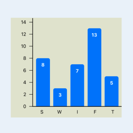
It can be debated whether showing the y-axis on a vertical bar chart is improving it. In general, I prefer to try and present the information in a bar chart without y-axis. However, it can be beneficial to see the axes when creating a chart or when there are many categories of data.
- How to create a Bar Chart in SwiftUI
- Add Axes to a Bar Chart in SwiftUI
- Hide Bar Chart Axes in SwiftUI
- Bar Chart with multiple data sets in SwiftUI
- Horizontal Bar Chart in SwiftUI
Add Axes Placeholder
The first change is to add placeholder rectangles for where the X and Y axis will go.
The Axes could be in the ChartAreaView or in the BarChartView. We are going to
try the BarChartView so that this will control the space allocated for the axes.
The following changes use stacks to layout the axes and the Chart. The
ChartAreaView adjusts automatically to fit within the available space.
 1struct BarChartView: View {
 2    var title: String
 3    var data: [DataItem]
 4
 5    var body: some View {
 6        GeometryReader { gr in
 7            let headHeight = gr.size.height * 0.10
 8            let axisWidth = gr.size.width * 0.25
 9            let axisHeight = gr.size.height * 0.1
10            VStack {
11                ChartHeaderView(title: title, height: headHeight)
12                VStack(spacing:0) {
13                    HStack(spacing:0) {
14                        YaxisView(width: axisWidth)
15                        ChartAreaView(data: data)
16                    }
17                    HStack(spacing:0) {
18                        Rectangle()
19                            .fill(Color.clear)
20                            .frame(width:axisWidth, height:axisHeight)
21                        XaxisView(height: axisHeight)
22                    }
23                }
24            }
25        }
26    }
27}
The BarView is updated to remove the labels below the bars as these will be moved
to the x-axis.
 1struct BarView: View {
 2    var name: String
 3    var value: Double
 4    var maxValue: Double
 5    var fullBarHeight: Double
 6
 7    var body: some View {
 8        GeometryReader { gr in
 9            let barHeight = (Double(fullBarHeight) / maxValue) * value
10            let textWidth = gr.size.width * 0.80
11            VStack {
12                Spacer()
13                RoundedRectangle(cornerRadius:5.0)
14                    .fill(Color.blue)
15                    .frame(height: CGFloat(barHeight), alignment: .trailing)
16                    .overlay(
17                        Text("\(value, specifier: "%.0F")")
18                            .font(.footnote)
19                            .foregroundColor(.white)
20                            .fontWeight(.bold)
21                            .frame(width: textWidth)
22                            .offset(y:10)
23                        ,
24                        alignment: .top
25                    )
26            }
27            .padding(.horizontal, 4)
28        }
29    }
30}
1struct YaxisView: View {
2    var width: CGFloat
3    var body: some View {
4        Rectangle()
5            .fill(Color.purple.opacity(0.5))
6            .frame(width:width)
7    }
8}
1struct XaxisView: View {
2    var height:  CGFloat
3    var body: some View {
4        Rectangle()
5            .fill(Color.purple.opacity(0.5))
6            .frame(height:height)
7    }
8}

Add labels to x-axis
The background color is set and a Rectangle is used for the axis line. Simply adding the label for each data item does not align the labels with the bars in the chart.
 1struct XaxisView: View {
 2    var data: [DataItem]
 3    var height:  CGFloat
 4
 5    var body: some View {
 6        ZStack {
 7            RoundedRectangle(cornerRadius: 0.0)
 8                .fill(Color(#colorLiteral(red: 0.8906477705, green: 0.9005050659, blue: 0.8208766097, alpha: 1)))
 9
10            Rectangle()
11                .fill(Color.black)
12                .frame(height:1.5)
13                .offset(x: 0, y: -(height/2.0))
14
15            VStack {
16                HStack(spacing:0) {
17                    ForEach(data) { item in
18                        Text(item.name)
19                            .font(.footnote)
20                    }
21                    .padding(4)
22                }
23            }
24        }
25    }
26}

Use GeometryReader in XaxisView to set the width of the labels as well as
calculating the padding size between labels. Similar changes are made to BarView so
the bars in the chart and the labels on the x-axis line up.
 1struct XaxisView: View {
 2    var data: [DataItem]
 3
 4    var body: some View {
 5        GeometryReader { gr in
 6            let labelWidth = (gr.size.width * 0.9) / CGFloat(data.count)
 7            let padWidth = (gr.size.width * 0.05) / CGFloat(data.count)
 8            ZStack {
 9                RoundedRectangle(cornerRadius: 0.0)
10                    .fill(Color(#colorLiteral(red: 0.8906477705, green: 0.9005050659, blue: 0.8208766097, alpha: 1)))
11
12                Rectangle()
13                    .fill(Color.black)
14                    .frame(height:1.5)
15                    .offset(x: 0, y: -(gr.size.height/2.0))
16
17                HStack(spacing:0) {
18                    ForEach(data) { item in
19                        Text(item.name)
20                            .font(.footnote)
21                            .frame(width:labelWidth)
22                    }
23                    .padding(.horizontal, padWidth)
24                }
25            }
26        }
27    }
28}
 1struct BarView: View {
 2    var name: String
 3    var value: Double
 4    var maxValue: Double
 5    var fullBarHeight: Double
 6
 7    var body: some View {
 8        GeometryReader { gr in
 9            let barHeight = (Double(fullBarHeight) / maxValue) * value
10            let textWidth = gr.size.width * 0.80
11            let padWidth = gr.size.width * 0.10
12            ZStack {
13                VStack(spacing:0) {
14                    Spacer()
15                    Rectangle()
16                        .fill(Color.blue)
17                        .frame(height: 5.0, alignment: .trailing)
18                }
19                .padding(.horizontal, padWidth)
20
21                VStack(spacing:0) {
22                    Spacer()
23                    RoundedRectangle(cornerRadius:5.0)
24                        .fill(Color.blue)
25                        .frame(height: CGFloat(barHeight), alignment: .trailing)
26                        .overlay(
27                            Text("\(value, specifier: "%.0F")")
28                                .font(.footnote)
29                                .foregroundColor(.white)
30                                .fontWeight(.bold)
31                                .frame(width: textWidth)
32                                .offset(y:10)
33                            ,
34                            alignment: .top
35                        )
36
37                }
38                .padding(.horizontal, padWidth)
39            }
40        }
41    }
42}
The main view is modified to contain a number of charts set in different sizes to see how the bar chart with the x-axis displays. The preview is changed to iPad Pro to contain all the bar charts. This allows changes to be made and previewed rapidly in SwiftUI.

Calculate tick marks for axis
The numbers on the y-axis are dependent on the values in the data set. A helper function is created to calculate the tick marks, spacing them evenly between zero and just above the maximum value. This is currently limitied to only positive numbers from 0 to 1,000,000.
 1struct AxisParameters {
 2    static func getTicks(top:Int) -> [Int] {
 3        var step = 0
 4        var high = top
 5        switch(top) {
 6        case 0...8:
 7            step = 1
 8        case 9...17:
 9            step = 2
10        case 18...50:
11            step = 5
12        case 51...170:
13            step = 10
14        case 171...500:
15            step = 50
16        case 501...1700:
17            step = 200
18        case 1701...5000:
19            step = 500
20        case 5001...17000:
21            step = 1000
22        case 17001...50000:
23            step = 5000
24        case 50001...170000:
25            step = 10000
26        case 170001...1000000:
27            step = 50000
28        default:
29            step = 10000
30        }
31        high = ((top/step) * step) + step + step
32        var ticks:[Int] = []
33        for i in stride(from: 0, to: high, by: step) {
34            ticks.append(i)
35        }
36        return ticks
37    }
38}
Add Numbers to y-axis
The numbers on the y-axis need to be aligned with the bars in the chart, so a scale
factor is calculated in BarChartView. This scaleFactor is passed to the
ChartAreaView and the yAxisView. The tick marks are calculated using the helper
function and passed on the the YaxisView.
 1struct BarChartView: View {
 2    var title: String
 3    var data: [DataItem]
 4
 5    var body: some View {
 6        GeometryReader { gr in
 7            // Get height for chart and axis
 8            let fullChartHeight = gr.size.height * 0.8
 9            let headHeight = gr.size.height * 0.1
10            let axisWidth = gr.size.width * 0.2
11            let axisHeight = gr.size.height * 0.1
12
13            let maxValue = data.map { $0.value }.max()!
14            let tickMarks = AxisParameters.getTicks(top: Int(maxValue))
15            let maxTickHeight = fullChartHeight * 0.95
16            let scaleFactor = maxTickHeight / CGFloat(tickMarks[tickMarks.count-1])
17
18            VStack {
19                ChartHeaderView(title: title, height: headHeight)
20                ZStack {
21                    Rectangle()
22                        .fill(Color(#colorLiteral(red: 0.8906477705, green: 0.9005050659, blue: 0.8208766097, alpha: 1)))
23
24                    VStack(spacing:0) {
25                        HStack(spacing:0) {
26                            YaxisView(ticks: tickMarks, scaleFactor: Double(scaleFactor))
27                                .frame(width:axisWidth, height: fullChartHeight)
28                            ChartAreaView(data: data, scaleFactor: Double(scaleFactor))
29                                .frame(height: fullChartHeight)
30                        }
31                        HStack(spacing:0) {
32                            Rectangle()
33                                .fill(Color.clear)
34                                .frame(width:axisWidth, height:axisHeight)
35                            XaxisView(data: data)
36                                .frame(height:axisHeight)
37                        }
38                    }
39                }
40            }
41        }
42    }
43}
The ChartAreaView is simplified to fit into the available space and to pass on the
scaleFactor to each BarView.
 1struct ChartAreaView: View {
 2    var data: [DataItem]
 3    var scaleFactor: Double
 4
 5    var body: some View {
 6        ZStack {
 7            RoundedRectangle(cornerRadius: 5.0)
 8                .fill(Color(#colorLiteral(red: 0.8906477705, green: 0.9005050659, blue: 0.8208766097, alpha: 1)))
 9
10            VStack {
11                HStack(spacing:0) {
12                    ForEach(data) { item in
13                        BarView(
14                            name: item.name,
15                            value: item.value,
16                            scaleFactor: scaleFactor)
17                    }
18                }
19                .padding(.horizontal, 4)
20            }
21        }
22    }
23}
The BarView is updated to use the scaleFactor when determining the heights of the
bars.
 1struct BarView: View {
 2    var name: String
 3    var value: Double
 4    var scaleFactor: Double
 5
 6    var body: some View {
 7        GeometryReader { gr in
 8            let barHeight = value * scaleFactor
 9            let textWidth = gr.size.width * 0.80
10            let padWidth = gr.size.width * 0.10
11            ZStack {
12                VStack(spacing:0) {
13                    Spacer()
14                    Rectangle()
15                        .fill(Color.blue)
16                        .frame(height: 5.0, alignment: .trailing)
17                }
18                .padding(.horizontal, padWidth)
19
20                VStack(spacing:0) {
21                    Spacer()
22                    RoundedRectangle(cornerRadius:5.0)
23                        .fill(Color.blue)
24                        .frame(height: CGFloat(barHeight), alignment: .trailing)
25                        .overlay(
26                            Text("\(value, specifier: "%.0F")")
27                                .font(.footnote)
28                                .foregroundColor(.white)
29                                .fontWeight(.bold)
30                                .frame(width: textWidth)
31                                .offset(y:10)
32                            ,
33                            alignment: .top
34                        )
35                }
36                .padding(.horizontal, padWidth)
37            }
38        }
39    }
40}
The YaxisView is updated to the tick marks list and the scaleFactor to place a
small rectangle for the tick marks and a Text view for the tick mark value.
 1struct YaxisView: View {
 2    var ticks: [Int]
 3    var scaleFactor: Double
 4
 5    var body: some View {
 6        GeometryReader { gr in
 7            let fullChartHeight = gr.size.height
 8            ZStack {
 9                // y-axis line
10                Rectangle()
11                    .fill(Color.black)
12                    .frame(width:1.5)
13                    .offset(x: (gr.size.width/2.0)-1, y: 1)
14
15                // Tick marks
16                ForEach(ticks, id:\.self) { t in
17                    HStack {
18                        Spacer()
19                        Text("\(t)")
20                            .font(.footnote)
21                        Rectangle()
22                            .frame(width: 10, height: 1)
23                    }
24                    .offset(y: (fullChartHeight/2.0) - (CGFloat(t) * CGFloat(scaleFactor)))
25                }
26            }
27        }
28    }
29}

Real data shown with x and y axes
Here is the updated bar chart showing the top ten countries with the highest Under Five Mortality Rates from Unicef Datasets. In this example, the horizontal space for the y-axis may be a bit too wide, as it is set to 20% of the overall width.
 1struct U5mrView: View {
 2    let chartData: [DataItem] = [
 3        DataItem(name: "NGA", value: 117.2),
 4        DataItem(name: "SOM", value: 116.9),
 5        DataItem(name: "TCD", value: 113.7),
 6        DataItem(name: "CAF", value: 110.0),
 7        DataItem(name: "SLE", value: 109.2),
 8        DataItem(name: "GIN", value:  98.8),
 9        DataItem(name: "SSD", value:  96.2),
10        DataItem(name: "MLI", value:  94.0),
11        DataItem(name: "BEN", value:  90.2),
12        DataItem(name: "BFA", value:  87.5)
13    ]
14
15    var body: some View {
16        ScrollView {
17            VStack(spacing:40) {
18                Spacer().frame(height:30)
19
20                HStack(spacing:40) {
21                    BarChartView(
22                        title: "Countries with the highest Under Five Mortality Rates in 2019", data: chartData)
23                        .frame(width: 700, height: 600, alignment: .center)
24                }
25
26                Spacer()
27            }
28        }
29    }
30}

Conclusion
It is relatively easy to get started with a basic Bar Chart in SwiftUI. It does get more complicated to add more features such as x and y axes to the chart. There is room from improvement in the area of determining the tick marks for the axis and whether or not the space for the axes should be a proportion of the overall chart or a fixed size. The key to adding axes is to ensure the axes scale with the chart area content and that the tick marks line up with the content in the chart.