Horizontal Bar Chart in SwiftUI
Horizontal Bar Charts present categories of data as rectangular bars with the widths proportional to the values they represent. This article shows how to build on the vertical bar chart to create a horizontal bar chart.
The horizontal bar chart is not simply a rotation of the vertical bar chart. In applications like Numbers, the Horizontal bar chart is selected as a separate chart type than a vertical bar chart. Aside from the bar differences, the x and y axes also need to be formatted differently.
Related Articles:
- How to create a Bar Chart in SwiftUI
- Add Axes to a Bar Chart in SwiftUI
- Hide Bar Chart Axes in SwiftUI
- Bar Chart with multiple data sets in SwiftUI
- Horizontal Bar Chart in SwiftUI
Convert the bars to Horizontal
The Horizontal Bar Chart is not just a configuration on the vertical bar chart, there
are some elements that can be reused. It is not straight-forward to reuse some of the
Structs and SwiftUI Views for both vertical bar chart components and horizontal bar
chart components. The title and Key areas can be reused as is. A copy of
BarChartView is created and the name changed to BarChartHView. This controls the
layout of the chart and three of the views in it are changed to YaxisHView,
ChartAreaHView and XaxisHView, which are initially just copies of the views used
in the vertical bar chart. The maxTickHeight is changed to maxTickWidth as it is
now dependent on the available horizontal space.
 1struct BarChartHView: View {
 2    var title: String
 3    var chartData: BarChartData
 4    var isShowingYAxis = true
 5    var isShowingXAxis = true
 6    var isShowingHeading = true
 7    var isShowingKey = true
 8
 9    var body: some View {
10        let data = chartData.data
11        GeometryReader { gr in
12            let axisWidth = gr.size.width * (isShowingYAxis ? 0.15 : 0.0)
13            let axisHeight = gr.size.height * (isShowingXAxis ? 0.1 : 0.0)
14            let keyHeight = gr.size.height * (isShowingKey ? 0.1 : 0.0)
15            let headHeight = gr.size.height * (isShowingHeading ? 0.14 : 0.0)
16            let fullChartHeight = gr.size.height - axisHeight - headHeight - keyHeight
17            let fullChartWidth = gr.size.width - axisWidth
18
19            let maxValue = data.flatMap { $0.values }.max()!
20            let tickMarks = AxisParameters.getTicks(top: Int(maxValue))
21            let maxTickWidth = fullChartWidth * 0.95
22            let scaleFactor = maxTickWidth / CGFloat(tickMarks[tickMarks.count-1])
23
24            VStack(spacing:0) {
25                if isShowingHeading {
26                    ChartHeaderView(title: title)
27                        .frame(height: headHeight)
28                }
29                ZStack {
30                    Rectangle()
31                        .fill(Color(#colorLiteral(red: 0.8906477705, green: 0.9005050659, blue: 0.8208766097, alpha: 1)))
32
33                    VStack(spacing:0) {
34                        if isShowingKey {
35                            KeyView(keys: chartData.keys)
36                                .frame(height: keyHeight)
37                        }
38
39                        HStack(spacing:0) {
40                            if isShowingYAxis {
41                                YaxisHView(ticks: tickMarks, scaleFactor: Double(scaleFactor))
42                                    .frame(width:axisWidth, height: fullChartHeight)
43                            }
44                            ChartAreaHView(data: data, scaleFactor: Double(scaleFactor))
45                                .frame(height: fullChartHeight)
46                        }
47                        HStack(spacing:0) {
48                            Rectangle()
49                                .fill(Color.clear)
50                                .frame(width:axisWidth, height:axisHeight)
51                            if isShowingXAxis {
52                                XaxisHView(data: data)
53                                    .frame(height:axisHeight)
54                            }
55                        }
56                    }
57                }
58            }
59        }
60    }
61}
The ChartAreaHView is almost identical to ChartAreaView except the Bars are
placed in a vertical stack rather than a horizontal stack.
 1struct ChartAreaHView: View {
 2    var data: [DataItem]
 3    var scaleFactor: Double
 4
 5    var body: some View {
 6        ZStack {
 7            RoundedRectangle(cornerRadius: 5.0)
 8                .fill(Color(#colorLiteral(red: 0.8906477705, green: 0.9005050659, blue: 0.8208766097, alpha: 1)))
 9
10            VStack {
11                VStack(spacing:0) {
12                    ForEach(data) { item in
13                        BarHView(
14                            name: item.name,
15                            values: item.values,
16                            scaleFactor: scaleFactor)
17                    }
18                }
19            }
20        }
21    }
22}
The BarHView is changed from the original BarView to layout the bars
horizontally. The width of the rectangular bars is proportional to the value of the
data.
 1struct BarHView: View {
 2    var name: String
 3    var values: [Double]
 4    var scaleFactor: Double
 5
 6    var body: some View {
 7        GeometryReader { gr in
 8            let padHeight = gr.size.height * 0.07
 9            VStack(spacing:0) {
10                Spacer()
11                    .frame(height:padHeight)
12
13                ForEach(values.indices) { i in
14                    let barSize = values[i] * scaleFactor
15
16                    ZStack {
17                        HStack(spacing:0) {
18                            Rectangle()
19                                .fill(ChartColors.BarColor(i))
20                                .frame(width: min(5.0, CGFloat(barSize)), alignment: .trailing)
21                            Spacer()
22                        }
23
24                        HStack(spacing:0) {
25                            RoundedRectangle(cornerRadius:5.0)
26                                .fill(ChartColors.BarColor(i))
27                                .frame(width: CGFloat(barSize), alignment: .trailing)
28                                .overlay(
29                                    Text("\(values[i], specifier: "%.0F")")
30                                        .font(.footnote)
31                                        .foregroundColor(.white)
32                                        .fontWeight(.bold)
33                                        .offset(x:-10, y:0)
34                                    ,
35                                    alignment: .trailing
36                                )
37                            Spacer()
38                        }
39                    }
40                }
41
42                Spacer()
43                    .frame(height:padHeight)
44            }
45        }
46    }
47}

Update the y-axis
A YaxisHView view is created to display y-axis on the horizontal bar chart with
the categories for the data in the bars. The swift code for the y-axis labels is
similar to the x-axis code for the vertical bar chart with width settings swapped for
height settings. The code for the y-axis line is the same for both chart types.
 1struct YaxisHView: View {
 2    var data: [DataItem]
 3
 4    var body: some View {
 5        GeometryReader { gr in
 6            let labelHeight = (gr.size.height * 0.9) / CGFloat(data.count)
 7            let padHeight = gr.size.height * 0.05 / CGFloat(data.count)
 8
 9            ZStack {
10                Rectangle()
11                    .fill(Color(#colorLiteral(red: 0.8906477705, green: 0.9005050659, blue: 0.8208766097, alpha: 1)))
12
13                // y-axis line
14                Rectangle()
15                    .fill(Color.black)
16                    .frame(width:1.5)
17                    .offset(x: (gr.size.width/2.0)-1, y: 1)
18
19                VStack(spacing:0) {
20                    ForEach(data) { item in
21                        Text(item.name)
22                            .font(.footnote)
23                            .frame(height: labelHeight)
24                    }
25                    .padding(.vertical, padHeight)
26                }
27            }
28        }
29    }
30}

Update the x-axis
Similarly a XaxisHView view is created to display the x-axis on the horizontal bar
chart and is uses code similar to that in the y-axis on the vertical bar chart for
laying out the tick marks and the scale values.
 1struct XaxisHView: View {
 2    var ticks: [Int]
 3    var scaleFactor: Double
 4
 5    var body: some View {
 6        GeometryReader { gr in
 7            let fullChartWidth = gr.size.width
 8            ZStack {
 9                // x-axis line
10                Rectangle()
11                    .fill(Color.black)
12                    .frame(height: 1.5)
13                    .offset(x: 0, y: -(gr.size.height/2.0))
14
15                // Tick marks
16                ForEach(ticks, id:\.self) { t in
17                    VStack {
18                        Rectangle()
19                            .frame(width: 1, height: 10)
20                        Text("\(t)")
21                            .font(.footnote)
22                            .rotationEffect(Angle(degrees: -45))
23                        Spacer()
24                    }
25                    .offset(x:  (CGFloat(t) * CGFloat(scaleFactor)) - (fullChartWidth/2.0) - 1)
26                }
27            }
28        }
29    }
30}

Horizontal and Vertical bar charts
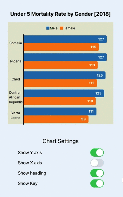
An iPad simulator is used to compare the use of Vertical and Horizontal Bar Charts to show the countries with the highest Under Five Mortality Rates in 2018. The multiple data feature of the Bar charts is used to compare mortality rates for boys and girls.

The Horizontal Bar Chart reuses a lot of the code from the Vertical Bar Chart so the effect of showing or hiding the title, key and axes works. In the horizontal bar chart, displaying the values on the bars and hiding the x-axis can result in a cleaner chart.
Show and hide the elements on a Horizontal Bar Chart
Conclusion
The SwiftUI code to create the horizontal bar chart is different to that used to create the vertical bar chart. The techniques learned in creating the vertical bar chart can be reused, but it is best to think of the horizontal bar chart as a different chart to the vertical bar chart. When we drill down into the components such as the axes, it can be seen that the axis lines are the same in both charts, but the labels and positioning of them are transposed between x and y. This might be a reason to break these components into smaller SwiftUI views and reuse with composition.
gist file for Horizontal bar chart SwiftUI code