Create a bar chart with SwiftUI Charts in iOS 16
At WWWDC 2022, Apple introduced SwiftUI Charts, which makes it easy to create various charts within SwiftUI views. This article demonstrates how to quickly create a bar chart and customise the chart containing multiple sets of data.
Previous articles on Swift Charts:
Default bar chart
Start with the default bar chart created with SwiftUI Charts similar to the line chart created in a Simple line chart. The bar chart shows Step count data for each day of the week for a week in July with the height of the each bar proportional to the number of steps taken.
 1struct TestView1: View {
 2    let currentWeek: [StepCount] = [
 3        StepCount(day: "20220717", steps: 4200),
 4        StepCount(day: "20220718", steps: 15000),
 5        StepCount(day: "20220719", steps: 2800),
 6        StepCount(day: "20220720", steps: 10800),
 7        StepCount(day: "20220721", steps: 5300),
 8        StepCount(day: "20220722", steps: 10400),
 9        StepCount(day: "20220723", steps: 4000)
10    ]
11
12    var body: some View {
13        VStack {
14            GroupBox ( "Bar Chart - Step Count") {
15                Chart(currentWeek) {
16                    BarMark(
17                        x: .value("Week Day", $0.weekday, unit: .day),
18                        y: .value("Step Count", $0.steps)
19                    )
20                }
21            }
22            .frame(height: 500)
23
24            Spacer()
25        }
26        .padding()
27    }
28}
A StepCount structure is defined that conforms to Identifiable and holds the date
and the number of steps.
 1struct StepCount: Identifiable {
 2    let id = UUID()
 3    let weekday: Date
 4    let steps: Int
 5
 6    init(day: String, steps: Int) {
 7        let formatter = DateFormatter()
 8        formatter.dateFormat = "yyyyMMdd"
 9
10        self.weekday = formatter.date(from: day) ?? Date.distantPast
11        self.steps = steps
12    }
13
14    var weekdayString: String {
15        let dateFormatter = DateFormatter()
16        dateFormatter.dateFormat = "yyyyMMdd"
17        dateFormatter.dateStyle = .long
18        dateFormatter.timeStyle = .none
19        dateFormatter.locale = Locale(identifier: "en_US")
20        return  dateFormatter.string(from: weekday)
21    }
22}

Customise bars and axes
The default chart can be customised in similar ways to Customise a line chart. Here the y-axis is moved to the leading position and the labels on the x-axis are centered and configured to just display the weekday.
 1struct TestView3: View {
 2    let currentWeek: [StepCount] = [
 3        StepCount(day: "20220717", steps: 4200),
 4        StepCount(day: "20220718", steps: 15000),
 5        StepCount(day: "20220719", steps: 2800),
 6        StepCount(day: "20220720", steps: 10800),
 7        StepCount(day: "20220721", steps: 5300),
 8        StepCount(day: "20220722", steps: 10400),
 9        StepCount(day: "20220723", steps: 4000)
10    ]
11
12    var body: some View {
13        VStack {
14            GroupBox ( "Bar Chart - Step Count") {
15                Chart(currentWeek) {
16                    BarMark(
17                        x: .value("Week Day", $0.weekday, unit: .day),
18                        y: .value("Step Count", $0.steps)
19                    )
20                    .foregroundStyle(Color.orange)
21                }
22                .chartYAxis {
23                    AxisMarks(position: .leading)
24                }
25                .chartXAxis {
26                    AxisMarks (values: .stride (by: .day)) { value in
27                        AxisGridLine().foregroundStyle(.orange)
28                        AxisValueLabel(format: .dateTime.weekday(),
29                                       centered: true)
30                    }
31                }
32            }
33            .frame(height: 500)
34
35            Spacer()
36        }
37        .padding()
38    }
39}

Label the bars
Another way to simplify a bar chart like this is to remove the y-axis and x-axis gridlines and place the value for each bar on the bars themselves. The bars are too narrow to contain the full values of the step count, so the number of steps are displayed in thousands.
 1struct TestView4: View {
 2    let currentWeek: [StepCount] = [
 3        StepCount(day: "20220717", steps: 4200),
 4        StepCount(day: "20220718", steps: 15000),
 5        StepCount(day: "20220719", steps: 2800),
 6        StepCount(day: "20220720", steps: 10800),
 7        StepCount(day: "20220721", steps: 5300),
 8        StepCount(day: "20220722", steps: 10400),
 9        StepCount(day: "20220723", steps: 4000)
10    ]
11
12    var body: some View {
13        VStack {
14            GroupBox ( "Bar Chart - Step Count (x 1,000)") {
15                Chart(currentWeek) {
16                    let stepThousands = Double($0.steps) / 1000.00
17                    BarMark(
18                        x: .value("Week Day", $0.weekday, unit: .day),
19                        y: .value("Step Count", $0.steps)
20                    )
21                    .foregroundStyle(Color.orange)
22                    .annotation(position: .overlay, alignment: .topLeading, spacing: 3) {
23                        Text("\(stepThousands, specifier: "%.1F")")
24                            .font(.footnote)
25                            .foregroundColor(.white)
26                    }
27                }
28                .chartYAxis(.hidden)
29                .chartXAxis {
30                    AxisMarks (values: .stride (by: .day)) { value in
31                        AxisValueLabel(format: .dateTime.weekday(),
32                                       centered: true)
33                    }
34                }
35            }
36            .frame(height: 500)
37
38            Spacer()
39        }
40        .padding()
41    }
42}

Make horizontal Bar Chart
The labels on the bars are a little tight. There is more room for the labels if we
switch the Bar Chart to display the bars horizontally. This is easily done switching
the x and y values for each BarMark.
 1struct TestView5: View {
 2    let currentWeek: [StepCount] = [
 3        StepCount(day: "20220717", steps: 4200),
 4        StepCount(day: "20220718", steps: 15000),
 5        StepCount(day: "20220719", steps: 2800),
 6        StepCount(day: "20220720", steps: 10800),
 7        StepCount(day: "20220721", steps: 5300),
 8        StepCount(day: "20220722", steps: 10400),
 9        StepCount(day: "20220723", steps: 4000)
10    ]
11
12    var body: some View {
13        VStack {
14            GroupBox ( "Bar Chart - Step Count") {
15                Chart(currentWeek) {
16                    let steps = $0.steps
17                    BarMark(
18                        x: .value("Step Count", $0.steps),
19                        y: .value("Week Day", $0.weekday, unit: .day)
20                    )
21                    .foregroundStyle(Color.orange)
22                    .annotation(position: .overlay, alignment: .trailing, spacing: 5) {
23                        Text("\(steps)")
24                            .font(.footnote)
25                            .foregroundColor(.white)
26                            .fontWeight(.bold)
27                    }
28                }
29                .chartXAxis(.hidden)
30                .chartYAxis {
31                    AxisMarks (position: .leading, values: .stride (by: .day)) { value in
32                        AxisValueLabel(format: .dateTime.weekday(),
33                                       centered: true)
34                    }
35                }
36            }
37            .frame(height: 500)
38
39            Spacer()
40        }
41        .padding()
42    }
43}

Add second set of data to Bar Chart
A second set of data is added to the bar chart. Unfortunately, by default, the two sets of data values are displayed on top of each other as a stacked bar chart.
 1struct TestView6: View {
 2    var body: some View {
 3        let currentWeek: [StepCount] = [
 4            StepCount(day: "20220717", steps: 4200),
 5            StepCount(day: "20220718", steps: 15000),
 6            StepCount(day: "20220719", steps: 2800),
 7            StepCount(day: "20220720", steps: 10800),
 8            StepCount(day: "20220721", steps: 5300),
 9            StepCount(day: "20220722", steps: 10400),
10            StepCount(day: "20220723", steps: 4000)
11        ]
12
13        let previousWeek: [StepCount] = [
14            StepCount(day: "20220710", steps: 15800),
15            StepCount(day: "20220711", steps: 7300),
16            StepCount(day: "20220712", steps: 8200),
17            StepCount(day: "20220713", steps: 25600),
18            StepCount(day: "20220714", steps: 16100),
19            StepCount(day: "20220715", steps: 16500),
20            StepCount(day: "20220716", steps: 3200)
21        ]
22
23        let stepData = [
24            (period: "Previous Week", data: previousWeek),
25            (period: "Current Week", data: currentWeek)
26        ]
27
28        VStack {
29            GroupBox ( "Bar Chart - Step Count") {
30                Chart(stepData, id: \.period) { steps in
31                    ForEach(steps.data) {
32                        BarMark(
33                            x: .value("Week Day", $0.shortDay),
34                            y: .value("Step Count", $0.steps)
35                        )
36                        .foregroundStyle(by: .value("Week", steps.period))
37                    }
38                }
39                .chartYAxis {
40                    AxisMarks(position: .leading)
41                }
42            }
43            .frame(height: 500)
44
45            Spacer()
46        }
47        .padding()
48    }
49}

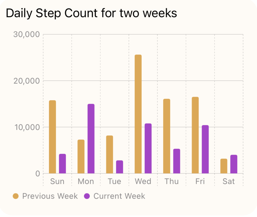
Side-by-side Bars
The position function is used to position the bars along the x-axis according to their time period. Now the bars for the current week and the previous week are displayed side-by-side, making it easy to compare the two sets of results.
 1struct TestView7: View {
 2    var body: some View {
 3        let previousWeek: [StepCount] = [
 4            StepCount(day: "20220710", steps: 15800),
 5            StepCount(day: "20220711", steps: 7300),
 6            StepCount(day: "20220712", steps: 8200),
 7            StepCount(day: "20220713", steps: 25600),
 8            StepCount(day: "20220714", steps: 16100),
 9            StepCount(day: "20220715", steps: 16500),
10            StepCount(day: "20220716", steps: 3200)
11        ]
12
13        let currentWeek: [StepCount] = [
14            StepCount(day: "20220717", steps: 4200),
15            StepCount(day: "20220718", steps: 15000),
16            StepCount(day: "20220719", steps: 2800),
17            StepCount(day: "20220720", steps: 10800),
18            StepCount(day: "20220721", steps: 5300),
19            StepCount(day: "20220722", steps: 10400),
20            StepCount(day: "20220723", steps: 4000)
21        ]
22
23        let stepData = [
24            (period: "Previous Week", data: previousWeek),
25            (period: "Current Week", data: currentWeek)
26        ]
27
28        VStack {
29            GroupBox ( "Daily Step Count for two weeks") {
30                Chart(stepData, id: \.period) { steps in
31                    ForEach(steps.data) {
32                        BarMark(
33                            x: .value("Week Day", $0.shortDay),
34                            y: .value("Step Count", $0.steps)
35                        )
36                        .foregroundStyle(by: .value("Week", steps.period))
37                        .position(by: .value("week", steps.period))
38                    }
39                }
40                .chartYAxis {
41                    AxisMarks(position: .leading)
42                }
43                .chartForegroundStyleScale([
44                    "Previous Week" : Color(hue: 0.10, saturation: 0.70, brightness: 0.90),
45                    "Current Week": Color(hue: 0.80, saturation: 0.70, brightness: 0.80)
46                ])
47            }
48            .frame(height: 500)
49            .groupBoxStyle(YellowGroupBoxStyle())
50
51            Spacer()
52        }
53        .padding()
54    }
55}

Conclusion
SwiftUI Charts is a quick and easy way to add charts to a SwiftUI view. This article showed how to display a bar chart from the default chart to a more customised bar chart with multiple sets of data. The code for Bar Chart is available on GitHub.