Display top section of Bar Charts with Swift Charts
There are times when data in a bar chart has similar values for a number of the bars and it can be difficult to see the differences. One option is to zoom in on the top section of the bar chart. This article investigates a number of options and identifies the best approach for this in Swift Charts.
Related articles on Swift Charts:
Display a bar chart
SwiftUI Charts, introduced in iOS 16, makes it easy to create charts such as the following bar chart. Define an array of data and pass it to a Chart, creating a BarMark for each element in the array.
1struct Data: Identifiable {
2 var name: String
3 var value: Int
4 var id = UUID()
5}
6
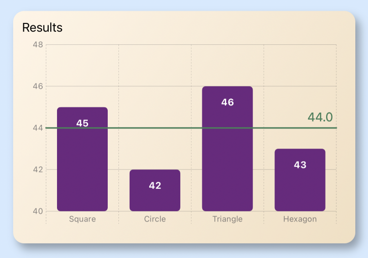
7let chartData: [Data] = [.init(name: "Square", value: 45),
8 .init(name: "Circle", value: 42),
9 .init(name: "Triangle", value: 46),
10 .init(name: "Hexagon", value: 43)]
 1struct BarView1: View {
 2    var mean: Double {
 3        return Double(chartData.reduce(0) { $0 + $1.value }) / Double(chartData.count)
 4    }
 5
 6    var body: some View {
 7        ZStack {
 8            Color(hue: 0.58, saturation: 0.17, brightness: 1.0)
 9                    .edgesIgnoringSafeArea(.all)
10
11            VStack {
12                GroupBox("Results - full bars displayed") {
13                    Chart(chartData) { values in
14                        BarMark(
15                            x: .value("name", values.name),
16                            y: .value("value", values.value)
17                        )
18                        .foregroundStyle(Colors.barColor)
19                        .cornerRadius(10.0)
20                        .annotation(position: .overlay, alignment: .top, spacing: 15.0) {
21                            Text("\(values.value)")
22                                .font(.caption2)
23                                .foregroundColor(.white)
24                                .fontWeight(.bold)
25                                .padding(2)
26                        }
27
28                        RuleMark(y: .value("mean", mean))
29                            .foregroundStyle(Colors.lineColor)
30                            .annotation(position: .overlay,
31                                        alignment: .bottomTrailing,
32                                        spacing: 20) {
33                                Text("mean = \(String(format: "%.1f", mean))")
34                                    .foregroundColor(Colors.lineColor)
35                            }
36                    }
37                    .chartYAxis {
38                        AxisMarks(position: .leading) { _ in
39                           AxisValueLabel()
40                        }
41                    }
42                    .chartXAxis {
43                        AxisMarks(position: .bottom) { _ in
44                            AxisGridLine()
45                            AxisValueLabel()
46                        }
47                    }
48                    .padding()
49                }
50                .frame(height: 400)
51                Spacer()
52            }
53        }
54    }
55}
 1struct Colors {
 2    static let barColor = Color(hue: 0.8, saturation: 0.7, brightness: 0.5)
 3    static let lineColor = Color(hue: 0.4, saturation: 0.5, brightness: 0.5)
 4    static let bgPlotColor = Color(hue: 0.12, saturation: 0.10, brightness: 0.92)
 5
 6    static let bgGradient = LinearGradient(
 7        gradient: Gradient(colors: [
 8            Color(hue: 0.10, saturation: 0.10, brightness: 1.0),
 9            Color(hue: 0.10, saturation: 0.20, brightness: 0.95)
10        ]),
11        startPoint: .topLeading,
12        endPoint: .bottomTrailing)
13}

Zoom in on top section of bar chart
It can be difficult to see the differences between the bars when all the values are similar. One way to improve this is with the use of annotation to add the values to the bars. Another option is to zoom the y-axis to just show the top section of the bars, which can be achieved using chartYScale. The bar chart is updated to set the Domain for the y-axis to a range from 40 to 48.
The results are surprising, The plot area is correctly set for the y-axis from 40 to 48, however the bars in the bar chart extend below the plot area and below the chart. These bars are displayed over any content that may be placed below the chart.
 1struct BarView2: View {
 2    var mean: Double {
 3        return Double(chartData.reduce(0) { $0 + $1.value }) / Double(chartData.count)
 4    }
 5
 6    var body: some View {
 7        ZStack {
 8            Color(hue: 0.58, saturation: 0.17, brightness: 1.0)
 9                    .edgesIgnoringSafeArea(.all)
10
11            VStack {
12                GroupBox("Results - top bars - extend below chart") {
13                    Chart(chartData) { values in
14                        BarMark(
15                            x: .value("name", values.name),
16                            y: .value("value", values.value)
17                        )
18                        .foregroundStyle(Colors.barColor)
19                        .cornerRadius(10.0)
20                        .annotation(position: .overlay, alignment: .top, spacing: 15.0) {
21                            Text("\(values.value)")
22                                .font(.caption2)
23                                .foregroundColor(.white)
24                                .fontWeight(.bold)
25                                .padding(2)
26                        }
27
28                        RuleMark(y: .value("mean", mean))
29                            .foregroundStyle(Colors.lineColor)
30                            .annotation(position: .overlay,
31                                        alignment: .bottomTrailing,
32                                        spacing: 20) {
33                                Text("mean = \(String(format: "%.1f", mean))")
34                                    .foregroundColor(Colors.lineColor)
35                            }
36                    }
37                    .chartYScale(domain: 40...48)
38                    .chartYAxis {
39                        AxisMarks(position: .leading) { _ in
40                           AxisValueLabel()
41                        }
42                    }
43                    .chartXAxis {
44                        AxisMarks(position: .bottom) { _ in
45                            AxisGridLine()
46                            AxisValueLabel()
47                        }
48                    }
49                    .padding()
50                }
51                .frame(height: 400)
52                Spacer()
53            }
54        }
55    }
56}

Use Group Box Style
A lot of iOS apps use card-type views to separate sections in an App. The use of
groupboxes is good for layout and groupBoxStyle can be used to set consistent
styles for various sections of an app. It is surprising that applying a
groupBoxStyle cuts off the extended bars in the bar chart at the edge of the
GroupBox. This helps to have the bars not block other content, but the bars are still
extended below the plot area.
 1struct YellowGroupBoxStyle: GroupBoxStyle {
 2    func makeBody(configuration: Configuration) -> some View {
 3        configuration.content
 4            .padding(.top, 20)
 5            .padding(10)
 6            .background(Colors.bgGradient)
 7            .cornerRadius(15)
 8            .shadow(radius: 6.0, x: 6.0, y: 8.0)
 9            .overlay(
10                configuration.label.padding(12),
11                alignment: .topLeading
12            )
13            .padding()
14    }
15}
 1struct BarView3: View {
 2    var mean: Double {
 3        return Double(chartData.reduce(0) { $0 + $1.value }) / Double(chartData.count)
 4    }
 5
 6    var body: some View {
 7        ZStack {
 8            Color(hue: 0.58, saturation: 0.17, brightness: 1.0)
 9                    .edgesIgnoringSafeArea(.all)
10            VStack {
11                GroupBox("Results - top bars - groupBoxStyle") {
12                    Chart(chartData) { values in
13                        BarMark(
14                            x: .value("name", values.name),
15                            y: .value("value", values.value)
16                        )
17                        .foregroundStyle(Colors.barColor)
18                        .cornerRadius(10.0)
19                        .annotation(position: .overlay, alignment: .top, spacing: 15.0) {
20                            Text("\(values.value)")
21                                .font(.caption2)
22                                .foregroundColor(.white)
23                                .fontWeight(.bold)
24                                .padding(2)
25                        }
26
27                        RuleMark(y: .value("mean", mean))
28                            .foregroundStyle(Colors.lineColor)
29                            .annotation(position: .overlay,
30                                        alignment: .bottomTrailing,
31                                        spacing: 20) {
32                                Text("mean = \(String(format: "%.1f", mean))")
33                                    .foregroundColor(Colors.lineColor)
34                            }
35                    }
36                    .chartYScale(domain: 40...48)
37                    .chartYAxis {
38                        AxisMarks(position: .leading) { _ in
39                           AxisValueLabel()
40                        }
41                    }
42                    .chartXAxis {
43                        AxisMarks(position: .bottom) { _ in
44                            AxisGridLine()
45                            AxisValueLabel()
46                        }
47                    }
48                    .padding()
49                }
50                .groupBoxStyle(YellowGroupBoxStyle())
51                .frame(height: 400)
52                Spacer()
53            }
54        }
55    }
56}

Clip the bar chart
The Chart can be modified with the clipped method and this almost works. The bars seem to be clipped below the plot area, including the x-axis labels with the effect that the x-axis labels are covered over with the extended bars.
 1struct BarView4: View {
 2    var mean: Double {
 3        return Double(chartData.reduce(0) { $0 + $1.value }) / Double(chartData.count)
 4    }
 5
 6    var body: some View {
 7        ZStack {
 8            Color(hue: 0.58, saturation: 0.17, brightness: 1.0)
 9                    .edgesIgnoringSafeArea(.all)
10
11            VStack {
12                GroupBox("Results - top bars - clipped") {
13                    Chart(chartData) { values in
14                        BarMark(
15                            x: .value("name", values.name),
16                            y: .value("value", values.value)
17                        )
18                        .foregroundStyle(Colors.barColor)
19                        .cornerRadius(10.0)
20                        .annotation(position: .overlay, alignment: .top, spacing: 15.0) {
21                            Text("\(values.value)")
22                                .font(.caption2)
23                                .foregroundColor(.white)
24                                .fontWeight(.bold)
25                                .padding(2)
26                        }
27
28                        RuleMark(y: .value("mean", mean))
29                            .foregroundStyle(Colors.lineColor)
30                            .annotation(position: .overlay,
31                                        alignment: .bottomTrailing,
32                                        spacing: 20) {
33                                Text("mean = \(String(format: "%.1f", mean))")
34                                    .foregroundColor(Colors.lineColor)
35                            }
36                    }
37                    .chartYScale(domain: 40...48)
38                    .clipped()
39                    .chartYAxis {
40                        AxisMarks(position: .leading) { _ in
41                           AxisValueLabel()
42                        }
43                    }
44                    .chartXAxis {
45                        AxisMarks(position: .bottom) { _ in
46                            AxisGridLine()
47                            AxisValueLabel()
48                        }
49                    }
50                    .padding()
51                }
52                .groupBoxStyle(YellowGroupBoxStyle())
53                .frame(height: 400)
54                Spacer()
55            }
56        }
57    }
58}

Use yStart and yEnd on bar chart
The solution is to take a closer look at BarMark and the initialiser
init(x:yStart:yEnd:width:). In this initialiser, a start value and an end
value can be specified for the bar mark rather than a single y-value for each element
in the array of data. Change the BarMark to specify x, yStart and yEnd values,
using a constant for the start values - the same constant as is used for the starting
range in the chartYScale domain.
 1struct BarView5: View {
 2    var mean: Double {
 3        return Double(chartData.reduce(0) { $0 + $1.value }) / Double(chartData.count)
 4    }
 5
 6    let minValue = 40
 7    let maxValue = 48
 8
 9    var body: some View {
10        ZStack {
11            Color(hue: 0.58, saturation: 0.17, brightness: 1.0)
12                    .edgesIgnoringSafeArea(.all)
13
14            VStack {
15                GroupBox("Results - top bars - yStart & yEnd") {
16                    Chart(chartData) { values in
17                        BarMark(
18                            x: .value("name", values.name),
19                            yStart:  .value("value", minValue),
20                            yEnd: .value("value", values.value)
21                        )
22                        .foregroundStyle(Colors.barColor)
23                        .cornerRadius(5.0)
24                        .annotation(position: .overlay,
25                                    alignment: .top) {
26                            Text("\(values.value)")
27                                .font(.footnote)
28                                .foregroundColor(.white)
29                                .fontWeight(.bold)
30                                .offset(y:30)
31                        }
32                        RuleMark(y: .value("mean", mean))
33                            .foregroundStyle(Colors.lineColor)
34                            .annotation(position: .overlay,
35                                        alignment: .bottomTrailing,
36                                        spacing: 5) {
37                                Text("mean = \(String(format: "%.2f", mean))")
38                                    .foregroundColor(Colors.lineColor)
39                            }
40                    }
41                    .chartYAxis {
42                        AxisMarks(position: .leading)
43                    }
44                    .padding()
45                    .chartYScale(domain: minValue...maxValue)
46                }
47                .groupBoxStyle(YellowGroupBoxStyle())
48                .frame(height: 400)
49                Spacer()
50            }
51        }
52    }
53}

Use RectangleMark
Finally we have what we wanted where the bottom sections of the bars are excluded and
the bar chart is zoomed in on the top section of the chart. Is this still a bar
chart? An alternative is to move away from BarMark and use RectangleMark
instead. The same data is charted with BarMark and RectangleMark below with
identical results produced..
 1struct RectangleMarkView: View {
 2    var mean: Double {
 3        return Double(chartData.reduce(0) { $0 + $1.value }) / Double(chartData.count)
 4    }
 5
 6    let minValue = 40
 7    let maxValue = 48
 8
 9    var body: some View {
10        ZStack {
11            Color(hue: 0.58, saturation: 0.17, brightness: 1.0)
12                    .edgesIgnoringSafeArea(.all)
13
14            VStack {
15                HStack {
16                    GroupBox("Results - BarMark") {
17                        Chart(chartData) { values in
18                            BarMark(
19                                x: .value("name", values.name),
20                                yStart:  .value("value", minValue),
21                                yEnd: .value("value", values.value)
22                            )
23                            .foregroundStyle(Colors.barColor)
24                            .cornerRadius(5.0)
25                            .annotation(position: .overlay,
26                                        alignment: .top) {
27                                Text("\(values.value)")
28                                    .font(.footnote)
29                                    .foregroundColor(.white)
30                                    .fontWeight(.bold)
31                                    .offset(y:30)
32                            }
33                            RuleMark(y: .value("mean", mean))
34                                .foregroundStyle(Colors.lineColor)
35                                .annotation(position: .overlay,
36                                            alignment: .bottomTrailing,
37                                            spacing: 5) {
38                                    Text("\(String(format: "%.1f", mean))")
39                                        .foregroundColor(Colors.lineColor)
40                                }
41                        }
42                        .chartYAxis {
43                            AxisMarks(position: .leading)
44                        }
45                        .padding()
46                        .chartYScale(domain: minValue...maxValue)
47                    }
48                    .groupBoxStyle(YellowGroupBoxStyle())
49
50                    GroupBox("Results - RectangleMark") {
51                        Chart(chartData) { values in
52                            RectangleMark(
53                                x: .value("name", values.name),
54                                yStart:  .value("value", minValue),
55                                yEnd: .value("value", values.value)
56                            )
57                            .foregroundStyle(Colors.barColor)
58                            .cornerRadius(5.0)
59                            .annotation(position: .overlay,
60                                        alignment: .top) {
61                                Text("\(values.value)")
62                                    .font(.footnote)
63                                    .foregroundColor(.white)
64                                    .fontWeight(.bold)
65                                    .offset(y:30)
66                            }
67                            RuleMark(y: .value("mean", mean))
68                                .foregroundStyle(Colors.lineColor)
69                                .annotation(position: .overlay,
70                                            alignment: .bottomTrailing,
71                                            spacing: 5) {
72                                    Text("\(String(format: "%.1f", mean))")
73                                        .foregroundColor(Colors.lineColor)
74                                }
75                        }
76                        .chartYAxis {
77                            AxisMarks(position: .leading)
78                        }
79                        .padding()
80                        .chartYScale(domain: minValue...maxValue)
81                    }
82                    .groupBoxStyle(YellowGroupBoxStyle())
83                }
84                .frame(height: 350)
85            }
86        }
87    }
88}

Use line chart instead
Both BarMark and RectangleMark produce identical results with bar charts zoomed
in on the top section of the bars. This chart could be open to misinterpretation as
in the examples above the bar for 46 looks to be twice as much as the bar for 43
(because it is) - however, the underlying data has not doubled. There may be an
assumption, when glancing at a bar chart, that the bar represents the size of the
data.
A line chart, using LineMark, might be more appropriate when trying to communicate differences between one category an the next.
 1struct LineChartView: View {
 2    var mean: Double {
 3        return Double(chartData.reduce(0) { $0 + $1.value }) / Double(chartData.count)
 4    }
 5
 6    var body: some View {
 7        ZStack {
 8            Color(hue: 0.58, saturation: 0.17, brightness: 1.0)
 9                    .edgesIgnoringSafeArea(.all)
10
11            VStack {
12                GroupBox("Results - LineMark") {
13                    Chart(chartData) { values in
14                        LineMark(
15                            x: .value("name", values.name),
16                            y: .value("value", values.value)
17                        )
18                        .foregroundStyle(Colors.barColor)
19                        .symbol(by: .value("data", "value"))
20                        .symbolSize(150)
21                        .annotation(position: .overlay,
22                                    alignment: .top) {
23                            Text("\(values.value)")
24                                .font(.footnote)
25                                .foregroundColor(.white)
26                                .fontWeight(.bold)
27                                .offset(y:30)
28                        }
29                        RuleMark(y: .value("mean", mean))
30                            .foregroundStyle(Colors.lineColor)
31                            .annotation(position: .overlay,
32                                        alignment: .bottomTrailing,
33                                        spacing: 5) {
34                                VStack {
35                                    Text("mean")
36                                    Text("\(String(format: "%.1f", mean))")
37                                }
38                                .foregroundColor(Colors.lineColor)
39                            }
40                    }
41                    .chartYAxis {
42                        AxisMarks(position: .leading)
43                    }
44                    .chartLegend(.hidden)
45                    .padding()
46                    .chartYScale(domain: 40...48)
47                }
48                .groupBoxStyle(YellowGroupBoxStyle())
49                .frame(height: 400)
50                Spacer()
51            }
52        }
53    }
54}

Conclusion
Bar charts are used to present categories of data as rectangular bars with the
heights or widths proportional to the values they represent. When a data set contains
data with very slight differences, it is possible to zoom in on the top section of
tha bar chart with Swift Charts. The mechanism to do this is to use yStart and
yEnd values for each BarMark as well as setting the y-axis scale with
chartYScale.
However, just because it is possible, does not mean it should be done, as the resulting bar chart might be misleading. The size of the bar is no longer proportional to the value it represents. It may be better to use a line chart to zoom in on differences between different categories.
The code for BarChartSection View is available on GitHub.