Create a star rating SwiftUI component
Create an interactive star rating SwiftUI component. This article will use the star cutout shape with rounded corners as well as elements of the custom slider to create a star rating component in SwiftUI.
Row of Star shapes
Here is the Star shape that was created in Create a Star cutout shape in SwiftUI and Star with rounded corners in SwiftUI.
 1struct StarShape: Shape {
 2    var points = 5
 3    var cornerRadius = 3.0
 4    var isCutout = false
 5    var isCircleOutline = false
 6
 7    func path(in rect: CGRect) -> Path {
 8        // centre of the containing rect
 9        var center = CGPoint(x: rect.width/2.0, y: rect.height/2.0)
10        // Adjust center down for odd number of sides less than 8
11        if points%2 == 1 && points < 8 && !isCircleOutline {
12            center = CGPoint(x: center.x, y: center.y * ((Double(points) * (-0.04)) + 1.3))
13        }
14
15        // radius of a circle that will fit in the rect with some padding
16        let outerRadius = (Double(min(rect.width,rect.height)) / 2.0) * 0.9
17        let innerRadius = outerRadius * 0.4
18        let offsetAngle = Double.pi * (-0.5)
19
20        var starSegments:[Segment] = []
21        for i in 0..<(points){
22            let angle1 = (2.0 * Double.pi/Double(points)) * Double(i)  + offsetAngle
23            let outerPoint = Cartesian(length: outerRadius, angle: angle1)
24            let angle2 = (2.0 * Double.pi/Double(points)) * (Double(i) + 0.5)  + offsetAngle
25            let innerPoint = Cartesian(length: (innerRadius), angle: (angle2))
26
27            let segment = Segment(
28                outerCenter: CGPoint(x: outerPoint.x + center.x,
29                                     y: outerPoint.y + center.y),
30                outerAngle: angle1,
31                outerRadius: cornerRadius,
32                innerCenter: CGPoint(x: innerPoint.x + center.x,
33                                     y: innerPoint.y + center.y),
34                innerAngle: angle2)
35            starSegments.append(segment)
36        }
37
38        let path = Path() { path in
39            if isCutout {
40                if isCircleOutline {
41                    path.addPath(Circle().path(in: rect))
42
43                } else {
44                    path.addPath(Rectangle().path(in: rect))
45                }
46            }
47            for (n, seg) in starSegments.enumerated() {
48                n == 0 ? path.move(to: seg.line) : path.addLine(to: seg.line)
49                path.addArc(center: seg.outerCenter,
50                            radius: seg.outerRadius,
51                            startAngle: Angle(radians: seg.outerStartAngle),
52                            endAngle: Angle(radians: seg.outerEndAngle),
53                            clockwise: false)
54                path.addLine(to: seg.line2)
55                path.addArc(center: seg.innerCenter,
56                            radius: seg.outerRadius,
57                            startAngle: Angle(radians: seg.innerStartAngle),
58                            endAngle: Angle(radians: seg.innerEndAngle),
59                            clockwise: true)
60            }
61            path.closeSubpath()
62        }
63        return path
64    }
65}
These star shapes can be places in a HStack as cutout stars with a clear background.
1    HStack(spacing:0) {
2        ForEach(1...5, id:\.self) { _ in
3            StarShape(points: 5, cornerRadius: 1, isCutout: true)
4                .fill(Color.gray, style: FillStyle(eoFill: true, antialiased: true))
5                .frame(width: 50, height: 50, alignment: .center)
6        }
7    }

Set color for star rating
Embed the row of Star cutout shapes into a separate view StarRatingView. This view
takes the value of the star rating as well as an optional value of the total number of
starts. The default for the number of stars is five, but different numbers could be
used, such as ten to display a component with a rating out of ten stars. A background
is set in a ZStack behind the stars composed of two rectangles in a HStack. The color
of the first Rectangle is set to yellow and its width is set to the proportion of the
value of the star rating. The remaining space is filled by the second Rectangle with
a transparent fill color. In this way, the stars are filled in proportional to the
star rating.
 1struct StarRatingView: View {
 2    var value: Double
 3    var stars: Int = 5
 4
 5    init(value: Double) {
 6        self.init(value: value, stars: 5)
 7    }
 8
 9    init(value: Double, stars: Int) {
10        self.value = min(value, Double(stars))
11        self.stars = stars
12    }
13
14    var body: some View {
15        GeometryReader { gr in
16            let ratingWidth = gr.size.width * value / Double(stars)
17            let starWidth = gr.size.width / Double(stars)
18            let radius = starWidth * 0.01
19            ZStack {
20                HStack(spacing:0) {
21                    Rectangle()
22                        .fill(.yellow)
23                        .frame(width: ratingWidth)
24                    Rectangle()
25                        .fill(.clear)
26                }
27
28                HStack(spacing:0) {
29                    ForEach(1...stars, id:\.self) { _ in
30                        StarShape(points: 5, cornerRadius: radius, isCutout: true)
31                            .fill(Color.gray, style: FillStyle(eoFill: true, antialiased: true))
32                            .frame(width: starWidth, height: gr.size.height, alignment: .center)
33                    }
34                }
35            }
36        }
37    }
38}
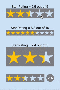
Here are examples of using the star rating with different number of stars as well as laying them out in different sizes.
 1struct ContentView: View {
 2    @State private var currentValue = 4.0
 3
 4    var body: some View {
 5        ZStack {
 6            Color(red: 214/255, green: 232/255, blue: 248/255)
 7                .edgesIgnoringSafeArea(.all)
 8
 9            VStack(spacing:40) {
10                VStack(spacing:0) {
11                    let rating = 2.5
12                    Text("Star Rating = \(rating, specifier: "%.1F") out of 5")
13                    VStack {
14                        StarRatingView(value: rating, stars: 5)
15                            .frame(width: 250, height: 50, alignment: .center)
16                    }
17                }
18
19                VStack(spacing:0) {
20                    let rating = 6.3
21                    Text("Star Rating = \(rating, specifier: "%.1F") out of 10")
22                    VStack {
23                        StarRatingView(value: rating, stars: 10)
24                            .frame(width: 250, height: 30, alignment: .center)
25                    }
26                }
27
28                VStack(spacing:0) {
29                    let rating = 2.4
30                    Text("Star Rating = \(rating, specifier: "%.1F") out of 3")
31                    VStack {
32                        StarRatingView(value: rating, stars: 3)
33                            .frame(width: 250, height: 100, alignment: .center)
34                    }
35                }
36
37                Spacer()
38            }
39        }
40    }
41}

Make the star rating interactive
The Star Rating SwiftUI view can be made interactive with the use of a DragGesture, similar to the sliders in How to customise the Slider in SwiftUI. The DragGesture is added to the HStack of stars so that any drag along the stars will update the star rating.
 1struct StarRatingView: View {
 2    @Binding var value: Double
 3    var stars: Int = 5
 4
 5    @State var lastCoordinateValue: CGFloat = 0.0
 6
 7    var body: some View {
 8        GeometryReader { gr in
 9            let ratingWidth = gr.size.width * value / Double(stars)
10            let starWidth = gr.size.width / Double(stars)
11            let radius = starWidth * 0.01
12
13            let maxValue = gr.size.width
14            let scaleFactor = maxValue / Double(stars)
15            let sliderVal = self.value * scaleFactor
16
17            ZStack {
18                HStack(spacing:0) {
19                    Rectangle()
20                        .fill(.yellow)
21                        .frame(width: ratingWidth)
22                    Rectangle()
23                        .fill(.clear)
24                }
25
26                HStack(spacing:0) {
27                    ForEach(1...stars, id:\.self) { _ in
28                        StarShape(points: 5, cornerRadius: radius, isCutout: true)
29                            .fill(Color.gray, style: FillStyle(eoFill: true, antialiased: true))
30                            .frame(width: starWidth, height: gr.size.height, alignment: .center)
31                    }
32                }
33                .gesture(
34                    DragGesture(minimumDistance: 0)
35                        .onChanged { v in
36                            if (abs(v.translation.width) < 0.1) {
37                                self.lastCoordinateValue = sliderVal
38                            }
39                            if v.translation.width > 0 {
40                                let nextCoordinateValue = min(maxValue, self.lastCoordinateValue + v.translation.width)
41                                self.value = (nextCoordinateValue / scaleFactor)
42                            } else {
43                                let nextCoordinateValue = max(0.0, self.lastCoordinateValue + v.translation.width)
44                                self.value = (nextCoordinateValue / scaleFactor)
45                            }
46                        }
47                )
48            }
49        }
50    }
51}
The ContentView is similar to before, except a new rating is added with a circle showing the chosen star rating.
 1struct ContentView: View {
 2    @State private var rating1 = 2.5
 3    @State private var rating2 = 6.3
 4    @State private var rating3 = 2.4
 5    @State private var rating4 = 2.4
 6
 7    var body: some View {
 8        ZStack {
 9            Color(red: 214/255, green: 232/255, blue: 248/255)
10                .edgesIgnoringSafeArea(.all)
11
12            VStack(spacing:40) {
13                VStack(spacing:0) {
14                    Text("Star Rating = \(rating1, specifier: "%.1F") out of 5")
15                    StarRatingView(value: $rating1, stars: 5)
16                        .frame(width: 250, height: 50, alignment: .center)
17                }
18
19                VStack(spacing:0) {
20                    Text("Star Rating = \(rating2, specifier: "%.1F") out of 10")
21                    StarRatingView(value: $rating2, stars: 10)
22                        .frame(width: 250, height: 30, alignment: .center)
23                }
24
25                VStack(spacing:0) {
26                    Text("Star Rating = \(rating3, specifier: "%.1F") out of 3")
27                    StarRatingView(value: $rating3, stars: 3)
28                        .frame(width: 250, height: 100, alignment: .center)
29                }
30
31                HStack(spacing:10) {
32                    StarRatingView(value: $rating4, stars: 5)
33                        .frame(width: 200, height: 40, alignment: .center)
34                    Circle()
35                        .fill(.gray)
36                        .frame(width: 40, height: 40, alignment: .center)
37                        .overlay(
38                            Text("\(rating4, specifier: "%.1F")")
39                                .foregroundColor(.white)
40                                .fontWeight(.bold)
41                        )
42                }
43
44                Spacer()
45            }
46        }
47    }
48}

Set the star rating on initial touch point
The star rating is adjusted with the DragGesture, but it starts from it's current
position and slides as the finger is dragged across the screen. This can create a
disconnect between the user and the star rating component. The expectation is that
the current star rating would match the touch-point of the finger. This is a
throw-back to treating the DragGesture on the stars as a slider. The fix is to set
the lastCoordinateValue to the x coordinate of the current location when the
DragGesture changes.
 1struct StarRatingView: View {
 2    @Binding var value: Double
 3    var stars: Int = 5
 4
 5    @State var lastCoordinateValue: CGFloat = 0.0
 6
 7    var body: some View {
 8        GeometryReader { gr in
 9            let ratingWidth = gr.size.width * value / Double(stars)
10            let starWidth = gr.size.width / Double(stars)
11            let radius = starWidth * 0.01
12
13            let maxValue = gr.size.width
14            let scaleFactor = maxValue / Double(stars)
15
16            ZStack {
17                HStack(spacing:0) {
18                    Rectangle()
19                        .fill(.yellow)
20                        .frame(width: ratingWidth)
21                    Rectangle()
22                        .fill(.clear)
23                }
24
25                HStack(spacing:0) {
26                    ForEach(1...stars, id:\.self) { _ in
27                        StarShape(points: 5, cornerRadius: radius, isCutout: true)
28                            .fill(Color.gray, style: FillStyle(eoFill: true, antialiased: true))
29                            .frame(width: starWidth, height: gr.size.height, alignment: .center)
30                    }
31                }
32                .gesture(
33                    DragGesture(minimumDistance: 0)
34                        .onChanged { v in
35                            if (abs(v.translation.width) < 0.1) {
36                                self.lastCoordinateValue = v.location.x
37                            }
38                            if v.translation.width > 0 {
39                                let nextCoordinateValue = min(maxValue, self.lastCoordinateValue + v.translation.width)
40                                self.value = (nextCoordinateValue / scaleFactor)
41                            } else {
42                                let nextCoordinateValue = max(0.0, self.lastCoordinateValue + v.translation.width)
43                                self.value = (nextCoordinateValue / scaleFactor)
44                            }
45                        }
46                )
47            }
48        }
49    }
50}
No change is needed to the ContentView and the behavior is that the star rating and yellow color jump to the finger location and move with the DragGesture.

Interactive Star Rating changing with Drag Gesture
Conclusion
This article built on the work done in Create a Star cutout shape in SwiftUI and Star with rounded corners in SwiftUI to create a star rating SwiftUI view. The number of stars in the view can be set as well as the value for the star rating. A DragGesture is used to make the star rating interactive with the value bound to the calling view.