Create a Star cutout shape in SwiftUI
Path can be used in SwiftUI to create practically any shape. I found creating a cutout shape difficult until I found that FillStyle can be used with the even-odd rule. This article shows how to create a shape outline where the outside can be colored and the center kept transparent to allow other content to show through. Shape cutouts can be used to frame content and help highlight the content for the user.
Using the SF Symbols
I first thought I could use the SF Symbol shapes by setting foreground and background
colors. When using one of the sf-symbols like star.fill setting the opacity of
the foreground just removes the foreground shape and reveals the background. The
star symbol does show the content inside the Star, but also outside the star and
setting a color on the background once again blocks out the whole background.
Finally, there is an sf-symbol for star.square.fill, which has the star as the
foreground as a square around a Star cutout. This is close to the desired effect with
the content underneath shown through the star shape. There is a lot of padding around
the shapes and configuration is limited.
1struct CakeView: View {
2    var body: some View {
3        Image("cake")
4            .resizable()
5            .scaledToFit()
6            .frame(width: 100, height: 100, alignment: .center)
7    }
8}
 1struct SFSymbolView: View {
 2    var body: some View {
 3        VStack(spacing:20) {
 4            CakeView()
 5
 6            HStack(spacing:30) {
 7                ZStack {
 8                    CakeView()
 9                    Image(systemName: "star.fill")
10                        .font(.system(size: 130))
11                        .foregroundColor(Color.clear)
12                        .background(Color.green)
13                }
14                .frame(width: 150, height: 150, alignment: .center)
15
16                ZStack {
17                    CakeView()
18                    Image(systemName: "star.fill")
19                        .font(.system(size: 130))
20                        .foregroundColor(Color.red.opacity(0.5))
21                        .background(Color.green)
22                }
23                .frame(width: 150, height: 150, alignment: .center)
24            }
25
26            HStack(spacing:30) {
27                ZStack {
28                    CakeView()
29                    Image(systemName: "star")
30                        .font(.system(size: 130))
31                        .foregroundColor(Color.red)
32                }
33                .frame(width: 150, height: 150, alignment: .center)
34
35                ZStack {
36                    CakeView()
37                    Image(systemName: "star")
38                        .font(.system(size: 130))
39                        .foregroundColor(Color.red)
40                        .background(Color.green)
41                }
42                .frame(width: 150, height: 150, alignment: .center)
43            }
44
45            HStack(spacing:30) {
46                ZStack {
47                    CakeView()
48                    Image(systemName: "star.square.fill")
49                        .font(.system(size: 130))
50                        .foregroundColor(Color.red)
51                        .background(Color.green.opacity(0.3))
52                }
53                .frame(width: 150, height: 150, alignment: .center)
54
55                ZStack {
56                    CakeView()
57                    Image(systemName: "star.square.fill")
58                        .font(.system(size: 150))
59                        .foregroundColor(Color.red)
60                }
61                .frame(width: 150, height: 150, alignment: .center)
62            }
63
64            Spacer()
65        }
66    }
67}

Using clipShape to frame an image
Use of shape rather than SF-symbol does provide more flexibility. The first two images use the stroke method to outline a shape over the background image. Increasing the linewidth of the shape can create a shape cutout, when it is combined with a clipped method so the view is clipped within its bounding frame. This is somewhat crude with less control over the size of the cutout as the stroke line width extends in both directions.
 1    HStack(spacing:30) {
 2        ZStack {
 3            Image("cake")
 4                .resizable()
 5                .scaledToFit()
 6                .frame(width: 120, height: 120, alignment: .center)
 7            Circle()
 8                .stroke(Color.green, lineWidth: 3.0)
 9                .frame(width: 120, height: 120, alignment: .center)
10        }
11        .frame(width: 150, height: 150, alignment: .center)
12
13        ZStack {
14            Image("cake")
15                .resizable()
16                .scaledToFit()
17                .frame(width: 120, height: 120, alignment: .center)
18            Circle()
19                .stroke(Color.green, lineWidth: 60.0)
20                .frame(width: 150, height: 150, alignment: .center)
21                .clipped()
22        }
23        .frame(width: 150, height: 150, alignment: .center)
24    }
Instead of using a separate cutout shape over the image in a ZStack, we could use the clipShape method as was discussed in Displaying Images in SwiftUI to frame an image. This clipShape approach provides the ability to clip the view to any shape including a custom shape. This may be enough for most circumstances. Note that this is one view, so it will not work if the desire is to have a separate draggable cutout view.
 1    HStack(spacing:30) {
 2        Image("cake")
 3            .resizable()
 4            .scaledToFit()
 5            .frame(width: 120, height: 120, alignment: .center)
 6            .clipShape(Circle())
 7            .frame(width: 150, height: 150, alignment: .center)
 8            .background(Color.green)
 9
10        Image("cake")
11            .resizable()
12            .scaledToFit()
13            .frame(width: 120, height: 120, alignment: .center)
14            .frame(width: 140, height: 80, alignment: .center)
15            .background(Color.white)
16            .clipShape(Ellipse())
17            .frame(width: 150, height: 130, alignment: .center)
18            .background(Color.green)
19    }
Another approach is to reverse the order of the views and clip the image over a view of the desired background. Again this is not a cutout shape, but may be sufficient if the entire view is static.
 1    HStack(spacing:30) {
 2        ZStack {
 3            Color.green
 4                .frame(width: 150, height: 150, alignment: .center)
 5            Image("cake")
 6                .resizable()
 7                .scaledToFit()
 8                .frame(width: 120, height: 120, alignment: .center)
 9                .clipShape(Circle())
10        }
11        .frame(width: 150, height: 150, alignment: .center)
12
13        ZStack {
14            Color.green
15                .frame(width: 130, height: 150, alignment: .center)
16            Image("cake")
17                .resizable()
18                .scaledToFit()
19                .frame(width: 120, height: 120, alignment: .center)
20                .frame(width: 80, height: 120, alignment: .center)
21                .clipShape(Rectangle())
22        }
23        .frame(width: 150, height: 150, alignment: .center)
24    }

Using shapes in a Path with FillStyle
The solution to creating a stand-alone cutout shape is to use two paths with a
FillStyle structure setting the Even–odd rule property to true. The first two
images define a path to contain the paths of two shapes; a circle over a square and a
square over a circle. Using the FillStyle with eoFill property set to true, the
first shape is filled and the second shape is left transparent.
 1    HStack(spacing:30) {
 2        ZStack {
 3            Image("cake")
 4                .resizable()
 5                .scaledToFit()
 6                .frame(width: 120, height: 120, alignment: .center)
 7            Path { path in
 8                path.addPath(Rectangle().path(in: CGRect(x: 0, y: 0, width: 150, height: 150)))
 9                path.addPath(Circle().path(in: CGRect(x: 25, y: 25, width: 100, height: 100)))
10            }
11            .fill(Color.purple,
12                  style: FillStyle(eoFill: true, antialiased: true))
13        }
14        .frame(width: 150, height: 150, alignment: .center)
15
16        ZStack {
17            Image("cake")
18                .resizable()
19                .scaledToFit()
20                .frame(width: 120, height: 120, alignment: .center)
21            Path { path in
22                path.addPath(Circle().path(in: CGRect(x: 0, y: 0, width: 150, height: 150)))
23                path.addPath(Rectangle().path(in: CGRect(x: 25, y: 25, width: 100, height: 100)))
24            }
25            .fill(Color.purple,
26                  style: FillStyle(eoFill: true, antialiased: true))
27        }
28        .frame(width: 150, height: 150, alignment: .center)
29    }
The second two images use Path to define custom shapes for the cutout shape. The next step would be to embed these path definitions into shapes of their own to simplify the main view.
 1   HStack(spacing:30) {
 2       ZStack {
 3           Image("cake")
 4               .resizable()
 5               .scaledToFit()
 6               .frame(width: 120, height: 120, alignment: .center)
 7           Path { path in
 8               path.addPath(Rectangle().path(in: CGRect(x: 0, y: 0, width: 150, height: 150)))
 9               path.move(to: CGPoint(x: 0, y: 75))
10               path.addLine(to: CGPoint(x: 75, y: 0))
11               path.addLine(to: CGPoint(x: 150, y: 75))
12               path.addLine(to: CGPoint(x: 75, y: 150))
13               path.addLine(to: CGPoint(x: 0, y: 75))
14           }
15           .fill(Color.purple,
16                 style: FillStyle(eoFill: true, antialiased: true))
17       }
18       .frame(width: 150, height: 150, alignment: .center)
19
20       ZStack {
21           Image("cake")
22               .resizable()
23               .scaledToFit()
24               .frame(width: 120, height: 120, alignment: .center)
25           Path { path in
26               path.addPath(Rectangle().path(in: CGRect(x: 0, y: 0, width: 150, height: 150)))
27               path.move(to: CGPoint(x: 0, y: 75))
28               path.addQuadCurve(to: CGPoint(x: 75, y: 0),
29                                 control: CGPoint(x: 75, y: 75))
30               path.addQuadCurve(to: CGPoint(x: 150, y: 75),
31                                 control: CGPoint(x: 75, y: 75))
32               path.addQuadCurve(to: CGPoint(x: 75, y: 150),
33                                 control: CGPoint(x: 75, y: 75))
34               path.addQuadCurve(to: CGPoint(x: 0, y: 75),
35                                 control: CGPoint(x: 75, y: 75))                    }
36           .fill(Color.purple,
37                 style: FillStyle(eoFill: true, antialiased: true))
38       }
39       .frame(width: 150, height: 150, alignment: .center)
40   }

Defining Star Shapes
A star shape is defined similar to the regular polygon defined in Animating a shape change in SwiftUI. In addition, to the outer points of the star, we need to define corresponding inner points. This is achieved by setting an inner circle (with a radius 0.4 times that of the outer circle) for the inner points of the star. By making the number of points in the star a variable the same shape can be used to create any star. Note there is a vertical adjustment down for the center of the circles when the number of points on the star is odd and less than 8. This is because although the star is centered inside a circle, which is centered in the frame - the star appears off-center when viewed in a solid Square.
 1struct StarShape: Shape {
 2    var points = 5
 3
 4    func Cartesian(length:Double, angle:Double) -> CGPoint {
 5        return CGPoint(x: length * cos(angle),
 6                       y: length * sin(angle))
 7    }
 8
 9    func path(in rect: CGRect) -> Path {
10        // centre of the containing rect
11        var center = CGPoint(x: rect.width/2.0, y: rect.height/2.0)
12        // Adjust center down for odd number of sides less than 8
13        if points%2 == 1 && points < 8 {
14            center = CGPoint(x: center.x, y: center.y * ((Double(points) * (-0.04)) + 1.3))
15        }
16
17        // radius of a circle that will fit in the rect
18        let outerRadius = Double(min(rect.width,rect.height)) / 2.0
19        let innerRadius = outerRadius * 0.4
20        let offsetAngle = (Double.pi / Double(points)) + Double.pi/2.0
21
22        var vertices:[CGPoint] = []
23        for i in 0..<points{
24            // Calculate the angle in Radians
25            let angle1 = (2.0 * Double.pi/Double(points)) * Double(i)  + offsetAngle
26            let outerPoint = Cartesian(length: outerRadius, angle: angle1)
27            vertices.append(CGPoint(x: outerPoint.x + center.x, y: outerPoint.y + center.y))
28
29            let angle2 = (2.0 * Double.pi/Double(points)) * (Double(i) + 0.5)  + offsetAngle
30            let innerPoint = Cartesian(length: (innerRadius),
31                                       angle: (angle2))
32            vertices.append(CGPoint(x: innerPoint.x + center.x, y: innerPoint.y + center.y))
33        }
34
35        let path = Path() { path in
36            for (n, pt) in vertices.enumerated() {
37                n == 0 ? path.move(to: pt) : path.addLine(to: pt)
38            }
39            path.closeSubpath()
40        }
41        return path
42    }
43}
A number of stars are displayed with different number of points to exercise the use
of the StarShape
 1    var body: some View {
 2        VStack(spacing:20) {
 3            ForEach([3,4,5], id: \.self) { i in
 4                HStack(spacing:30) {
 5                    VStack(spacing:0) {
 6                        let points = i
 7                        StarShape(points: points)
 8                            .fill(Color.orange)
 9                            .frame(width: 150, height: 150)
10                        Text("\(points) points")
11                    }
12
13                    VStack(spacing:0) {
14                        let points = i * 3
15                        StarShape(points: points)
16                            .fill(Color.orange)
17                            .frame(width: 150, height: 150)
18                        Text("\(points) points")
19                    }
20                }
21            }
22            Spacer()
23        }
24    }

The same stars are displayed using stroke to show the stars outline.
 1    var body: some View {
 2        VStack(spacing:20) {
 3            ForEach([3,4,5], id: \.self) { i in
 4                HStack(spacing:30) {
 5                    VStack(spacing:0) {
 6                        let points = i
 7                        StarShape(points: points)
 8                            .stroke(Color.orange, lineWidth: 3.0)
 9                            .frame(width: 150, height: 150)
10                        Text("\(points) points")
11                    }
12
13                    VStack(spacing:0) {
14                        let points = i * 3
15                        StarShape(points: points)
16                            .stroke(Color.orange, lineWidth: 3.0)
17                            .frame(width: 150, height: 150)
18                        Text("\(points) points")
19                    }
20                }
21            }
22            Spacer()
23        }
24    }

Star cutout shape
One simple change can be made to the StarShape to allow it to be displayed as a
cutout shape rather than a solid shape. Add an extra boolean parameter cutout with
a default of false, so the existing shapes stay the same. Add a conditional step to
add a Rectangle path for the containing frame to the start of the path definition
when the cutout parameter is set to true.
 1struct StarShape: Shape {
 2    var points = 5
 3    var cutout = false
 4
 5    func Cartesian(length:Double, angle:Double) -> CGPoint {
 6        return CGPoint(x: length * cos(angle),
 7                       y: length * sin(angle))
 8    }
 9
10    func path(in rect: CGRect) -> Path {
11        // centre of the containing rect
12        var center = CGPoint(x: rect.width/2.0, y: rect.height/2.0)
13        // Adjust center down for odd number of sides less than 8
14        if points%2 == 1 && points < 8 {
15            center = CGPoint(x: center.x, y: center.y * ((Double(points) * (-0.04)) + 1.3))
16        }
17
18        // radius of a circle that will fit in the rect
19        let outerRadius = Double(min(rect.width,rect.height)) / 2.0
20        let innerRadius = outerRadius * 0.4
21        let offsetAngle = (Double.pi / Double(points)) + Double.pi/2.0
22
23        var vertices:[CGPoint] = []
24        for i in 0..<points{
25            // Calculate the angle in Radians
26            let angle1 = (2.0 * Double.pi/Double(points)) * Double(i)  + offsetAngle
27            let outerPoint = Cartesian(length: outerRadius, angle: angle1)
28            vertices.append(CGPoint(x: outerPoint.x + center.x, y: outerPoint.y + center.y))
29
30            let angle2 = (2.0 * Double.pi/Double(points)) * (Double(i) + 0.5)  + offsetAngle
31            let innerPoint = Cartesian(length: (innerRadius),
32                                       angle: (angle2))
33            vertices.append(CGPoint(x: innerPoint.x + center.x, y: innerPoint.y + center.y))
34        }
35
36        let path = Path() { path in
37            if cutout {
38                path.addPath(Rectangle().path(in: rect))
39            }
40            for (n, pt) in vertices.enumerated() {
41                n == 0 ? path.move(to: pt) : path.addLine(to: pt)
42            }
43            path.closeSubpath()
44        }
45        return path
46    }
47}
Setting the cutout to true renders the shape with the outside filled in and the
inside star shape transparent. When the cutout parameter is set to false then the
star is rendered as before.
 1    var body: some View {
 2        VStack(spacing:20) {
 3            ForEach([5,6,7], id: \.self) { i in
 4                HStack(spacing:30) {
 5                    VStack(spacing:0) {
 6                        let points = i
 7                        StarShape(points: points, cutout: true)
 8                            .fill(Color(red: 0.68, green: 0.29, blue: 0.29),
 9                                  style: FillStyle(eoFill: true))
10                            .frame(width: 150, height: 150)
11                        Text("\(points) points")
12                    }
13
14                    VStack(spacing:0) {
15                        let points = i
16                        StarShape(points: points, cutout: false)
17                            .fill(Color(red: 0.68, green: 0.29, blue: 0.29),
18                                  style: FillStyle(eoFill: true))
19                            .frame(width: 150, height: 150)
20                        Text("\(points) points")
21                    }
22                }
23            }
24            Spacer()
25        }
26    }

Using Cutout Shapes
This cutout behavior can used with any custom shape such as the heart defined in Create a blob shape in SwiftUI. The cutout parameter needs to be added and the rectangle path added to the start of the path when the cutout parameter is true. That's it! - the heart shape can now be used as a cutout shape.
 1struct HeartShape: Shape {
 2    var cutout = false
 3
 4    func path(in rect: CGRect) -> Path {
 5        let size = min(rect.width, rect.height)
 6        let xOffset = (rect.width > rect.height) ? (rect.width - rect.height) / 2.0 : 0.0
 7        let yOffset = (rect.height > rect.width) ? (rect.height - rect.width) / 2.0 : 0.0
 8
 9        func offsetPoint(p: CGPoint) -> CGPoint {
10            return CGPoint(x: p.x + xOffset, y: p.y+yOffset)
11        }
12        var path = Path()
13
14        if cutout {
15            path.addPath(Rectangle().path(in: rect))
16        }
17
18        path.move(to: offsetPoint(p: (CGPoint(x: (size * 0.50), y: (size * 0.25)))))
19        path.addCurve(to: offsetPoint(p: CGPoint(x: 0, y: (size * 0.25))),
20                      control1: offsetPoint(p: CGPoint(x: (size * 0.50), y: (-size * 0.10))),
21                      control2: offsetPoint(p: CGPoint(x: 0, y: 0)))
22        path.addCurve(to: offsetPoint(p: CGPoint(x: (size * 0.50), y: size)),
23                      control1: offsetPoint(p: CGPoint(x: 0, y: (size * 0.60))),
24                      control2: offsetPoint(p: CGPoint(x: (size * 0.50), y: (size * 0.80))))
25        path.addCurve(to: offsetPoint(p: CGPoint(x: size, y: (size * 0.25))),
26                      control1: offsetPoint(p: CGPoint(x: (size * 0.50), y: (size * 0.80))),
27                      control2: offsetPoint(p: CGPoint(x: size, y: (size * 0.60))))
28        path.addCurve(to: offsetPoint(p: CGPoint(x: (size * 0.50), y: (size * 0.25))),
29                      control1: offsetPoint(p: CGPoint(x: size, y: 0)),
30                      control2: offsetPoint(p: CGPoint(x: (size * 0.50), y: (-size * 0.10))))
31        return path
32    }
33}
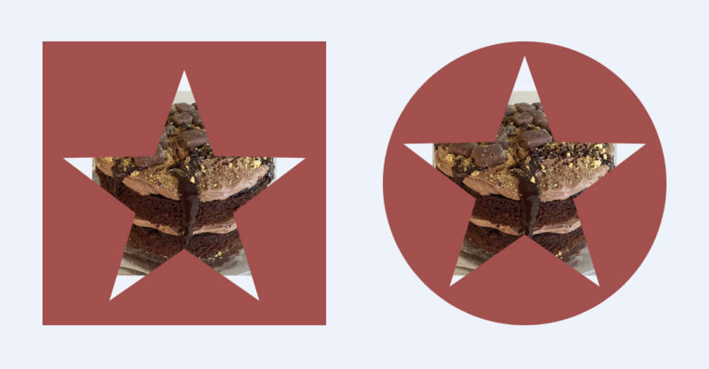
Here the star and heart cutout shapes are used to frame the cake image.
 1    var body: some View {
 2        VStack(spacing:40) {
 3            Text("Cutout Shapes")
 4                .font(.title2)
 5                .fontWeight(.bold)
 6
 7            ZStack {
 8                Image("cake")
 9                    .resizable()
10                    .scaledToFit()
11                    .frame(width: 200, height: 200)
12                    .frame(width: 180, height: 180)
13                    .clipped()
14
15                StarShape(points: 5, cutout: true)
16                    .fill(Color(red: 0.68, green: 0.29, blue: 0.29),
17                          style: FillStyle(eoFill: true))
18                    .frame(width: 200, height: 180)
19            }
20
21            ZStack {
22                Image("cake")
23                    .resizable()
24                    .scaledToFit()
25                    .frame(width: 200, height: 200)
26                    .frame(width: 180, height: 180)
27                    .clipped()
28
29                HeartShape(cutout: true)
30                    .fill(Color(red: 0.68, green: 0.29, blue: 0.29),
31                          style: FillStyle(eoFill: true))
32                    .frame(width: 200, height: 180)
33            }
34
35            Spacer()
36        }
37    }

Conclusion
It is easier than I first perceived to create a cutout shape in SwiftUI. The trick is
to use multiple paths in the shape definition and to set the eoFill parameter to
true of the FillStyle on the shape.