How to customise the Slider in SwiftUI
There is limited ability to customise the Slider in SwiftUI as of Xcode 13. These are three options of presenting a custom view of the Slider in a SwiftUI App. Set the tint color and background color of the slider; fall back to using the UISliderView from UIKit or create a custom SliderView from scratch in SwiftUI.
These are 3 options to customising a Slider control in SwiftUI:
- Set tint and background color
- Use UISlider from UIKit wrapped in a UIViewRepresentable
- Create a custom slider from scratch in SwiftUI
Set tint and background color
There are great advantages to using the default SwiftUI controls like Slider. They can be added to a view with just a couple of lines of code, they adapt well to different layouts and sizes and they tend to have accessibility baked in. Sometimes, the default appearance is not the desired look required in an app and we look for ways to customise the appearance. Unfortunately, there are limited options available to customise the look and feel of the Slider.
 1struct ContentView: View {
 2    @State private var currentValue = 6.0
 3
 4    var body: some View {
 5        VStack(spacing:30) {
 6            Text("SwiftUI Slider")
 7                .font(.title2)
 8                .fontWeight(.bold)
 9
10            Text("value = \(currentValue, specifier: "%.2F")")
11
12            VStack(spacing:0) {
13                Text("Default Slider")
14                Slider(
15                    value: $currentValue,
16                    in: 0...10.0
17                )
18                    .frame(width: 200)
19            }
20
21            VStack(spacing:0) {
22                Text("background color")
23                Slider(
24                    value: $currentValue,
25                    in: 0...10.0
26                )
27                    .background(Color.yellow)
28                    .frame(width: 200)
29            }
30
31            VStack(spacing:0) {
32                Text("tint color")
33                Slider(
34                    value: $currentValue,
35                    in: 0...10.0
36                )
37                    .tint(Color.yellow)
38                    .frame(width: 200)
39            }
40
41            VStack(spacing:0) {
42                Text("accent color")
43                Slider(
44                    value: $currentValue,
45                    in: 0...10.0
46                )
47                    .accentColor(Color.yellow)
48                    .frame(width: 200)
49            }
50
51            Spacer()
52        }
53    }
54}

Use UISlider from UIKit
The second option to customise more of the features of the Slider is to use the
UISlider from UIKit. This needs to be wrapped in UIViewRepresentable and
different properties of the UISlider can be exposed to the SwiftUI View. Note that
the system does not automatically communicate changes occurring within the
UISliderView to other parts of your SwiftUI interface. A Coordinator instance
is required to facilitate coordination with other SwiftUI views and user interaction.
 1struct UISliderView: UIViewRepresentable {
 2    @Binding var value: Double
 3
 4    var minValue = 1.0
 5    var maxValue = 100.0
 6    var thumbColor: UIColor = .white
 7    var minTrackColor: UIColor = .blue
 8    var maxTrackColor: UIColor = .lightGray
 9
10    class Coordinator: NSObject {
11        var value: Binding<Double>
12
13        init(value: Binding<Double>) {
14            self.value = value
15        }
16
17        @objc func valueChanged(_ sender: UISlider) {
18            self.value.wrappedValue = Double(sender.value)
19        }
20    }
21
22    func makeCoordinator() -> UISliderView.Coordinator {
23        Coordinator(value: $value)
24    }
25
26    func makeUIView(context: Context) -> UISlider {
27        let slider = UISlider(frame: .zero)
28        slider.thumbTintColor = thumbColor
29        slider.minimumTrackTintColor = minTrackColor
30        slider.maximumTrackTintColor = maxTrackColor
31        slider.minimumValue = Float(minValue)
32        slider.maximumValue = Float(maxValue)
33        slider.value = Float(value)
34
35        slider.addTarget(
36            context.coordinator,
37            action: #selector(Coordinator.valueChanged(_:)),
38            for: .valueChanged
39        )
40
41        return slider
42    }
43
44    func updateUIView(_ uiView: UISlider, context: Context) {
45        uiView.value = Float(value)
46    }
47}
The UISliderView can be used in a SwiftUI view with the optional parameters to
specify colors for the thumb and track colors.
 1struct ContentView: View {
 2    @State private var currentValue = 6.0
 3
 4    var body: some View {
 5        VStack(spacing:30) {
 6            Text("SwiftUI Slider")
 7                .font(.title2)
 8                .fontWeight(.bold)
 9
10            Text("value = \(currentValue, specifier: "%.2F")")
11
12            VStack(spacing:0) {
13                Text("UISlider")
14                UISliderView(value: $currentValue,
15                             minValue: 1.0,
16                             maxValue: 10.0)
17                    .frame(width: 200)
18            }
19
20            VStack(spacing:0) {
21                Text("UISlider with colors")
22                UISliderView(value: $currentValue,
23                             minValue: 1.0,
24                             maxValue: 10.0,
25                             thumbColor: .red,
26                             minTrackColor: .purple,
27                             maxTrackColor: .green)
28                    .frame(width: 200)
29            }
30
31            VStack(spacing:0) {
32                Text("UISlider with colors")
33                UISliderView(value: $currentValue,
34                             minValue: 1.0,
35                             maxValue: 10.0,
36                             thumbColor: .clear,
37                             minTrackColor: .purple,
38                             maxTrackColor: .clear)
39                    .frame(width: 200)
40            }
41
42            Spacer()
43        }
44    }
45}

Create Custom Slider view
The third option is to define a custom slider-style view from scratch in SwiftUI. This obviously offers the most flexibility regarding look and feel, but requires the most effort and may not be suitable for applications that are expected to work in a number of environments. This starts out easy enough with a rounded rectangle as the track for the slider and a circle for the thumb.
A DragGesture is used on the circle to allow the user to interact with the slider and checks are placed to ensure the circle stays inside the rounded rectangle.
 1struct SliderView1: View {
 2    @Binding var value: Double
 3
 4    @State var lastCoordinateValue: CGFloat = 0.0
 5
 6    var body: some View {
 7        GeometryReader { gr in
 8            let thumbSize = gr.size.height * 0.8
 9            let radius = gr.size.height * 0.5
10            let minValue = gr.size.width * 0.015
11            let maxValue = (gr.size.width * 0.98) - thumbSize
12
13            ZStack {
14                RoundedRectangle(cornerRadius: radius)
15                    .foregroundColor(.gray)
16                HStack {
17                    Circle()
18                        .foregroundColor(Color.white)
19                        .frame(width: thumbSize, height: thumbSize)
20                        .offset(x: self.value)
21                        .gesture(
22                            DragGesture(minimumDistance: 0)
23                                .onChanged { v in
24                                    if (abs(v.translation.width) < 0.1) {
25                                        self.lastCoordinateValue = self.value
26                                    }
27                                    if v.translation.width > 0 {
28                                        self.value = min(maxValue, self.lastCoordinateValue + v.translation.width)
29                                    } else {
30                                        self.value = max(minValue, self.lastCoordinateValue + v.translation.width)
31                                    }
32
33                                }
34                        )
35                    Spacer()
36                }
37            }
38        }
39    }
40}
The SliderView1 can be used specifying different height and widths to create
different sliders.
 1struct ContentView: View {
 2    @State private var currentValue = 6.0
 3
 4    var body: some View {
 5        VStack(spacing:20) {
 6            Text("Custom Slider")
 7                .font(.title2)
 8                .fontWeight(.bold)
 9
10            Text("value = \(currentValue, specifier: "%.2F")")
11
12            SliderView1(value: $currentValue)
13                .frame(width:300, height:30)
14
15            SliderView1(value: $currentValue)
16                .frame(width:300, height:10)
17
18            SliderView1(value: $currentValue)
19                .frame(width:300, height:80)
20
21            Spacer()
22        }
23    }
24}

Custom slider to reflect the value
The problem with the initial slider is that the value of the thumb is the value of the x coordinate and so varies with the width of the Slider.
 1struct SliderView2: View {
 2    @Binding var value: Double
 3
 4    @State var lastCoordinateValue: CGFloat = 0.0
 5    var sliderRange: ClosedRange<Double> = 1...100
 6
 7    var body: some View {
 8        GeometryReader { gr in
 9            let thumbSize = gr.size.height * 0.8
10            let radius = gr.size.height * 0.5
11            let minValue = gr.size.width * 0.015
12            let maxValue = (gr.size.width * 0.98) - thumbSize
13
14            let scaleFactor = (maxValue - minValue) / (sliderRange.upperBound - sliderRange.lowerBound)
15            let lower = sliderRange.lowerBound
16            let sliderVal = (self.value - lower) * scaleFactor + minValue
17
18            ZStack {
19                RoundedRectangle(cornerRadius: radius)
20                    .foregroundColor(.blue)
21                HStack {
22                    Circle()
23                        .foregroundColor(Color.yellow)
24                        .frame(width: thumbSize, height: thumbSize)
25                        .offset(x: sliderVal)
26                        .gesture(
27                            DragGesture(minimumDistance: 0)
28                                .onChanged { v in
29                                    if (abs(v.translation.width) < 0.1) {
30                                        self.lastCoordinateValue = sliderVal
31                                    }
32                                    if v.translation.width > 0 {
33                                        let nextCoordinateValue = min(maxValue, self.lastCoordinateValue + v.translation.width)
34                                        self.value = ((nextCoordinateValue - minValue) / scaleFactor)  + lower
35                                    } else {
36                                        let nextCoordinateValue = max(minValue, self.lastCoordinateValue + v.translation.width)
37                                        self.value = ((nextCoordinateValue - minValue) / scaleFactor) + lower
38                                    }
39
40                                }
41                        )
42                    Spacer()
43                }
44            }
45        }
46    }
47}
 1struct ContentView: View {
 2    @State private var currentValue1 = 6.0
 3    @State private var currentValue2 = 6.0
 4
 5    var body: some View {
 6        VStack(spacing:20) {
 7            Text("Custom Slider")
 8                .font(.title2)
 9                .fontWeight(.bold)
10
11            VStack(spacing:0) {
12                Text("value 1 = \(currentValue1, specifier: "%.2F")")
13                SliderView2(value: $currentValue1)
14                    .frame(width:100, height:30)
15            }
16
17            VStack(spacing:0) {
18                Text("value 2 = \(currentValue2, specifier: "%.2F")")
19                SliderView2(value: $currentValue2,
20                            sliderRange: 4...10)
21                    .frame(width:200, height:100)
22            }
23
24            VStack(spacing:0) {
25                Text("value 2 = \(currentValue2, specifier: "%.2F")")
26                SliderView2(value: $currentValue2,
27                            sliderRange: 4...10)
28                    .frame(width:200, height:10)
29            }
30
31            Spacer()
32        }
33    }
34}

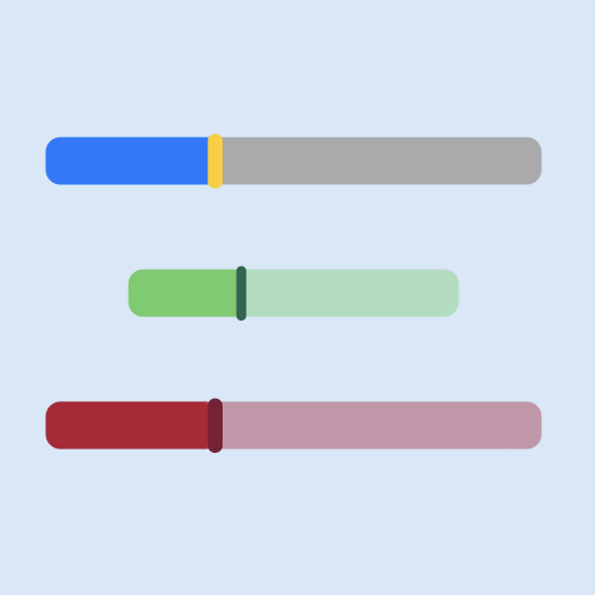
Set thumb and track colors
The thumb is changed to be a rounded rectangle rather than a circle and the color options are exposed for the track before the thumb and after the thumb as well as the color for the thumb.
 1struct SliderView3: View {
 2    @Binding var value: Double
 3
 4    @State var lastCoordinateValue: CGFloat = 0.0
 5    var sliderRange: ClosedRange<Double> = 1...100
 6    var thumbColor: Color = .yellow
 7    var minTrackColor: Color = .blue
 8    var maxTrackColor: Color = .gray
 9
10    var body: some View {
11        GeometryReader { gr in
12            let thumbHeight = gr.size.height * 1.1
13            let thumbWidth = gr.size.width * 0.03
14            let radius = gr.size.height * 0.5
15            let minValue = gr.size.width * 0.015
16            let maxValue = (gr.size.width * 0.98) - thumbWidth
17
18            let scaleFactor = (maxValue - minValue) / (sliderRange.upperBound - sliderRange.lowerBound)
19            let lower = sliderRange.lowerBound
20            let sliderVal = (self.value - lower) * scaleFactor + minValue
21
22            ZStack {
23                Rectangle()
24                    .foregroundColor(maxTrackColor)
25                    .frame(width: gr.size.width, height: gr.size.height * 0.95)
26                    .clipShape(RoundedRectangle(cornerRadius: radius))
27                HStack {
28                    Rectangle()
29                        .foregroundColor(minTrackColor)
30                    .frame(width: sliderVal, height: gr.size.height * 0.95)
31                    Spacer()
32                }
33                .clipShape(RoundedRectangle(cornerRadius: radius))
34                HStack {
35                    RoundedRectangle(cornerRadius: radius)
36                        .foregroundColor(thumbColor)
37                        .frame(width: thumbWidth, height: thumbHeight)
38                        .offset(x: sliderVal)
39                        .gesture(
40                            DragGesture(minimumDistance: 0)
41                                .onChanged { v in
42                                    if (abs(v.translation.width) < 0.1) {
43                                        self.lastCoordinateValue = sliderVal
44                                    }
45                                    if v.translation.width > 0 {
46                                        let nextCoordinateValue = min(maxValue, self.lastCoordinateValue + v.translation.width)
47                                        self.value = ((nextCoordinateValue - minValue) / scaleFactor)  + lower
48                                    } else {
49                                        let nextCoordinateValue = max(minValue, self.lastCoordinateValue + v.translation.width)
50                                        self.value = ((nextCoordinateValue - minValue) / scaleFactor) + lower
51                                    }
52                               }
53                        )
54                    Spacer()
55                }
56            }
57        }
58    }
59}
 1struct ContentView: View {
 2    @State private var currentValue1 = 6.0
 3
 4    var body: some View {
 5        VStack(spacing:20) {
 6            Text("Custom Slider")
 7                .font(.title2)
 8                .fontWeight(.bold)
 9
10            VStack(spacing:0) {
11                Text("value 1 = \(currentValue1, specifier: "%.2F")")
12                SliderView3(value: $currentValue1,
13                            sliderRange: 4...10)
14                    .frame(width:300, height:30)
15            }
16
17            VStack(spacing:0) {
18                Text("value 1 = \(currentValue1, specifier: "%.2F")")
19                SliderView3(value: $currentValue1,
20                            sliderRange: 4...10,
21                            thumbColor: .purple,
22                            minTrackColor: .red,
23                            maxTrackColor: .green)
24                    .frame(width:300, height:30)
25            }
26
27            VStack(spacing:0) {
28                Text("value 1 = \(currentValue1, specifier: "%.2F")")
29                SliderView3(value: $currentValue1,
30                            sliderRange: 4...10,
31                            thumbColor: .red,
32                            minTrackColor: .red,
33                            maxTrackColor: .clear)
34                    .frame(width:300, height:30)
35            }
36
37            VStack(spacing:0) {
38                Text("value 1 = \(currentValue1, specifier: "%.2F")")
39                SliderView3(value: $currentValue1,
40                            sliderRange: 4...10)
41                    .frame(width:300, height:100)
42            }
43
44            Spacer()
45        }
46    }
47}

Conclusion
The is limited options to customise the default Slider in SwiftUI. The tint color or accent color can be used to set the color of the track trailing the thumb. and a background color can be set behind the Slider. There are two other options to further customise the look and feel of a slider control in SwiftUI. One option is to use the UISlider from UIKit and this is probably the most recommended way to go as a lot of the work is done for you in UIKit. The other option is to define your own Slider-style SwiftUI View. This offers the most customisation, but at the cost of having to implement everything. This may seem like the right direction to go, but it could mean implementing some SwiftUI view that is so customised that customers are confused on how to use it. There is a lot more customisation that could be done to the custom SwiftUI Slider and decisions need to be made on which properties need to be exposed. There is great flexibility in creating your own SwiftUI views to create a uniques customer experience.