Create a line chart in SwiftUI
A line chart is a graphical representation of changes in some data over time or between categories. The chart consists of two axes; x-axis is the horizontal axis representing the time change; and y-axis is the vertical axis representing the magnitude of the data. This article demonstrates how to create simple line charts using shapes in SwiftUI.
A Line chart is great for showing a change over time or showing differences between categories. Line charts are also useful to compare the change in a number of variables relative to each other. Data presented in a line chart can be much more quickly and easily understood than the same data presented in a table.
Draw a line joining a number of points
Start by defining a LineShape that takes a list of double values and uses Path
to draw lines from one value to the next. The x-axis is divided into the number of
data points with values between 0.0 and 1.0 (this will be addressed later). This is
similar to the LineShape shown in How to animate a Shape change in SwiftUI,
except the animation is not required and has been removed.
 1struct LineShape: Shape {
 2    var yValues: [Double]
 3
 4    func path(in rect: CGRect) -> Path {
 5        let xIncrement = (rect.width / (CGFloat(yValues.count) - 1))
 6        var path = Path()
 7        path.move(to: CGPoint(x: 0.0,
 8                              y: yValues[0] * Double(rect.height)))
 9        for i in 1..<yValues.count {
10            let pt = CGPoint(x: (Double(i) * Double(xIncrement)),
11                             y: (yValues[i] * Double(rect.height)))
12            path.addLine(to: pt)
13        }
14        return path
15    }
16}
 1struct ContentView: View {
 2    var body: some View {
 3        VStack {
 4            Text("Line Chart")
 5
 6            ZStack {
 7                Rectangle()
 8                    .stroke(Color.gray, lineWidth: 3.0)
 9                    .frame(width: 300, height: 300, alignment: .center)
10
11                LineShape(yValues: [0.2, 0.4, 0.3, 0.8, 0.5])
12                    .stroke(Color.red, lineWidth: 2.0)
13                    .frame(width: 300, height: 300, alignment: .center)
14            }
15
16            Spacer()
17        }
18    }
19}

Set y-axis zero on bottom
The default coordinate system in iOS is to start with (0,0) at the top left with the
y-coordinate increasing down the screen. So the initial line chart seems to have the
reverse y values, as line charts usually have the y-axis increasing from bottom to
top. This is corrected by subtracting the y-values from 1.0 before adjusting for
height in the LineShape.
 1struct LineShape: Shape {
 2    var yValues: [Double]
 3
 4    func path(in rect: CGRect) -> Path {
 5        let xIncrement = (rect.width / (CGFloat(yValues.count) - 1))
 6        var path = Path()
 7        path.move(to: CGPoint(x: 0.0,
 8                              y: (1.0 - yValues[0]) * Double(rect.height)))
 9        for i in 1..<yValues.count {
10            let pt = CGPoint(x: (Double(i) * Double(xIncrement)),
11                             y: (1.0 - yValues[i]) * Double(rect.height))
12            path.addLine(to: pt)
13        }
14        return path
15    }
16}

Create layout for Line Chart
Create a number of SwiftUI views to layout the Line chart - similar to the bar chart
layout in How to create a Bar Chart in SwiftUI. LineChartView is composed of a
header and a chart area, where the chart area uses the LineShape to plot the line.
This separation makes it easier to develop the different sections and multiple charts
can be added to the main view to ensure the results are as expected.
 1struct ContentView: View {
 2    var body: some View {
 3        ZStack {
 4            Color(red: 208/255, green: 225/255, blue: 242/255, opacity: 0.4)
 5                .edgesIgnoringSafeArea(.all)
 6
 7            VStack {
 8                Text("Line Chart")
 9
10                LineChartView(
11                    title: "the chart title",
12                    data: [0.2, 0.4, 0.3, 0.8, 0.5])
13                    .frame(width: 300, height: 300, alignment: .center)
14
15                Spacer().frame(height:50)
16
17                HStack {
18                    LineChartView(
19                        title: "One",
20                        data: [0.88, 0.76, 0.92, 0.18, 0.7, 0.51, 0.66, 0.35, 0.53])
21                        .frame(width: 100, height: 100, alignment: .center)
22
23                    Spacer().frame(width:50)
24
25                    LineChartView(
26                        title: "Two",
27                        data: [0.88, 0.76, 0.92, 0.18, 0.7, 0.51, 0.66, 0.35, 0.53, 0.63, 0.58, 0.24, 0.39, 0.47, 0.34, 0.45, 0.64, 0.1, 0.27, 0.16, 0.37, 0.53, 0.62, 0.39, 0.32, 0.24, 0.42, 0.6, 0.79, 0.54, 0.26, 0.74, 0.61, 0.83, 0.1, 0.47, 0.14, 0.86, 0.73, 0.62, 0.23, 0.11, 0.78, 0.12, 0.23, 0.33, 0.11, 0.94, 0.74, 0.19])
28                        .frame(width: 150, height: 100, alignment: .center)
29                }
30
31                Spacer()
32            }
33        }
34    }
35}
 1struct LineChartView: View {
 2    var title: String
 3    var data: [Double]
 4
 5    var body: some View {
 6        GeometryReader { gr in
 7            let headHeight = gr.size.height * 0.10
 8            VStack {
 9                ChartHeaderView(title: title, height: headHeight)
10                ChartAreaView(data: data)
11            }
12        }
13    }
14}
1struct ChartHeaderView: View {
2    var title: String
3    var height: CGFloat
4
5    var body: some View {
6        Text(title)
7            .frame(height: height)
8    }
9}
 1struct ChartAreaView: View {
 2    var data: [Double]
 3
 4    var body: some View {
 5        ZStack {
 6            RoundedRectangle(cornerRadius: 5.0)
 7                .fill(Color(#colorLiteral(red: 0.8906477705, green: 0.9005050659, blue: 0.8208766097, alpha: 1)))
 8
 9            LineShape(yValues: data)
10                .stroke(Color.red, lineWidth: 2.0)
11        }
12    }
13}

Allow range of numbers on y-axis
The initial chart only allows for y-values between 0.0 and 1.0. Change the LineShape to set the y-axis based on the max value to plot. The y-coordinate of each point is relative to the maximum value in the data series.
 1struct LineShape: Shape {
 2    var yValues: [Double]
 3
 4    func path(in rect: CGRect) -> Path {
 5        let xIncrement = (rect.width / (CGFloat(yValues.count) - 1))
 6        let factor = rect.height / CGFloat(yValues.max() ?? 1.0)
 7        var path = Path()
 8        path.move(to: CGPoint(x: 0.0,
 9                              y: (rect.height - (yValues[0] * factor))))
10        for i in 1..<yValues.count {
11            let pt = CGPoint(x: (Double(i) * Double(xIncrement)),
12                             y: (rect.height - (yValues[i] * factor)))
13            path.addLine(to: pt)
14        }
15        return path
16    }
17}
The sample line charts are updated to ranges of values other than 0 to 1.
 1struct ContentView: View {
 2    var body: some View {
 3        ZStack {
 4            Color(red: 208/255, green: 225/255, blue: 242/255, opacity: 0.4)
 5                .edgesIgnoringSafeArea(.all)
 6
 7            VStack {
 8                Text("Line Chart")
 9
10                LineChartView(
11                    title: "the chart title",
12                    data: [164, 182, 212, 198, 242, 30, 158, 6, 67, 195, 104, 125, 125, 92, 81, 188, 50, 155, 225, 243, 53, 141, 32, 1])
13                    .frame(width: 300, height: 300, alignment: .center)
14
15                Spacer().frame(height:50)
16
17                HStack {
18                    LineChartView(
19                        title: "One",
20                        data: [0.88, 0.76, 0.92, 0.18, 0.7, 0.51, 0.66, 0.35, 0.53])
21                        .frame(width: 100, height: 100, alignment: .center)
22
23                    Spacer().frame(width:50)
24
25                    LineChartView(
26                        title: "Two",
27                        data: [6, 30, 195, 164, 182, 198, 212, 400])
28                        .frame(width: 150, height: 100, alignment: .center)
29                }
30
31                Spacer()
32            }
33        }
34    }
35}

Add the x-axis and y-axis
A lot of the work done on the axes for a bar chart in Add Axes to a Bar Chart in
SwiftUI can be reused. The LineChartData is structured to contain a list of
values for each x-value, this could possibly be restructured in a number of ways.
However, it is easy to transform the data into a sequence of values for each line
using the Swift map function. The YaxisView, XaxisView and KeyView are all
used with minor modifications.
 1struct DataItem: Identifiable {
 2    let name: String
 3    let values: [Double]
 4    let id = UUID()
 5}
 6
 7struct LineChartData {
 8    let keys: [String]
 9    let data: [DataItem]
10}
 1struct YaxisView: View {
 2    var ticks: [Int]
 3    var scaleFactor: Double
 4
 5    var body: some View {
 6        GeometryReader { gr in
 7            let fullChartHeight = gr.size.height
 8            ZStack {
 9                // y-axis line
10                Rectangle()
11                    .fill(Color.black)
12                    .frame(width:1.5)
13                    .offset(x: (gr.size.width/2.0)-1, y: 1)
14
15                // Tick marks
16                ForEach(ticks, id:\.self) { t in
17                    HStack {
18                        Spacer()
19                        Text("\(t)")
20                            .font(.footnote)
21                        Rectangle()
22                            .frame(width: 10, height: 1)
23                    }
24                    .offset(y: (fullChartHeight/2.0) - (CGFloat(t) * CGFloat(scaleFactor)))
25                }
26            }
27        }
28    }
29}
 1struct XaxisView: View {
 2    var data: [DataItem]
 3
 4    var body: some View {
 5        GeometryReader { gr in
 6            let labelWidth = (gr.size.width * 0.9) / CGFloat(data.count)
 7            let padWidth = (gr.size.width * 0.05) / CGFloat(data.count)
 8            ZStack {
 9                Rectangle()
10                    .fill(Color(#colorLiteral(red: 0.8906477705, green: 0.9005050659, blue: 0.8208766097, alpha: 1)))
11
12                Rectangle()
13                    .fill(Color.black)
14                    .frame(height: 1.5)
15                    .offset(x: 0, y: -(gr.size.height/2.0))
16
17                HStack(spacing:0) {
18                    ForEach(data) { item in
19                        Text(item.name)
20                            .font(.footnote)
21                            .frame(width:labelWidth, height: gr.size.height)
22                    }
23                    .padding(.horizontal, padWidth)
24                }
25            }
26        }
27    }
28}
 1struct KeyView: View {
 2    let keys: [String]
 3
 4    var body: some View {
 5        HStack {
 6            ForEach(keys.indices) { i in
 7                HStack(spacing:0) {
 8                    Image(systemName: "square.fill")
 9                        .foregroundColor(colors[i])
10                    Text("\(keys[i])")
11                }
12                .font(.footnote)
13            }
14        }
15    }
16}
The LineChartView is modified to use LineChartData and to set the layout for the
chart with axes and key. The data from LineChartData is passed into ChartAreaView.
 1struct LineChartView: View {
 2    var title: String
 3    var chartData: LineChartData
 4
 5    let isShowingKey = true
 6
 7    var body: some View {
 8        let data = chartData.data
 9        GeometryReader { gr in
10            let headHeight = gr.size.height * 0.10
11            let maxValue = data.flatMap { $0.values }.max()!
12            let axisWidth = gr.size.width * 0.15
13            let axisHeight = gr.size.height * 0.1
14            let keyHeight = gr.size.height * (isShowingKey ? 0.1 : 0.0)
15            let fullChartHeight = gr.size.height - axisHeight - headHeight - keyHeight
16
17            let tickMarks = AxisParameters.getTicks(top: Int(maxValue))
18            let scaleFactor = (fullChartHeight * 0.95) / CGFloat(tickMarks[tickMarks.count-1])
19
20            VStack {
21                ChartHeaderView(title: title)
22                    .frame(height: headHeight)
23
24                ZStack {
25                    Rectangle()
26                        .fill(Color(#colorLiteral(red: 0.8906477705, green: 0.9005050659, blue: 0.8208766097, alpha: 1)))
27
28                    VStack(spacing:0) {
29                        if isShowingKey {
30                            KeyView(keys: chartData.keys)
31                                .frame(height: keyHeight)
32                        }
33
34                        HStack(spacing:0) {
35                            YaxisView(ticks: tickMarks, scaleFactor: Double(scaleFactor))
36                                .frame(width:axisWidth, height: fullChartHeight)
37                            ChartAreaView(data: data, scaleFactor: Double(scaleFactor))
38                                .frame(height: fullChartHeight)
39                        }
40
41                        HStack(spacing:0) {
42                            Rectangle()
43                                .fill(Color.clear)
44                                .frame(width:axisWidth, height:axisHeight)
45                            XaxisView(data: data)
46                                .frame(height:axisHeight)
47                        }
48                    }
49                }
50            }
51        }
52    }
53}
The ChartAreaView is updated to take a list of DataItems and transforms the data
into an array for each line, which is passed to the LineShape to draw.
 1struct ChartAreaView: View {
 2    var data: [DataItem]
 3    var scaleFactor: Double
 4
 5    var body: some View {
 6        ZStack {
 7            RoundedRectangle(cornerRadius: 5.0)
 8                .fill(Color(#colorLiteral(red: 0.8906477705, green: 0.9005050659, blue: 0.8208766097, alpha: 1)))
 9
10            ForEach(data[0].values.indices) { i in
11                let list = data.map { $0.values[i] }
12                LineShape(yValues: list, scaleFactor: scaleFactor)
13                    .stroke(colors[i], lineWidth: 2.0)
14            }
15        }
16    }
17}
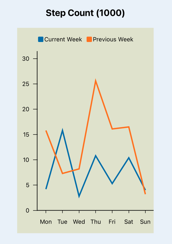
 1struct ContentView: View {
 2
 3    let stepData = LineChartData(
 4        keys: ["Current Week", "Previous Week"],
 5        data: [
 6            DataItem(name: "Mon", values: [4.2, 15.8]),
 7            DataItem(name: "Tue", values: [15.8, 7.3]),
 8            DataItem(name: "Wed", values: [2.8, 8.2]),
 9            DataItem(name: "Thu", values: [10.8, 25.6]),
10            DataItem(name: "Fri", values: [5.3, 16.1]),
11            DataItem(name: "Sat", values: [10.4, 16.5]),
12            DataItem(name: "Sun", values: [4.0, 3.2])
13        ])
14
15    var body: some View {
16        ZStack {
17            Color(red: 208/255, green: 225/255, blue: 242/255, opacity: 0.4)
18                .edgesIgnoringSafeArea(.all)
19
20            VStack {
21                LineChartView(
22                    title: "Daily step count (1000)",
23                    chartData: stepData)
24                    .frame(width: 300, height: 500, alignment: .center)
25
26                Spacer()
27            }
28        }
29    }
30}

Align the x-axis
In the chart above, the points on the chart do not align with the labels on the x-axis. The labels are spaced evenly below the axis, but the points for the line begin on the y-axis and end on the edge of the chart. Tick marks on the x-axis do not add any value in the bar chart, but would be valuable on a line chart.
Tick marks are added to the XaxisView using Rectangles above the test labels.
 1struct XaxisView: View {
 2    var data: [DataItem]
 3
 4    var body: some View {
 5        GeometryReader { gr in
 6            let labelWidth = (gr.size.width * 0.9) / CGFloat(data.count)
 7            let padWidth = (gr.size.width * 0.05) / CGFloat(data.count)
 8            let labelHeight = gr.size.height
 9            let tickHeight = gr.size.height * 0.12
10            ZStack {
11                Rectangle()
12                    .fill(Color(#colorLiteral(red: 0.8906477705, green: 0.9005050659, blue: 0.8208766097, alpha: 1)))
13
14                Rectangle()
15                    .fill(Color.black)
16                    .frame(height: 1.5)
17                    .offset(x: 0, y: -(gr.size.height/2.0))
18
19                HStack(spacing:0) {
20                    ForEach(data) { item in
21                        ZStack {
22                            VStack {
23                                Rectangle()
24                                    .frame(width: 1, height: tickHeight)
25                                Spacer()
26                            }
27                            Text(item.name)
28                                .font(.footnote)
29                            .frame(width:labelWidth, height: labelHeight)
30                        }
31                    }
32                    .padding(.horizontal, padWidth)
33                }
34            }
35        }
36    }
37}
The horizontal spacing for the x points is updated in the LineShape. The points are
spread evenly across the x-axis by creating an increment value and setting the first
point to be mid-way along this increment. The points on the chart now lign up with
the tick marks on the x-axis.
 1struct LineShape: Shape {
 2    var yValues: [Double]
 3    var scaleFactor: Double
 4
 5    func path(in rect: CGRect) -> Path {
 6        let xIncrement = (rect.width / (CGFloat(yValues.count)))
 7        var xValue = xIncrement * 0.5
 8        var path = Path()
 9        path.move(to: CGPoint(x: xValue,
10                              y: (rect.height - (yValues[0] * scaleFactor))))
11        for i in 1..<yValues.count {
12            xValue += xIncrement
13            let pt = CGPoint(x: xValue,
14                             y: (rect.height - (yValues[i] * scaleFactor)))
15            path.addLine(to: pt)
16        }
17        return path
18    }
19}

Display real data in the Line Chart
Here is the comparison of population changes in two countries shown in tabular format and using the Line Chart.
Population changes in Ireland and The Gambia
| Year | Ireland | The Gambia |
|---|---|---|
| 2000 | 3.79 | 1.32 |
| 2001 | 3.85 | 1.36 |
| 2002 | 3.93 | 1.40 |
| 2003 | 3.98 | 1.45 |
| 2004 | 4.05 | 1.50 |
| 2005 | 4.13 | 1.54 |
| 2006 | 4.23 | 1.59 |
| 2007 | 4.38 | 1.64 |
| 2008 | 4.49 | 1.69 |
| 2009 | 4.53 | 1.74 |
| 2010 | 4.55 | 1.79 |
| 2011 | 4.57 | 1.85 |
| 2012 | 4.59 | 1.91 |
| 2013 | 4.61 | 1.96 |
| 2014 | 4.65 | 2.02 |
| 2015 | 4.69 | 2.09 |
| 2016 | 4.74 | 2.15 |
| 2017 | 4.79 | 2.21 |
| 2018 | 4.86 | 2.28 |
| 2019 | 4.92 | 2.35 |
| 2020 | 4.98 | 2.42 |
| 2021 | 5.01 | 2.51 |
 1struct ContentView: View {
 2    let popData = LineChartData(
 3        keys: ["Ireland", "The Gambia"],
 4        data: [
 5            DataItem(name: "2000", values: [3.79, 1.32]),
 6            DataItem(name: "2001", values: [3.85, 1.36]),
 7            DataItem(name: "2002", values: [3.93, 1.40]),
 8            DataItem(name: "2003", values: [3.98, 1.45]),
 9            DataItem(name: "2004", values: [4.05, 1.50]),
10            DataItem(name: "2005", values: [4.13, 1.54]),
11            DataItem(name: "2006", values: [4.23, 1.59]),
12            DataItem(name: "2007", values: [4.38, 1.64]),
13            DataItem(name: "2008", values: [4.49, 1.69]),
14            DataItem(name: "2009", values: [4.53, 1.74]),
15            DataItem(name: "2010", values: [4.55, 1.79]),
16            DataItem(name: "2011", values: [4.57, 1.85]),
17            DataItem(name: "2012", values: [4.59, 1.91]),
18            DataItem(name: "2013", values: [4.61, 1.96]),
19            DataItem(name: "2014", values: [4.65, 2.02]),
20            DataItem(name: "2015", values: [4.69, 2.09]),
21            DataItem(name: "2016", values: [4.74, 2.15]),
22            DataItem(name: "2017", values: [4.79, 2.21]),
23            DataItem(name: "2018", values: [4.86, 2.28]),
24            DataItem(name: "2019", values: [4.92, 2.35]),
25            DataItem(name: "2020", values: [4.98, 2.42]),
26            DataItem(name: "2021", values: [5.01, 2.51])
27        ])
28
29    var body: some View {
30        ZStack {
31            Color(red: 208/255, green: 225/255, blue: 242/255, opacity: 0.4)
32                .edgesIgnoringSafeArea(.all)
33
34            VStack {
35                LineChartView(
36                    title: "Population Data (million)",
37                    chartData: popData)
38                    .frame(width: 1000, height: 500, alignment: .center)
39
40                Spacer()
41            }
42        }
43    }
44}

Conclusion
A line chart can be created using the SwiftUI Path structure in a 2D shape to draw a line between consecutive points. It is relatively easy to get started with a basic chart, but there is more work to customise the layout as well as add labels and annotate the chart. The code in this article leveraged code developed for the bar chart. There is still room to improve the line chart such as adding labels on the axes or the ability to rotate the x-axis labels.