Add horizontal scroll to charts with SwiftUI Charts in iOS 16
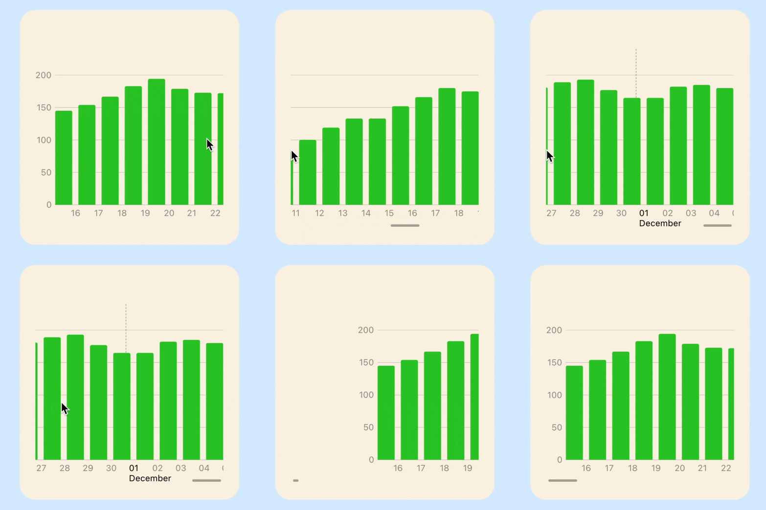
Apple introduced SwiftUI Charts at WWWDC 2022, which makes it incredibly easy to create charts within SwiftUI views. The default chart presents the entire data in the chart plot regardless of how much data is available. It can be beneficial to show more details on a chart and add the ability to scroll through the chart.
Related articles on Swift Charts:
Create sample data
Define a data model that will generate random data for a property like body weight measured in pounds in a range between 175 and 200. The generation of the data gives minor changes each day to make the data more realistic.
 1struct Weight: Identifiable {
 2    let id = UUID()
 3    let day: Date
 4    let pounds: Int
 5
 6    init(date: Date, weight: Int) {
 7        self.day = date
 8        self.pounds = weight
 9    }
10
11    var weekdayString: String {
12        let dateFormatter = DateFormatter()
13        dateFormatter.dateFormat = "yyyyMMdd"
14        dateFormatter.dateStyle = .long
15        dateFormatter.timeStyle = .none
16        dateFormatter.locale = Locale(identifier: "en_US")
17        return dateFormatter.string(from: day)
18    }
19}
 1struct WeightData {
 2    private(set) var allWeights: [Weight]?
 3
 4    static let weightInitial = 180
 5    static let weightInterval = 2
 6    static let weightMin = 175
 7    static let weightMax = 200
 8
 9    init() {
10        createWeightData(days: 100)
11    }
12
13    private mutating func createWeightData(days: Int) {
14        // Generate sample weight date between 175 and 200 pounds (+ or - 0-3 pounds daily)
15        self.allWeights = []
16        var selectedWeight = WeightData.weightInitial
17        var add = true
18        for interval in 0...days {
19            switch selectedWeight {
20            case (WeightData.weightMax - WeightData.weightInterval + 1)..<Int.max:
21                add = false
22            case 0..<(WeightData.weightMin + WeightData.weightInterval):
23                add = true
24            default:
25                add = (Int.random(in: 0...4) == 3) ? !add : add
26            }
27
28            selectedWeight = add ? selectedWeight + Int.random(in: 0...WeightData.weightInterval) : selectedWeight - Int.random(in: 0...WeightData.weightInterval)
29            let selectedDate = Calendar.current.date(byAdding: .day, value: (-1 * interval), to: Date())!
30            self.allWeights!.append(Weight(date: selectedDate, weight: selectedWeight))
31        }
32    }
33}

Display weight data on Line Chart
Create a ViewModel to bridge between the Model and the View as discussed in MVVM in
SwiftUI. A function is added to WeightViewModel to reinitialise the model with a
different number of days. Buttons are added to the view to change the number of days
so the graph can be changed to display the data. It can be seen that the scales on
the chart adjust automatically to display all the data. This is a great feature of
Swift Charts and it allows charts to be created quickly that adjust to the
available space on screen. However, when there is a large number of data samples, the
chart can appear a bit squashed and make it difficult to see the details.
Model
 1struct WeightData {
 2    private(set) var allWeights: [Weight]?
 3
 4    static let weightInitial = 180
 5    static let weightInterval = 2
 6    static let weightMin = 175
 7    static let weightMax = 200
 8
 9    mutating func createWeightData(days: Int) {
10        // Generate sample weight date between 175 and 200 pounds (+ or - 0-3 pounds daily)
11        self.allWeights = []
12        var selectedWeight = WeightData.weightInitial
13        var add = true
14        for interval in 0...days {
15            switch selectedWeight {
16            case (WeightData.weightMax - WeightData.weightInterval + 1)..<Int.max:
17                add = false
18            case 0..<(WeightData.weightMin + WeightData.weightInterval):
19                add = true
20            default:
21                add = (Int.random(in: 0...4) == 3) ? !add : add
22            }
23
24            selectedWeight = add ? selectedWeight + Int.random(in: 0...WeightData.weightInterval) : selectedWeight - Int.random(in: 0...WeightData.weightInterval)
25            let selectedDate = Calendar.current.date(byAdding: .day, value: (-1 * interval), to: Date())!
26            self.allWeights!.append(Weight(date: selectedDate, weight: selectedWeight))
27        }
28    }
29}
ViewModel
 1class WeightViewModel: ObservableObject {
 2    @Published private var weightModel = WeightData()
 3
 4    init() {
 5        weightModel.createWeightData(days: 100)
 6    }
 7
 8    var allWeights: [Weight]? {
 9        weightModel.allWeights
10    }
11
12    func generateWeightData(numberOfDays: Int) {
13        weightModel.createWeightData(days: numberOfDays)
14    }
15}
View
 1struct WeightChartView1: View {
 2    @ObservedObject private var weightVm = WeightViewModel()
 3
 4    var body: some View {
 5        ZStack {
 6            Color(hue: 0.58, saturation: 0.17, brightness: 1.0)
 7                .edgesIgnoringSafeArea(.all)
 8
 9            VStack() {
10                GroupBox ("Daily weight (pounds)") {
11                    if let weights = weightVm.allWeights {
12                        Chart {
13                            ForEach(weights) { weight in
14                                LineMark(
15                                    x: .value("Week Day", weight.day),
16                                    y: .value("Step Count", weight.pounds)
17                                )
18                                .foregroundStyle(ViewConstants.color1)
19                                .accessibilityLabel("\(weight.day.toString())")
20                                .accessibilityValue("\(weight.pounds) pounds")
21                            }
22                        }
23                        .chartYScale(domain: ViewConstants.minYScale...ViewConstants.maxYScale)
24                        .chartYAxis() {
25                            AxisMarks(position: .leading)
26                        }
27                    }
28                }
29                .groupBoxStyle(YellowGroupBoxStyle())
30                .frame(width: ViewConstants.chartWidth,  height: ViewConstants.chartHeight)
31
32                Text("Generate Data")
33                    .font(.title2)
34                HStack {
35                    Button("10") {
36                        weightVm.generateWeightData(numberOfDays: 10)
37                    }
38                    Button("50") {
39                        weightVm.generateWeightData(numberOfDays: 50)
40                    }
41                    Button("100") {
42                        weightVm.generateWeightData(numberOfDays: 100)
43                    }
44                    Button("1000") {
45                        weightVm.generateWeightData(numberOfDays: 1000)
46                    }
47                }
48
49                Spacer()
50            }
51            .padding()
52        }
53    }
54
55    private struct ViewConstants {
56        static let color1 = Color(hue: 0.33, saturation: 0.81, brightness: 0.76)
57        static let minYScale = 150
58        static let maxYScale = 240
59        static let chartWidth: CGFloat = 350
60        static let chartHeight: CGFloat = 400
61    }
62}

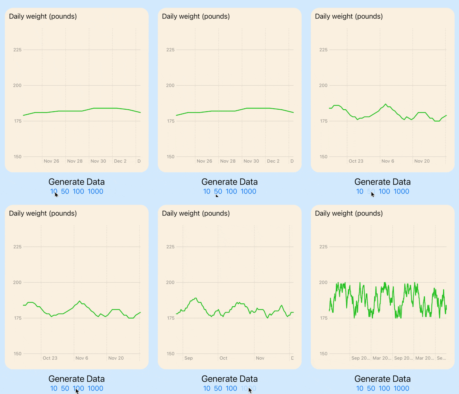
Line chart with 10, 50, 100 and 1,000 data points
Displaying weight data in a Bar Chart
It is relatively to change the line chart into a bar chart with the use of BarMark
for each data point. It does not make sense to cut down the y-axis scale with a bar
chart so the default y-axis scale is used. The bar chart looks much worse than the
line chart when the individual bars cannot be seen.
 1struct WeightChartView2: View {
 2    @ObservedObject private var weightVm = WeightViewModel()
 3
 4    var body: some View {
 5        ZStack {
 6            Color(hue: 0.58, saturation: 0.17, brightness: 1.0)
 7                .edgesIgnoringSafeArea(.all)
 8
 9            VStack() {
10                GroupBox ("Daily weight (pounds)") {
11                    if let weights = weightVm.allWeights {
12                        Chart {
13                            ForEach(weights) { weight in
14                                BarMark(
15                                    x: .value("Week Day", weight.day),
16                                    y: .value("Step Count", weight.pounds)
17                                )
18                                .foregroundStyle(ViewConstants.color1)
19                                .accessibilityLabel("\(weight.day.toString())")
20                                .accessibilityValue("\(weight.pounds) pounds")
21                            }
22                        }
23                        .chartYAxis() {
24                            AxisMarks(position: .leading)
25                        }
26                    }
27                }
28                .groupBoxStyle(YellowGroupBoxStyle())
29                .frame(width: ViewConstants.chartWidth,  height: ViewConstants.chartHeight)
30
31                Text("Generate Data")
32                    .font(.title2)
33                HStack {
34                    Button("10") {
35                        weightVm.generateWeightData(numberOfDays: 10)
36                    }
37                    Button("50") {
38                        weightVm.generateWeightData(numberOfDays: 50)
39                    }
40                    Button("100") {
41                        weightVm.generateWeightData(numberOfDays: 100)
42                    }
43                    Button("1000") {
44                        weightVm.generateWeightData(numberOfDays: 1000)
45                    }
46                }
47
48                Spacer()
49            }
50            .padding()
51        }
52    }
53
54    private struct ViewConstants {
55        static let color1 = Color(hue: 0.33, saturation: 0.81, brightness: 0.76)
56        static let minYScale = 150
57        static let maxYScale = 240
58        static let chartWidth: CGFloat = 350
59        static let chartHeight: CGFloat = 400
60    }
61}

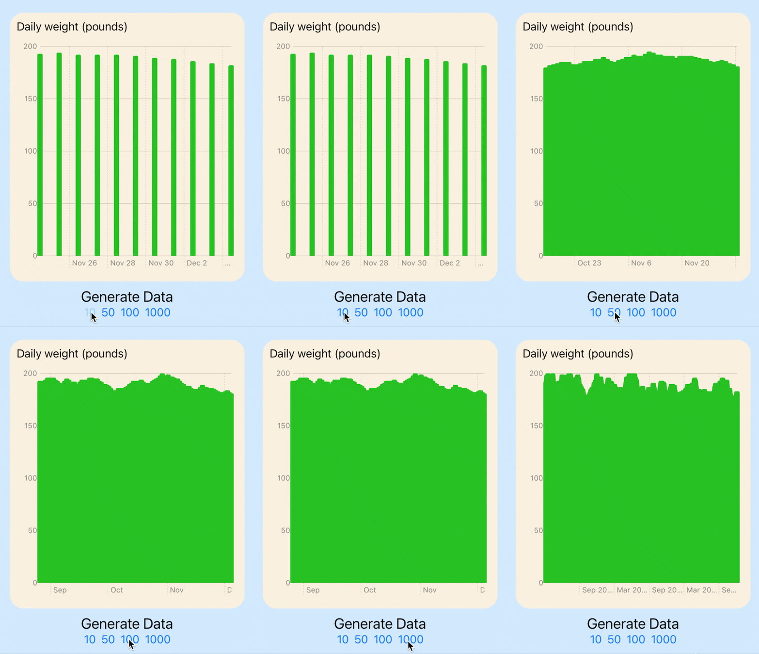
Bar chart with 10, 50, 100 and 1,000 data points
Add scroll to line chart
The solution is relatively straight forward, simply wrap the chart in a ScrollView and set the axis to horizontal. It is also necessary to set the desired width of the chart. This is set to a width for each point multiplied by the number of points in the data, so that a chart with 100 data points will be twice as wide as a chart with 50 data points. The second element that needs to be configured is the X-axis labels and gridlines, these are set using AxisMarks on chartXAxis so that name of the month is displayed for the first of each month. Some extensions are added to the Date type to easily check if a date is the first of a month and to get name of the month.
 1struct WeightChartView3: View {
 2    @ObservedObject private var weightVm = WeightViewModel()
 3
 4    var body: some View {
 5        ZStack {
 6            Color(hue: 0.58, saturation: 0.17, brightness: 1.0)
 7                .edgesIgnoringSafeArea(.all)
 8
 9            VStack() {
10                GroupBox ("Daily weight (pounds)") {
11                    if let weights = weightVm.allWeights {
12                        ScrollView(.horizontal) {
13                            Chart {
14                                ForEach(weights) { weight in
15                                    LineMark(
16                                        x: .value("Week Day", weight.day),
17                                        y: .value("Step Count", weight.pounds)
18                                    )
19                                    .foregroundStyle(ViewConstants.color1)
20                                    .accessibilityLabel("\(weight.day.toString())")
21                                    .accessibilityValue("\(weight.pounds) pounds")
22                                }
23                            }
24                            .chartYScale(domain: ViewConstants.minYScale...ViewConstants.maxYScale)
25                            .chartYAxis() {
26                                AxisMarks(position: .leading)
27                            }
28                            .chartXAxis {
29                                AxisMarks(preset: .extended,
30                                          position: .bottom,
31                                          values: .stride (by: .day)) { value in
32                                    if value.as(Date.self)!.isFirstOfMonth() {
33                                        AxisGridLine()
34                                            .foregroundStyle(.black.opacity(0.5))
35                                        let label = "01\n\(value.as(Date.self)!.monthName())"
36                                        AxisValueLabel(label).foregroundStyle(.black)
37                                    } else {
38                                        AxisValueLabel(
39                                            format: .dateTime.day(.twoDigits)
40                                        )
41                                    }
42                                }
43                            }
44                            .frame(width: ViewConstants.dataPointWidth * CGFloat(weights.count))
45                        }
46                    }
47                }
48                .groupBoxStyle(YellowGroupBoxStyle())
49                .frame(width: ViewConstants.chartWidth,  height: ViewConstants.chartHeight)
50
51                Text("Generate Data")
52                    .font(.title2)
53                HStack {
54                    Button("10") {
55                        weightVm.generateWeightData(numberOfDays: 10)
56                    }
57                    Button("50") {
58                        weightVm.generateWeightData(numberOfDays: 50)
59                    }
60                    Button("100") {
61                        weightVm.generateWeightData(numberOfDays: 100)
62                    }
63                    Button("1000") {
64                        weightVm.generateWeightData(numberOfDays: 1000)
65                    }
66                }
67
68                Spacer()
69            }
70            .padding()
71        }
72    }
73
74    private struct ViewConstants {
75        static let color1 = Color(hue: 0.33, saturation: 0.81, brightness: 0.76)
76        static let minYScale = 150
77        static let maxYScale = 240
78        static let chartWidth: CGFloat = 350
79        static let chartHeight: CGFloat = 400
80        static let dataPointWidth: CGFloat = 20
81    }
82}
Extensions on date
 1extension Date {
 2    func toString() -> String {
 3        let dateFormatter = DateFormatter()
 4        dateFormatter.dateStyle = .long
 5        dateFormatter.timeStyle = .none
 6        dateFormatter.locale = Locale(identifier: "en_US")
 7        return dateFormatter.string(from: self)
 8    }
 9
10    func isFirstOfMonth() -> Bool {
11        let components = Calendar.current.dateComponents([.day], from: self)
12        return components.day == 1
13    }
14
15    func monthName() -> String {
16        let dateFormatter = DateFormatter()
17        dateFormatter.dateFormat = "MMMM"
18        dateFormatter.locale = Locale(identifier: "en_US")
19        return dateFormatter.string(from: self)
20    }
21}
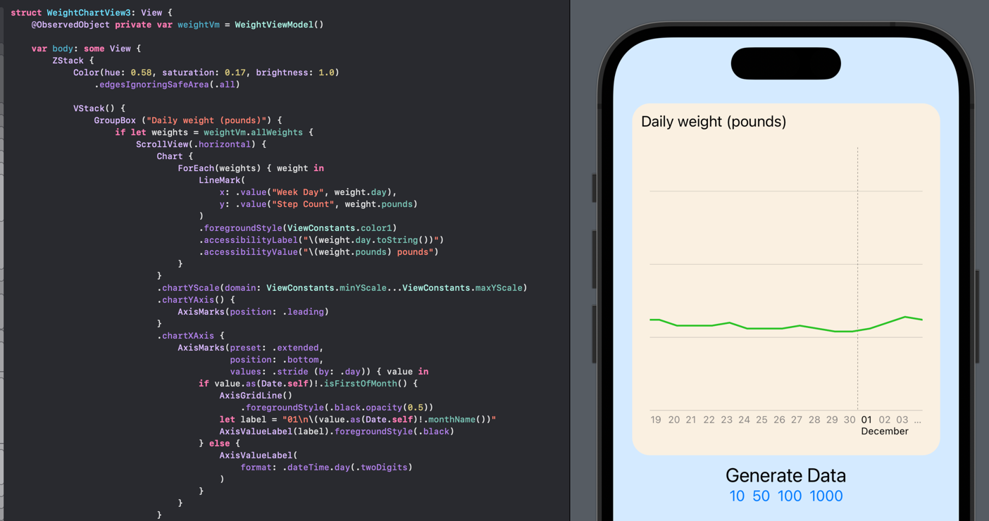

Line chart with horizontal scrolling to display large number of data points
Add scroll to bar chart
Adding horizontal scrolling to the bar chart is similar as the line chart. The width of each bar can ve set as the width for each data point. The value for each bar is displayed as an annotation.
 1struct WeightChartView4: View {
 2    @ObservedObject private var weightVm = WeightViewModel()
 3
 4    var body: some View {
 5        ZStack {
 6            Color(hue: 0.58, saturation: 0.17, brightness: 1.0)
 7                .edgesIgnoringSafeArea(.all)
 8
 9            VStack() {
10                GroupBox ("Daily weight (pounds)") {
11                    if let weights = weightVm.allWeights {
12                        ScrollView(.horizontal) {
13                            Chart {
14                                ForEach(weights) { weight in
15                                    BarMark(
16                                        x: .value("Week Day", weight.day),
17                                        y: .value("Step Count", weight.pounds),
18                                        width: ViewConstants.barWidth
19                                    )
20                                    .annotation(position: .top) {
21                                        Text("\(weight.pounds)").font(.footnote)
22                                    }
23                                    .foregroundStyle(ViewConstants.color1)
24                                    .accessibilityLabel("\(weight.day.toString())")
25                                    .accessibilityValue("\(weight.pounds) pounds")
26                                }
27                            }
28                            .chartYScale(domain: 0...ViewConstants.maxYScale)
29                            .chartYAxis() {
30                                AxisMarks(position: .leading)
31                            }
32                            .chartXAxis {
33                                AxisMarks(preset: .extended,
34                                          position: .bottom,
35                                          values: .stride (by: .day)) { value in
36                                    if value.as(Date.self)!.isFirstOfMonth() {
37                                        AxisGridLine()
38                                            .foregroundStyle(.black.opacity(0.5))
39                                        let label = "01\n\(value.as(Date.self)!.monthName())"
40                                        AxisValueLabel(label).foregroundStyle(.black)
41                                    } else {
42                                        AxisValueLabel(
43                                            format: .dateTime.day(.twoDigits)
44                                        )
45                                    }
46                                }
47                            }
48                            .frame(width: ViewConstants.dataPointWidth * CGFloat(weights.count))
49                        }
50                    }
51                }
52                .groupBoxStyle(YellowGroupBoxStyle())
53                .frame(width: ViewConstants.chartWidth,  height: ViewConstants.chartHeight)
54
55                Text("Generate Data")
56                    .font(.title2)
57                HStack {
58                    Button("10") {
59                        weightVm.generateWeightData(numberOfDays: 10)
60                    }
61                    Button("50") {
62                        weightVm.generateWeightData(numberOfDays: 50)
63                    }
64                    Button("100") {
65                        weightVm.generateWeightData(numberOfDays: 100)
66                    }
67                    Button("1000") {
68                        weightVm.generateWeightData(numberOfDays: 1000)
69                    }
70                }
71                Spacer()
72            }
73            .padding()
74        }
75    }
76
77    private struct ViewConstants {
78        static let color1 = Color(hue: 0.33, saturation: 0.81, brightness: 0.76)
79        static let minYScale = 150
80        static let maxYScale = 240
81        static let chartWidth: CGFloat = 350
82        static let chartHeight: CGFloat = 400
83        static let dataPointWidth: CGFloat = 30
84        static let barWidth: MarkDimension = 22
85    }
86}
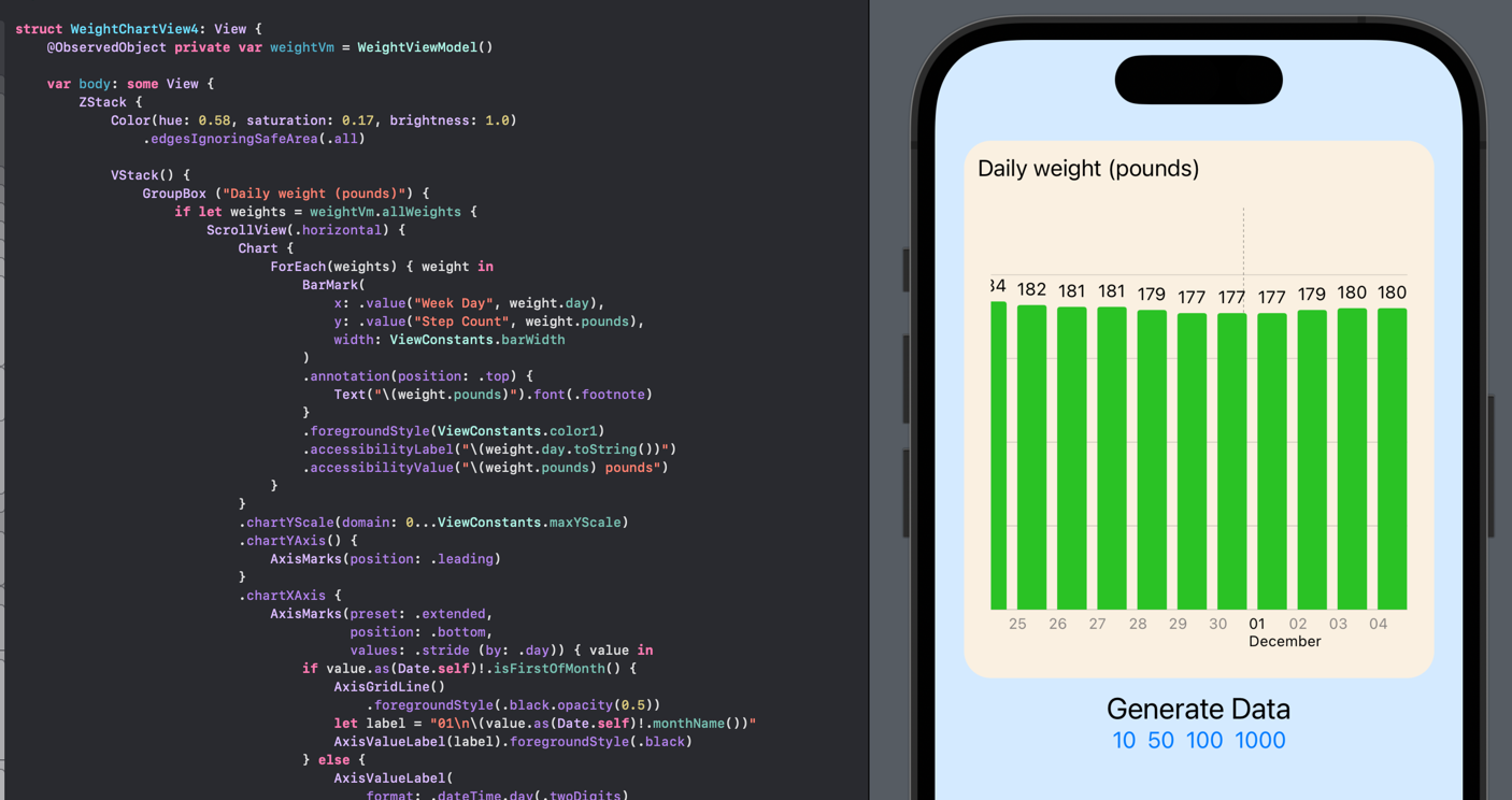

Bar chart with horizontal scrolling to display large number of data points
Conclusion
The default behavior for Swift Charts is to display all the data points in the plot area of the chart. This can result in larger volumes of data being squashed and the chart difficult to interpret. One solution is to wrap the chart in a ScrollView, which requires setting the width of the chart based on the number of sample points to plot. One possible issue with the above code is that the entire chart scrolls, with the result that the y-axis scrolls off screen. It might be better to scroll the plot data but keep the y-axis visible so the scale remains visible.
The code for ScrollingChartsApp is available on GitHub.