Form view in SwiftUI
Form view is used in SwiftUI to present a collection of user input controls, such as text fields and toggle buttons to gather information from the user. Forms are frequently used in settings screens and data entry screens. This article walks through displaying text, toggle buttons, pickers and steppers in a SwiftUI Form.
A Form is a container for grouping controls used for data entry, such as the settings screens or the calendar entry screen in iOS. SwiftUI renders forms in a manner appropriate for the platform and several components in SwiftUI automatically adjust their appearance and behavior when placed inside a form.
Text and TextField
The UI controls can be grouped into sections using the Section container view. A
Section can have a header, content and footer. The header and footer are usually set
as named paramenters with the content specified as a trailing closure. Text can be
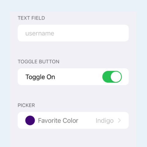
presented in forms as read-only text using Text or as a text field for user input
in a TextField view. The TextField is created with a label, that is displayed as
ghost text in the TextField, and a binding variable, that is updated with the text
the user enters. The binding variable is updated continuously as the user types text
in the field.
This code shows how to add a section with a header and a footer as well as how to add text and a TextField to a form.
 1struct TextFormView: View {
 2    @State var username: String = ""
 3
 4    var body: some View {
 5        Form {
 6            Section(header: Text("Header of a section"),
 7                    footer: Text("Footer of a section can contain extra information about this section")) {
 8                Text("Section Content")
 9            }
10
11            Section(header: Text("Display read-only text"),
12                    footer: Text("")) {
13                Text("Read-only text")
14            }
15
16            Section(header: Text("Text Field for user to edit")) {
17                TextField("Tap to edit text", text: $username)
18            }
19        }
20    }
21}

Toggle Buttons
A Toggle control toggles between on and off states and are very familiar from any
settings screen in iOS. A toggle is created by providing an isOn binding to a
Boolean property and a label. The Label is usually set to a Text view describing the
purpose of the property bound to the toggle. As the label is usually text, a
convenience initializer is provided that takes a string as the first parameter - see
'Contacts' toggle in the code.
 1struct ToggleFormView: View {
 2    @State var isMailOn = true
 3    @State var isContactsOn = false
 4    @State var isMemojiStickersOn = true
 5
 6    var body: some View {
 7        Form {
 8            Section(header: Text("Display Toggle On")) {
 9                Toggle(isOn: $isMailOn, label: {
10                    Text("Mail")
11                })
12            }
13
14            Section(header: Text("Display Toggle Off")) {
15                Toggle("Contacts", isOn: $isContactsOn)
16            }
17
18            Section(header: Text("Emoji"),
19                    footer: Text("Send Memoji and Animoji stickers from your emoji keyboard")) {
20                Toggle("Memoji Stickers", isOn: $isMemojiStickersOn)
21            }
22        }
23    }
24}

Picker
A Picker is used to select one option from a set of mutually exclusive values. In iOS, this is presented like a cell in a navigation list with an arrow on the trailing end to indicate navigation to another view. Selecting the picker presents the list of options in a separate view with the currently selected option marked. The user can select another option from the list, which automatically navigates back to the form view.
A picker is created by providing a selection binding, a label and the content
to display. The selection is bound to a property for the currently selected value.
The label can be set to text to display or a more complex view. The code below uses a
view that displays the selected color in the label. The content is provided from a
list of tuples containing the colors of the rainbow.
 1struct PickerFormView: View {
 2    @State private var selColorIndex = 0
 3    let colors: [(Color, String)] = [
 4        (.red, "Red"),
 5        (.orange, "Orange"),
 6        (.yellow, "Yellow"),
 7        (.green, "Green"),
 8        (.blue, "Blue"),
 9        (Color(red: 75/255, green: 0/255, blue: 130/255), "Indigo"),
10        (Color(red: 238/255, green: 130/255, blue: 238/255), "Violet")
11    ]
12
13    var body: some View {
14        NavigationView {
15            Form {
16                Section(header: Text("Display Picker"),
17                        footer: Text("""
18        Set your favorite color.
19        A Picker is used to allow the user to select one option from a set of mutually exclusive values.
20        """
21                        )
22                ) {
23
24                    Picker(selection: $selColorIndex,
25                           label: pickerLabelView(
26                            title: "Favorite Color",
27                            selColor: colors[selColorIndex].0)
28                    ) {
29                        ForEach(0 ..< colors.count, id: \.self) {
30                            Text(self.colors[$0].1)
31                        }
32                    }
33                }
34            }
35            .navigationTitle("Settings")
36        }
37    }
38}
 1struct pickerLabelView: View {
 2    var title: String
 3    var selColor: Color
 4
 5    var body: some View {
 6        HStack {
 7            Capsule()
 8                .fill(selColor)
 9                .frame(width: 15, height: 25)
10            Text(title)
11        }
12    }
13}

Stepper
A Stepper is a control that provides an increment and decrement action. This can
be used to modify a numeric value and allow the user to increase or decrease it. It
can also take parameters for onIncrement and onDecrement closures to execute when
the controls plus and minus buttons are selected. The numeric stepper in the
following code shows sets a bound number to between 1 and 5 inclusive. The plus
button gets disabled when the maximum number is reached and the minus button gets
disabled when the minimum number is reached. The second stepper cycles through a list
of colors and updates the bound selected color, the onIncrement and onDecrement
functions are set in such a way that the colors cycle around.
 1struct StepperFormView: View {
 2    @State private var selNumber = 2
 3    @State private var selColorIndex = 0
 4
 5    let colors: [(Color, String)] = [
 6        (.red, "Red"),
 7        (.orange, "Orange"),
 8        (.yellow, "Yellow"),
 9        (.green, "Green"),
10        (.blue, "Blue"),
11        (Color(red: 75/255, green: 0/255, blue: 130/255), "Indigo"),
12        (Color(red: 238/255, green: 130/255, blue: 238/255), "Violet")
13    ]
14
15    func incrementStep() {
16        selColorIndex = (selColorIndex + 1) % colors.count
17    }
18
19    func decrementStep() {
20        selColorIndex = (colors.count + selColorIndex - 1) % colors.count
21    }
22
23    var body: some View {
24        Form {
25            Section (header: Text("Display Numeric Stepper"),
26                     footer: Text("Set a number between 1 and 5 inclusive.")) {
27                Stepper(value: $selNumber, in:1...5, step: 1) {
28                    Text("Selected Number: \(selNumber)")
29                }
30            }
31
32            Section (header: Text("Display Stepper"),
33                     footer: Text("""
34Set a color from the rainbow.
35A Stepper control allows the user to have granular control while incrementing or decrementing a value.
36"""
37                     )) {
38                Stepper(onIncrement: incrementStep,
39                        onDecrement: decrementStep) {
40                    HStack {
41                        Circle()
42                            .fill(colors[selColorIndex].0)
43                            .frame(width: 20, height: 20)
44                        Text("\(colors[selColorIndex].1)")
45                    }
46                }
47            }
48        }
49    }
50}

Combining multiple sections
A section may contain multiple controls and a form may contain multiple sections. These controls are combined to create a single form to present to the user.
 1struct SettingsView: View {
 2    @State var username: String = ""
 3    @State var isMemojiStickersOn = true
 4    @State private var selColorIndexPicker = 0
 5    @State private var selColorIndexStepper = 0
 6
 7
 8    let colors: [(Color, String)] = [
 9        (.red, "Red"),
10        (.orange, "Orange"),
11        (.yellow, "Yellow"),
12        (.green, "Green"),
13        (.blue, "Blue"),
14        (Color(red: 75/255, green: 0/255, blue: 130/255), "Indigo"),
15        (Color(red: 238/255, green: 130/255, blue: 238/255), "Violet")
16    ]
17
18    func incrementStep() {
19        selColorIndexStepper = (selColorIndexStepper + 1) % colors.count
20    }
21
22    func decrementStep() {
23        selColorIndexStepper = (colors.count + selColorIndexStepper - 1) % colors.count
24    }
25
26    var body: some View {
27        NavigationView {
28            Form {
29                Section(header: Text("Username")) {
30                    TextField("username", text: $username)
31                }
32
33                Section(header: Text("Emoji"),
34                        footer: Text("Send Memoji and Animoji stickers from your emoji keyboard")) {
35                    Toggle(isOn: $isMemojiStickersOn, label: {
36                        Text("Memoji Stickers")
37                    })
38                }
39
40                Section(header: Text("Favorite Color"),
41                        footer: Text("Set your favorite color.")) {
42                    HStack {
43                        Capsule()
44                            .fill(colors[selColorIndexPicker].0)
45                            .frame(width: 15, height: 25)
46
47                        Picker(selection: $selColorIndexPicker,
48                               label: Text("Favorite Color")) {
49                            ForEach(0 ..< colors.count, id: \.self) {
50                                Text(self.colors[$0].1)
51                            }
52                        }
53                    }
54                }
55
56                Section (header: Text("Rainbow Color"),
57                         footer: Text("Set a color from the rainbow.")) {
58                    Stepper(onIncrement: incrementStep,
59                        onDecrement: decrementStep) {
60                        HStack {
61                            Circle()
62                                .fill(colors[selColorIndexStepper].0)
63                                .frame(width: 20, height: 20)
64                            Text("\(colors[selColorIndexStepper].1)")
65                        }
66                    }
67                }
68            }
69            .navigationTitle("Settings")
70        }
71    }
72}

Showing the settings in a modal sheet
The settings for an App are often presented in a modal dialog. There are more details on modal dialogs discussed in Modal view in SwiftUI. The following code presents the settings form in a sheet View, which can be dismissed by swiping down.
 1struct ShowModalFormView: View {
 2    @State private var isShowingSettings = false
 3
 4    var body: some View {
 5        VStack {
 6            Text("Display settings in a modal form.")
 7                .padding(.vertical, 50)
 8                .padding()
 9
10            Button(action: {
11                isShowingSettings.toggle()
12            }) {
13                Text("Settings")
14            }
15            .sheet(isPresented: $isShowingSettings) {
16                SettingsView()
17            }
18
19            Spacer()
20        }
21    }
22}


Conclusion
Forms in SwiftUI are great to present a collection of user input controls, such as text fields, toggle buttons and pickers to users. They are a convenient mechanism to help the user enter only valid options and are used frequently in settings screens and in quick user input views. This article showed how to use TextField, Toggle buttons, Pickers and Steppers in a SwiftUI Form.
Forms are usually used for data entry, so it is rare to see Text views in Forms. It is much more common to use the header and footer parameters to specify any read-only text to display to the user. The Stepper control is not used as much in the default iOS apps as it used to be, this may be because the Picker provides a better user experience or because the picker can more easily be changed to include further navigation options without much disruption to the user experience.