Modal view in SwiftUI
Modal views are views that are presented over the main application and prevent interaction with the views behind until the modal view is dismissed. There are different types of modal views available in SwiftUI, each designed for a particular function. This article shows the use of Sheets, Alerts, Action Sheets and Popovers and how to interact with these views.
Modal views are used to help users focus on the most important or relevant information. They are also used to ensure users get critical notifications and prevent users from continuing on without taking some action.
There are a number of modal views in SwiftUI
- Sheets
- Alerts
- Action Sheets
- Popover
Sheet - binding to boolean
The sheet view is displayed as a card that almost completely covers the underlying content. It is animated to slide up from the bottom by default and it can be dismissed by swiping down from anywhere on the sheet view. It is usually used to present a form or to display a large amount of content in text and/or graphic format and it should not involve a complex interactive task. The sheet view is used throughout the default iOS apps such as entering a new reminder or adding a new event in calendar. The sheet view is presented by binding to a Boolean value stating whether or not to present the sheet.
 1struct ShowSheetView: View {
 2    @State private var isShowingSheet = false
 3
 4    var body: some View {
 5        VStack {
 6            Text("Select the button below to show instructions in a modal sheet.")
 7                .padding(.vertical, 50)
 8                .padding()
 9
10            Button(action: {
11                isShowingSheet.toggle()
12            }) {
13                Text("Show Instructions")
14            }
15            .sheet(isPresented: $isShowingSheet) {
16                InstructionView()
17            }
18
19            Spacer()
20        }
21    }
22}
 1struct InstructionView: View {
 2    var body: some View {
 3        VStack {
 4            Text("Instructions")
 5                .font(.title)
 6                .fontWeight(.bold)
 7                .padding(50)
 8            Text("Make Tea")
 9                .font(.headline)
10                .fontWeight(.bold)
11            Text("""
121. Fill the kettle with water.
132. Boil the water in the kettle.
143. Pour some of the boiled water into a cup.
154. Empty the cup.
165. Put the teabag in the cup.
176. Fill the cup to 80% with the boiled water.
187. Remove teabag after a minute or two.
198. Add milk to the cup (if required).
209. Stir the tea.
2110. Drink and enjoy!.
22""")
23
24            Spacer()
25        }
26        .padding()
27    }
28}

Sheet - binding to item
The Sheet view can also be used to display content or another form where the content
in the sheet view is specific to the item selected. This is done by binding the sheet
to an item rather than a boolean value. The following code uses a list of colors that
are bound to a rainbow object. The onTapGesture is used to set the selected color
and display a ColorDetail view in a modal sheet. The user interaction with the
sheet is the same, with the detail view sliding up from the bottom and swipe-down
gesture to dismiss.
 1struct SheetItemView: View {
 2    @State var colorDetail: ColorItem?
 3
 4    var body: some View {
 5        List(rainbow) { colorItem in
 6            Text(colorItem.name)
 7            .font(.title)
 8            .frame(maxWidth: .infinity, maxHeight: .infinity)
 9            .onTapGesture {
10                self.colorDetail = colorItem
11            }
12            .sheet(item: $colorDetail){selectedColor in
13                ColorDetailView(colorItem: selectedColor)
14            }
15        }
16    }
17}
ColorDetailView to show in the sheet view.
 1struct ColorDetailView: View {
 2    var colorItem: ColorItem
 3
 4    var body: some View {
 5        ScrollView {
 6            VStack {
 7                Spacer()
 8                    .frame(height: 100)
 9
10                ZStack {
11                    Circle()
12                        .fill(colorItem.col)
13                        .frame(width: 200, height: 200)
14
15                    Circle()
16                        .fill(
17                            AngularGradient(
18                                gradient: Gradient(
19                                    colors: [
20                                        Color(red: 1.0, green: 1.0, blue: 1.0, opacity: 0.85),
21                                        Color(red: 1.0, green: 1.0, blue: 1.0, opacity: 0.00),
22                                    ]),
23                                center: .center
24                            )
25                        )
26                        .rotationEffect(Angle(degrees: -90))
27                        .frame(width: 160, height: 160)
28                }
29
30                Text(colorItem.name)
31                    .font(.largeTitle)
32                    .fontWeight(.heavy)
33                    .foregroundColor(colorItem.col)
34                    .padding()
35
36                HStack {
37                    VStack(alignment: .trailing) {
38                        Text("Wavelength:")
39                        Text("Hexadecimal:")
40                    }
41                    VStack(alignment: .trailing) {
42                        Text(colorItem.wavelength)
43                        Text(colorItem.hex)
44                    }
45                }
46
47                Spacer()
48            }
49        }
The colors of the rainbow used to represent model data.
 1struct ColorItem: Identifiable {
 2    let id = UUID()
 3    let name: String
 4    let col: Color
 5    let wavelength: String
 6    let hex: String
 7}
 8
 9let rainbow = [
10    ColorItem(name: "Red",
11              col: Color(.red),
12              wavelength: "625–740",
13              hex: "#ff0000"),
14    ColorItem(name: "Orange",
15              col: Color(.orange),
16              wavelength: "585-620",
17              hex: "#ffa500"),
18    ColorItem(name: "Yellow",
19              col: .yellow,
20              wavelength: "570–590",
21              hex: "#ffff00"),
22    ColorItem(name: "Green",
23              col: .green,
24              wavelength: "495–570",
25              hex: "#008000"),
26    ColorItem(name: "Blue",
27              col: .blue,
28              wavelength: "450-495",
29              hex: "#0000ff"),
30    ColorItem(name: "Indigo",
31              col: Color(red: 75/255, green: 0/255, blue: 130/255),
32              wavelength: "445-464",
33              hex: "#4b0082"),
34    ColorItem(name: "Violet",
35              col: Color(red: 238/255, green: 130/255, blue: 238/255),
36              wavelength: "380-450",
37              hex: "#ee82ee")
38]

Sheet with dismiss button
The swipe down gesture to dismiss is fantastic and comes free with SwiftUI framework,
but it may not be intuitive to customers to use. It is recommended that a button is
provided on the sheet view to help users dismiss the sheet view. This done by using
the PresentationMode environment setting that is added to ColorDetailView . The
dismiss button is added as an overlay, so the button is always visible on the sheev
view. SheetItemView does not require any changes and the swipe-down gesture still
works as before.
 1struct ColorDetailView: View {
 2    @Environment(\.presentationMode) var mode
 3
 4    var colorItem: ColorItem
 5
 6    var body: some View {
 7        ScrollView {
 8
 9    // ... same code as above  ...
10
11        }
12        .overlay (
13            VStack {
14                Spacer()
15                HStack {
16                    Button(action: {
17                        self.mode.wrappedValue.dismiss()
18                    }, label: {
19                        HStack {
20                            Image(systemName: "xmark.square")
21                            Text("Dismiss")
22                        }
23                        .foregroundColor(.red)
24                        .padding(10)
25                        .cornerRadius(20)
26                    })
27                    .padding()
28                }
29            }
30        )
31        .navigationBarHidden(true)
32    }
33}


Full Screen Modal View
fullScreenCover is a variation on the Sheet view that displays the modal view in full screen mode. This completely blocks the content behind the Full Screen View. The Full screen view slides up from the bottom in the same manner as sheet, but the swipe-down gesture does not dismiss the view. A dismiss button is required to dismiss the full screen view and the view slides down similar to the sheet view.
 1struct FullScreenDismissView: View {
 2    @State var colorDetail: ColorItem?
 3
 4    var body: some View {
 5        List(rainbow) { colorItem in
 6            Text(colorItem.name)
 7            .font(.title)
 8            .frame(maxWidth: .infinity, maxHeight: .infinity)
 9            .onTapGesture {
10                self.colorDetail = colorItem
11            }
12            .fullScreenCover(item: $colorDetail){selectedColor in
13                ColorDetailView(colorItem: selectedColor)
14            }
15        }
16    }
17}

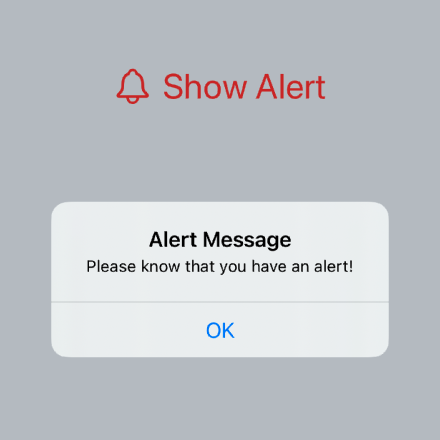
Alert
Another common modal view is an Alert view. These are used to deliver essential information. The Alert view interrupts the user experience and should be used sparingly, when important information needs to be presented or some action needs to be taken.
 1struct ShowAlertView: View {
 2    @State private var isPresented = false
 3
 4    var body: some View {
 5        VStack {
 6            Spacer()
 7                .frame(height:100)
 8
 9            Button(action: {
10                isPresented = true
11            }, label: {
12                HStack {
13                    Image(systemName: "bell")
14                    Text("Show Alert")
15                }
16                .font(.title)
17                .foregroundColor(.red)
18                .padding(10)
19                .cornerRadius(20)
20            })
21            .alert(isPresented: $isPresented) {
22                Alert(title: Text("Alert Message"),
23                      message: Text("Please know that you have an alert!"),
24                      dismissButton: .default(Text("OK")))
25            }
26            Spacer()
27        }
28    }
29}

Action Sheet
ActionSheet is a kind of mixture of Sheet and Alert. It presents an alert type message, but slides up from the bottom of the screen and fades out the main content. It can contain a number of button options and selecting one of these causes the ActionSheet to slide down off screen again.
 1struct ShowActionSheetView: View {
 2    @State private var isShowingActionSheet = false
 3    @State private var message = ""
 4
 5    var body: some View {
 6        VStack {
 7            Spacer()
 8                .frame(height:50)
 9
10            Button(action: {
11                isShowingActionSheet = true
12            }, label: {
13                HStack {
14                    Image(systemName: "bolt.fill")
15                    Text("Show Action Sheet")
16                }
17                .font(.title)
18                .foregroundColor(.green)
19                .padding(10)
20                .cornerRadius(20)
21            })
22            .actionSheet(isPresented: $isShowingActionSheet) {
23                ActionSheet(
24                    title: Text("Delete all of the files?"),
25                    message: Text("This action cannot be undone."),
26                    buttons:[
27                        .destructive(Text("Delete Files")) {
28                            self.message = "All files deleted!"
29                        },
30                        .cancel() {self.message = ""}
31                    ]
32                )}
33
34            Text(message)
35                .padding(.vertical, 50)
36                .foregroundColor(.red)
37
38            Spacer()
39        }
40    }
41}

Popover
The popover view can be used to display additional information on an item. On iPhone popovers are displayed as a sheet view that slides up from the bottom and is dismissed with the swipe-down gesture. On the iPad, the popovers are displayed in balloons anchored to the view that last set the item to which the popover is bound.
 1struct ColorPopView: View {
 2    var colorItem: ColorItem
 3
 4    var body: some View {
 5        VStack {
 6            HStack {
 7                Image(systemName: "seal.fill")
 8                Text("\(colorItem.name)")
 9                    .fontWeight(.heavy)
10            }
11            .font(.largeTitle)
12            .foregroundColor(colorItem.col)
13            .padding()
14            Text("\(colorItem.wavelength)")
15        }
16    }
17}
 1struct ShowPopOverView: View {
 2    @State var indigoState: ColorItem?
 3    @State var greenState: ColorItem?
 4
 5    var body: some View {
 6        VStack(spacing: 150) {
 7            Spacer()
 8                .frame(height: 20)
 9
10            Button(rainbow[3].name, action: {
11                greenState = rainbow[3]
12            })
13            .popover(item: $greenState) { c in
14                ColorPopView(colorItem: c)
15            }
16
17            Button(rainbow[5].name, action: {
18                indigoState = rainbow[5]
19            })
20            .popover(item: $indigoState) { c in
21                ColorPopView(colorItem: c)
22            }
23
24            Spacer()
25        }
26    }
27}


Conclusion
There are a number of different mechanisms of displaying modal views to the user in SwiftUI.
- Sheets: - use to display information or a short interactive form
- Alerts: - use to interrupt the user to present critical information
- Action Sheets: - use to interrupt the user with options for different actions to take
- Popover: - use to present additional information on a particular item
Modal views can be a great way to present a small task and ensure the application stays focussed on the taks until it is complete. Alerts are essential for critical information, but lose effectiveness if they are overused. I love the way popovers are presented on iPad, but not on iPhone. There are issues with the way the popovers are anchored on iPad and the parameters for setting the anchor are ignored on iOS and only used for macOS. It is probably better to stick to Sheet on iPhone rather than popover.