Flip a card in SwiftUI
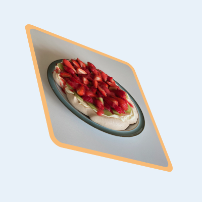
Card-style views are common in iOS apps as they provide a nice way of visually separating data on a small screen. This article walks through how to animate the flipping of a card in SwiftUI.
Initial shape
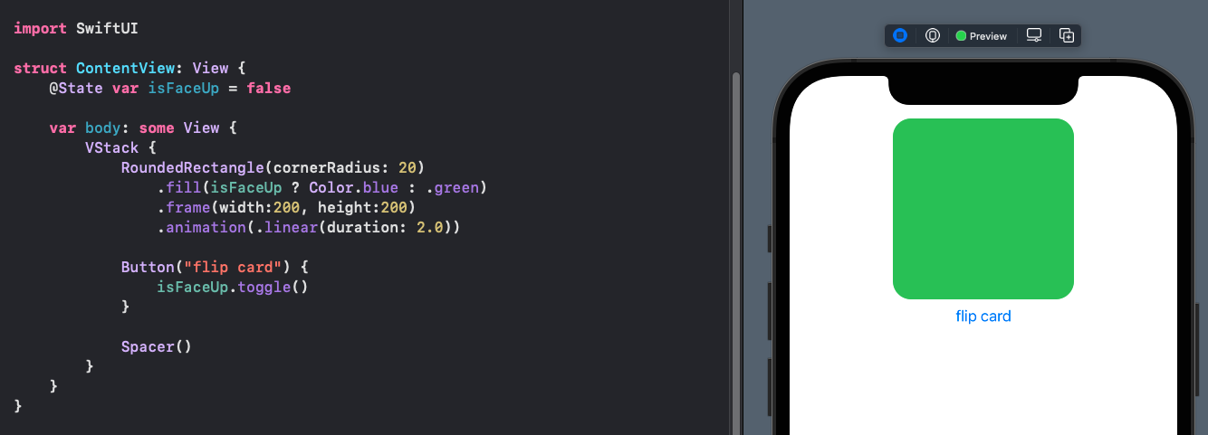
Start with a RoundedRectangle with two colors for each side. When the "flip card" button is touched the color of the card changes. The animation is set to 2 seconds to exaggerate the change. One color fades out and the other color fades in, but the card does not flip.
 1struct ContentView: View {
 2    @State var isFaceUp = false
 3
 4    var body: some View {
 5        VStack {
 6            RoundedRectangle(cornerRadius: 20)
 7                .fill(isFaceUp ? Color.blue : .green)
 8                .frame(width:200, height:200)
 9                .animation(.linear(duration: 2.0))
10
11            Button("flip card") {
12                isFaceUp.toggle()
13            }
14
15            Spacer()
16        }
17    }
18}
Add image to Card
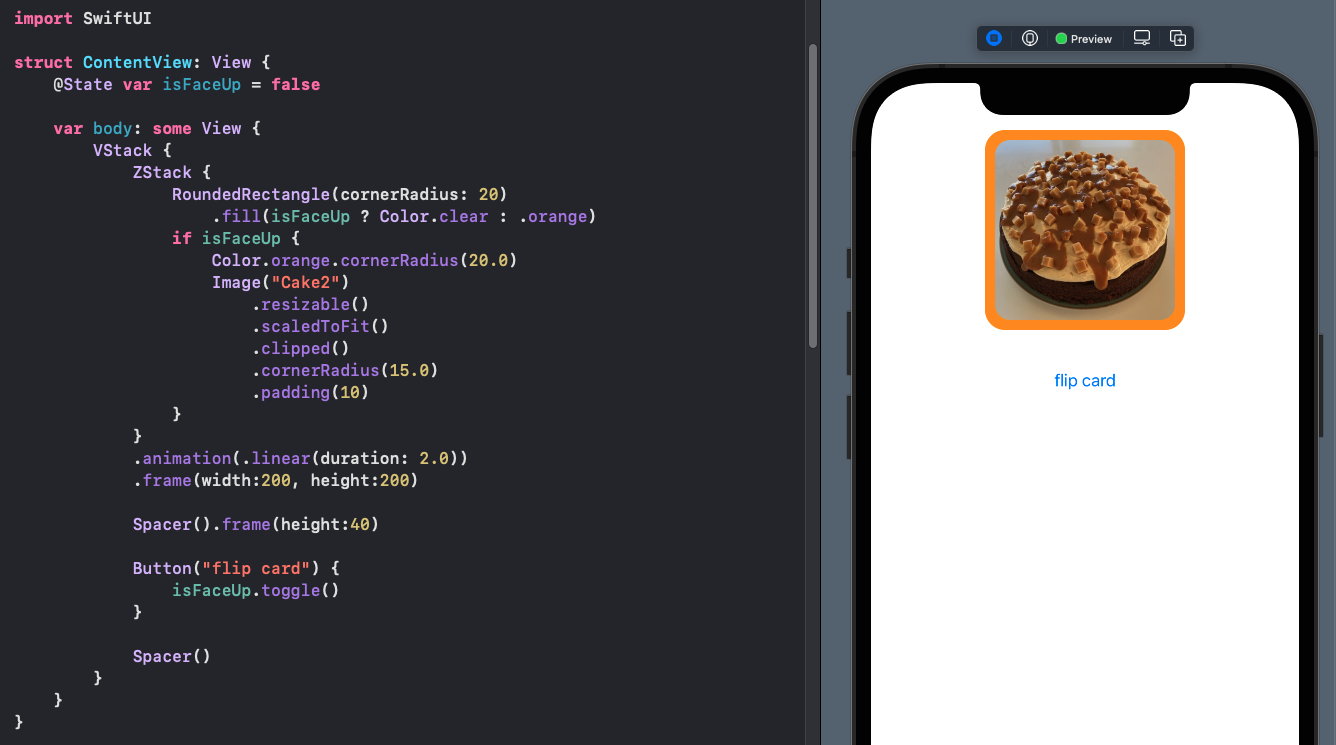
The card is updated to a ZStack that contains an image when the card is face up. Images are added to the assets as described in Displaying Images in SwiftUI. The card does not flip, but fades from the front to the back of the card.
 1struct ContentView: View {
 2    @State var isFaceUp = false
 3
 4    var body: some View {
 5        VStack {
 6            ZStack {
 7                RoundedRectangle(cornerRadius: 20)
 8                    .fill(isFaceUp ? Color.clear : .orange)
 9                if isFaceUp {
10                    Color.orange.opacity(0.5).cornerRadius(20.0)
11                    Image("Cake2")
12                        .resizable()
13                        .scaledToFit()
14                        .clipped()
15                        .cornerRadius(15.0)
16                        .padding(10)
17                }
18            }
19            .animation(.linear(duration: 2.0))
20            .frame(width:200, height:200)
21
22            Spacer().frame(height:40)
23
24            Button("flip card") {
25                isFaceUp.toggle()
26            }
27
28            Spacer()
29        }
30    }
31}
Rotate Card in 3D
The code for the Card is extracted into a separate view CardView. The SwiftUI view
modifier rotation3DEffect allows the rotation of a view in a combination of the
3D axes. The following shows the effect of rotating the card in each of the 3 axes.
Specifying the y-axis shows a rotation of the card along the vertical axis. There is
still the issue of the image appearing through the card before the face of the card
is visible, although the image is reversed and seems to be in perspective with the
card.
 1struct CardView: View {
 2    var isFaceUp: Bool
 3    var imageName = "Cake1"
 4    var axis:(CGFloat,CGFloat,CGFloat) = (1.0,0.0,0.0)
 5
 6    var body: some View {
 7        ZStack {
 8            RoundedRectangle(cornerRadius: 20)
 9                .fill(Color.orange.opacity(isFaceUp ? 0.5 : 1.0))
10            if isFaceUp {
11                Image(imageName)
12                    .resizable()
13                    .scaledToFit()
14                    .clipped()
15                    .cornerRadius(15.0)
16                    .padding(10)
17            }
18        }
19        .rotation3DEffect(
20            Angle.degrees(isFaceUp ? 0: 180),
21            axis: axis
22        )
23    }
24}
 1struct ContentView: View {
 2    @State var isFaceUp = false
 3
 4    var body: some View {
 5        VStack {
 6            Text("Flip card on each Axis")
 7                .font(.title)
 8                .fontWeight(.bold)
 9
10            HStack(spacing:40) {
11                VStack {
12                    CardView(isFaceUp: isFaceUp, imageName: "Cake2", axis: (1,0,0))
13                        .animation(.linear(duration: 2.0))
14                        .frame(width:100, height:100)
15                    Text("x-axis")
16                }
17                VStack {
18                    CardView(isFaceUp: isFaceUp, imageName: "Cake3", axis: (0,1,0))
19                        .animation(.linear(duration: 2.0))
20                        .frame(width:100, height:100)
21                    Text("y-axis")
22                }
23                VStack {
24                    CardView(isFaceUp: isFaceUp, imageName: "Cake5", axis: (0,0,1))
25                        .animation(.linear(duration: 2.0))
26                        .frame(width:100, height:100)
27                    Text("z-axis")
28                }
29            }
30
31            Spacer().frame(height:40)
32
33            Button("flip card") {
34                isFaceUp.toggle()
35            }
36
37            Spacer()
38        }
39    }
40}
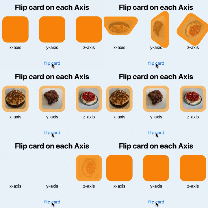
Use 3DRotationEffect to flip a card on each axis
Use custom ViewModifier
Define a custom ViewModifier with the front and back opacity set and the
rotation3DEffect set to rotate on the y axis. The common way to use ViewModifiers
is to define an extension to View itself that incorporates the view modifier. The
extension function is cardFlip that takes a boolean parameter as to whether or not
the card is facing up or down.
 1struct CardFlip: ViewModifier {
 2    var isFaceUp: Bool
 3
 4    func body(content: Content) -> some View {
 5        ZStack {
 6            RoundedRectangle(cornerRadius: 20)
 7                .fill(Color.orange.opacity(isFaceUp ? 0.5 : 1.0))
 8            content.opacity(isFaceUp ? 1.0 : 0.0)
 9        }
10        .rotation3DEffect(
11            Angle.degrees(isFaceUp ? 0: 180),
12            axis: (0,1,0),
13            perspective: 0.3
14        )
15    }
16}
17
18
19extension View {
20    func cardFlip(isFaceUp: Bool) -> some View {
21        modifier(CardFlip(isFaceUp: isFaceUp))
22    }
23}
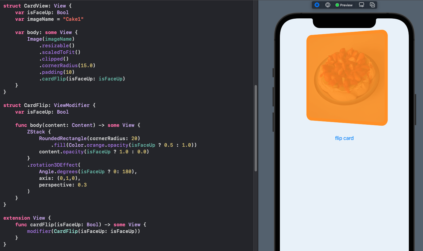
The CardView is updated to use the new cardFlip function.
 1struct CardView: View {
 2    var isFaceUp: Bool
 3    var imageName = "Cake1"
 4
 5    var body: some View {
 6        Image(imageName)
 7            .resizable()
 8            .scaledToFit()
 9            .clipped()
10            .cornerRadius(15.0)
11            .padding(10)
12            .cardFlip(isFaceUp: isFaceUp)
13    }
14}
Explicit animation is added to the button action with the duration set to 3 seconds to slow down the animation. It can be seen that the image fading in through the card is still an issue.
 1struct ContentView: View {
 2    @State var isFaceUp = false
 3
 4    var body: some View {
 5       VStack {
 6           HStack(spacing:40) {
 7               VStack {
 8                   CardView(isFaceUp: isFaceUp, imageName: "Cake5")
 9                       .frame(width:250, height:250)
10               }
11           }
12
13           Spacer().frame(height:40)
14
15           Button("flip card") {
16               withAnimation(.easeInOut(duration: 3.0)) {
17                   isFaceUp.toggle()
18               }
19           }
20
21           Spacer()
22       }
23    }
24}
Use AnimatableModifier
I have covered AnimatableModifier before in How to animate a Shape change in
SwiftUI and related articles. One aspect of AnimatableModifier is that is conforms
to ViewModifier protocol. Change the CardFlip struct to adopt AnimatableModifier
protocol. CardFlip has to provide animatableData, so a private property of
rotationAngle is added to the struct. The rotationAngle will change as the card is
rotated during the rotation3DEffect and is set to zero degrees when the card is face
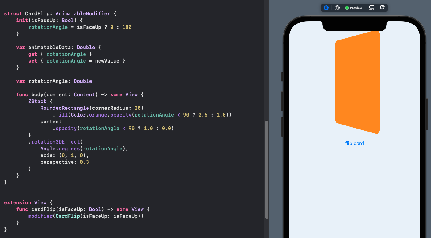
up and 180 degrees when the card is face down. The opacities for the front and back
of the card are changed all at once when the rotationAngle is greater than or less
than 90 degrees. No changes are needed in the CardView or the ContentView and the
card flip now shows the front image only when some of the front of the card is being
shown.
 1struct CardFlip: AnimatableModifier {
 2    init(isFaceUp: Bool) {
 3        rotationAngle = isFaceUp ? 0 : 180
 4    }
 5
 6    var animatableData: Double {
 7        get { rotationAngle }
 8        set { rotationAngle = newValue }
 9    }
10
11    var private rotationAngle: Double
12
13    func body(content: Content) -> some View {
14        ZStack {
15            RoundedRectangle(cornerRadius: 20)
16                .fill(Color.orange.opacity(rotationAngle < 90 ? 0.5 : 1.0))
17            content
18                .opacity(rotationAngle < 90 ? 1.0 : 0.0)
19        }
20        .rotation3DEffect(
21            Angle.degrees(rotationAngle),
22            axis: (0, 1, 0),
23            perspective: 0.3
24        )
25    }
26}
Change Axis or rotation
Change the axis of rotation by specifying the axis in the CardFlip
AnimatableModifier and using this axis in the rotation3DEffect.
 1struct CardFlip: AnimatableModifier {
 2    private var rotationAngle: Double
 3    private var axis:(CGFloat, CGFloat, CGFloat)
 4
 5    init(isFaceUp: Bool, axis:(CGFloat, CGFloat, CGFloat)) {
 6        rotationAngle = isFaceUp ? 0 : 180
 7        self.axis = axis
 8    }
 9
10    var animatableData: Double {
11        get { rotationAngle }
12        set { rotationAngle = newValue }
13    }
14
15    func body(content: Content) -> some View {
16        ZStack {
17            RoundedRectangle(cornerRadius: 20)
18                .fill(Color.orange.opacity(rotationAngle < 90 ? 0.0 : 1.0))
19            content
20                .opacity(rotationAngle < 90 ? 1.0 : 0.0)
21        }
22        .rotation3DEffect(
23            Angle.degrees(rotationAngle),
24            axis: (self.axis),
25            perspective: 0.3
26        )
27    }
28}
29
30extension View {
31    func cardFlip(isFaceUp: Bool, axis:(CGFloat, CGFloat, CGFloat)) -> some View {
32        modifier(CardFlip(isFaceUp: isFaceUp, axis: axis))
33    }
34}
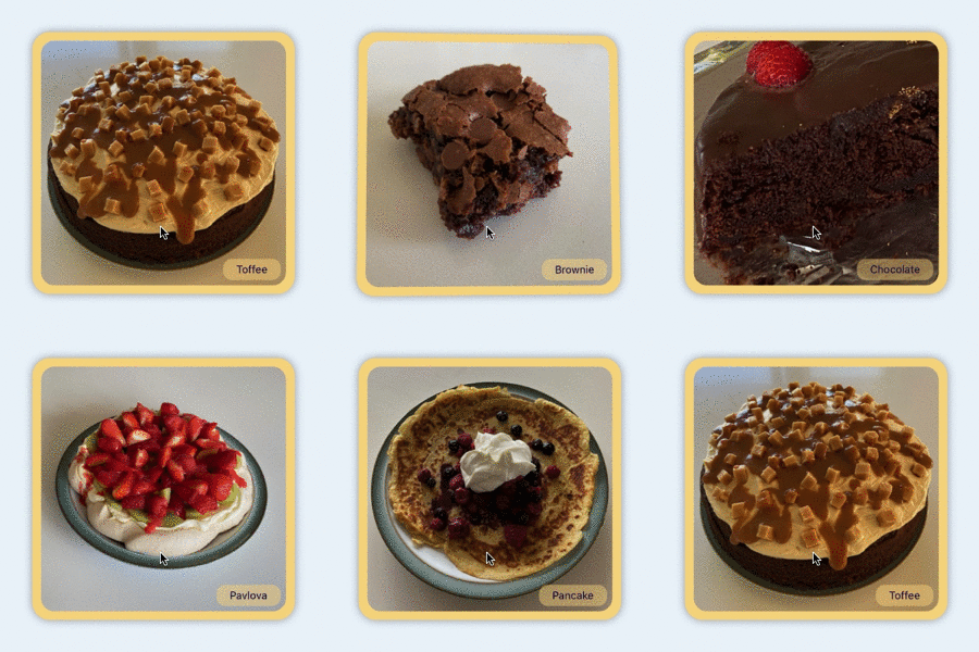
The CardView is updated to include its background color and a label in the bottom
right hand corner. Note that the cardFlip modifier is applied to the entire ZStack
so that all of the contents appear and disappear at the same time.
 1struct CardView: View {
 2    var isFaceUp: Bool
 3    var imageName = "pavlova"
 4    var axis: (CGFloat, CGFloat, CGFloat) = (0, 1, 0)
 5
 6    var body: some View {
 7        ZStack {
 8            RoundedRectangle(cornerRadius: 20)
 9                .fill(Color(red: 0.97, green: 0.85, blue: 0.55))
10                .shadow(radius: 5)
11            Image(imageName)
12                .resizable()
13                .scaledToFit()
14                .clipped()
15                .cornerRadius(15.0)
16                .padding(10)
17            VStack {
18                Spacer()
19                HStack {
20                    Spacer()
21                    Text(imageName.capitalized)
22                        .font(.caption)
23                        .foregroundColor(Color(red: 0.09, green: 0, blue: 0.30))
24                        .padding(5)
25                        .padding(.horizontal, 10)
26                        .background(Color(red: 0.97, green: 0.85, blue: 0.55).opacity(0.5))
27                        .cornerRadius(10)
28                }
29            }
30            .padding()
31        }
32        .cardFlip(isFaceUp: isFaceUp, axis: axis)
33    }
34}
The ContentView is updated with arrays of images and rotation directions and these
are cycled through with each card flip when the card is face down.
 1struct ContentView: View {
 2    @State var isFaceUp = false
 3    @State var imageIndex = 0
 4    @State var dirIndex = 0
 5
 6    let images = ["pancake", "toffee", "brownie", "chocolate", "pavlova"]
 7    let directions: [(CGFloat, CGFloat, CGFloat)] = [(0,1,0), (1,0,0), (1,1,0)]
 8
 9    private func flip() {
10        if !isFaceUp {
11            imageIndex = (imageIndex + 1) % images.count
12            dirIndex = (dirIndex + 1) % directions.count
13        }
14        isFaceUp.toggle()
15    }
16
17    var body: some View {
18        VStack {
19            Spacer().frame(height:80)
20
21            VStack {
22                CardView(isFaceUp: isFaceUp,
23                         imageName: images[imageIndex],
24                         axis: directions[dirIndex])
25                    .frame(width:300, height:300)
26                    .onTapGesture {
27                        withAnimation(.easeInOut(duration: 1.0)) {
28                            flip()
29                        }
30                    }
31            }
32
33            Spacer()
34        }
35    }
36}
Flip cards - face changes when angle is greater than 90 degrees
Conclusion
It is relatively easy to define two sides of a card, in SwiftUI, using two views in a ZStack with the opacity of each view changed to only show one at a time. When animating from one state to the other, the default is to fade one view in and fade the other one out simultaneously. SwiftUI provides rotation3DEffect to rotate a view in three dimensions around a specified axis of rotation. Setting the angle of rotation to 0 degrees for one state and 180 degrees for the other state allows us to animate the rotation of the views, giving the impression of a card. The challenge is the image fades in through the back of the card and this is resolved by using an AnimatableModifier that uses the angle or rotation as the animatableData. The visibility on the image on the front of the card becomes totally visible when the rotation angle is greater than 90 degrees and the back of the card is visible when the rotation angle is less than 90 degrees.