Displaying Images in SwiftUI
Images can be used in a variety of ways to create engaging and entertaining iOS Apps. Images can be used as backgrounds, icons, buttons and to improve content. This article shows how to add an image in Xcode and goes through some of the display modifiers to use to control the image display.
Add Image to Xcode Project
First add an image to the Xcode project by dragging the image from finder and
dropping onto the Xcode Assets. Dropping the image will automatically create a new
image set. The image can also be added by using the + button and importing the
image from the file system.

Rename the image set to "tree" - this name will be used to reference the image in the Swift code.

Display Image
The image can be displayed using the image view in SwiftUI. The name of the image is passed in as a parameter to the image view. Only part of the image is displayed as the image is high resolution
1Image("tree")

Fit entire image
The modifier resizable is used to display the entire image on the screen.
Unfortunately, this stretches the image to fill the entire screen. The displayed
image is stretched vertically in portrait and horizontally when in landscape mode.
1Image("tree")
2    .resizable()

Keep image aspect ratio
The aspect ratio of the image can be maintained by either using scaledToFit or
aspectRatio modifiers. This scaledToFit method is equivalent to calling aspectRatio
with a nil aspectRatio and a content mode of fit. Using nil as aspectRatio maintains
the current aspect ratio in the resulting view. Both of these result in the same
image shown. The image now stretches to whichever side it hits first, in the tree
image this is the shorter side of the phone in both orientations.
1Image("tree")
2    .resizable()
3    .scaledToFit()
1Image("tree")
2    .resizable()
3    .aspectRatio(contentMode: .fit)
The preview is modified to show the view in portrait and landscape mode, which makes it quicker to make changes and see the results. The iOS device cannot be rotated in preview mode, but a fixed layout can be used specifying the width and height.
 1struct ContentView_Previews: PreviewProvider {
 2    static var previews: some View {
 3        Group {
 4            ContentView()
 5                .previewDevice("iPhone 12")
 6            ContentView()
 7                .previewLayout(.fixed(width: 2532/3, height: 1170/3))
 8        }
 9    }
10}

resizable and scaledtofit modifiers keeps aspect ratio
Display image from edge to edge
The default is to fill the safe area of the screen on iOS devices. This can be
overridden with edgesIgnoringSafeArea as follows. scaledToFill is the same as
aspectRatio(contentMode: .fill) resulting the image filling the available space
with the shortest side and cropping the longer side.
1Image("tree")
2    .resizable()
3    .scaledToFill()
4    .edgesIgnoringSafeArea(.all)

resizable, scaledtofill and edgesIgnoringSafeArea modifiers keeps aspect ratio and fills screen
Position image in frame
Images are often combined with other content as they are used to enhance the look and feel of an App. Image views can be combined with other views and laid out using Stacks.
 1VStack {
 2    VStack(spacing: 20) {
 3        Image("tree")
 4            .resizable()
 5            .scaledToFill()
 6            .clipped()
 7            .cornerRadius(10)
 8
 9        Text("Tree on the coast")
10
11        Spacer()
12    }
13    .frame(width: 250, height: 230)
14    .padding(20)
15    .background(Color(red: 200/255, green: 200/255, blue: 230/255))
16    .cornerRadius(20)
17
18    Spacer()
19}

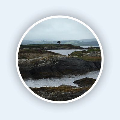
Clip an image to a circle
A common use of images is in icons or user avatars and the images are presented in a circular frame. This can be achieved using clipshape modifier. The image is clipped to a particular shape such as a circle, ellipse or capsule and the image can be set to fit the shape or fill the shape. A border can be added using an overlay of the same shape and the use of a shadow can help the image pop out.
 1ScrollView {
 2    VStack(spacing:100) {
 3        HStack {
 4            VStack {
 5                Image("tree")
 6                    .resizable()
 7                    .scaledToFit()
 8                    .frame(width: 250)
 9                Text("frame")
10                    .font(.title)
11            }
12            VStack {
13                Image("tree")
14                    .resizable()
15                    .scaledToFit()
16                    .frame(width: 250)
17                    .clipShape(Circle())
18                Text("Circle")
19                    .font(.title)
20            }
21
22            VStack {
23                Image("tree")
24                    .resizable()
25                    .scaledToFit()
26                    .frame(width: 250)
27                    .clipShape(Circle())
28                    .overlay(Circle().stroke(Color.white, lineWidth: 3))
29                    .shadow(radius:3)
30                Text("Border and Shadow")
31                    .font(.title)
32            }
33        }
34
35        HStack(spacing:50) {
36            Text("Ellipse")
37                .font(.largeTitle)
38
39            Image("tree")
40                .resizable()
41                .scaledToFit()
42                .frame(width: 250)
43                .clipShape(Ellipse())
44                .overlay(Ellipse().stroke(Color.white, lineWidth: 3))
45                .shadow(color: Color(red: 200/255, green: 200/255, blue: 230/255), radius: 10)
46
47            Image("tree")
48                .resizable()
49                .scaledToFill()
50                .frame(width: 150, height: 250)
51                .clipShape(Ellipse())
52                .overlay(Ellipse().stroke(Color(red: 200/255, green: 200/255, blue: 230/255), lineWidth: 3))
53                .shadow(color: Color(red: 200/255, green: 200/255, blue: 230/255), radius: 10)
54
55            Spacer()
56        }
57
58        HStack(spacing:50) {
59            Text("Capsule")
60                .font(.largeTitle)
61
62            Image("tree")
63                .resizable()
64                .scaledToFit()
65                .frame(width: 250)
66                .clipShape(Capsule())
67                .overlay(Capsule().stroke(Color.white, lineWidth: 3))
68                .shadow(radius: 10)
69
70            Image("tree")
71                .resizable()
72                .scaledToFill()
73                .frame(width: 150, height: 250)
74                .clipShape(Capsule())
75                .overlay(Capsule().stroke(Color.white, lineWidth: 3))
76                .shadow(radius: 10)
77
78            Spacer()
79        }
80
81        Spacer()
82    }
83    .padding()
84}

Image clipped to different shapes such as circle or ellipse
Add text overlay
In addition to adding a border, an overlay can also be used to add text to an image.
 1VStack {
 2    Image("tree")
 3        .resizable()
 4        .scaledToFit()
 5        .overlay(
 6            Text("Lonely tree on the wild atlantic shore")
 7                .font(.system(.title, design:.rounded))
 8                .fontWeight(.heavy)
 9                .padding()
10                .background(Color(white: 0.9, opacity: 0.5))
11                .cornerRadius(20),
12            alignment: .bottom
13        )
14    Spacer()
15}

Conclusion
It is easy to add images to iOS apps using the SwiftUI framework and these can be used to create a more engaging, interactive experience for users. The images can be set to the desired size, cropped to any particular shape and have text and other views overlaid on top of them.