Create Activity Rings in SwiftUI
Activity Rings have become ubiquitous since the introduction of the Apple Watch. The default is to have three circular activity rings for move, exercise and stand goals for the day. An Activity Ring is a type of circular progress bar that start at 12 O'Clock in clock notation and extends clockwise as activity progresses. A significant aspect of the activity ring is to show progress over 100%, so that if one has an exercise daily target of 30 minutes and 45 minutes or exercise are completed in a single day, then the Activity Ring should display 150%.
Start with Circular Progress Bar
Activity Rings are similar to the circular Progress indicator described in How to
create a progress indicator in SwiftUI. The one limitation of this is the lack of
the rounded leading edge once 100% progress has been reached. The color gradient
allows one to see the level of activity reached, but this would be lost if a solid
color were used. One slight change is made to CircularProgressView to remove the
setting of the size within the CircularProgressView and allow it to be set in the
calling View.
 1struct CircularProgressView: View {
 2    var progress: Double
 3
 4    var body: some View {
 5        let progressText = String(format: "%.0f%%", progress * 100)
 6        let purpleAngularGradient = AngularGradient(
 7            gradient: Gradient(colors: [
 8                Color(red: 200/255, green: 168/255, blue: 240/255),
 9                Color(red: 71/255, green: 33/255, blue: 158/255)
10            ]),
11            center: .center,
12            startAngle: .degrees(0),
13            endAngle: .degrees(360.0 * progress))
14
15        ZStack {
16            Circle()
17                .stroke(Color(.systemGray4), lineWidth: 20)
18            Circle()
19                .trim(from: 0, to: CGFloat(self.progress))
20                .stroke(
21                    purpleAngularGradient,
22                    style: StrokeStyle(lineWidth: 20, lineCap: .round))
23                .rotationEffect(Angle(degrees: -90))
24                .overlay(
25                    Text(progressText)
26                        .font(.system(size: 36, weight: .bold, design:.rounded))
27                        .foregroundColor(Color(.systemGray))
28                )
29        }
30    }
31}
A sample of different progress percentages show that the rounded leading edge is lost once the percentage reaches 100%.
 1struct ContentView: View {
 2    var body: some View {
 3        VStack {
 4            HStack {
 5                CircularProgressView(progress: 0.25)
 6                CircularProgressView(progress: 0.75)
 7            }
 8            .frame(height:150)
 9            .padding()
10
11            HStack {
12                CircularProgressView(progress: 1.0)
13                CircularProgressView(progress: 1.25)
14            }
15            .frame(height:150)
16            .padding()
17
18            HStack {
19                CircularProgressView(progress: 2.0)
20                CircularProgressView(progress: 4.25)
21            }
22            .frame(height:150)
23            .padding()
24
25            Spacer()
26        }
27    }
28}

Limitations of using Circular Progress View as Activity Ring
Add arc to the ZStack
The first attempt is to add an arc for the segment of the circle over the 100%. This is truly awful, the color does not blend in correctly and the animation shows the main circular activity growing and then the extra arc fading in. This approach does not address the display when the value is an even multiple of 100%.
 1struct ActivityRingView: View {
 2    var progress: Double
 3
 4    var body: some View {
 5        let purpleAngularGradient = AngularGradient(
 6            gradient: Gradient(colors: [
 7                Color(red: 200/255, green: 168/255, blue: 240/255),
 8                Color(red: 71/255, green: 33/255, blue: 158/255)
 9            ]),
10            center: .center,
11            startAngle: .degrees(0),
12            endAngle: .degrees(360.0 * progress))
13
14        ZStack {
15            Circle()
16                .stroke(Color(.systemGray4), lineWidth: 20)
17            Circle()
18                .trim(from: 0, to: CGFloat(self.progress))
19                .stroke(
20                    purpleAngularGradient,
21                    style: StrokeStyle(lineWidth: 20, lineCap: .round))
22                .rotationEffect(Angle(degrees: -90))
23                .overlay(
24                    Text("\(progress*100, specifier: "%.0F")%")
25                        .font(.system(size: 26, weight: .bold, design:.rounded))
26                        .foregroundColor(Color(.systemGray))
27                )
28            if (progress > 1.0)
29            {
30                Circle()
31                    .trim(from: 0, to: CGFloat(self.progress - progressFloor))
32                    .stroke(
33                        Color(red: 71/255, green: 33/255, blue: 158/255),
34                        style: StrokeStyle(lineWidth: 20, lineCap: .round))
35                    .rotationEffect(Angle(degrees: -90))
36            }
37        }
38    }
39}

Attempt to show activity over 100% using extra arc above 100
Add Circle to end of Activity Ring
Building on overlaying the end of the Activity Ring using a ZStack, we look at
adding a circle to the end of the activity ring in the ZStack. The two main
challenges are calculating the position of the circle and animation of the circle.
Define an ActivityRingTip struct that conforms to the Shape protocol, which
requires the path() function to return the path for the shape. The center of the
circle is calculated using trigonometry based on the activity progress. The Shape
struct already conforms to Animatable protocol, but has animatableData set to
EmptyAnimatableData by default. By setting the animatableData to the activity ring
progress, the ActivityRingTip will be animated from one position to the next.
 1struct ActivityRingTip: Shape {
 2    var progress: Double
 3    var ringRadius: Double
 4
 5    private var position: CGPoint {
 6        let progressAngle = Angle(degrees: (360.0 * progress) - 90.0)
 7        return CGPoint(
 8            x: ringRadius * cos(progressAngle.radians),
 9            y: ringRadius * sin(progressAngle.radians))
10    }
11
12    var animatableData: Double {
13        get { progress }
14        set { progress = newValue }
15    }
16
17    func path(in rect: CGRect) -> Path {
18        var path = Path()
19        if progress > 0.0 {
20            let frame = CGRect(
21                x: position.x,
22                y: position.y,
23                width: rect.size.width,
24                height: rect.size.height)
25            path.addEllipse(in: frame)
26        }
27        return path
28    }
29}
Add the ActivityRingTip to the ZStack in the ActivityRingView. The color is set to orange just to easily see the circle and test animation. The text of the percentage in the center is also there just for testing and development purposes. Activity rings allow for multiple concentric rings and the center would be blank.
 1struct ActivityRingView: View {
 2    var progress: Double
 3    var thickness: CGFloat = 20.0
 4
 5    var body: some View {
 6        GeometryReader { gr in
 7            let ringRadius = min(gr.size.height, gr.size.width) / 2.0
 8            let purpleAngularGradient = AngularGradient(
 9                gradient: Gradient(colors: [
10                    Color(red: 200/255, green: 168/255, blue: 240/255),
11                    Color(red: 71/255, green: 33/255, blue: 158/255)
12                ]),
13                center: .center,
14                startAngle: .degrees(0),
15                endAngle: .degrees(360.0 * progress))
16
17            ZStack {
18                Circle()
19                    .stroke(Color(.systemGray4), lineWidth: thickness)
20                Circle()
21                    .trim(from: 0, to: CGFloat(self.progress))
22                    .stroke(
23                        purpleAngularGradient,
24                        style: StrokeStyle(lineWidth: thickness, lineCap: .round))
25                    .rotationEffect(Angle(degrees: -90))
26                    .overlay(
27                        Text("\(progress*100, specifier: "%.0F")%")
28                            .font(.system(size: 26, weight: .bold, design:.rounded))
29                            .foregroundColor(Color(.systemGray))
30                    )
31                ActivityRingTip(progress: progress,
32                        ringRadius: Double(ringRadius))
33                    .fill(Color.orange)
34                    .frame(width:thickness, height:thickness)
35            }
36        }
37    }
38}

Colors of Activity Rings
It makes sense to pass in colors to the Activity Rings as well as setting the radius of the Activity Ring and the thickness. The ActivityRingView is updated to specify the ring radius, the thickness as well as the start and end colors.
 1struct ActivityRingView: View {
 2    var progress: Double
 3    var ringRadius: CGFloat = 60.0
 4    var thickness: CGFloat = 20.0
 5    var startColor = Color(red: 0.784, green: 0.659, blue: 0.941)
 6    var endColor = Color(red: 0.278, green: 0.129, blue: 0.620)
 7
 8    var body: some View {
 9        let activityAngularGradient = AngularGradient(
10            gradient: Gradient(colors: [startColor, endColor]),
11            center: .center,
12            startAngle: .degrees(0),
13            endAngle: .degrees(360.0 * progress))
14
15        ZStack {
16            Circle()
17                .stroke(Color(.systemGray5), lineWidth: thickness)
18                .frame(width:ringRadius * 2.0)
19            Circle()
20                .trim(from: 0, to: CGFloat(self.progress))
21                .stroke(
22                    activityAngularGradient,
23                    style: StrokeStyle(lineWidth: thickness, lineCap: .round))
24                .rotationEffect(Angle(degrees: -90))
25                .frame(width:ringRadius * 2.0)
26                .overlay(
27                    Text("\(progress*100, specifier: "%0.0F")%")
28                        .font(.system(size: 26, weight: .bold, design:.rounded))
29                        .foregroundColor(Color(.systemGray))
30                )
31            ActivityRingTip(progress: progress,
32                            ringRadius: Double(ringRadius))
33                .fill(endColor)
34                .frame(width:thickness, height:thickness)
35        }
36    }
37}
The ActivityRingView can be called with just the progress or by specifying all the
parameters.
 1...
 2
 3            HStack(spacing:50) {
 4                ActivityRingView(progress: 0.10)
 5                ActivityRingView(progress: 0.75,
 6                                 ringRadius: 60.0,
 7                                 thickness: 20.0,
 8                                 startColor: Color(red: 0.784, green: 0.659, blue: 0.941),
 9                                 endColor: Color(red: 0.278, green: 0.129, blue: 0.620))
10            }
11            .frame(height:150)
12
13...

Hide Activity Ring Tip circle on lower percentages
It can be seen in the above images that the Circle for the ActivityRingTip is too
visible when the progress is less than 50 percent. The ActivityRingTip is updated to
be clear when the progress is less tha 95%. This threshold is chosen as the end
starts to overlap with the start just after this percentage.
 1struct ActivityRingView: View {
 2    var progress: Double
 3    var ringRadius: CGFloat = 60.0
 4    var thickness: CGFloat = 20.0
 5    var startColor = Color(red: 0.784, green: 0.659, blue: 0.941)
 6    var endColor = Color(red: 0.278, green: 0.129, blue: 0.620)
 7
 8    var body: some View {
 9        let activityAngularGradient = AngularGradient(
10            gradient: Gradient(colors: [startColor, endColor]),
11            center: .center,
12            startAngle: .degrees(0),
13            endAngle: .degrees(360.0 * progress))
14
15        ZStack {
16            Circle()
17                .stroke(Color(.systemGray5), lineWidth: thickness)
18                .frame(width:ringRadius * 2.0)
19            Circle()
20                .trim(from: 0, to: CGFloat(self.progress))
21                .stroke(
22                    activityAngularGradient,
23                    style: StrokeStyle(lineWidth: thickness, lineCap: .round))
24                .rotationEffect(Angle(degrees: -90))
25                .frame(width:ringRadius * 2.0)
26                .overlay(
27                    Text("\(progress*100, specifier: "%0.0F")%")
28                        .font(.system(size: 26, weight: .bold, design:.rounded))
29                        .foregroundColor(Color(.systemGray))
30                )
31            ActivityRingTip(progress: progress,
32                            ringRadius: Double(ringRadius))
33                .fill(progress>0.95 ? endColor : .clear)
34                .frame(width:thickness, height:thickness)
35        }
36    }
37}

Add a shadow to leading tip
As the percentage grows or if the start and end colors are very close, then it can be difficult to see the leading tip. One way to improve this and give the impression of depth is to add a shadow to the leading activity tip circle. The challenge is calculating the position of the shadow, which will need to change depending on the position of the leading tip. The shadow offset is calculated by adding 0.0075 to the progress and then calculating the tip circle point and the shadow point and using the different in x and y values as the offset for the shadow. This will ensure the shadow is in the direction of the Activity Ring.
 1struct ActivityRingView: View {
 2    var progress: Double
 3    var ringRadius: Double = 60.0
 4    var thickness: CGFloat = 20.0
 5    var startColor = Color(red: 0.784, green: 0.659, blue: 0.941)
 6    var endColor = Color(red: 0.278, green: 0.129, blue: 0.620)
 7
 8    private var ringTipShadowOffset: CGPoint {
 9        let ringTipPosition = tipPosition(progress: progress, radius: ringRadius)
10        let shadowPosition = tipPosition(progress: progress + 0.0075, radius: ringRadius)
11        return CGPoint(x: shadowPosition.x - ringTipPosition.x,
12                       y: shadowPosition.y - ringTipPosition.y)
13    }
14
15    private func tipPosition(progress:Double, radius:Double) -> CGPoint {
16        let progressAngle = Angle(degrees: (360.0 * progress) - 90.0)
17        return CGPoint(
18            x: radius * cos(progressAngle.radians),
19            y: radius * sin(progressAngle.radians))
20    }
21
22    var body: some View {
23        let activityAngularGradient = AngularGradient(
24            gradient: Gradient(colors: [startColor, endColor]),
25            center: .center,
26            startAngle: .degrees(0),
27            endAngle: .degrees(360.0 * progress))
28
29        ZStack {
30            Circle()
31                .stroke(Color(.systemGray5), lineWidth: thickness)
32                .frame(width:CGFloat(ringRadius) * 2.0)
33            Circle()
34                .trim(from: 0, to: CGFloat(self.progress))
35                .stroke(
36                    activityAngularGradient,
37                    style: StrokeStyle(lineWidth: thickness, lineCap: .round))
38                .rotationEffect(Angle(degrees: -90))
39                .frame(width:CGFloat(ringRadius) * 2.0)
40            ActivityRingTip(progress: progress,
41                            ringRadius: Double(ringRadius))
42                .fill(progress>0.95 ? endColor : .clear)
43                .frame(width:thickness, height:thickness)
44                .shadow(color: progress>0.95 ? .black.opacity(0.3) : .clear,
45                        radius: 2.5,
46                        x: ringTipShadowOffset.x,
47                        y: ringTipShadowOffset.y)
48        }
49    }
50}
Multiple Activity Rings can be placed in a ZStack with different radius sizes. A shadow is shown on the activity ring tip when the progress is greater than 95 percent.
 1...
 2
 3            ZStack() {
 4                ActivityRingView(progress: 1.25,
 5                                 ringRadius: 140.0,
 6                                 thickness: 20.0,
 7                                 startColor: Color(red: 1.000, green: 0.596, blue: 0.588),
 8                                 endColor: Color(red: 0.839, green: 0.153, blue: 0.157))
 9                ActivityRingView(progress: 1.75,
10                                 ringRadius: 120.0,
11                                 thickness: 20.0,
12                                 startColor: Color(red: 0.596, green: 0.875, blue: 0.541),
13                                 endColor: Color(red: 0.173, green: 0.627, blue: 0.173))
14                ActivityRingView(progress: 1.15,
15                                 ringRadius: 100.0,
16                                 thickness: 20.0,
17                                 startColor: Color(red: 1.000, green: 0.733, blue: 0.471),
18                                 endColor: Color(red: 1.000, green: 0.498, blue: 0.055))
19                ActivityRingView(progress: 0.40,
20                                 ringRadius: 80.0,
21                                 thickness: 20.0,
22                                 startColor: Color(red: 0.784, green: 0.659, blue: 0.941),
23                                 endColor: Color(red: 0.278, green: 0.129, blue: 0.620))
24            }
25
26...

Add a background to the Activity Ring
When Multiple Activity Rings are used and all the rings have zero progress, the outline of the individual rings cannot be seen. This is because the rings all share the same background. The background color is changed to the star color of the activity ring with 15% opacity. In addition, edge lines are placed to better define the rings.
 1struct ActivityRingView: View {
 2    var progress: Double
 3    var ringRadius: Double = 60.0
 4    var thickness: CGFloat = 20.0
 5    var startColor = Color(red: 0.784, green: 0.659, blue: 0.941)
 6    var endColor = Color(red: 0.278, green: 0.129, blue: 0.620)
 7
 8    private var ringTipShadowOffset: CGPoint {
 9        let ringTipPosition = tipPosition(progress: progress, radius: ringRadius)
10        let shadowPosition = tipPosition(progress: progress + 0.0075, radius: ringRadius)
11        return CGPoint(x: shadowPosition.x - ringTipPosition.x,
12                       y: shadowPosition.y - ringTipPosition.y)
13    }
14
15    private func tipPosition(progress:Double, radius:Double) -> CGPoint {
16        let progressAngle = Angle(degrees: (360.0 * progress) - 90.0)
17        return CGPoint(
18            x: radius * cos(progressAngle.radians),
19            y: radius * sin(progressAngle.radians))
20    }
21
22    var body: some View {
23        let activityAngularGradient = AngularGradient(
24            gradient: Gradient(colors: [startColor, endColor]),
25            center: .center,
26            startAngle: .degrees(0),
27            endAngle: .degrees(360.0 * progress))
28
29        ZStack {
30            Circle()
31                .stroke(startColor.opacity(0.15), lineWidth: thickness)
32                .frame(width:CGFloat(ringRadius) * 2.0)
33            Circle()
34                .stroke(Color(.systemGray2), lineWidth: 1.0)
35                .frame(width:(CGFloat(ringRadius) * 2.0) + thickness)
36            Circle()
37                .stroke(Color(.systemGray2), lineWidth: 1.0)
38                .frame(width:(CGFloat(ringRadius) * 2.0) - thickness)
39            Circle()
40                .trim(from: 0, to: CGFloat(self.progress))
41                .stroke(
42                    activityAngularGradient,
43                    style: StrokeStyle(lineWidth: thickness, lineCap: .round))
44                .rotationEffect(Angle(degrees: -90))
45                .frame(width:CGFloat(ringRadius) * 2.0)
46            ActivityRingTip(progress: progress,
47                            ringRadius: Double(ringRadius))
48                .fill(progress>0.95 ? endColor : .clear)
49                .frame(width:thickness, height:thickness)
50                .shadow(color: progress>0.95 ? .black.opacity(0.3) : .clear,
51                        radius: 2.5,
52                        x: ringTipShadowOffset.x,
53                        y: ringTipShadowOffset.y)
54        }
55    }
56}


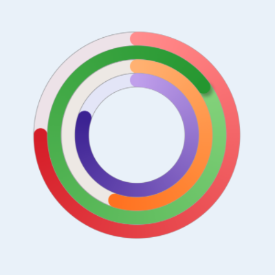
Four Activity Rings with randomly increasing progress
Conclusion
Activity Rings are similar to the circular Progress indicator described in How to create a progress indicator in SwiftUI. One difference is that activity rings need to accomodate values greater than 100%. This article showed how to define Activity Rings in SwiftUI using a circle for the main activity and using a path to draw an extra circle at the end when the progress has exceeded 95%. A shadow is also added to the tip of the Activity Ring to give the impression of depth.