How to create a progress indicator in SwiftUI
Circular rings are used frequently to show progress on a particular task or project. There has been a lot more awareness and discussion on closing activity rings since the introduction of the Apple watch. In this article we will create a circular progress indicator with the percentage complete displayed in the center.
Start with a Circle
The Circle shape in SwiftUI provides the basis of the circular progress view. Two
circles are used in a ZStack to provide a gray background to show the path the
progress bar is travelling. The stroke modifier is used to set the color of both
circles. It is intuitive that a complete circle represents 100%. The circle on top is
colored to show the progress with the trim modifier used to set the arc length.
The circles could also be created by defining a Path for a shape using the
path.addArc function, but use of circle is easier as it abstracts away some of the
details.
 1ZStack {
 2    Circle()
 3        .stroke(Color(.systemGray4), lineWidth: 20)
 4    Circle()
 5        .trim(from: 0, to: 0.55)
 6        .stroke(Color.blue, lineWidth: 20)
 7}
 8.frame(width: 200, height: 200)
 9
10Path() { path in
11    path.addArc(
12        center: CGPoint(x: 100, y: 100),
13        radius: 90,
14        startAngle: Angle(degrees: 0.0),
15        endAngle: Angle(degrees: 360 * 0.55),
16        clockwise: false)
17}
18.stroke(Color.blue, lineWidth: 20)
19.frame(width: 200, height: 200)

Set progress to start at top
The default orientation in SwiftUI is a flipped xy coordinate system with the top left corner starting at (0, 0). The x coordinate increases moving from left to right and y increases moving down the screen. The circle shape is centered in its container view as required. The Trim modifier starts the arc at the horizontal line matching the center, which is equivalent 3 o'clock in clock position. What we want is the progress bar to start from the 12 o'clock position or the top of the circle. This could be achieved by subtracting 0.25 from the angles in the trim modifier, but it is better achieved by rotating the circle 90o anti-clockwise. The following code modifies the circular progress to start at the top as well as extracting the code for the progress view into it a separate view.
 1struct CirclesTopView: View {
 2    var body: some View {
 3        VStack() {
 4            CircularProgressView(progress: 0.55)
 5
 6            CircularProgressView(progress: 0.85)
 7                .scaleEffect(0.75)
 8
 9            Spacer()
10        }
11        .padding(20)
12    }
13}
14
15struct CircularProgressView: View {
16    var progress: Double
17
18    var body: some View {
19        ZStack {
20            Circle()
21                .stroke(Color(.systemGray4), lineWidth: 20)
22            Circle()
23                .trim(from: 0, to: CGFloat(self.progress))
24                .stroke(Color.blue, lineWidth: 20)
25        }
26        .rotationEffect(Angle(degrees: -90))
27        .frame(width: 200, height: 200)
28        .padding()
29    }
30}

Change to rounded progress bar
The ends of the circular progress bar look particularly harsh, when one has become accustomed to seeing the activity rings on an Apple watch. Fortunately, it is easy to modify the ends of the stroke line using StrokeStyle specifying the lineCap as round. Once you see the round end, there's no going back to the butt end.
 1struct CircularProgressView: View {
 2    var progress: Double
 3
 4    var body: some View {
 5        ZStack {
 6            Circle()
 7                .stroke(Color(.systemGray4), lineWidth: 20)
 8            Circle()
 9                .trim(from: 0, to: CGFloat(self.progress))
10                .stroke(
11                    Color.blue,
12                    style: StrokeStyle(lineWidth: 20, lineCap: .round))
13        }
14        .rotationEffect(Angle(degrees: -90))
15        .frame(width: 200, height: 200)
16        .padding()
17    }
18}

Add text to progress view
Text can be added with the exact percentage progress using the overlay modifier on
the circle shape. Note the rotationEffect needs to be moved to just rotate the
progress circle since we do not want the text rotated. The text is formatted to
display with zero decimal places.
 1struct CircularProgressView: View {
 2    var progress: Double
 3
 4    var body: some View {
 5        let progressText = String(format: "%.0f%%", progress * 100)
 6
 7        ZStack {
 8            Circle()
 9                .stroke(Color(.systemGray4), lineWidth: 20)
10            Circle()
11                .trim(from: 0, to: CGFloat(self.progress))
12                .stroke(
13                    Color.blue,
14                    style: StrokeStyle(lineWidth: 20, lineCap: .round))
15                .rotationEffect(Angle(degrees: -90))
16                .overlay(
17                    Text(progressText)
18                        .font(.system(size: 56, weight: .bold, design:.rounded))
19                        .foregroundColor(Color(.systemGray))
20                )
21        }
22        .frame(width: 200, height: 200)
23        .padding()
24    }
25}

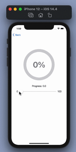
Animate the Progress View
Animation is easily added to the circular progress view by attaching the animation modifier. A Slider is used to modify the progress and see the progress bar respond.
 1struct AnimateProgressView: View {
 2    @State private var progress: Double = 42.0
 3
 4    var minProgress = 0.0
 5    var maxProgress = 100.0
 6
 7    var body: some View {
 8        VStack() {
 9            CircularProgressView(progress: self.progress / 100)
10                .animation(.linear)
11
12            VStack {
13            Text("Progress: \(progress, specifier: "%.1f")")
14                Slider(value: $progress,
15                       in: minProgress...maxProgress,
16                       minimumValueLabel: Text("0"),
17                       maximumValueLabel: Text("100")
18                ) {}
19            }
20            .padding()
21
22            Spacer()
23        }
24        .padding(20)
25    }
26}

Add color gradient to progress bar
The progress bar can be further customised by adding a color gradient. An AngularGradient is used with the color getting darker to the end of the current progress. The end angle for the color is set to the current progress value.
 1struct CircularProgressView: View {
 2    var progress: Double
 3
 4    var body: some View {
 5        let progressText = String(format: "%.0f%%", progress * 100)
 6        let purpleAngularGradient = AngularGradient(
 7            gradient: Gradient(colors: [
 8                Color(red: 200/255, green: 168/255, blue: 240/255),
 9                Color(red: 71/255, green: 33/255, blue: 158/255)
10            ]),
11            center: .center,
12            startAngle: .degrees(0),
13            endAngle: .degrees(360.0 * progress))
14
15        ZStack {
16            Circle()
17                .stroke(Color(.systemGray4), lineWidth: 20)
18            Circle()
19                .trim(from: 0, to: CGFloat(self.progress))
20                .stroke(
21                    purpleAngularGradient,
22                    style: StrokeStyle(lineWidth: 20, lineCap: .round))
23                .rotationEffect(Angle(degrees: -90))
24                .overlay(
25                    Text(progressText)
26                        .font(.system(size: 56, weight: .bold, design:.rounded))
27                        .foregroundColor(Color(.systemGray))
28                )
29        }
30        .frame(width: 200, height: 200)
31        .padding()
32    }
33}
 1struct FinalProgressView: View {
 2    @State private var progress: Double = 42.0
 3
 4    var minProgress = 0.0
 5    var maxProgress = 100.0
 6
 7    var body: some View {
 8        VStack() {
 9            CircularProgressView(progress: self.progress / 100)
10                .animation(.linear)
11
12            VStack {
13            Text("Progress: \(progress, specifier: "%.1f")")
14                Slider(value: $progress,
15                       in: minProgress...maxProgress,
16                       minimumValueLabel: Text("0"),
17                       maximumValueLabel: Text("100")
18                ) {}
19            }
20            .accentColor(Color(red: 200/255, green: 168/255, blue: 240/255))
21            .padding()
22
23            Spacer()
24        }
25        .padding(20)
26    }
27}

Circular progress indicator
Conclusion
In this article we created a circular progress indicator similar to those seen in activity rings. A slider is used to interact with the progress and see the progress animating. An angular color gradient is added to show darker color at the higher end of the progress.