Create interactive chart with matplotlib and ipywidgets
ipywidgets are interactive HTML elements that can be used in Jupyter Notebooks to interact with outputs such as tables and charts. This article briefly introduces ipywidgets and uses them to change the rolling day period in a chart for the rolling average of deaths from covid-19.
ipywidgets or (jupyter-widgets) are interactive HTML elements used to provide the user with tools to interact with data and visualize the effects of parameter changes.
Slider with Interact
The Interact function is a convenient way to quickly create an interactive widget. It takes a function as it's first parameter and then the function parameters with the possible values. Interact creates user interface controls for exploring code and data interactively.
The function below takes one parameter and returns a string stating the value of that parameter. ipywidgets uses widget abbreviations to generate the appropriate UI control, for example when an integer-valued keyword argument of 10 is passed to interact, it generates an integer-valued slider control with a range of -10 to 30.
1def f(x):
2    return f"The selected value is '{x}'"
3
4w.interact(f, x=10)
Note that if you change x to pass in a boolean value, then a checkbox control is created and a textbox is created if a string is passed in.
1def f(x):
2    return f"The selected value is '{x}'"
3
4_ = w.interact(f, x=100)
5_ = w.interact(f, x=True)
6_ = w.interact(f, x="Apple")
7_ = w.interact(f, x=["Apple", "Banana", "Pear"])
It is necessary to specify the start, stop and increment values in a tuple to explicitly create a slider control.
1_ = w.interact(f, x=(1,7,1))

Widget layout
There are many widgets documented in the Widget List that are distributed with
ipywidgets. These can be combined to create a more complex user interface composed of
numerous widgets. As these are HTML elements, the Layout and Styling of
ipywidgets utilizes many of the styling mechanisms of web pages. The layout
attribute uses a number of CSS properties such as height, width, visibility, border
and margin as well as grid-layout and flexbox features. This code created four
ipywidgets controls and lays them out using HBox and VBox.
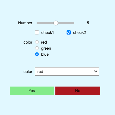
 1slider = w.IntSlider(value=5, min=0, max=10, step=1, description="Number")
 2button = w.Button(
 3    description="The Button",
 4    style=w.ButtonStyle(button_color="Plum"),
 5)
 6dropdown = w.Dropdown(
 7    value="green",
 8    options=["red", "orange", "yellow", "green", "blue", "indigo", "violet"],
 9    description="Rainbow",
10)
11radiobuttons = w.RadioButtons(
12    value="thu",
13    options=["mon", "tue", "wed", "thu", "fri", "sat", "sun"],
14    description="Which Day",
15)
16
17w.HBox([slider, button, dropdown, radiobuttons])
18
19w.VBox([slider, button, dropdown, radiobuttons])

The vertical and horizontal boxes can be nested to build up more complex layouts. This shows a horizontal containing two vertical boxes. Border ans padding styles can be applied to the boxes to make it easier to highlight sections.
1w.HBox(
2    [
3        w.VBox([button, radiobuttons]),
4        w.VBox([slider, dropdown]),
5    ]
6)
1box1 = w.VBox([button, radiobuttons])
2box2 = w.VBox([slider, dropdown])
3
4box1.layout = w.Layout(border="solid 1px red", margin="5px", padding="10px")
5box2.layout = w.Layout(border="solid 1px blue", margin="5px", padding="10px")
6
7w.HBox([box1, box2])

Rolling average of Deaths from COVID-19
I have previously had a look at the Daily counts and rolling average of COVID-19 numbers, so decided to recreate a chart like this with the addition of widgets. This code retrieves the latest data from Johns Hopkins University Github page, cleans the data and creates the chart for the top five countries with the highest rolling average of deaths.
1# Number of Death Cases - Global: time series data for deaths
2deaths_path = 'https://raw.githubusercontent.com/CSSEGISandData/COVID-19/master/csse_covid_19_data/csse_covid_19_time_series/time_series_covid19_deaths_global.csv'
3deaths_df = pd.read_csv(deaths_path)
 1def clean_covid_data(df):
 2    # 1. Drop unwanted columns
 3    df.drop(['Province/State', 'Lat', 'Long'], axis = 1, inplace = True)
 4
 5    # 2. Group by Country
 6    df = df.groupby('Country/Region').sum()
 7
 8    # 3. Convert column headings to datetime
 9    df.columns = pd.to_datetime(df.columns)
10
11    # 4. Remove the column name
12    df.rename_axis(None, axis = 0, inplace = True)
13
14    return df
 1def plot_axis(ax, df, countries, rolling, days):
 2    ax.set_title(f"{rolling}-day rolling average, for the last {days} days")
 3    ax.set_facecolor(plt.cm.Blues(0.2))
 4    rolling_df = df.rolling(rolling, axis=1).mean()
 5    for i, country in enumerate(countries):
 6        ax.plot(
 7            df.columns[-days:],
 8            rolling_df.loc[country].tail(days),
 9            label=country,
10            color=plt.cm.tab10(i),
11        )
12    ax.legend(bbox_to_anchor=(0.99, 1), loc="upper left", facecolor=plt.cm.Blues(0.1))
13    ax.set_xlabel("Date", fontsize="large", fontweight="bold")
14    ax.set_ylabel("Number of Deaths", fontsize="large", fontweight="bold")
15    ax.spines["right"].set_visible(False)
16    ax.spines["top"].set_visible(False)
1def create_rolling_average_chart(df, countries, rolling, days, title):
2    fig, ax = plt.subplots(figsize=(10, 5), facecolor=plt.cm.Blues(0.2))
3    fig.suptitle(title, fontsize="xx-large", fontweight="bold")
4    plot_axis(ax, df, countries, rolling, days)
5    fig.autofmt_xdate()
6    plt.tight_layout()
7    return fig
 1deaths_df = clean_covid_data(deaths_df)
 2daily_deaths_df = deaths_df.diff(axis=1)
 3top_countries = list(
 4    daily_deaths_df.iloc[:, -1].sort_values(ascending=False).head(10).index
 5)
 6create_rolling_average_chart(
 7    daily_deaths_df,
 8    top_countries[:5],
 9    7,
10    100,
11    "Daily rolling average of deaths from COVID-19",
12)

Using ipywidgets to modify days for rolling average
The following class is created to put the widgets and the matplotlib chart together.
In this example a slider widget is used to select the rolling period from 1 to 10
inclusive. In addition, a dropdown widget is used to set the number of recent days.
One of the key aspects to this interaction is the observe method of the widget to
register a callback. observe is used to specify a method to call when the widget
value changes rolling_slider.observe(self.update_rollout, "value").
  1class average_deaths(widgets.VBox):
  2    df = None
  3    output = widgets.Output()
  4    rolling_days = 7
  5    recent_days = 100
  6
  7    def __init__(self, df):
  8        super().__init__()
  9        self.df = df
 10
 11        # create the chart
 12        self.create_chart()
 13
 14        # create and layout the widget controls
 15        controls = self.create_control_panel()
 16
 17        # add the widgets to the view
 18        self.children = [controls, self.output]
 19
 20    def create_chart(self):
 21        """create the chart in the widget output control"""
 22        with self.output:
 23            self.fig, self.ax = plt.subplots(
 24                figsize=(9.5, 4.5), facecolor=plt.cm.Blues(0.2)
 25            )
 26            self.fig.suptitle(
 27                "Deaths from COVID-19", fontsize="xx-large", fontweight="bold"
 28            )
 29            self.plot_axis()
 30            self.fig.autofmt_xdate()
 31            plt.tight_layout()
 32            self.fig.canvas.toolbar_position = "bottom"
 33
 34    def create_control_panel(self):
 35        """create the slider and dropdown controls"""
 36        rolling_slider = widgets.IntSlider(
 37            value=self.rolling_days,
 38            min=1,
 39            max=10,
 40            step=1,
 41        )
 42        recent_dropdown = widgets.Dropdown(
 43            options=[50, 100, 200, 300, 1000],
 44            value=self.recent_days,
 45            description="",
 46            disabled=False,
 47        )
 48        controls = widgets.HBox(
 49            [
 50                widgets.VBox(
 51                    [
 52                        widgets.Label("Rolling Average Days: "),
 53                        widgets.Label("Recent Number of Days: "),
 54                    ]
 55                ),
 56                widgets.VBox([rolling_slider, recent_dropdown]),
 57            ]
 58        )
 59        controls.layout = self.control_box_layout()
 60
 61        # hook up the widgets to observe changes
 62        rolling_slider.observe(self.update_rollout, "value")
 63        recent_dropdown.observe(self.update_recent, "value")
 64        return controls
 65
 66    def control_box_layout(self):
 67        """create layout for control panel"""
 68        return widgets.Layout(
 69            border="solid 1px Navy",
 70            margin="0px 10px 10px 0px",
 71            padding="5px 5px 5px 5px",
 72        )
 73
 74    def update_rollout(self, change):
 75        """update the chart with changes in rolling frequency"""
 76        self.rolling_days = change.new
 77        self.plot_axis()
 78        self.fig.autofmt_xdate()
 79
 80    def update_recent(self, change):
 81        """update the chart with changes in recent number of days"""
 82        self.recent_days = change.new
 83        self.plot_axis()
 84        self.fig.autofmt_xdate()
 85
 86    def plot_axis(self):
 87        """clear any previous chart and plot the lines for the top countries"""
 88        self.ax.clear()
 89        self.ax.set_title(
 90            f"{self.rolling_days}-day rolling average, for the last {self.recent_days} days"
 91        )
 92        self.ax.set_facecolor(plt.cm.Blues(0.2))
 93        rolling_df = self.df.rolling(self.rolling_days, axis=1).mean()
 94        top_countries = list(
 95            rolling_df.iloc[:, -1].sort_values(ascending=False).head(10).index
 96        )
 97        for i, country in enumerate(top_countries[:5]):
 98            self.ax.plot(
 99                self.df.columns[-self.recent_days :],
100                rolling_df.loc[country].tail(self.recent_days),
101                label=country,
102                color=plt.cm.tab10(i),
103            )
104        self.ax.legend(
105            bbox_to_anchor=(1, 0.8), loc="upper left", facecolor=plt.cm.Blues(0.1)
106        )
107        self.ax.set_xlabel("Date", fontsize="large", fontweight="bold")
108        self.ax.set_ylabel("Number of Deaths", fontsize="large", fontweight="bold")
109        self.ax.spines["right"].set_visible(False)
110        self.ax.spines["top"].set_visible(False)
111
112
113average_deaths(daily_deaths_df)


Conclusion
I'm still not sure about the use of ipywidgets. They provide a mechanism of interacting with other user interface in a Jupyter notebook, so they could be used to create a number of variations for charts without having to create the different charts. However, they require a server to deploy or else an interactive Jupyter notebook and if one has the interactive notebook, then the data could be changed and the various charts created. ipywidgets may be more useful when there are easier ways to deploy and interact with the Jupyter notebooks containing them. It would be great if GitHub hosted the Jupyter notebooks in such a way to allow interaction with ipywidgets - Rolling averages of deaths from COVID-19. A work around is to open these notebooks in Binder - Here is a direct link to Binder - Rolling averages of deaths from COVID-19. ipywidgets are interesting, but I'm not seeing the practical application of them yet.