Plotly - Display an Interactive Chart
Pandas is great for searching, filtering and manipulating data and information can be visualised in charts easily using Matplotlib module. These charts are static and provide a snapshot of data that can be annotated to highlight certain data points. These are great for posters, slides and printed materials. It would be great if these charts could be more interactive as the world has moved to digital media and more data visualisations are viewed on screens. Plotly is used to recreate the under five mortality rate changes over time in an interactive chart.
Python modules used in this article
 1# import modules
 2import pandas as pd
 3import numpy as np
 4import shutil as sh
 5import requests
 6import os
 7
 8import plotly.express as px
 9import plotly.graph_objects as go
10from plotly.subplots import make_subplots
Plotly
Plotly is an open-source graphing library for Python that produces interactive charts. This allows the user to hover over data points to display exact values; Zoom in on sections of a chart; deselect key data series to focus on other data and reset the chart to the original. Plotly can be used to create extremely rich visualisations with many user interactions.
Load the data into a dataframe
How to download and load the excel data is covered in "Pandas - Load data from Excel file and Display Chart". This article will focus on creating charts with Plotly from the Pandas dataframe. The following code loads the data from Excel and filters to the median values. The source file is available from Unicef datasets at under-five mortality rate.
 1# Load the excel worksheet into a dataframe
 2u5mr_df = pd.read_excel(
 3    "/tmp/data/Under-five-mortality-rate_2020.xlsx",
 4    sheet_name = 'Country estimates (both sexes)',
 5    header = 14)
 6
 7# Drop the last two rows
 8u5mr_df.drop(u5mr_df.tail(2).index, inplace = True)
 9
10# Rename the columns to Years
11u5mr_df.columns = [x[:-2] if x.endswith('.5') else x for x in u5mr_df.columns]
12
13# Rename 'Uncertainty.Bounds*' column to 'Uncertainty.Bounds'
14u5mr_df = u5mr_df.rename(columns={'Uncertainty.Bounds*': 'Uncertainty.Bounds'})
15
16# Filter to the Median values
17u5mr_med_df = u5mr_df[u5mr_df['Uncertainty.Bounds'] == 'Median']
18
19# Review the data
20u5mr_med_df.iloc[[0,1,2,3,-4,-3,-2,-1], [0,1,2,3,4,5,6,-4,-3,-2,-1]]
21"""
22    ISO.Code Country.Name Uncertainty.Bounds  1950  1951  1952        1953       2016       2017       2018       2019
231        AFG  Afghanistan             Median   NaN   NaN   NaN         NaN  67.572190  64.940759  62.541196  60.269399
244        ALB      Albania             Median   NaN   NaN   NaN         NaN   9.419110   9.418052   9.525133   9.682407
257        DZA      Algeria             Median   NaN   NaN   NaN         NaN  24.792098  24.319482  23.805926  23.256168
2610       AND      Andorra             Median   NaN   NaN   NaN         NaN   3.369056   3.218925   3.085839   2.966929
27574      VNM     Viet Nam             Median   NaN   NaN   NaN         NaN  21.220796  20.843125  20.405423  19.935167
28577      YEM        Yemen             Median   NaN   NaN   NaN         NaN  56.823614  56.966430  58.460003  58.356138
29580      ZMB       Zambia             Median   NaN   NaN   NaN  234.418232  66.510929  64.337901  63.294182  61.663465
30583      ZWE     Zimbabwe             Median   NaN   NaN   NaN         NaN  59.538505  58.234924  55.856832  54.612967
31"""
Show simple Plotly chart
This code gets the top ten countries with the highest Under Five Mortality Rates in 2019
and uses plotly.graph_objects to create a simple barchart. While the layout of this
chart could made nicer, hovering over each of the bars displays the details of the country
and the U5MR for that country. The hover text displays external to the bar and
automatically switches to displaying inside bar when there is not enough room. There
is also a Plotly toolbar displayed on the top right of the chart. Selecting a region
inside the chart will zoon in on the selected area.
 1Top_10 = u5mr_med_df.sort_values(by=u5mr_df.columns[-1], ascending=False)[["Country.Name", "2019"]].head(10)
 2"""
 3                 Country.Name        2019
 4376                   Nigeria  117.202078
 5481                   Somalia  116.972096
 6100                      Chad  113.790418
 797   Central African Republic  110.053912
 8466              Sierra Leone  109.236528
 9214                    Guinea   98.802973
10487               South Sudan   96.229299
11316                      Mali   94.035418
1255                      Benin   90.286429
1379               Burkina Faso   87.542426
14"""
15
16import plotly.graph_objects as go
17fig = go.Figure(
18    data = [go.Bar(x = list(Top_10["2019"]),
19                   y = list(Top_10["Country.Name"]),
20                   orientation = "h")],
21    layout = go.Layout(
22        title = go.layout.Title(
23            text = "Top ten countries with highest Under Five Infant Mortality in 2019"
24        )
25    )
26)
27
28fig.show()
Simple horizontal bar chart showing top ten countries with highest Under 5 Mortality Rates in 2019
Show top ten U5MR bar Chart
The following code modifies the default bar chart to improve the display. The chart layout, colors and font are changed as well as the format of the hover text.
 1Top_10 = u5mr_med_df.sort_values(by=u5mr_df.columns[-1], ascending=False)[["Country.Name", "2019"]].head(10)
 2bg_color = 'rgba(208,225,242,1.0)'
 3
 4fig = go.Figure(
 5    data = [go.Bar(x = list(Top_10["2019"]),
 6                   y = list(Top_10["Country.Name"]),
 7                   hovertemplate = "%{y}: <br><br>U5MR: %{x:.1f}<extra></extra>",
 8                   orientation = 'h')]
 9)
10
11fig.update_layout(
12    # Set default font
13        font = dict(
14        family = "Droid Sans",
15        size = 16
16    ),
17    # Set figure title
18    title = dict(
19        text = "<b>Top ten countries with highest Under Five Mortality Rate in 2019</b>",
20        xref = 'container',
21        yref = 'container',
22        x = 0.5,
23        y = 0.91,
24        xanchor = 'center',
25        yanchor = 'middle',
26        font = dict(family = 'Droid Sans', size = 24)
27    ),
28    # set x-axis
29    xaxis = dict(
30        title = dict(
31            text = 'Under Five Mortality Rate (per 1000 live births)',
32            font = dict(family = 'Droid Sans', size = 18)
33        ),
34        showgrid = False,
35        linecolor = bg_color,
36        linewidth = 2,
37        showticklabels = True,
38    ),
39    # set y-axis
40    yaxis = dict(
41        showgrid = False,
42        linecolor = bg_color,
43        linewidth = 4,
44    ),
45    # set the plot bacground color
46    plot_bgcolor = bg_color,
47    # set the hover background color
48    hoverlabel = dict(
49        bgcolor = 'rgba(75,152,201,0.2)',
50        font_size = 16
51    ),
52    paper_bgcolor = bg_color,
53)
54
55fig.update_traces(marker_color = 'rgb(75,152,201)')
56fig['layout']['yaxis']['autorange'] = "reversed"
57
58fig.show()
Nicer bar chart showing top ten countries with highest Under 5 Mortality Rates in 2019
Show top ten U5MR over time
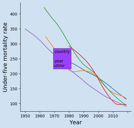
There is a limit to how beneficial an interactive chart is when it is just displaying the total numbers for the top ten countries in the bar chart above. The interactive chart is much more useful when looking at a multiple sets of data plotted over time such as the changes in the current top ten countries over time. The following line chart shows the changes in Under 5 Mortality Rate for countries with the highest rates in an interactive plotly chart. This is similar to a static chart that was previously created with Matplotlib. The advantages are that exact numbers fo a prticular can be seen by hovering over that point as well as hiding some countries to focus on countries of interest.
This function Extract the mortality rates for the top number of countries based on rates in the latest year.
 1def get_top_countries(data_df, lowest = True, num = 10):
 2    '''Extract the mortality rates for the top number of countries
 3    based on rates in the latest year
 4
 5    Keyword arguments:
 6    data_df  -- dateframe of all the mortality rates for all the countries
 7    lowest   -- boolean flag to either contries with the lowest rate
 8                or highest rate (default is True)
 9    num      -- number of countries to return (default is 10)
10
11    return: dataframe that has been transposed and filtered to the top n counbtries
12    '''
13    # Need to transpose the dataframe to use year as the x-axis
14    df = data_df.sort_values(by = data_df.columns[-1], ascending = lowest).head(10).T
15    df.reset_index(drop = False, inplace = True)
16
17    # Set the Country.Name as the heading for the columns
18    df.columns = df.iloc[np.where(df['index'] == 'Country.Name')[0][0]]
19
20    # Rename the Country.Name column to Year
21    df = df.rename(columns = {'Country.Name': 'Year'})
22
23    # Drop the rows that do not contain u5mr data
24    df = (df[df['Year']
25             .isin(['ISO.Code',
26                    'Country.Name',
27                    'Uncertainty.Bounds']) == False]
28        )
29    df.reset_index(drop = True, inplace = True)
30
31    return df
This function creates the Plotly line chart showing the changes in each country over time. It uses a separate function to format the hover text to make it easier to modify and maintain.
  1def hov_text(ary_x, ary_y, country):
  2    '''Create the hover text for each data point
  3
  4    Keyword arguments:
  5    ary_x    -- list of all the x data points
  6    ary_y    -- list of all the y data points
  7    country  -- name of country
  8
  9    return: A list of hover texts for the selected country
 10            with format to display
 11    '''
 12    txt = [f'''
 13    <b>{country}<b><br><br>
 14    Year: <b>{ary_x[i]}</b><br>
 15    U5MR: <b>{ary_y[i]:.1F}</b><br>
 16    <extra></extra>
 17    ''' for i in range(len(ary_x))]
 18    return txt
 19
 20
 21def create_top_case_chart(df, title):
 22    '''Create a plotly line chart from the dataframe, which must contain
 23    a column for 'Year' and the other columns as countries
 24
 25    Keyword arguments:
 26    df      -- dateframe of the mortality rates for all the countries
 27    title   -- text to be displayed as the title of the chart
 28
 29    return: a Plotly Graph Object figure
 30    '''
 31    bg_color = 'rgba(208, 225, 242, 1.0)'
 32    line_color = 'rgba(75, 152, 201, 1.0)'
 33    grid_color = 'rgba(75, 152, 201, 0.3)'
 34
 35    y_max = ((max(df.drop(['Year'], axis = 'columns').max()) // 100) + 1) * 100
 36    y_min = 0
 37    x_min = int(min(df['Year'])) - 2
 38    x_max = int(max(df['Year'])) + 2
 39
 40    fig = go.Figure()
 41    for c in df.drop(['Year'], axis = 'columns').columns:
 42        fig.add_trace(go.Scatter(x = df.Year,
 43                                 y = df[c],
 44                                 name = c,
 45                                 hovertemplate = hov_text(df.Year, df[c], c)))
 46
 47    fig.update_traces(
 48        hoverinfo = 'text+name',
 49        mode = 'lines'
 50    )
 51
 52    fig.update_layout(
 53        # Set figure title
 54        title = dict(
 55            text = f'<b>{title}</b>',
 56            xref = 'container',
 57            yref = 'container',
 58            x = 0.5,
 59            y = 0.9,
 60            xanchor = 'center',
 61            yanchor = 'middle',
 62            font = dict(family = 'Droid Sans', size = 28)
 63        ),
 64        # set legend
 65        legend = dict(
 66            orientation = "h",
 67            traceorder = 'normal',
 68            font_size = 12,
 69            x = 0.0,
 70            y = -0.3,
 71            xanchor = "left",
 72            yanchor = "top"
 73        ),
 74        # set x-axis
 75        xaxis = dict(
 76            title = 'Year',
 77            range = [x_min, x_max],
 78            linecolor = line_color,
 79            linewidth = 2,
 80            gridcolor = grid_color,
 81            showticklabels = True,
 82            ticks = 'outside',
 83        ),
 84        # set y-axis
 85        yaxis = dict(
 86            title = 'Under Five Mortality Rate',
 87            range = [y_min, y_max],
 88            linecolor = line_color,
 89            linewidth = 2,
 90            gridcolor = grid_color,
 91            showticklabels = True,
 92            ticks = 'outside',
 93        ),
 94        showlegend = True,
 95        # set the plot bacground color
 96        plot_bgcolor = bg_color,
 97        paper_bgcolor = bg_color,
 98    )
 99
100    return fig
Finally these functions are used to create the chart for the top ten countries.
1top_10_fig = create_top_case_chart(
2    get_top_countries(u5mr_med_df, False),
3    f'Changes in Under Five Mortality Rate <BR>for countries with the highest in {u5mr_df.columns[-1]}')
4top_10_fig.show()
Interactive chart showing changes in Under 5 Mortality Rate for countries with the highest rates
Show lower ten U5MR over time
It can take some time formatting the layout and colors of a chart to display just right. The good news is that the same functions can be used to display similar sets of data. The following code is all that is needed to get the ten countries with the current lowest Under Five Mortality Rates.
1lowest_10_fig = create_top_case_chart(
2    get_top_countries(u5mr_med_df, True),
3    f'Changes in Under Five Mortality Rate <BR>for countries with the lowest in {u5mr_df.columns[-1]}')
4lowest_10_fig.show()
Interactive chart showing changes in Under 5 Mortality Rate for countries with the lowest rates
Display data for specific countries
The same chart function can be used to display the changes on mortality rates over time. The function above to retrieve the top five is a little too specific and could possibly split into two functions - one to filter the data of interest and a second to transpose the data and prepare it for creating the chart.
 1countries = [
 2    'Canada', 'China', 'France', 'Iceland',
 3    'India', 'Ireland', 'Mexico', 'Sweden',
 4    'United Kingdom', 'United States of America'
 5]
 6
 7select_df = u5mr_med_df[u5mr_med_df['Country.Name'].isin(countries)]
 8
 9# Need to transpose the dataframe to use year as the x-axis
10select_df = select_df.sort_values(by = select_df.columns[-1]).T
11select_df.reset_index(drop = False, inplace = True)
12
13# Set the Country.Name as the heading for the columns
14select_df.columns = select_df.iloc[np.where(select_df['index'] == 'Country.Name')[0][0]]
15
16# Rename the Country.Name column to Year
17select_df = select_df.rename(columns = {'Country.Name': 'Year'})
18
19# Drop the rows that do not contain u5mr data
20select_df = (select_df[select_df['Year']
21                       .isin(['ISO.Code',
22                              'Country.Name',
23                              'Uncertainty.Bounds']) == False]
24            )
25select_df.reset_index(drop = True, inplace = True)
26
27select_fig = create_top_case_chart(
28    select_df,
29    f'Changes in Under Five Mortality Rate for selected countries')
30
31select_fig.show()
Interactive chart showing changes in Under 5 Mortality Rate for selected countries
Host the interactive chart in static web site
I've created dashboards using Dash, which creates nice interactive dashboards in flask-like apps. I'd like to give a shout out to Igor Gotlibovych for providing instructions on how to host plotly interactive charts on a Hugo static website - Including plotly figures in Hugo posts. Thank you for providing this information.
Conclusion
Matplotlib is great for creating charts in Python, but the results are static images of the data. Plotly is great for creating interactive charts that help bring the data to life. These charts can be customised in a number of ways to present data that users can hover over to see more information, hide some data by deselecting on the legend or zoom in on a section of the chart.