LinearGradient in SwiftUI
LinearGradient in SwiftUI is used to create a gradient color effect of two or more colors. It is used to fill an area or object with a linear color transition from one point to another in a straight line. This article explores the use of LinearGradient and how to use it to improve the color tip on the color pencil.
Related articles on color gradients in SwiftUI:
- LinearGradient in SwiftUI
- AngularGradient in SwiftUI
- RadialGradient in SwiftUI
- Animate background with color gradient in SwiftUI
Simple Linear Gradient
Start by defining arrays of colors that can be used in the App to more easily compare different gradients. The view shows LinearGradient from leading to trailing with two colors and with seven colors.
Colors
 1struct AppColors {
 2    static let twoColors = [Color.blue, .yellow]
 3
 4    static let rainbow = [
 5        Color.red,
 6        .orange,
 7        .yellow,
 8        .green,
 9        .blue,
10        Color(hue: 0.773, saturation: 1.0, brightness: 0.51),
11        Color(hue: 0.771, saturation: 1.0, brightness: 1.00)
12    ]
13}
View
 1struct StartLinearGradientView: View {
 2    var body: some View {
 3        VStack {
 4            Text("LinearGradient")
 5                .font(.largeTitle)
 6                .fontWeight(.bold)
 7            Divider()
 8
 9            VStack(spacing: 0) {
10                Text("Two colors")
11                    .font(.title)
12                    .fontWeight(.bold)
13
14                RoundedRectangle(cornerRadius: 20)
15                    .fill(
16                        LinearGradient(colors: AppColors.twoColors,
17                                       startPoint: .leading,
18                                       endPoint: .trailing)
19                    )
20                    .frame(width: 300, height: 300)
21            }
22            Divider()
23
24            VStack(spacing: 0) {
25                Text("Seven colors")
26                    .font(.title)
27                    .fontWeight(.bold)
28
29                RoundedRectangle(cornerRadius: 20)
30                    .fill(
31                        LinearGradient(colors: AppColors.rainbow,
32                                       startPoint: .leading,
33                                       endPoint: .trailing)
34                    )
35                    .frame(width: 300, height: 300)
36            }
37
38            Spacer()
39        }
40    }
41}

Different Start and End points
Explore how the color gradient changes when we use different start and end points for
the LinearGradient. An enum for UnitPointType is defined to make it easier to set
the start and end points with text and associated UnitPoint. A subview is created to
display the start and endpoints as well as display the color gradient in a rounded
rectangle.
enum UnitPointType
 1enum UnitPointType: String, CaseIterable {
 2    case topLeading = "topLeading"
 3    case top = "top"
 4    case topTrailing = "topTrailing"
 5    case leading = "leading"
 6    case center = "center"
 7    case trailing = "trailing"
 8    case bottomLeading = "bottomLeading"
 9    case bottom = "bottom"
10    case bottomTrailing = "bottomTrailing"
11
12    var unitPoint: UnitPoint {
13        switch self {
14        case .topLeading:
15            return UnitPoint.topLeading
16        case .top:
17            return UnitPoint.top
18        case .topTrailing:
19            return UnitPoint.topTrailing
20        case .leading:
21            return UnitPoint.leading
22        case .center:
23            return UnitPoint.center
24        case .trailing:
25            return UnitPoint.trailing
26        case .bottomLeading:
27            return UnitPoint.bottomLeading
28        case .bottom:
29            return UnitPoint.bottom
30        case .bottomTrailing:
31            return UnitPoint.bottomTrailing
32        }
33    }
34}
LinearGradientView
 1struct LinearGradientView: View {
 2    var start: UnitPointType
 3    var end: UnitPointType
 4
 5    var body: some View {
 6        HStack {
 7            VStack {
 8                Text("\(start.rawValue)").font(.title2)
 9                Text("\(end.rawValue)").font(.title2)
10            }
11            RoundedRectangle(cornerRadius: 20)
12                .fill(
13                    LinearGradient(colors: AppColors.rainbow,
14                                   startPoint: start.unitPoint,
15                                   endPoint: end.unitPoint)
16                )
17                .frame(width: 100, height: 100)
18        }
19    }
20}
StartEndLinearView
 1struct StartEndLinearView: View {
 2    var body: some View {
 3        ScrollView {
 4            VStack {
 5                Text("Start & Stop values")
 6                    .font(.largeTitle)
 7                    .fontWeight(.bold)
 8
 9                VStack(alignment: .trailing) {
10                    LinearGradientView(start: .leading,
11                                       end: .trailing)
12                    LinearGradientView(start: .top,
13                                       end: .bottom)
14                    LinearGradientView(start: .topLeading,
15                                       end: .bottomTrailing)
16                    LinearGradientView(start: .topLeading,
17                                       end: .trailing)
18                    LinearGradientView(start: .topLeading,
19                                       end: .center)
20                    LinearGradientView(start: .topLeading,
21                                       end: .bottom)
22                    LinearGradientView(start: .topLeading,
23                                       end: .leading)
24                    LinearGradientView(start: .top,
25                                       end: .center)
26                }
27                .padding(.horizontal, 50)
28
29                Spacer()
30            }
31        }
32    }
33}

All variations of Start and End points
It is possible to iterate over all the start point and end point options and display all the possible linear gradient options in a grid. This view is better displayed on an iPad, but can be scrolled on an iPhone as well. This can be convenient to see all the different combinations of start and end points.
LinearGradientView2
 1struct LinearGradientView2: View {
 2    var start: UnitPointType
 3    var end: UnitPointType
 4
 5    var body: some View {
 6        RoundedRectangle(cornerRadius: 10)
 7            .fill(
 8                LinearGradient(colors: AppColors.rainbow,
 9                               startPoint: start.unitPoint,
10                               endPoint: end.unitPoint)
11            )
12    }
13}
AllStartEndLinearView
 1struct AllStartEndLinearView: View {
 2    var body: some View {
 3        ScrollView([.vertical, .horizontal]) {
 4            HStack {
 5                VStack{
 6                    Rectangle()
 7                        .fill(.black)
 8                        .frame(width: 150, height: 5)
 9                        .rotationEffect(Angle(degrees: 30))
10                        .overlay(
11                            Text("StartPoint")
12                                .fontWeight(.bold)
13                                .offset(x:40, y: -20)
14                        )
15                        .overlay(
16                            Text("EndPoint")
17                                .fontWeight(.bold)
18                                .offset(x:-40, y: 20)
19                        )
20                    ForEach(UnitPointType.allCases, id: \.self) { endinging in
21                        Text("\(endinging.rawValue)")
22                            .font(.footnote)
23                            .frame(width: 120, height: 90)
24                    }
25                }
26
27                ForEach(UnitPointType.allCases, id: \.self) { starting in
28                    VStack{
29                        Text("\(starting.rawValue)")
30                            .font(.footnote)
31                            .frame(height: 50)
32                        ForEach(UnitPointType.allCases, id: \.self) { endinging in
33                            LinearGradientView2(start: starting,
34                                                end: endinging)
35                            .frame(width: 90, height: 90)
36                        }
37                    }
38                }
39            }
40        }
41    }
42}

Coordinate Start and End points
All the standard start ans end point combinations are shown above. It is also possible to specify x and y coordinates for the start and end points. These can be any value between 0 and 1. Here are just two examples as the possible combinations are endless. When the y values are the same, the result will be a horizontal gradient regardless of the specific values.
PointCoordinateView
 1struct PointCoordinateView: View {
 2    var body: some View {
 3        VStack(spacing: 30) {
 4            Text("Point Coordinates")
 5                .font(.largeTitle)
 6                .fontWeight(.bold)
 7            Divider()
 8
 9            VStack(spacing: 0) {
10                Text("Start Point: (0.6, 0.2)  ")
11                    .font(.title)
12                Text("End Point: (0.2, 0.6)  ")
13                    .font(.title)
14
15                RoundedRectangle(cornerRadius: 20)
16                    .fill(
17                        LinearGradient(colors: AppColors.twoColors,
18                                       startPoint: UnitPoint(x: 0.6, y: 0.2),
19                                       endPoint: UnitPoint(x: 0.2, y: 0.6))
20                    )
21                    .frame(width: 200, height: 200)
22            }
23            Divider()
24
25            VStack(spacing: 0) {
26                Text("Start Point: (0.7, 0.5)  ")
27                    .font(.title)
28                Text("End Point: (0.9, 0.5)  ")
29                    .font(.title)
30                RoundedRectangle(cornerRadius: 20)
31                    .fill(
32                        LinearGradient(colors: AppColors.rainbow,
33                                       startPoint: UnitPoint(x: 0.7, y: 0.5),
34                                       endPoint: UnitPoint(x: 0.9, y: 0.5))
35                    )
36                    .frame(width: 200, height: 200)
37            }
38
39            Spacer()
40        }
41    }
42}

Linear gradient on color pencil tip
The start and end point coordinates can be used to create a reflection effect on the
color tip of the color pencil defined in Create a color pencil in SwiftUI. The
pencil on the left shows the original and the one on the right shows the new version.
The view in the middle shows the color gradient across the entire frame with an
outline of the pencil tip. The SwiftUI preview updates in real time to show the
effect of setting different start and end coordinates in the getTipColorGradient
function.
PencilTipGradientView
 1struct PencilTipGradientView: View {
 2    let color = Color.blue
 3
 4    var body: some View {
 5        VStack {
 6            HStack(spacing: 30) {
 7                ZStack {
 8                    PencilTipShape()
 9                        .fill(getColorGradient(color))
10                    PencilTimberShape()
11                        .fill(Color(hue: 0.07, saturation: 0.4, brightness: 0.9))
12                    PencilBodyShape()
13                        .fill(getColorGradient(color))
14                }
15                .frame(width: 100, height: 600)
16
17                ZStack {
18                    Rectangle()
19                        .fill(getTipColorGradient(color))
20                    PencilTipShape()
21                        .stroke(Color.red, lineWidth: 5)
22                }
23                .frame(width: 100, height: 600)
24
25                ZStack {
26                    PencilTipShape()
27                        .fill(getTipColorGradient(color))
28                    PencilTimberShape()
29                        .fill(Color(hue: 0.07, saturation: 0.4, brightness: 0.9))
30                    PencilBodyShape()
31                        .fill(getColorGradient(color))
32                }
33                .frame(width: 100, height: 600)
34            }
35        }
36    }
37
38    func getColorGradient(_ col: Color) -> LinearGradient {
39        var hue: CGFloat  = 0.0
40        var saturation: CGFloat = 0.0
41        var brightness: CGFloat = 0.0
42        var alpha: CGFloat = 0.0
43
44        let uiColor = UIColor(col)
45        uiColor.getHue(&hue, saturation: &saturation, brightness: &brightness, alpha: &alpha)
46
47        return LinearGradient(
48            colors: [
49                Color(hue: hue, saturation: saturation * 1.0, brightness: brightness * 0.4),
50                Color(hue: hue, saturation: saturation * 1.0, brightness: brightness * 0.8),
51                Color(hue: hue, saturation: saturation * 1.0, brightness: brightness * 1.0),
52                Color(hue: hue, saturation: saturation * 0.6, brightness: brightness * 1.0),
53                Color(hue: hue, saturation: saturation * 0.8, brightness: brightness * 0.9)
54            ],
55            startPoint: .leading,
56            endPoint: .trailing)
57    }
58
59    func getTipColorGradient(_ col: Color) -> LinearGradient {
60        var hue: CGFloat  = 0.0
61        var saturation: CGFloat = 0.0
62        var brightness: CGFloat = 0.0
63        var alpha: CGFloat = 0.0
64
65        let uiColor = UIColor(col)
66        uiColor.getHue(&hue, saturation: &saturation, brightness: &brightness, alpha: &alpha)
67
68        return LinearGradient(
69            colors: [
70                Color(hue: hue, saturation: saturation * 1.0, brightness: brightness * 0.4),
71                Color(hue: hue, saturation: saturation * 1.0, brightness: brightness * 0.8),
72                Color(hue: hue, saturation: saturation * 1.0, brightness: brightness * 1.0),
73                Color(hue: hue, saturation: saturation * 0.6, brightness: brightness * 1.0),
74                Color(hue: hue, saturation: saturation * 0.8, brightness: brightness * 0.9)
75            ],
76            startPoint: UnitPoint(x: 0.3, y: 0.13),
77            endPoint: UnitPoint(x: 0.7, y: 0.115))
78    }
79}

New Color Pencil
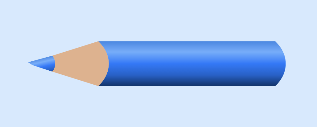
The final views show the result of using the different LinearGradient on the pencil color tip and the pencil body.
BlueColorPencilView
 1struct BlueColorPencilView: View {
 2    var body: some View {
 3        VStack {
 4            Text("Blue Pencil")
 5                .font(.largeTitle)
 6            ColorPencilView(color: .blue)
 7                .frame(width: 100, height: 600)
 8        }
 9    }
10}
PencilSetView
 1struct PencilSetView: View {
 2    var body: some View {
 3        VStack {
 4            Text("Color Pencils")
 5                .font(.largeTitle)
 6            HStack {
 7                ForEach(AppColors.rainbow, id: \.self) {
 8                    ColorPencilView(color: $0)
 9                        .frame(width: 50, height: 300)
10                }
11            }
12            Spacer()
13        }
14    }
15}


Conclusion
LinearGradient is used to transition from one color to another in an object in SwiftUI. It takes an array of colors and points for the start end of the transition. The color smoothly transitions from the start in a linear manner in the direction of the end along a straight line. There are some standard points set, but any coordinates can be used between 0 and 1.
Using specific coordinates, the color pencil was updated with a color gradient set at an angle across the tip of the pencil.
The source code for LinearGradientApp is available on GitHub.