Animate background with color gradient in SwiftUI
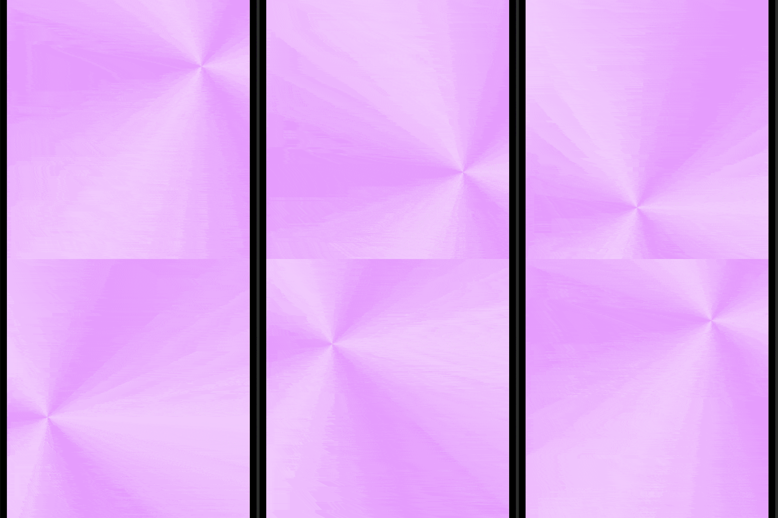
Animating the background of an app with a color gradient in SwiftUI can be a great way to enhance your app. By animating a change in the color gradient of the background, you can make your app feel more dynamic and engaging. One way to achieve this effect is by using AngularGradient to keep the background moving. However, other color gradients could easily be used instead.
Related articles on color gradients in SwiftUI:
- LinearGradient in SwiftUI
- AngularGradient in SwiftUI
- RadialGradient in SwiftUI
- Animate background with color gradient in SwiftUI
AngularGradient in a rectangle
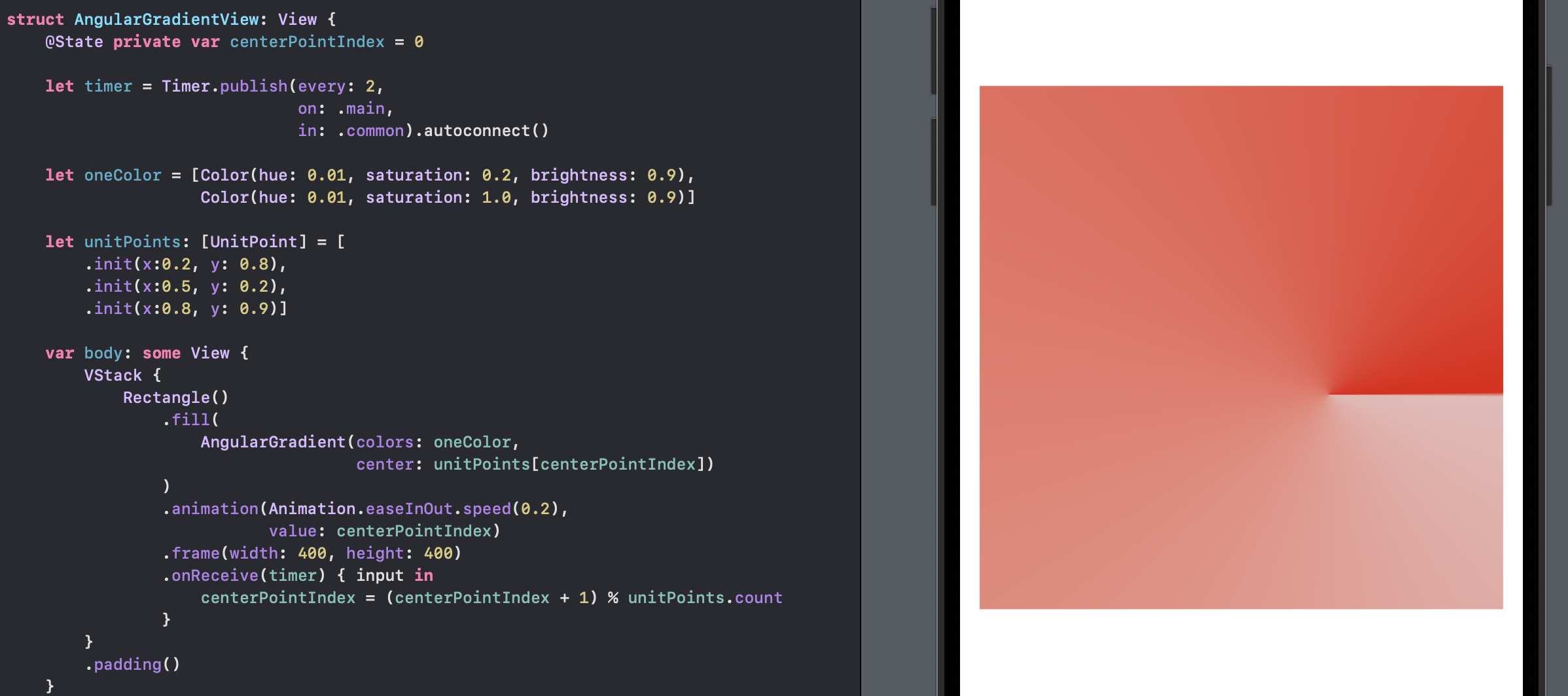
Let's start with a simple AngularGradient such as that described in Simple AngularGradient in SwiftUI. The center point of the AngularGradient is animated to move through a list of UnitPoints every two seconds. The UnitPoints are relative to the frame containing the AngularGradient. The colors and the duration of the animation can be modified to achieve the desired effect.
 1struct AngularGradientView: View {
 2    @State private var centerPointIndex = 0
 3
 4    let timer = Timer.publish(every: 2,
 5                              on: .main,
 6                              in: .common).autoconnect()
 7
 8    let oneColor = [Color(hue: 0.01, saturation: 0.2, brightness: 0.9),
 9                    Color(hue: 0.01, saturation: 1.0, brightness: 0.9)]
10
11    let unitPoints: [UnitPoint] = [
12        .init(x:0.2, y: 0.8),
13        .init(x:0.5, y: 0.2),
14        .init(x:0.8, y: 0.9)]
15
16    var body: some View {
17        VStack {
18            Rectangle()
19                .fill(
20                    AngularGradient(colors: oneColor,
21                                    center: unitPoints[centerPointIndex])
22                )
23                .animation(Animation.easeInOut.speed(0.2),
24                           value: centerPointIndex)
25                .frame(width: 400, height: 400)
26                .onReceive(timer) { input in
27                    centerPointIndex = (centerPointIndex + 1) % unitPoints.count
28                }
29        }
30        .padding()
31    }
32}
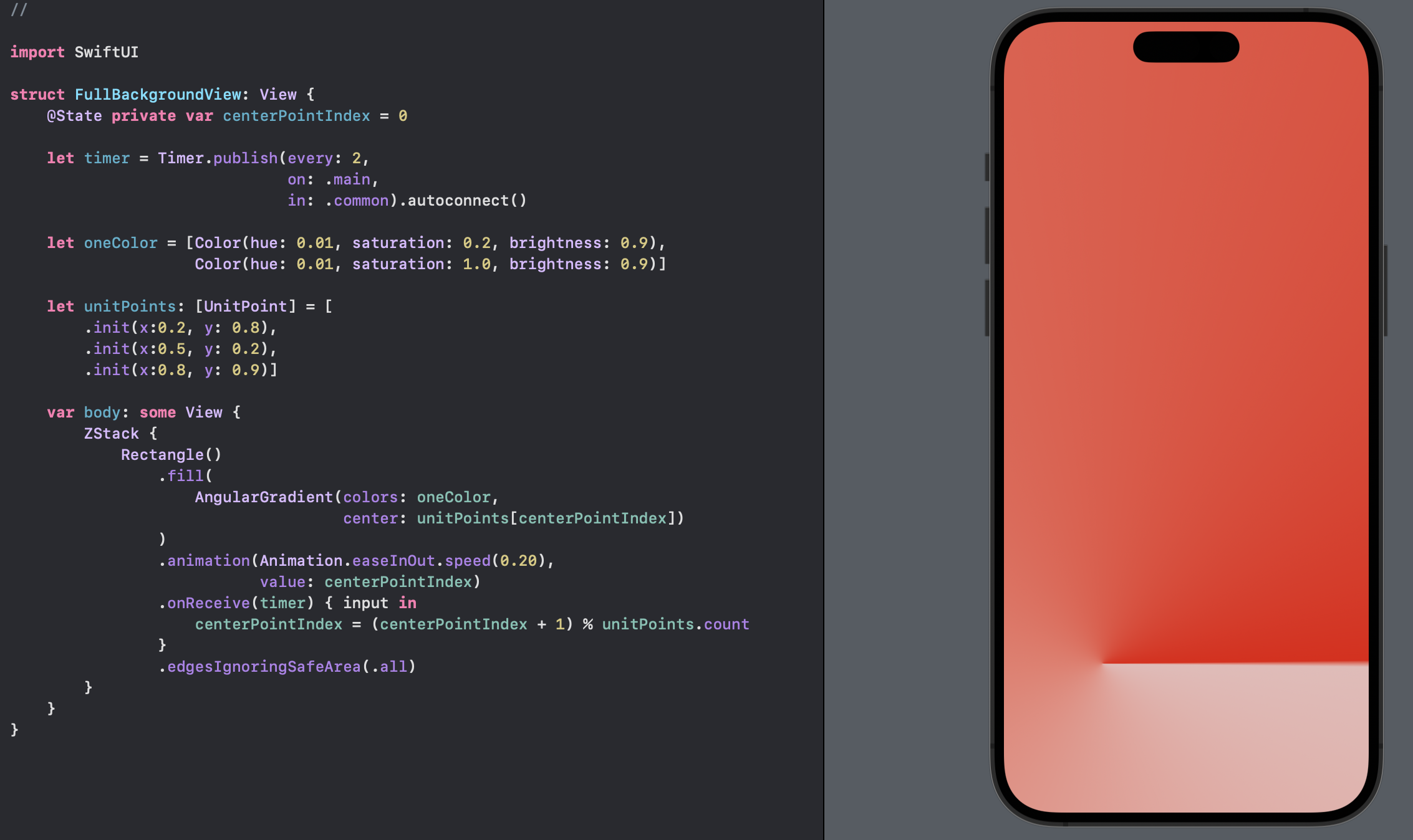
Full background
Place the AngularGradient in a ZStack and modify the view to ignore the safe areas to use it as a background in SwiftUI. This will ensure that the gradient fills the entire screen and moves as the background.
 1struct FullBackgroundView: View {
 2    @State private var centerPointIndex = 0
 3
 4    let timer = Timer.publish(every: 2,
 5                              on: .main,
 6                              in: .common).autoconnect()
 7
 8    let oneColor = [Color(hue: 0.01, saturation: 0.2, brightness: 0.9),
 9                    Color(hue: 0.01, saturation: 1.0, brightness: 0.9)]
10
11    let unitPoints: [UnitPoint] = [
12        .init(x:0.2, y: 0.8),
13        .init(x:0.5, y: 0.2),
14        .init(x:0.8, y: 0.9)]
15
16    var body: some View {
17        ZStack {
18            Rectangle()
19                .fill(
20                    AngularGradient(colors: oneColor,
21                                    center: unitPoints[centerPointIndex])
22                )
23                .animation(Animation.easeInOut.speed(0.20),
24                           value: centerPointIndex)
25                .onReceive(timer) { input in
26                    centerPointIndex = (centerPointIndex + 1) % unitPoints.count
27                }
28                .edgesIgnoringSafeArea(.all)
29        }
30    }
31}
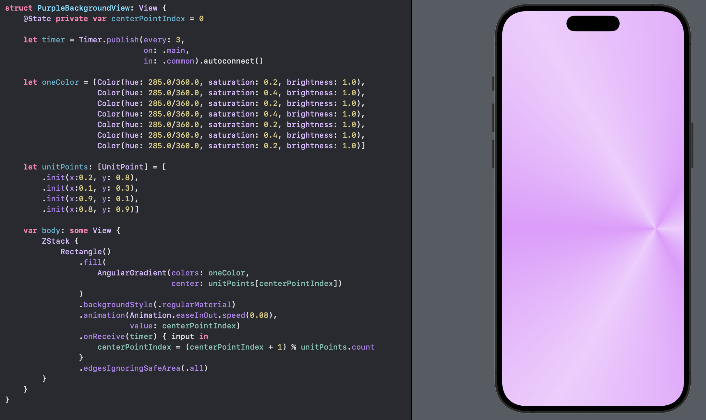
Purple color
Tweak the colors to use an array of alternating colors to create a star like pattern and adjust the time slightly.
 1struct PurpleBackgroundView: View {
 2    @State private var centerPointIndex = 0
 3
 4    let timer = Timer.publish(every: 3,
 5                              on: .main,
 6                              in: .common).autoconnect()
 7
 8    let oneColor = [Color(hue: 285.0/360.0, saturation: 0.2, brightness: 1.0),
 9                    Color(hue: 285.0/360.0, saturation: 0.4, brightness: 1.0),
10                    Color(hue: 285.0/360.0, saturation: 0.2, brightness: 1.0),
11                    Color(hue: 285.0/360.0, saturation: 0.4, brightness: 1.0),
12                    Color(hue: 285.0/360.0, saturation: 0.2, brightness: 1.0),
13                    Color(hue: 285.0/360.0, saturation: 0.4, brightness: 1.0),
14                    Color(hue: 285.0/360.0, saturation: 0.2, brightness: 1.0)]
15
16    let unitPoints: [UnitPoint] = [
17        .init(x:0.2, y: 0.8),
18        .init(x:0.1, y: 0.3),
19        .init(x:0.9, y: 0.1),
20        .init(x:0.8, y: 0.9)]
21
22    var body: some View {
23        ZStack {
24            Rectangle()
25                .fill(
26                    AngularGradient(colors: oneColor,
27                                    center: unitPoints[centerPointIndex])
28                )
29                .backgroundStyle(.regularMaterial)
30                .animation(Animation.easeInOut.speed(0.08),
31                           value: centerPointIndex)
32                .onReceive(timer) { input in
33                    centerPointIndex = (centerPointIndex + 1) % unitPoints.count
34                }
35                .edgesIgnoringSafeArea(.all)
36        }
37    }
38}
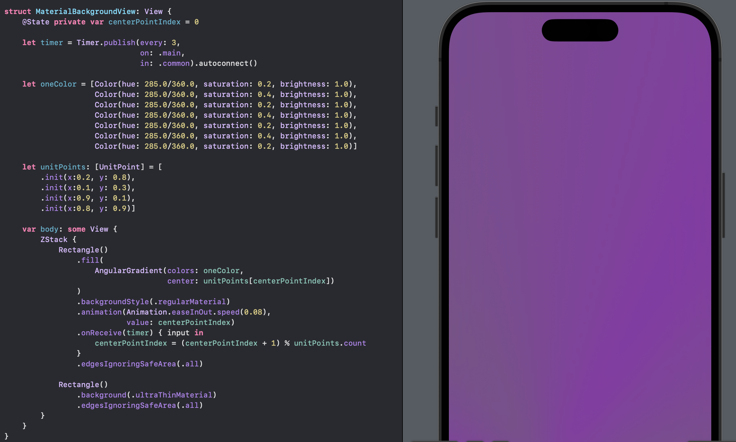
Use Material
A blur effect can be applied over the animated AngularGradient with the use of Material in SwiftUI. This adds a layer over the background and tones down the animation so it is not too distracting. This does seem to hide the animation too much.
 1    struct MaterialBackgroundView: View {
 2    @State private var centerPointIndex = 0
 3
 4    let timer = Timer.publish(every: 3,
 5                              on: .main,
 6                              in: .common).autoconnect()
 7
 8    let oneColor = [Color(hue: 285.0/360.0, saturation: 0.2, brightness: 1.0),
 9                    Color(hue: 285.0/360.0, saturation: 0.4, brightness: 1.0),
10                    Color(hue: 285.0/360.0, saturation: 0.2, brightness: 1.0),
11                    Color(hue: 285.0/360.0, saturation: 0.4, brightness: 1.0),
12                    Color(hue: 285.0/360.0, saturation: 0.2, brightness: 1.0),
13                    Color(hue: 285.0/360.0, saturation: 0.4, brightness: 1.0),
14                    Color(hue: 285.0/360.0, saturation: 0.2, brightness: 1.0)]
15
16    let unitPoints: [UnitPoint] = [
17        .init(x:0.2, y: 0.8),
18        .init(x:0.1, y: 0.3),
19        .init(x:0.9, y: 0.1),
20        .init(x:0.8, y: 0.9)]
21
22    var body: some View {
23        ZStack {
24            Rectangle()
25                .fill(
26                    AngularGradient(colors: oneColor,
27                                    center: unitPoints[centerPointIndex])
28                )
29                .backgroundStyle(.regularMaterial)
30                .animation(Animation.easeInOut.speed(0.08),
31                           value: centerPointIndex)
32                .onReceive(timer) { input in
33                    centerPointIndex = (centerPointIndex + 1) % unitPoints.count
34                }
35                .edgesIgnoringSafeArea(.all)
36
37            Rectangle()
38                .background(.ultraThinMaterial)
39                .edgesIgnoringSafeArea(.all)
40        }
41    }
42}
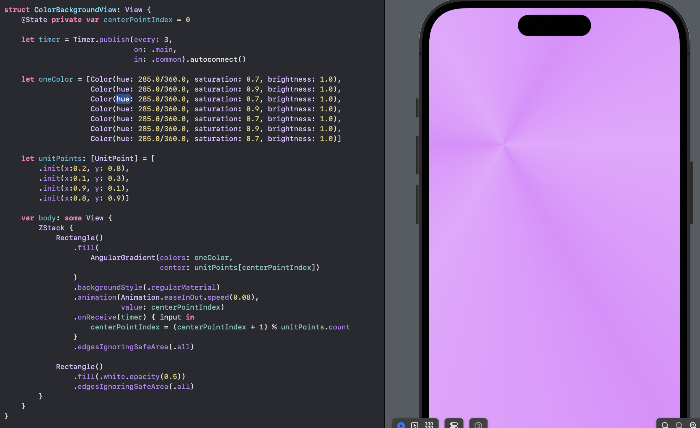
Use Color with Opacity
An alternative way to tone down the animation is to place a color layer over the background and controll how much of the background is seen with the opacity setting.
 1struct ColorBackgroundView: View {
 2    @State private var centerPointIndex = 0
 3
 4    let timer = Timer.publish(every: 3,
 5                              on: .main,
 6                              in: .common).autoconnect()
 7
 8    let oneColor = [Color(hue: 285.0/360.0, saturation: 0.7, brightness: 1.0),
 9                    Color(hue: 285.0/360.0, saturation: 0.9, brightness: 1.0),
10                    Color(hue: 285.0/360.0, saturation: 0.7, brightness: 1.0),
11                    Color(hue: 285.0/360.0, saturation: 0.9, brightness: 1.0),
12                    Color(hue: 285.0/360.0, saturation: 0.7, brightness: 1.0),
13                    Color(hue: 285.0/360.0, saturation: 0.9, brightness: 1.0),
14                    Color(hue: 285.0/360.0, saturation: 0.7, brightness: 1.0)]
15
16    let unitPoints: [UnitPoint] = [
17        .init(x:0.2, y: 0.8),
18        .init(x:0.1, y: 0.3),
19        .init(x:0.9, y: 0.1),
20        .init(x:0.8, y: 0.9)]
21
22    var body: some View {
23        ZStack {
24            Rectangle()
25                .fill(
26                    AngularGradient(colors: oneColor,
27                                    center: unitPoints[centerPointIndex])
28                )
29                .backgroundStyle(.regularMaterial)
30                .animation(Animation.easeInOut.speed(0.08),
31                           value: centerPointIndex)
32                .onReceive(timer) { input in
33                    centerPointIndex = (centerPointIndex + 1) % unitPoints.count
34                }
35                .edgesIgnoringSafeArea(.all)
36
37            Rectangle()
38                .fill(.white.opacity(0.5))
39                .edgesIgnoringSafeArea(.all)
40        }
41    }
42}
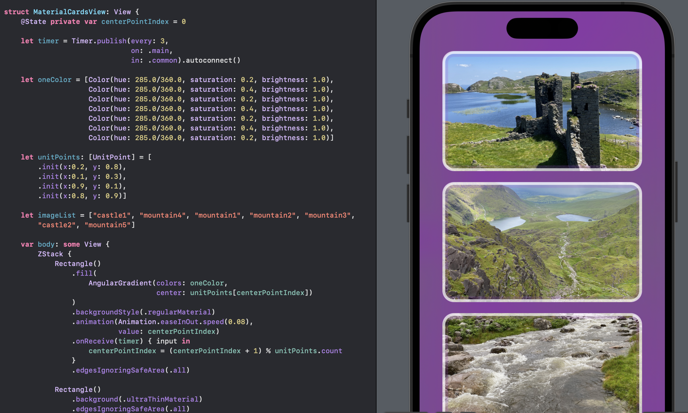
Cards with material background
This is an example of series of cards, showing images, over the animated background that is behind a material.
 1struct MaterialCardsView: View {
 2    @State private var centerPointIndex = 0
 3
 4    let timer = Timer.publish(every: 3,
 5                              on: .main,
 6                              in: .common).autoconnect()
 7
 8    let oneColor = [Color(hue: 285.0/360.0, saturation: 0.2, brightness: 1.0),
 9                    Color(hue: 285.0/360.0, saturation: 0.4, brightness: 1.0),
10                    Color(hue: 285.0/360.0, saturation: 0.2, brightness: 1.0),
11                    Color(hue: 285.0/360.0, saturation: 0.4, brightness: 1.0),
12                    Color(hue: 285.0/360.0, saturation: 0.2, brightness: 1.0),
13                    Color(hue: 285.0/360.0, saturation: 0.4, brightness: 1.0),
14                    Color(hue: 285.0/360.0, saturation: 0.2, brightness: 1.0)]
15
16    let unitPoints: [UnitPoint] = [
17        .init(x:0.2, y: 0.8),
18        .init(x:0.1, y: 0.3),
19        .init(x:0.9, y: 0.1),
20        .init(x:0.8, y: 0.9)]
21
22    let imageList = ["castle1", "mountain4", "mountain1", "mountain2", "mountain3", "castle2", "mountain5"]
23
24    var body: some View {
25        ZStack {
26            Rectangle()
27                .fill(
28                    AngularGradient(colors: oneColor,
29                                    center: unitPoints[centerPointIndex])
30                )
31                .backgroundStyle(.regularMaterial)
32                .animation(Animation.easeInOut.speed(0.08),
33                           value: centerPointIndex)
34                .onReceive(timer) { input in
35                    centerPointIndex = (centerPointIndex + 1) % unitPoints.count
36                }
37                .edgesIgnoringSafeArea(.all)
38
39            Rectangle()
40                .background(.ultraThinMaterial)
41                .edgesIgnoringSafeArea(.all)
42
43            ScrollView {
44                VStack(spacing: 30) {
45                    ForEach(0..<imageList.count, id: \.self) { index in
46                        CardView(imageName: imageList[index])
47                            .frame(width: 350, height: 200)
48                    }
49                    Spacer()
50                }
51                .padding()
52            }
53        }
54    }
55}
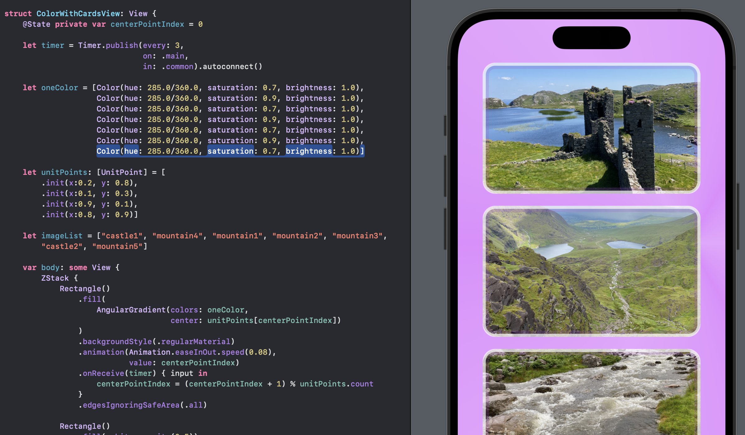
Cards with color background
This is an example of series of cards, showing images, over the animated background that is behind an opaque color layer. The use of opacity can be a great way to control how much of the animation is seen.
 1struct ColorWithCardsView: View {
 2    @State private var centerPointIndex = 0
 3
 4    let timer = Timer.publish(every: 3,
 5                              on: .main,
 6                              in: .common).autoconnect()
 7
 8    let oneColor = [Color(hue: 285.0/360.0, saturation: 0.7, brightness: 1.0),
 9                    Color(hue: 285.0/360.0, saturation: 0.9, brightness: 1.0),
10                    Color(hue: 285.0/360.0, saturation: 0.7, brightness: 1.0),
11                    Color(hue: 285.0/360.0, saturation: 0.9, brightness: 1.0),
12                    Color(hue: 285.0/360.0, saturation: 0.7, brightness: 1.0),
13                    Color(hue: 285.0/360.0, saturation: 0.9, brightness: 1.0),
14                    Color(hue: 285.0/360.0, saturation: 0.7, brightness: 1.0)]
15
16    let unitPoints: [UnitPoint] = [
17        .init(x:0.2, y: 0.8),
18        .init(x:0.1, y: 0.3),
19        .init(x:0.9, y: 0.1),
20        .init(x:0.8, y: 0.9)]
21
22    let imageList = ["castle1", "mountain4", "mountain1", "mountain2", "mountain3", "castle2", "mountain5"]
23
24    var body: some View {
25        ZStack {
26            Rectangle()
27                .fill(
28                    AngularGradient(colors: oneColor,
29                                    center: unitPoints[centerPointIndex])
30                )
31                .backgroundStyle(.regularMaterial)
32                .animation(Animation.easeInOut.speed(0.08),
33                           value: centerPointIndex)
34                .onReceive(timer) { input in
35                    centerPointIndex = (centerPointIndex + 1) % unitPoints.count
36                }
37                .edgesIgnoringSafeArea(.all)
38
39            Rectangle()
40                .fill(.white.opacity(0.5))
41                .edgesIgnoringSafeArea(.all)
42
43
44            ScrollView {
45                VStack(spacing: 30) {
46                    ForEach(0..<3, id: \.self) { index in
47                        CardView(imageName: imageList[index])
48                            .frame(width: 350, height: 200)
49                    }
50                    Spacer()
51                }
52                .padding()
53            }
54        }
55    }
56}
Conclusion
Animating a change in the color gradient of the background can make your app feel more dynamic and engaging. This article demonstrated one way to achieve this effect is by using AngularGradient to keep the background moving. There is a balance between animation to make the app engaging and animation that can be distracting. A Material layer can be used to tone down the background, but this seems to hide the background too much. A color layer seems a better fit with control of how much of the background animation is shown controlled by the opacity level.
The source code for ColorGradientApp is available on GitHub.