TabView in SwiftUI
A tab bar is presented at the bottom of the screen in iOS apps and is used for navigation between the major sections of an app. TabView is used in SwiftUI to easily add multiple tabs to the main view.
Tabs allow people to quickly see the main functional areas of the app and to easily switch between them while preserving the current state within each section. The TabView should only only be used to enable navigation and not perform actions. In general, it is best to keep the number of tabs between 3 and 5 as, although a more tab displays additional tabs, it requires an extra tap to reveal them.
TabView with Text
Start with a simple list of 4 tabs in a TabView. Each view for the tabs contains a Text view as well as an SF Symbols of the number for the view. The tabItem only support items of type Text or Image.
 1struct ContentView: View {
 2
 3    var body: some View {
 4        TabView {
 5            VStack {
 6                Text("The First Tab")
 7                Image(systemName: "1.circle.fill")
 8                    .foregroundColor(.red)
 9                    .font(.system(size: 120))
10            }
11            .tabItem {
12                Image(systemName: "1.circle.fill")
13                Text("First")
14            }
15
16            VStack {
17                Text("Second Tab")
18                Image(systemName: "2.circle.fill")
19                    .foregroundColor(.orange)
20                    .font(.system(size: 120))
21            }
22            .tabItem {
23                Image(systemName: "2.circle.fill")
24                Text("Second")
25            }
26
27            VStack {
28                Text("Third Tab")
29                Image(systemName: "3.circle.fill")
30                    .foregroundColor(.yellow)
31                    .font(.system(size: 120))
32            }
33            .tabItem {
34                Image(systemName: "3.circle.fill")
35                Text("Third")
36            }
37
38            VStack {
39                Text("Fourth Tab")
40                Image(systemName: "4.circle.fill")
41                    .foregroundColor(.green)
42                    .font(.system(size: 120))
43            }
44            .tabItem {
45                Image(systemName: "4.circle.fill")
46                    .font(.system(size: 60))
47                Text("Third")
48            }
49        }
50        .font(.system(.largeTitle, design:.rounded))
51    }
52}


SwiftUI TabView with simple text in each view
TabView containing other views
Rather than detailing the layout of each view within the TabView, each of the views are usually defined separately and the view specified in the TabView.
Define a ColorItem struct to contain a color with a description and selected state.
 1struct ColorItem: Identifiable, Equatable {
 2    let id = UUID()
 3    let col: Color
 4    let description: String
 5    let selected: Bool
 6
 7    init(col: Color, description: String, selected: Bool) {
 8        self.col = col
 9        self.description = description
10        self.selected = selected
11    }
12
13    init(col: Color, description: String) {
14        self.init(col: col, description: description, selected: false)
15    }
16}
Create a color list view that creates a series or ColorItems and displays these is
a ScrollView. The layout for each row is split out into a separate RowView.
 1struct ColorListView: View {
 2    var body: some View {
 3        VStack {
 4            Text("Color List")
 5                .font(.title)
 6                .fontWeight(.bold)
 7
 8            ScrollView {
 9                ForEach(0...20, id: \.self) { i in
10                    let c = ColorItem(col: Color(hue: Double(i)/20.0, saturation: 1, brightness: 1),
11                                      description: "hue = \(Double(i)/20.0)")
12                    RowView(colr: c)
13                }
14            }
15            .padding()
16        }
17    }
18}
19
20struct RowView: View {
21    var colr: ColorItem
22
23    var body: some View {
24        ZStack {
25            Rectangle()
26                .fill(colr.col)
27                .opacity(colr.selected ? 0.5 : 0.0)
28            VStack {
29                RoundedRectangle(cornerRadius: 20)
30                    .fill(colr.col)
31                    .frame(idealWidth: 200, maxWidth: .infinity, minHeight: 5, idealHeight: 5, maxHeight: 5, alignment: .center)
32                HStack {
33                    Text("\(colr.col.description)")
34                        .font(.title2)
35                        .fontWeight(.bold)
36                    Spacer()
37                    RoundedRectangle(cornerRadius: 10)
38                        .fill(colr.col)
39                        .frame(width: 10,
40                               height: 40,
41                               alignment: .leading)
42                    Text(colr.description)
43                        .frame(width: 125, alignment: .leading)
44                        .lineLimit(3)
45                }
46            }
47        }
48    }
49}
A second view is created to contain a list of the selected colors, but this is left empty for now.
1struct SelectedColorsView: View {
2    var body: some View {
3        Text("No Color Selected")
4    }
5}
Finally, the main view is updated to contain these two views in a TabView.
 1struct ContentView: View {
 2    var body: some View {
 3        TabView {
 4            ColorListView()
 5                .tabItem {
 6                    Image(systemName: "list.bullet.rectangle.fill")
 7                    Text("Color List")
 8                }
 9            SelectedColorsView()
10                .tabItem {
11                    Image(systemName: "paintpalette.fill")
12                    Text("Selected Colors")
13                }
14        }
15    }
16}

Sharing data between tab views
Views in SwiftUI should present the current state of data, which should be stored in a model. As such, any changes in the data should cause the views to refresh. Views in SwiftUI do not share data with each other directly, but update the underlying data, usually through a ViewModel. See more on MVVM pattern in MVVM in SwiftUI.
The app is updated to contain a ColorsModel that contains the list of ColorItems
and a ColorsViewModel, which conforms to ObservableObject protocol. This allows
the view in SwiftUI to bind to the ViewModel. The use of the @Published property
wrapper means that whenever there are any changes to the values property, all views
using that object will be reloaded to reflect those changes.
 1struct ColorsModel {
 2    var values: [ColorItem]
 3
 4    init() {
 5        self.values = []
 6        for i in 0...20 {
 7            let c = ColorItem(col: Color(hue: Double(i)/20.0, saturation: 1, brightness: 1),
 8                            description: "hue = \(Double(i)/20.0)")
 9            self.values.append(c)
10        }
11    }
12
13    var selectedColors: [ColorItem] {
14        return values.filter { $0.selected }
15    }
16
17    mutating func toggleSelected(_ c: ColorItem) {
18        if let i = values.firstIndex(of: c) {
19            values[i] = ColorItem(col: c.col, description: c.description, selected: !c.selected)
20        }
21    }
22}
 1class ColorsViewModel: ObservableObject {
 2    @Published private var colorList: ColorsModel
 3
 4    init() {
 5        colorList = ColorsModel()
 6    }
 7
 8    var colors: [ColorItem] {
 9        get { colorList.values }
10    }
11
12    var selectedColors: [ColorItem] {
13        get { colorList.selectedColors }
14    }
15
16    func toggleSelected(_ colr: ColorItem) {
17        self.colorList.toggleSelected(colr)
18    }
19}
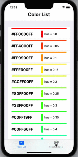
The ColorListView is updated to use the ViewModel to obtain the list of colorItems
and to display these in a list.
 1struct ColorListView: View {
 2    @ObservedObject var colVm: ColorsViewModel
 3
 4    var body: some View {
 5        VStack {
 6            Text("Color List")
 7                .font(.title)
 8                .fontWeight(.bold)
 9
10            List(self.colVm.colors) { col in
11                RowView(colr: col)
12                    .onTapGesture {
13                        colVm.toggleSelected(col)
14                    }
15            }
16        }
17    }
18}
The SelectedColorsView is updated to use the ViewModel to obtain the list of
colorItems that have been set to selected, through the selectedColors property on
the ViewModel.
 1struct SelectedColorsView: View {
 2    @ObservedObject var colVm: ColorsViewModel
 3
 4    var body: some View {
 5        VStack(spacing:0) {
 6            if (colVm.selectedColors.count > 0) {
 7                ForEach(colVm.selectedColors) { col in
 8                    Rectangle()
 9                        .fill(col.col)
10                        .overlay(
11                            Text("\(col.col.description)")
12                        )
13                }
14            }
15            else {
16                Text("No Color Selected")
17            }
18        }
19    }
20}
The ViewModel is set as an ObservedObject object and instantiated when the main
view is initialised. Multiple colors can be selected by tapping on them and these
selected colors are shown in the SelectedColorsView when the Selected Colors tab
is selected.
 1struct ContentView: View {
 2    @ObservedObject private var colVm: ColorsViewModel
 3
 4    init() {
 5        colVm = ColorsViewModel()
 6    }
 7
 8    var body: some View {
 9        TabView {
10            ColorListView(colVm: colVm)
11                .tabItem {
12                    Image(systemName: "list.bullet.rectangle.fill")
13                    Text("Color List")
14                }
15            SelectedColorsView(colVm: colVm)
16                .tabItem {
17                    Image(systemName: "paintpalette.fill")
18                    Text("Selected Colors")
19                }
20        }
21    }
22}

Adding Badge Count to a Tab
A badge with a number can easily be added to a tab using the badge static method. When a badge is set to the number of selected colors, it automatically disappears when the count is zero.
 1struct ContentView: View {
 2    @ObservedObject private var colVm: ColorsViewModel
 3
 4    init() {
 5        colVm = ColorsViewModel()
 6    }
 7
 8    var body: some View {
 9        TabView {
10            ColorListView(colVm: colVm)
11                .tabItem {
12                    Image(systemName: "list.bullet.rectangle.fill")
13                    Text("Color List")
14                }
15            SelectedColorsView(colVm: colVm)
16                .badge(colVm.selectedColors.count)
17                .tabItem {
18                    Image(systemName: "paintpalette.fill")
19                    Text("Selected Colors")
20                }
21        }
22    }
23}
SwiftUI TabView with sub views showing data from model
Conclusion
Tabs should be used to navigate to separate functional areas within an App. It is easy to add tabs in SwiftUI using TabView struct. When the content displayed in multiple tabs is related, any changes in one tab should update the underlying model and these will then propagate to the other tabs when viewed.