Create a circular slider in SwiftUI

A Slider control is a UI control that allows the user to select a value from within a range of values. In SwiftUI, it is usually presented as a thumb selector on a linear line. There are times when it might be better to present this type of selector as a circle with the thumb moving around the circumference. This article describes how to define a circular slider in SwiftUIt.
More information on the default Slider is covered in How to customise the Slider in SwiftUI as well as options to customise the look and feel.
[April 2023]
See related article on how to Create a circular slider in SwiftUI with ChatGPT.
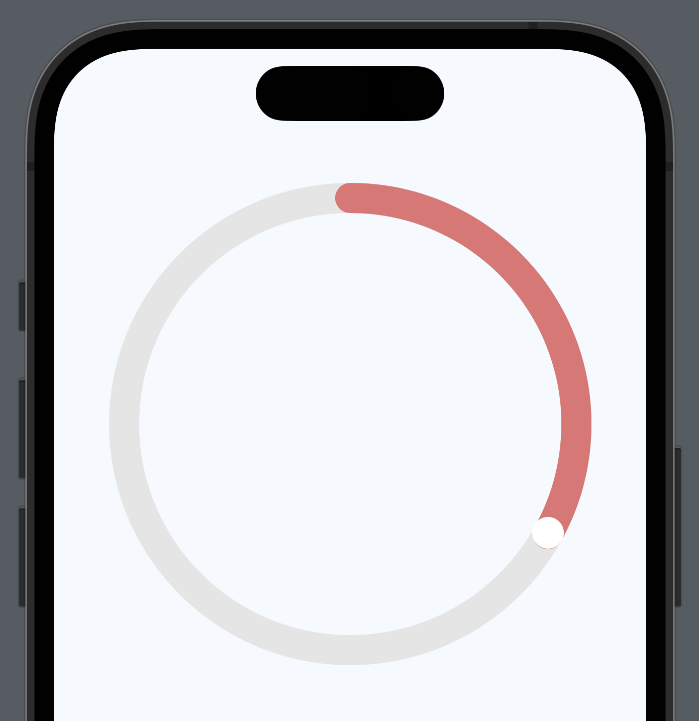
Initial circular outline
Start with three circles in a ZStack. A gray circle to represent the outline of path
of the Slider, a pale red arc to represent the progress along the circle and a circle
to represent the current cursor or thumb position. Set the range of the slider from
0.0 to 1.0 and hard-code in a diameter as well as a current position progress of
0.33.
 1struct CircularSliderView1: View {
 2    let progress = 0.33
 3    let ringDiameter = 300.0
 4
 5    private var rotationAngle: Angle {
 6        return Angle(degrees: (360.0 * progress))
 7    }
 8
 9    var body: some View {
10        VStack {
11            ZStack {
12                Circle()
13                    .stroke(Color(hue: 0.0, saturation: 0.0, brightness: 0.9), lineWidth: 20.0)
14                Circle()
15                    .trim(from: 0, to: progress)
16                    .stroke(Color(hue: 0.0, saturation: 0.5, brightness: 0.9),
17                            style: StrokeStyle(lineWidth: 20.0, lineCap: .round)
18                    )
19                    .rotationEffect(Angle(degrees: -90))
20                Circle()
21                    .fill(Color.white)
22                    .frame(width: 21, height: 21)
23                    .offset(y: -ringDiameter / 2.0)
24                    .rotationEffect(rotationAngle)
25            }
26            .frame(width: ringDiameter, height: ringDiameter)
27
28            Spacer()
29        }
30        .padding(.vertical, 80)
31    }
32}
Hook up the progress to thumb position
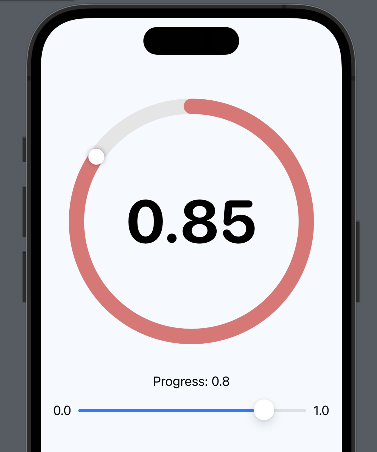
Change the progress variable to be a State variable and add a default Slider. This Slider is used to change the value of the progress and implement enough code on the circular slider to get the thumb and progress arc to respond. The current value is shown in the center of the circular slider.
 1struct CircularSliderView2: View {
 2    @State var progress = 0.33
 3    let ringDiameter = 300.0
 4
 5    private var rotationAngle: Angle {
 6        return Angle(degrees: (360.0 * progress))
 7    }
 8
 9    var body: some View {
10        ZStack {
11            Color(hue: 0.58, saturation: 0.04, brightness: 1.0)
12                .edgesIgnoringSafeArea(.all)
13
14            VStack {
15                ZStack {
16                    Circle()
17                        .stroke(Color(hue: 0.0, saturation: 0.0, brightness: 0.9), lineWidth: 20.0)
18                        .overlay() {
19                            Text("\(progress, specifier: "%.1f")")
20                                .font(.system(size: 78, weight: .bold, design:.rounded))
21                        }
22                    Circle()
23                        .trim(from: 0, to: progress)
24                        .stroke(Color(hue: 0.0, saturation: 0.5, brightness: 0.9),
25                                style: StrokeStyle(lineWidth: 20.0, lineCap: .round)
26                        )
27                        .rotationEffect(Angle(degrees: -90))
28                    Circle()
29                        .fill(Color.white)
30                        .shadow(radius: 3)
31                        .frame(width: 21, height: 21)
32                        .offset(y: -ringDiameter / 2.0)
33                        .rotationEffect(rotationAngle)
34                }
35                .frame(width: ringDiameter, height: ringDiameter)
36
37
38                VStack {
39                    Text("Progress: \(progress, specifier: "%.1f")")
40                    Slider(value: $progress,
41                           in: 0...1,
42                           minimumValueLabel: Text("0.0"),
43                           maximumValueLabel: Text("1.0")
44                    ) {}
45                }
46                .padding(.vertical, 40)
47
48                Spacer()
49            }
50            .padding(.vertical, 40)
51            .padding()
52        }
53    }
54}
Add touch gesture
A DragGesture is added to the thumb circle and a temporary Text view is used to show the current location as the Drag Gesture is in progress. It can be seen that the x and y coordinates change around the center of the frame containing the Circular Slider.
 1struct CircularSliderView3: View {
 2    @State var progress = 0.33
 3    let ringDiameter = 300.0
 4
 5    @State var loc = CGPoint(x: 0, y: 0)
 6
 7    private var rotationAngle: Angle {
 8        return Angle(degrees: (360.0 * progress))
 9    }
10
11    private func changeAngle(location: CGPoint) {
12        loc = location
13    }
14
15    var body: some View {
16        ZStack {
17            Color(hue: 0.58, saturation: 0.04, brightness: 1.0)
18                .edgesIgnoringSafeArea(.all)
19
20            VStack {
21                ZStack {
22                    Circle()
23                        .stroke(Color(hue: 0.0, saturation: 0.0, brightness: 0.9), lineWidth: 20.0)
24                        .overlay() {
25                            Text("\(progress, specifier: "%.1f")")
26                                .font(.system(size: 78, weight: .bold, design:.rounded))
27                        }
28                    Circle()
29                        .trim(from: 0, to: progress)
30                        .stroke(Color(hue: 0.0, saturation: 0.5, brightness: 0.9),
31                                style: StrokeStyle(lineWidth: 20.0, lineCap: .round)
32                        )
33                        .rotationEffect(Angle(degrees: -90))
34                    Circle()
35                        .fill(Color.blue)
36                        .shadow(radius: 3)
37                        .frame(width: 21, height: 21)
38                        .offset(y: -ringDiameter / 2.0)
39                        .rotationEffect(rotationAngle)
40                        .gesture(
41                            DragGesture(minimumDistance: 0.0)
42                                .onChanged() { value in
43                                    changeAngle(location: value.location)
44                                }
45                        )
46                }
47                .frame(width: ringDiameter, height: ringDiameter)
48
49                Spacer().frame(height:50)
50
51                Text("Location = (\(loc.x, specifier: "%.1f"), \(loc.y, specifier: "%.1f"))")
52
53                Spacer()
54            }
55            .padding(.vertical, 40)
56            .padding()
57        }
58    }
59}
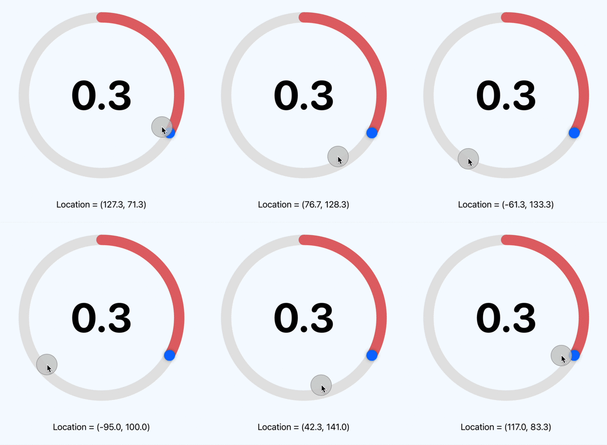
Use a temporary State variable to show how the location point changes with the Drag Gesture
Calculate angle for location
Add a private function to calculate the angle the thumb needs to move to from the location points in the drag gesture. A CGVector is created from the center to the location point and the angle is calculated using the ArcTangent function atan2. The angle calculated needs to be adjusted for becoming negative on the left of the center of the frame.
 1struct CircularSliderView4: View {
 2    @State var progress = 0.33
 3    let ringDiameter = 300.0
 4    @State var rotationAngle = Angle(degrees: 120)
 5
 6    private func changeAngle(location: CGPoint) -> Angle{
 7        // Create a Vector for the location (reversing the y-coordinate system on iOS)
 8        let vector = CGVector(dx: location.x, dy: -location.y)
 9
10        // Calculate the angle of the vector
11        let angleRadians = atan2(vector.dx, vector.dy)
12
13        // Convert the angle to a range from 0 to 360 (rather than having negative angles)
14        let positiveAngle = angleRadians < 0.0 ? angleRadians + (2.0 * .pi) : angleRadians
15
16        // Update slider progress value based on angle
17        progress = positiveAngle / (2.0 * .pi)
18
19        return Angle(radians: positiveAngle)
20    }
21
22    var body: some View {
23        ZStack {
24            Color(hue: 0.58, saturation: 0.04, brightness: 1.0)
25                .edgesIgnoringSafeArea(.all)
26
27            VStack {
28                ZStack {
29                    Circle()
30                        .stroke(Color(hue: 0.0, saturation: 0.0, brightness: 0.9), lineWidth: 20.0)
31                        .overlay() {
32                            Text("\(progress, specifier: "%.2f")")
33                                .font(.system(size: 78, weight: .bold, design:.rounded))
34                        }
35                    Circle()
36                        .trim(from: 0, to: progress)
37                        .stroke(Color(hue: 0.0, saturation: 0.5, brightness: 0.9),
38                                style: StrokeStyle(lineWidth: 20.0, lineCap: .round)
39                        )
40                        .rotationEffect(Angle(degrees: -90))
41                    Circle()
42                        .fill(Color.white)
43                        .shadow(radius: 3)
44                        .frame(width: 21, height: 21)
45                        .offset(y: -ringDiameter / 2.0)
46                        .rotationEffect(rotationAngle)
47                        .gesture(
48                            DragGesture(minimumDistance: 0.0)
49                                .onChanged() { value in
50                                    rotationAngle = changeAngle(location: value.location)
51                                }
52                        )
53                }
54                .frame(width: ringDiameter, height: ringDiameter)
55
56                Spacer()
57            }
58            .padding(.vertical, 40)
59            .padding()
60        }
61    }
62}
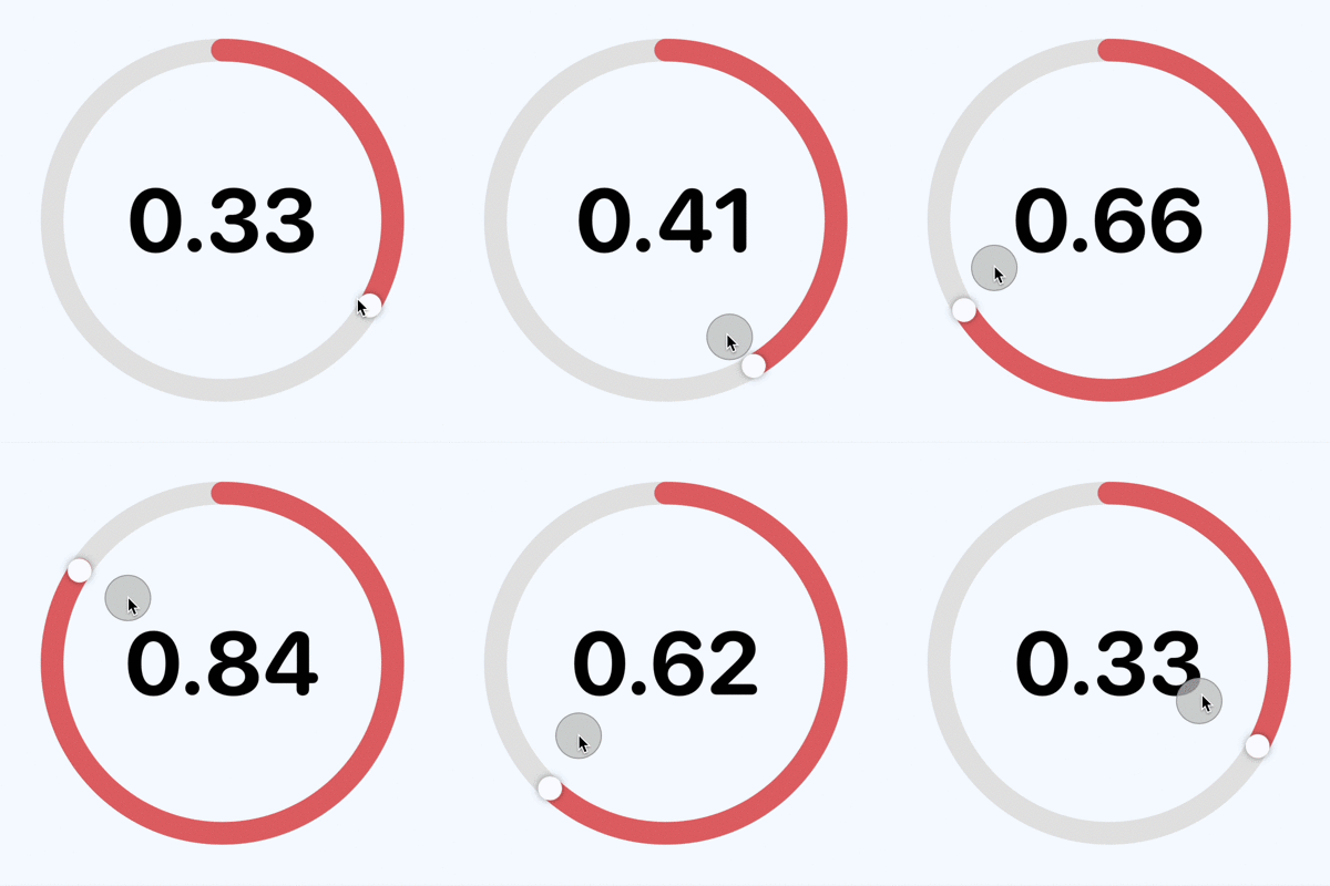
Calculate the angle from drag gesture location point and update progress
Configure slider for different values
There are two values that represent the progress on the circular slider, the
progress value used to display the progress arc and the rotationAngle used to
display the slider cursor. There should be only one property to hold the slider
progress. The view is extracted to a separate struct with the one binding value for
the progress on the circular slider.
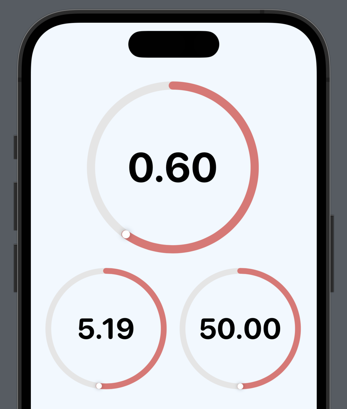
An optional parameter for the range on the Slider is also available. This requires a couple of adjustments to the progress to calculate the angle that has been set as well as the rotation angle for the position of the thumb on the circular slider. In addition, onAppear is called to calculate the rotation angle from the progress value before the View appears.
 1struct CircularSliderView: View {
 2    @Binding var progress: Double
 3
 4    @State private var rotationAngle = Angle(degrees: 0)
 5    private var minValue = 0.0
 6    private var maxValue = 1.0
 7
 8    init(value progress: Binding<Double>, in bounds: ClosedRange<Int> = 0...1) {
 9        self._progress = progress
10
11        self.minValue = Double(bounds.first ?? 0)
12        self.maxValue = Double(bounds.last ?? 1)
13        self.rotationAngle = Angle(degrees: progressFraction * 360.0)
14    }
15
16    private var progressFraction: Double {
17        return ((progress - minValue) / (maxValue - minValue))
18    }
19
20    private func changeAngle(location: CGPoint) {
21        // Create a Vector for the location (reversing the y-coordinate system on iOS)
22        let vector = CGVector(dx: location.x, dy: -location.y)
23
24        // Calculate the angle of the vector
25        let angleRadians = atan2(vector.dx, vector.dy)
26
27        // Convert the angle to a range from 0 to 360 (rather than having negative angles)
28        let positiveAngle = angleRadians < 0.0 ? angleRadians + (2.0 * .pi) : angleRadians
29
30        // Update slider progress value based on angle
31        progress = ((positiveAngle / (2.0 * .pi)) * (maxValue - minValue)) + minValue
32        rotationAngle = Angle(radians: positiveAngle)
33    }
34
35    var body: some View {
36        GeometryReader { gr in
37            let radius = (min(gr.size.width, gr.size.height) / 2.0) * 0.9
38            let sliderWidth = radius * 0.1
39
40            VStack(spacing:0) {
41                ZStack {
42                    Circle()
43                        .stroke(Color(hue: 0.0, saturation: 0.0, brightness: 0.9),
44                                style: StrokeStyle(lineWidth: sliderWidth))
45                        .overlay() {
46                            Text("\(progress, specifier: "%.0f")")
47                                .font(.system(size: radius * 0.7, weight: .bold, design:.rounded))
48                        }
49                    // uncomment to show tick marks
50                    //Circle()
51                    //    .stroke(Color(hue: 0.0, saturation: 0.0, brightness: 0.6),
52                    //            style: StrokeStyle(lineWidth: sliderWidth * 0.75,
53                    //                               dash: [2, (2 * .pi * radius)/24 - 2]))
54                    //    .rotationEffect(Angle(degrees: -90))
55                    Circle()
56                        .trim(from: 0, to: progressFraction)
57                        .stroke(Color(hue: 0.0, saturation: 0.5, brightness: 0.9),
58                                style: StrokeStyle(lineWidth: sliderWidth, lineCap: .round)
59                        )
60                        .rotationEffect(Angle(degrees: -90))
61                    Circle()
62                        .fill(Color.white)
63                        .shadow(radius: (sliderWidth * 0.3))
64                        .frame(width: sliderWidth, height: sliderWidth)
65                        .offset(y: -radius)
66                        .rotationEffect(rotationAngle)
67                        .gesture(
68                            DragGesture(minimumDistance: 0.0)
69                                .onChanged() { value in
70                                    changeAngle(location: value.location)
71                                }
72                        )
73                }
74                .frame(width: radius * 2.0, height: radius * 2.0, alignment: .center)
75                .padding(radius * 0.1)
76            }
77
78            .onAppear {
79                self.rotationAngle = Angle(degrees: progressFraction * 360.0)
80            }
81        }
82    }
83}
Three different views of CircularSliderView are added to a view to test and
demonstrate the different features of the Circular Slider view.
 1struct CircularSliderView5: View {
 2    @State var progress1 = 0.75
 3    @State var progress2 = 37.5
 4    @State var progress3 = 7.5
 5
 6    var body: some View {
 7        ZStack {
 8            Color(hue: 0.58, saturation: 0.06, brightness: 1.0)
 9                .edgesIgnoringSafeArea(.all)
10
11            VStack {
12                CircularSliderView(value: $progress1)
13                    .frame(width:250, height: 250)
14
15                HStack {
16                    CircularSliderView(value: $progress2, in: 32...50)
17
18                    CircularSliderView(value: $progress3, in: 0...100)
19                }
20
21                Spacer()
22            }
23            .padding()
24        }
25    }
26}
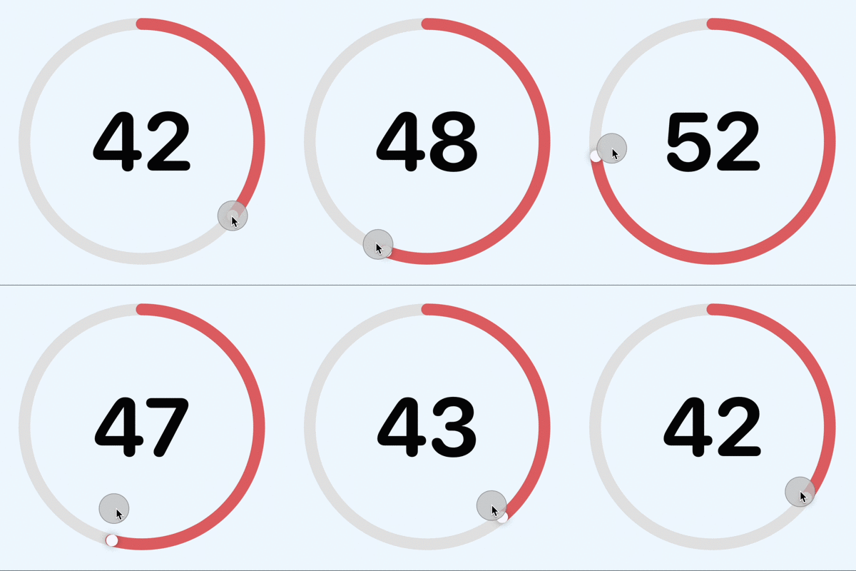
Circular slider from 32 to 50 in SwiftUI
Conclusion
This article how to define a circular slider control that responds to drag gesture. The size of the containing frame can be set and the slider works as expected. More parameters could be added to the control to set the colors or the format of the values displayed inside the circular slider. The code for Circular Slider is available on GitHub.