Navigation in SwiftUI
Most mobile apps contain more than one screen, so navigation from one screen to another is necessary. A typical implementation is to have a list of items where tapping on a single item will navigate to a detailed page for that item. SwiftUI framework provides NavigationView and NavigationLink for this purpose.
This article walks through using Navigation in SwiftUI and how to customise the look and feel of the navigation buttons.
Embed the list in NavigationView
Start with a list of items, I will use the list of colors from Using lists in SwiftUI. The entire list can be embedded in a NavigationView, but that does not give navigation as there is no destination defined. A space is created above the list for a Navigation title.
1NavigationView() {
2    List(self.colors) { col in
3        RowView(colr: col)
4    }
5}
Code to define colors and the layout of the rows.
 1    private var colors = [
 2        MyColor(name: "Red",
 3                col: Color(.red),
 4                description: "Red is the color at the end of the visible spectrum of light. It has a dominant wavelength of approximately 625–740 nanometres. It is a primary color in the RGB color model and the CMYK color model, and is the complementary color of cyan. Reds range from the brilliant yellow-tinged scarlet and vermillion to bluish-red crimson, and vary in shade from the pale red pink to the dark red burgundy."),
 5        MyColor(name: "Orange",
 6                col: Color(.orange),
 7                description: "Orange is the colour between yellow and red on the spectrum of visible light. It has a dominant wavelength of approximately 585-620 nanometres. In painting and traditional colour theory, it is a secondary colour of pigments, created by mixing yellow and red. In the RGB color model, it is a tertiary colour. It is named after the fruit of the same name."),
 8        MyColor(name: "Yellow",
 9                col: .yellow,
10                description: "Yellow is the color between orange and green on the spectrum of visible light. It has a dominant wavelength of approximately 570–590 nanometres. It is a primary color in subtractive color systems, used in painting or color printing. In the RGB color model, used to create colors on television and computer screens, yellow is a secondary color made by combining red and green at equal intensity. Carotenoids give the characteristic yellow color to autumn leaves, corn, canaries, daffodils, and lemons, as well as egg yolks, buttercups, and bananas. Sunlight has a slight yellowish hue when the Sun is near the horizon, due to atmospheric scattering of shorter wavelengths (green, blue, and violet)."),
11        MyColor(name: "Green",
12                col: .green,
13                description: "Green is the color between blue and yellow on the visible spectrum. It has a dominant wavelength of approximately 495–570 nanometres. In subtractive color systems, used in painting and color printing, it is created by a combination of yellow and blue, or yellow and cyan; in the RGB color model, used on television and computer screens, it is one of the additive primary colors, along with red and blue, which are mixed in different combinations to create all other colors. By far the largest contributor to green in nature is chlorophyll, the chemical by which plants photosynthesize and convert sunlight into chemical energy. Many creatures have adapted to their green environments by taking on a green hue themselves as camouflage."),
14        MyColor(name: "Blue",
15                col: .blue,
16                description: "Blue is one of the three primary colours of pigments in painting and traditional colour theory, as well as in the RGB colour model. It lies between violet and green on the spectrum of visible light. It has a dominant wavelength of approximately 450-495 nanometres. Most blues contain a slight mixture of other colours; azure contains some green, while ultramarine contains some violet. The clear daytime sky and the deep sea appear blue because of an optical effect known as Rayleigh scattering."),
17        MyColor(name: "Indigo",
18                col: Color(red: 75/255, green: 0/255, blue: 130/255),
19                description: "Indigo is a deep and rich color close to the color wheel blue, as well as to some variants of ultramarine, based on the ancient dye of the same name. The word indigo comes from the Latin for Indian as the dye was originally exported to Europe from India. It is traditionally regarded as a color in the visible spectrum, as well as one of the seven colors of the rainbow: the color between blue and violet; however, sources differ as to its actual position in the electromagnetic spectrum."),
20        MyColor(name: "Violet",
21                col: Color(red: 159/255, green: 0/255, blue: 255/255),
22                description: "Violet is the color of light at the short wavelength end of the visible spectrum, between blue and invisible ultraviolet. It is one of the seven colors that Isaac Newton labeled when dividing the spectrum of visible light in 1672. Violet light has a wavelength between approximately 380-450 nanometers. The color's name is derived from the violet flower.")
23    ]
 1struct RowView: View {
 2    var colr: MyColor
 3
 4    var body: some View {
 5        VStack {
 6            RoundedRectangle(cornerRadius: 20)
 7                .fill(colr.col)
 8                .frame(idealWidth: 200, maxWidth: .infinity, minHeight: 5, idealHeight: 5, maxHeight: 5, alignment: .center)
 9            HStack {
10                Text(colr.name)
11                    .font(.title)
12                    .fontWeight(.bold)
13                Spacer()
14                RoundedRectangle(cornerRadius: 20)
15                    .fill(colr.col)
16                    .frame(idealWidth: 5, maxWidth: 5, minHeight: 50, idealHeight: 50, maxHeight: .infinity, alignment: .leading)
17                Text(colr.description)
18                    .frame(width: 200, alignment: .leading)
19                    .lineLimit(3)
20            }
21        }
22    }
23}
24
25struct MyColor: Identifiable {
26    let id = UUID()
27    let name: String
28    let col: Color
29    let description: String
30}

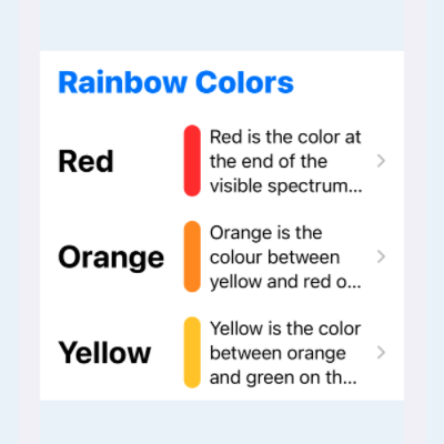
Set Navigation Title
The title for the navigation list can be set in the space above the list using navigationTitle. Note that navigationBarTitle has been deprecated and should no longer be used.
1NavigationView() {
2    List(self.colors) { col in
3        RowView(colr: col)
4    }
5    .navigationTitle("Rainbow Colors")
6}

Customise Navigation Title
It is necessary to use UINavigationBarAppearance from UIKit to customise the font
or color of the title, as this is not customisable from SwiftUI. Add an init
function to the view and create an instance of UINavigationBarAppearance. The color
of the navigation bar title is set by setting the foreground color on this instance
of navigation bar appearance. The following code sets the color to red and then
assigns this appearance to all three appearance properties of UINavigationBar.
 1    init() {
 2        let navBarAppearance = UINavigationBarAppearance()
 3        navBarAppearance.largeTitleTextAttributes = [
 4            .foregroundColor: UIColor.systemBlue
 5        ]
 6        navBarAppearance.titleTextAttributes = [
 7            .foregroundColor: UIColor.systemBlue
 8        ]
 9
10        UINavigationBar.appearance().standardAppearance = navBarAppearance
11        UINavigationBar.appearance().scrollEdgeAppearance = navBarAppearance
12        UINavigationBar.appearance().compactAppearance = navBarAppearance
13    }
14
15    var body: some View {
16        NavigationView() {
17            List(self.colors) { col in
18                RowView(colr: col)
19            }
20            .navigationTitle("Rainbow Colors")
21        }
22    }

Create detailed view
A destination view needs to be defined for the navigation. A new SwiftUI view is created that takes three parameters and defines the layout of a more detailed view for a selected color.
 1struct DetailedView: View {
 2    var color: Color
 3    var title: String
 4    var details: String
 5
 6    var body: some View {
 7        ScrollView {
 8            VStack {
 9                ZStack {
10                    Circle()
11                        .fill(color)
12                        .frame(width: 300, height: 300)
13
14                    Circle()
15                        .fill(
16                            AngularGradient(
17                                gradient: Gradient(
18                                    colors: [
19                                        Color(red: 1.0, green: 1.0, blue: 1.0, opacity: 0.85),
20                                        Color(red: 1.0, green: 1.0, blue: 1.0, opacity: 0.00),
21                                    ]),
22                                center: .center
23                            )
24                        )
25                        .rotationEffect(Angle(degrees: -90))
26                        .frame(width: 260, height: 260)
27                }
28
29                Text(title)
30                    .font(.largeTitle)
31                    .fontWeight(.heavy)
32
33                Text(details)
34                    .padding()
35
36                Spacer()
37            }
38        }
39    }
40}

Navigate to the Detailed view
Now that the detailed view is defined we can use NavigationLink to setup the navigation to the detailed view for each of the colors. Use of the NavigationLink automatically adds a disclosure to indicate to the user that there is more information available. The animation is provided for free by the SwiftUI framework as well as automatic back navigation.
 1    var body: some View {
 2        NavigationView() {
 3            List(self.colors) { col in
 4                NavigationLink (
 5                    destination: DetailedView(
 6                        color: col.col,
 7                        title: col.name,
 8                        details: col.description))
 9                {
10                    RowView(colr: col)
11                }
12            }
13            .navigationTitle("Rainbow Colors")
14        }
15    }

Customise the back button color
The image for the backward navigation can be changed, once again, but using
UINavigationBarAppearance from UIKit. The following code changes the image to a
filled in arrow and the tintColor is used to change the color to a darker blue.
 1    init() {
 2        let navBarAppearance = UINavigationBarAppearance()
 3        navBarAppearance.largeTitleTextAttributes = [
 4            .foregroundColor: UIColor.systemBlue
 5        ]
 6        navBarAppearance.titleTextAttributes = [
 7            .foregroundColor: UIColor.systemBlue
 8        ]
 9
10        navBarAppearance.setBackIndicatorImage(
11            UIImage(systemName: "arrowshape.turn.up.left.fill"),
12            transitionMaskImage: UIImage(systemName: "arrowshape.turn.up.left.fill"))
13
14        UINavigationBar.appearance().standardAppearance = navBarAppearance
15        UINavigationBar.appearance().scrollEdgeAppearance = navBarAppearance
16        UINavigationBar.appearance().compactAppearance = navBarAppearance
17
18        UINavigationBar.appearance().tintColor = UIColor(red: 0.3, green: 0.3, blue: 1.0, alpha: 1.0)
19    }

Replace back button
It is possible to completely replace the back button and use a custom button to navigate back to the list, although this may be confusing to customers who may be expecting the standard back button. The first step is to hide the back button and there are two ways of doing this. Either just hide the button using navigationBarBackButtonHidden - in which case a custom image and text can be added to the Navigation bar. Or completely hide the navigation bar using navigationBarHidden and place a custom button somewhere in the detail content. The second approach is used below, creating a back button with color to match the current color being displayed.
 1struct ColorDetailedView: View {
 2    @Environment(\.presentationMode) var mode
 3
 4    var color: Color
 5    var title: String
 6    var details: String
 7
 8    var body: some View {
 9        ScrollView {
10            VStack {
11                ZStack {
12                    Circle()
13                        .fill(color)
14                        .frame(width: 300, height: 300)
15
16                    Circle()
17                        .fill(
18                            AngularGradient(
19                                gradient: Gradient(
20                                    colors: [
21                                        Color(red: 1.0, green: 1.0, blue: 1.0, opacity: 0.85),
22                                        Color(red: 1.0, green: 1.0, blue: 1.0, opacity: 0.00),
23                                    ]),
24                                center: .center
25                            )
26                        )
27                        .rotationEffect(Angle(degrees: -90))
28                        .frame(width: 260, height: 260)
29                }
30
31                Text(title)
32                    .font(.largeTitle)
33                    .fontWeight(.heavy)
34                    .foregroundColor(color)
35
36                Text(details)
37                    .padding()
38
39                Spacer()
40            }
41        }
42        .overlay (
43            VStack {
44                HStack {
45                    Button(action: {
46                        self.mode.wrappedValue.dismiss()
47                    }, label: {
48                        Image(systemName: "arrowshape.turn.up.backward.circle.fill")
49                            .font(.largeTitle)
50                            .foregroundColor(color)
51                            .shadow(color: .gray, radius: 15)
52                    })
53                    .padding()
54                    Spacer()
55                }
56                Spacer()
57            }
58        )
59        .navigationBarHidden(true)
60    }
61}

Conclusion
Navigation is relatively straight forward with SwiftUI and a lot of functionality is provided by the framework such as animating the transition between views. The view is wrapped in a NavigationView with each item specifying a destination in a NavigationLink. There is limitied customisation available in SwiftUI and it is necessary to use UIKit to customise the Navigation bar title. The backward navigation button can be customised or replaced with a custom button - hooking up the action to the current view presentationMode to dismiss the view.