Layout with Stacks in SwiftUI
SwiftUI uses a declarative approach to creating the User Interface. This means the code is written to state what the user interface should look like. Stacks provide a mechanism to define the layout arrangement of multiple views in a SwiftUI app.
Stacks are used in SwiftUI to layout views instead of using auto layout. There are three types of stacks:
- VStack - Arrange views in the stack vertically
- HStack - Arrange views in the stack horizontally
- ZStack - Arrange views in the stack overlaid on top of each other
All three types of stacks are used in this article to layout the following App.

Stacks
The VStack, HStack and ZStack are simple views that layout their containing views. The VStack arranges its child views in a vertical stack, while the HStack arranges them horizontally. The ZStack lays down each of it's child views on top of each other. These stacks can be combined in numerous nested combinations to create a variety of layouts.

VStack
The heading in the desired layout consists of two Text Views arranged vertically. These are laid out using a VStack and the order written is the order the views are added to the VStack.
1VStack(alignment: .leading, spacing: 5){
2    Text("Hobbies")
3        .font(.system(.largeTitle, design:.rounded))
4        .fontWeight(.black)
5    Text("The quest for a balanced life")
6        .font(.title2)
7}

HStack
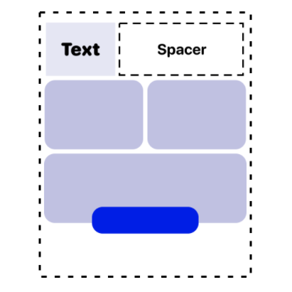
The heading and sub heading are arranged correctly with respect to each other, but they are in the center of the screen horizontally and vertically. To arrange these to the left side of the screen a HStack and a Spacer are used. The Spacer is a flexible space that expands to fill the containing Stack. Another VStack and Spacer is used to ensure the heading is displayed at the top of the screen.
 1VStack {
 2    HStack {
 3        VStack(alignment: .leading, spacing: 5){
 4            Text("Hobbies")
 5                .font(.system(.largeTitle, design:.rounded))
 6                .fontWeight(.black)
 7            Text("The quest for a balanced life")
 8                .font(.title2)
 9        }
10        Spacer()
11    }
12
13    Spacer()
14}

cmd+click can be used in Xcode to display a context menu allowing you to select
Embed in HStack.

cmd+click on a view to show popup option to embed in HStack
Extracting Views
There is also a menu option Extract Subview which will take all the nested code and
move it to a new View. This is a great way to refactor code and break down the code
into smaller reusable chunks. Now the main view contains just one View (HeaderView) in
the main VStack.
1VStack {
2    HeaderView()
3    Spacer()
4}
 1struct HeaderView: View {
 2    var body: some View {
 3        HStack {
 4            VStack(alignment: .leading, spacing: 5){
 5                Text("Hobbies")
 6                    .font(.system(.largeTitle, design:.rounded))
 7                    .fontWeight(.black)
 8                Text("The quest for a balanced life")
 9                    .font(.title2)
10            }
11            Spacer()
12        }
13    }
14}

Card View
Start by creating one card for Books. This consists of an image, which uses sf-symbols for the image. Apple provide SF Symbols as a set of over 2,400 highly configurable symbols that integrate with the San Francisco system font. Below the image is a VStack containing the two text views. The image and the text views stack is embedded further in a VStack, which is modified with a frame and background color.
 1VStack(spacing: 20) {
 2    Image(systemName: "character.book.closed.fill")
 3        .font(.system(size: 60))
 4        .rotation3DEffect(
 5            .degrees(20),
 6            axis: (x: 1.0, y: 0.0, z: -0.5)
 7        )
 8    VStack(spacing: 10) {
 9        Text("Books")
10            .font(.system(.title2, design:.rounded))
11            .fontWeight(.black)
12        Text("read, dream, believe, live")
13            .font(.body)
14            .fontWeight(.bold)
15            .lineLimit(2)
16            .multilineTextAlignment(.center)
17    }
18}
19.frame(minWidth: 0, maxWidth: .infinity, minHeight: 200, maxHeight: 250)
20.padding(10)
21.background(Color(red: 200/255, green: 200/255, blue: 230/255))
22.cornerRadius(20)

Extract Subview and pass in values
The code to layout the Card is extracted to a Subview in order to keep the code in the main view simpler. Three variables are created in the CardView struct, so that the CardView can be reused to display the cards for different hobbies. The specific details of the icon name and the text to display are passed in as arguments to the CardView constructor. The layout of the Books card looks the same, but the code is refactored into a separate Subview.
 1var body: some View {
 2    VStack {
 3        HeaderView()
 4
 5        CardView(
 6            iconName: "character.book.closed.fill",
 7            title: "Books",
 8            description: "read, dream, believe, live"
 9        )
10
11        Spacer()
12    }
13}
 1struct CardView: View {
 2    var iconName: String
 3    var title: String
 4    var description: String
 5
 6    var body: some View {
 7        VStack(spacing: 20) {
 8            Image(systemName: iconName)
 9                .font(.system(size: 60))
10                .rotation3DEffect(
11                    .degrees(20),
12                    axis: (x: 1.0, y: 0.0, z: -0.5)
13                )
14            VStack(spacing: 10) {
15                Text(title)
16                    .font(.system(.title2, design:.rounded))
17                    .fontWeight(.black)
18                Text(description)
19                    .font(.body)
20                    .fontWeight(.bold)
21                    .lineLimit(2)
22                    .multilineTextAlignment(.center)
23            }
24        }
25        .frame(minWidth: 0, maxWidth: .infinity, minHeight: 200, maxHeight: 250)
26        .padding(10)
27        .background(Color(red: 200/255, green: 200/255, blue: 230/255))
28        .cornerRadius(20)
29    }
30}

Add multiple cards
It is easy now to add more cards and arrange them using stacks. The maxHeight for the card was also adjusted to 200. This only needs to be changed in one place in the CardView, and all cards in the app are updated. The maxWidth of the cards being set to infinity causes the Horizontal stack to display the two cards with equal width. If there were three or four cards added, they would all divide up the available width equally.
 1VStack {
 2    HeaderView()
 3
 4    HStack {
 5        CardView(
 6            iconName: "character.book.closed.fill",
 7            title: "Books",
 8            description: "read, dream, believe, live"
 9        )
10
11        CardView(
12            iconName: "music.quarternote.3",
13            title: "Music",
14            description: "listen, sing, dance"
15        )
16    }
17
18    CardView(
19        iconName: "laptopcomputer.and.iphone",
20        title: "Programming",
21        description: "imagine, create, share, enjoy"
22    )
23
24    Spacer()
25}
26.padding()

ZStack
ZStack is used to display views on top of each other. The order in which the views are added to a stack determines the order the views are rendered. If the CardView was moved to the end of the ZStack, it would be rendered last and would appear on top of the two BadgeViews. The BadgeView is created to describe the code for the overlay views and this allows for reuse and keeps the main view simpler.
 1ZStack {
 2    CardView(
 3        iconName: "laptopcomputer.and.iphone",
 4        title: "Programming",
 5        description: "imagine, create, share, enjoy"
 6    )
 7
 8    BadgeView(title: "SwiftUI", padding: 5, radius: 10, rotation: -35, xOffset: -125, yOffset: -70)
 9
10    BadgeView(title: "Layout using Stacks", padding: 10, radius: 20, rotation: 0, xOffset: 0, yOffset: 110)
11
12}
 1struct BadgeView: View {
 2    var title: String
 3    var padding: CGFloat
 4    var radius: CGFloat
 5    var rotation: Double
 6    var xOffset: CGFloat
 7    var yOffset: CGFloat
 8
 9    var body: some View {
10        Text(title)
11            .font(.callout)
12            .fontWeight(.bold)
13            .padding(padding)
14            .background(Color(red: 20/255, green: 18/255, blue: 237/255))
15            .foregroundColor(.white)
16            .cornerRadius(radius)
17            .rotationEffect(.degrees(rotation))
18            .offset(x: xOffset, y: yOffset)
19    }
20}

Final Code
Here is the final code to create the layout as required. The use of sub views allows the main code to be kept simpler and reuse of code for greater consistency.
The main view:
 1struct StackLayout: View {
 2    var body: some View {
 3        VStack {
 4            HeaderView()
 5
 6            HStack {
 7                CardView(
 8                    iconName: "character.book.closed.fill",
 9                    title: "Books",
10                    description: "read, dream, believe, live"
11                )
12
13                CardView(
14                    iconName: "music.quarternote.3",
15                    title: "Music",
16                    description: "listen, sing, dance"
17                )
18            }
19
20            ZStack {
21                CardView(
22                    iconName: "laptopcomputer.and.iphone",
23                    title: "Programming",
24                    description: "imagine, create, share, enjoy"
25                )
26
27                BadgeView(title: "SwiftUI", padding: 5, radius: 10, rotation: -35, xOffset: -125, yOffset: -70)
28
29                BadgeView(title: "Layout using Stacks", padding: 10, radius: 20, rotation: 0, xOffset: 0, yOffset: 110)
30            }
31
32            Spacer()
33        }
34        .padding()
35    }
36}
The HeaderView:
 1struct HeaderView: View {
 2    var body: some View {
 3        HStack {
 4            VStack(alignment: .leading, spacing: 5){
 5                Text("Hobbies")
 6                    .font(.system(.largeTitle, design:.rounded))
 7                    .fontWeight(.black)
 8                Text("The quest for a balanced life")
 9                    .font(.title2)
10            }
11            Spacer()
12        }
13    }
14}
The CardView:
 1struct CardView: View {
 2    var iconName: String
 3    var title: String
 4    var description: String
 5
 6    var body: some View {
 7        VStack(spacing: 20) {
 8            Image(systemName: iconName)
 9                .font(.system(size: 60))
10                .rotation3DEffect(
11                    .degrees(20),
12                    axis: (x: 1.0, y: 0.0, z: -0.5)
13                )
14            VStack(spacing: 10) {
15                Text(title)
16                    .font(.system(.title2, design:.rounded))
17                    .fontWeight(.black)
18                Text(description)
19                    .font(.body)
20                    .fontWeight(.bold)
21                    .lineLimit(2)
22                    .multilineTextAlignment(.center)
23            }
24        }
25        .frame(minWidth: 0, maxWidth: .infinity, minHeight: 200, maxHeight: 200)
26        .padding(10)
27        .background(Color(red: 200/255, green: 200/255, blue: 230/255))
28        .cornerRadius(20)
29    }
30}
The BadgeView:
 1struct BadgeView: View {
 2    var title: String
 3    var padding: CGFloat
 4    var radius: CGFloat
 5    var rotation: Double
 6    var xOffset: CGFloat
 7    var yOffset: CGFloat
 8
 9    var body: some View {
10        Text(title)
11            .font(.callout)
12            .fontWeight(.bold)
13            .padding(padding)
14            .background(Color(red: 20/255, green: 18/255, blue: 237/255))
15            .foregroundColor(.white)
16            .cornerRadius(radius)
17            .rotationEffect(.degrees(rotation))
18            .offset(x: xOffset, y: yOffset)
19    }
20}

Conclusion
The SwiftUI framework uses Stacks to control the layout of views instead of Auto Layout. VStack arranges its child views in a vertical stack, HStack arranges them horizontally and ZStack arranges them on top of each other in the direction of the viewer. The Stacks can be nested and combined to create the desired App layout. Spacer is used to fill out available space to ensure views line up correctly. It is possible to quickly try different layouts with the use of Stacks and see the results in the preview as well as run different simulations. The resulting layout is easier to change and finalise without unexpected side effects than use of Auto Layout.