Displaying text in SwiftUI
Text is displayed in SwiftUI using the Text view. A Text view is displayed by default when a new iOS app is created and is set to contain the words "Hello world!"
Text View
The Text view is used to display text, which is passed into the view in a parameter. The default iOS app template starts with a simple Text View containing the phrase "Hello World!".
1struct ContentView: View {
2    var body: some View {
3        Text("Hello, world!")
4            .padding()
5    }
6}

Change Font Style
The default fonts style is "body", but this can be changed with the use of the font modifier. As can be seen from the documentation the font modifier takes one of eleven enumerations to modify the text in the view. The following code displays two Text views, one displaying a title and another displaying body text.
Here is the list of font options:
- largeTitle
- title
- title2
- title3
- headline
- subheadline
- body
- callout
- caption
- caption2
- footnote
1VStack {
2	Text("Title text")
3		.font(.title)
4	Text("Some body text under the title")
5		.font(.body)
6	Spacer()
7}

Using System Fonts
It is also possible to create a custom font, but there is are some advantages to
using the system fonts. The text fits in with the default Apple apps and the text
from the OS. In addition, the text is responsive and obeys the users preference for
text size. This shows the font change size from small to extra large based on the
text size settings in the System app. This feature is called Dynamic Type in iOS
that adjusts the font size based on the user's settings:
(Settings > Accessibility > Display & Text Size > Larger Text)

Custom fonts can be used and set to respect Dynamic Font. The size of the custom font is specified and this is related to one of the system styles. This text responds to changes to the display text size in Settings.
1VStack {
2	Text("Default")
3		.font(.body)
4	Text("Helvetica Neue")
5		.font(.custom("Helvetica Neue", size: 20, relativeTo: .body))
6	Text("Zapfino")
7		.font(.custom("Zapfino", size: 20, relativeTo: .body))
8	Spacer()
9}

Font Weight
The font weight modifier is used to set how thick or thin text characters appear. There are 9 options for font weight in Swift.
- black
- bold
- heavy
- light
- medium
- regular
- semibold
- thin
- ultraLight

Fixed Size
It is also possible to specify a fixed size for text. In this case, this text will not respond to Dynamic Font and this may be required in some circumstances.


Multiline Text
The Text view supports multiline text by default. There are additional properties
that can be set, such as limiting the number of lines displayed and where to truncate
the text. Note that using .truncationMode(.head) truncates the start of the last line
rather than the start of the entire text.
1Text("There must have been a moment, at the beginning, where we could have said -- no. But somehow we missed it.")
2	.truncationMode(.head)
3	.padding()
4	.frame(width: 300, height: 80, alignment: .center)
5	.background(Color.yellow.opacity(0.3))
6	.cornerRadius(10)

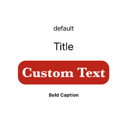
Multiple Properties
There are other properties that can be applied to text and multiple modifiers can be chained together to create unique displays for text in an app.
Common properties used on text
- font
- fontWeight
- padding
- background
- lineLimit
- lineSpacing
- foregroundColor
1Text("Final Text")
2	.font(.custom("Baskerville", size: 36, relativeTo: .body))
3	.fontWeight(.bold)
4	.padding(10)
5	.background(Color(.sRGB, red: 192/255, green: 47/255, blue: 19/255, opacity: 1.0))
6	.foregroundColor(.white)
7	.cornerRadius(20)

Conclusion
Text is displayed in SwiftUI using the Text view. The text can be configured in a number of ways using modifiers such as font, fontweight, padding and background. The default Text can handle multiline text and it can be modified to set how many lines to display or how to truncate the text. How the text is displayed can be customised significantly by chaining together multiple modifications.