Create custom buttons in SwiftUI
Buttons are used in SwiftUI to provide a mechanism for a user to initiate an interaction with an app. This article shows how to customise buttons in SwiftUI. SwiftUI provides a default style for buttons, but this can be modified in many ways and it can be helpful to provide a common style for buttons in your app.
Default button
The Button control is used in SwiftUI to declare a button specifying an action and a label. The action is either a closure or a method that does something when the button is triggered. In this article print statements will be used to represent the actions. The method of triggering the button varies by platform such as tapping a button in iOS and watchOS as opposed to clicking a button in macOS. The following creates the similar buttons with default style.
 1VStack {
 2    Button(action: doSomeAction) {
 3        Text("Button 1")
 4    }
 5
 6    Button("Button 2", action: doSomeAction)
 7
 8    Button(action: {
 9        print("Button 3 tapped")
10    }) {
11        Text("Button 3")
12    }
13
14    Spacer()
15}

Standard button styles
There are only three standard button styles available for iOS and the default does not need to be specified.
- DefaultButtonStyle
- PlainButtonStyle
- BorderlessButtonStyle
Other button styles available for tvOS and macOS
- LinkButtonStyle (macOS)
- BorderedButtonStyle (macOS, tvOS, watchOS)
- CardButtonStyle (tvOS)
 1VStack {
 2    Text("Standard button styles in iOS")
 3        .font(.headline)
 4        .padding()
 5
 6    Button("DefaultButtonStyle") {
 7        print("DefaultButtonStyle tapped")
 8    }
 9        .buttonStyle(DefaultButtonStyle())
10
11    Button("PlainButtonStyle") {
12        print("DefaultButtonStyle tapped")
13    }
14        .buttonStyle(PlainButtonStyle())
15
16    Button("BorderlessButtonStyle") {
17        print("BorderlessButtonStyle tapped")
18    }
19        .buttonStyle(BorderlessButtonStyle())
20
21    Spacer()
22}

Styling buttons
Buttons can be styled like other UI elements by applying font, padding and color modifiers. Applying the style to multiple buttons individually works, but will result in repeated code which is harder to maintain. Every button that uses the style will need to be updated when a change in style is required. This can be prone to errors as one of the buttons may be missed when updating the style.
 1VStack {
 2    Button(action: {
 3        print("Triangle tapped!")
 4    }) {
 5        HStack {
 6            Image(systemName: "triangle.fill")
 7            Text("Triangle")
 8        }
 9    }
10    .font(.system(size: 28, weight:.bold, design: .rounded))
11    .foregroundColor(.white)
12    .padding(.horizontal)
13    .padding(5)
14    .background(Color.blue.opacity(0.8))
15    .cornerRadius(20)
16
17    Button(action: {
18        print("Diamond tapped!")
19    }) {
20        HStack {
21            Image(systemName: "diamond.fill")
22            Text("Diamond")
23        }
24    }
25    .font(.system(size: 28, weight:.bold, design: .rounded))
26    .foregroundColor(.white)
27    .padding(.horizontal)
28    .padding(5)
29    .background(Color.blue.opacity(0.8))
30    .cornerRadius(20)
31
32    Button(action: {
33        print("Hexagon tapped!")
34    }) {
35        HStack {
36            Image(systemName: "hexagon.fill")
37            Text("Hexagon")
38        }
39    }
40    .font(.system(size: 28, weight:.bold, design: .rounded))
41    .foregroundColor(.white)
42    .padding(.horizontal)
43    .padding(5)
44    .background(Color.blue.opacity(0.8))
45    .cornerRadius(20)
46
47    Spacer()
48}

Using ButtonStyle
A button style can be defined by creating a style that conforms to the
ButtonStyle protocol. This style can then be applied to buttons in the app using
the buttonStyle modifier similar to the way the standard styles are applied. The
ButtonStyle protocol has one required method makeBody that creates a view that
representing the body of a button. A change in the appearance of the button can also
be specified in the button style. The following code reduces the opacity and the size
of the button when the button is pressed. Multiple button styles can be defined for your App and each button can be set to use
the appropriate style.
PrimitiveButtonStyle can be used to not just modify the style, but also modify the interaction behavior, such as change the trigger action to be a long press or a swipe gesture. This needs to be used with caution as a button not behaving like a button could result in a non-intuitive user interface. PrimitiveButtonStyle is not covered in this article as I struggle to find a genuine use for it.
 1struct BlueButtonStyle: ButtonStyle {
 2    func makeBody(configuration: Configuration) -> some View {
 3        configuration.label
 4            .font(.system(size: 28, weight:.bold, design: .rounded))
 5            .foregroundColor(.white)
 6            .padding(.horizontal)
 7            .padding(5)
 8            .background(Color.blue.opacity(0.8))
 9            .cornerRadius(20)
10            .shadow(color:.black, radius: 4)
11            .opacity(configuration.isPressed ? 0.6 : 1.0)
12            .scaleEffect(configuration.isPressed ? 0.8 : 1.0)
13    }
14}
 1struct UseButtonStyleView: View {
 2    @State private var message = ""
 3
 4    var body: some View {
 5        VStack {
 6            Text(self.message)
 7
 8            Button(action: {
 9                self.message = "Triangle tapped!"
10            }) {
11                HStack {
12                    Image(systemName: "triangle.fill")
13                    Text("Triangle")
14                }
15            }
16            .buttonStyle(BlueButtonStyle())
17
18            Button(action: {
19                self.message = "Diamond tapped!"
20            }) {
21                HStack {
22                    Image(systemName: "diamond.fill")
23                    Text("Diamond")
24                }
25            }
26            .buttonStyle(BlueButtonStyle())
27
28            Button(action: {
29                self.message = "Hexagon tapped!"
30            }) {
31                HStack {
32                    Image(systemName: "hexagon.fill")
33                    Text("Hexagon")
34                }
35            }
36            .buttonStyle(BlueButtonStyle())
37
38            Button(action: {
39                self.message = ""
40            }) {
41                HStack {
42                    Image(systemName: "clear")
43                    Text("Clear")
44                }
45            }
46            .buttonStyle(BorderlessButtonStyle())
47
48            Spacer()
49        }
50    }
51}


Button style changing opacity and size when pressed
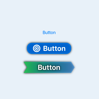
Setting a button shape
The styling can get more complex such as setting a shape for the buttons in an App or specifying a color gradient. This code creates an arrow shape and uses it as the background for a button style.
 1struct ArrowShape: Shape {
 2    func path(in rect: CGRect) -> Path {
 3        let xOffset = rect.size.width * 0.07
 4        var path = Path()
 5        path.move(to: CGPoint(x: 0, y: 0))
 6        path.addLine(to: CGPoint(x: rect.size.width - xOffset, y: 0))
 7        path.addLine(to: CGPoint(x: rect.size.width, y: rect.size.height / 2))
 8        path.addLine(to: CGPoint(x: rect.size.width - xOffset, y: rect.size.height))
 9        path.addLine(to: CGPoint(x: 0, y: rect.size.height))
10        path.addLine(to: CGPoint(x: xOffset, y: rect.size.height / 2))
11        path.closeSubpath()
12        return path
13    }
14}
 1struct ArrowButtonStyle: ButtonStyle {
 2    func makeBody(configuration: Configuration) -> some View {
 3        configuration.label
 4            .font(.system(size: 28, weight:.bold, design: .rounded))
 5            .foregroundColor(.white)
 6            .padding(.horizontal,50)
 7            .padding(5)
 8            .background(
 9                ArrowShape()
10                    .fill(LinearGradient(
11                            gradient: Gradient(colors: [Color.green, Color.blue.opacity(0.4)]),
12                            startPoint: .topLeading,
13                            endPoint: .bottomTrailing)))
14            .shadow(color:.black, radius: configuration.isPressed ? 2 : 4)
15            .scaleEffect(configuration.isPressed ? 0.9 : 1.0)
16    }
17}
 1struct ShapeButtonView: View {
 2    @State private var message = ""
 3
 4    var body: some View {
 5        VStack {
 6            Text(self.message)
 7
 8            Button(action: {
 9                self.message = "Button 1 tapped!"
10            }) {
11                Text("Button 1")
12            }
13            .buttonStyle(ArrowButtonStyle())
14
15            Button(action: {
16                self.message = "Button 2 tapped!"
17            }) {
18                Text("Button 2")
19            }
20            .buttonStyle(ArrowButtonStyle())
21
22            Spacer()
23        }
24    }
25}


Custom button style specifying shape
Conclusion
Buttons are one of the most simple interactive elements in SwiftUI. They trigger an action in response to a tap gesture (or a click in macOS). The default style for buttons provided by SwiftUI is limited, but it is easy to create a custom style by implementing the ButtonStyle protocol. This can be used to simply set color or font style or it can be used to create unique buttons for your app. Rather than styling each button individually, it is much betted to create a button style and to use this throughout your App.