Convert color from RGB to HSB in Swift
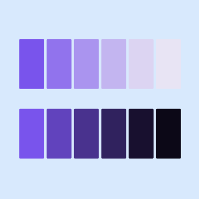
HSB (Hue, Saturation, and Brightness) represents color in a more human-understandable way, which closely mimics how colors are perceived in real life. Defining color using HSB instead of RGB (Red, Green, and Blue) in App design can result in a more intuitive design with the creation of harmonious color schemes and color gradients. This article shows how to convert color to HSB and RGV values using UIColor.
It is worth noting that HSB is less precise than RGB when it comes to representing the full range of colors available on modern displays. Converting colors from RGB to HSB may result in some loss of precision, however, the benefits of working with HSB in terms of usability and understandability outweigh the drawbacks.
Related articles on HSB:
Color Description
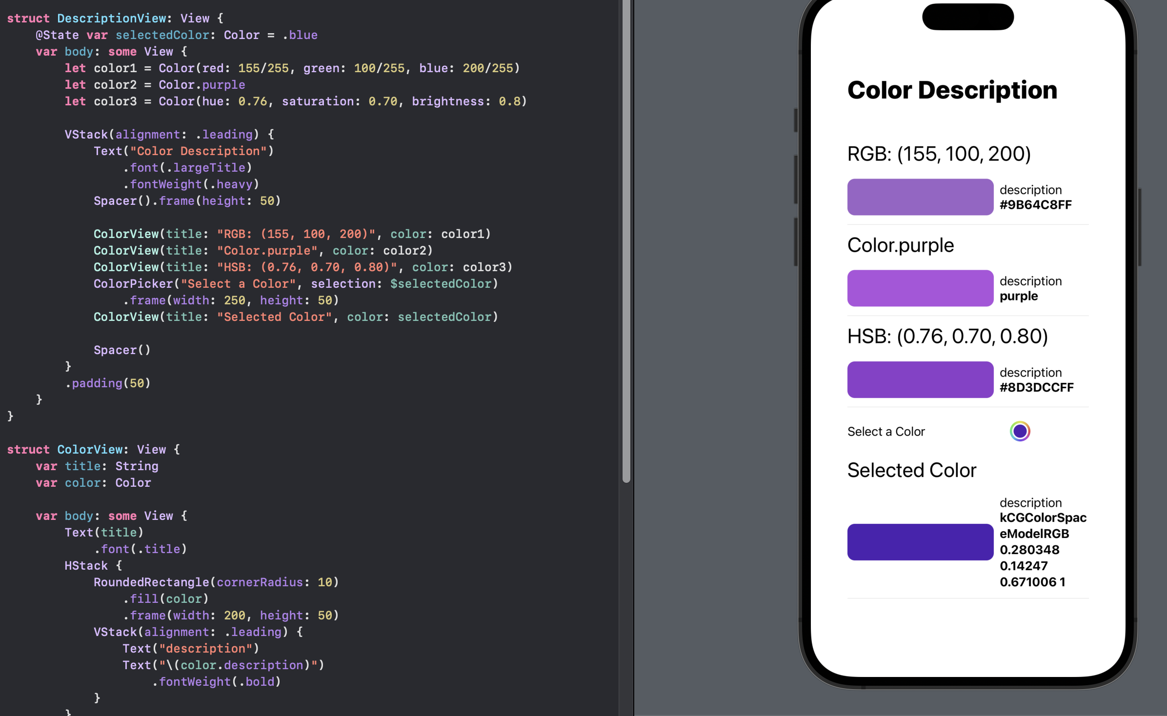
At first glance, the SwiftUI Color description property give the hex color values in
the form of #RRGGBBAA representing the Red, Green, Blue and Alpha components of the
color. These could be used to identify the RGB values of a color and apply a formula
to convert to a corresponding HSB values for the color. The problem with this
approach is that description property varies depending on how the color was defined
in SwiftUI.
The description of a SwiftUI Color defined with RGB values show the RGBA hex values, whereas one of the named colors in SwiftUI returns the name. The description of a color selected from ColorPicker shows the namespace and the RGB values in decimal format.
DescriptionView
 1struct DescriptionView: View {
 2    @State var selectedColor: Color = .blue
 3    var body: some View {
 4        let color1 = Color(red: 155/255, green: 100/255, blue: 200/255)
 5        let color2 = Color.purple
 6        let color3 = Color(hue: 0.76, saturation: 0.70, brightness: 0.8)
 7
 8        VStack(alignment: .leading) {
 9            Text("Color Description")
10                .font(.largeTitle)
11                .fontWeight(.heavy)
12            Spacer().frame(height: 50)
13
14            ColorView(title: "RGB: (155, 100, 200)", color: color1)
15            ColorView(title: "Color.purple", color: color2)
16            ColorView(title: "HSB: (0.76, 0.70, 0.80)", color: color3)
17            ColorPicker("Select a Color", selection: $selectedColor)
18                .frame(width: 250, height: 50)
19            ColorView(title: "Selected Color", color: selectedColor)
20
21            Spacer()
22        }
23        .padding(50)
24    }
25}
ColorView
 1struct ColorView: View {
 2    var title: String
 3    var color: Color
 4
 5    var body: some View {
 6        Text(title)
 7            .font(.title)
 8        HStack {
 9            RoundedRectangle(cornerRadius: 10)
10                .fill(color)
11                .frame(width: 200, height: 50)
12            VStack(alignment: .leading) {
13                Text("description")
14                Text("\(color.description)")
15                    .fontWeight(.bold)
16            }
17        }
18        Divider()
19    }
20}
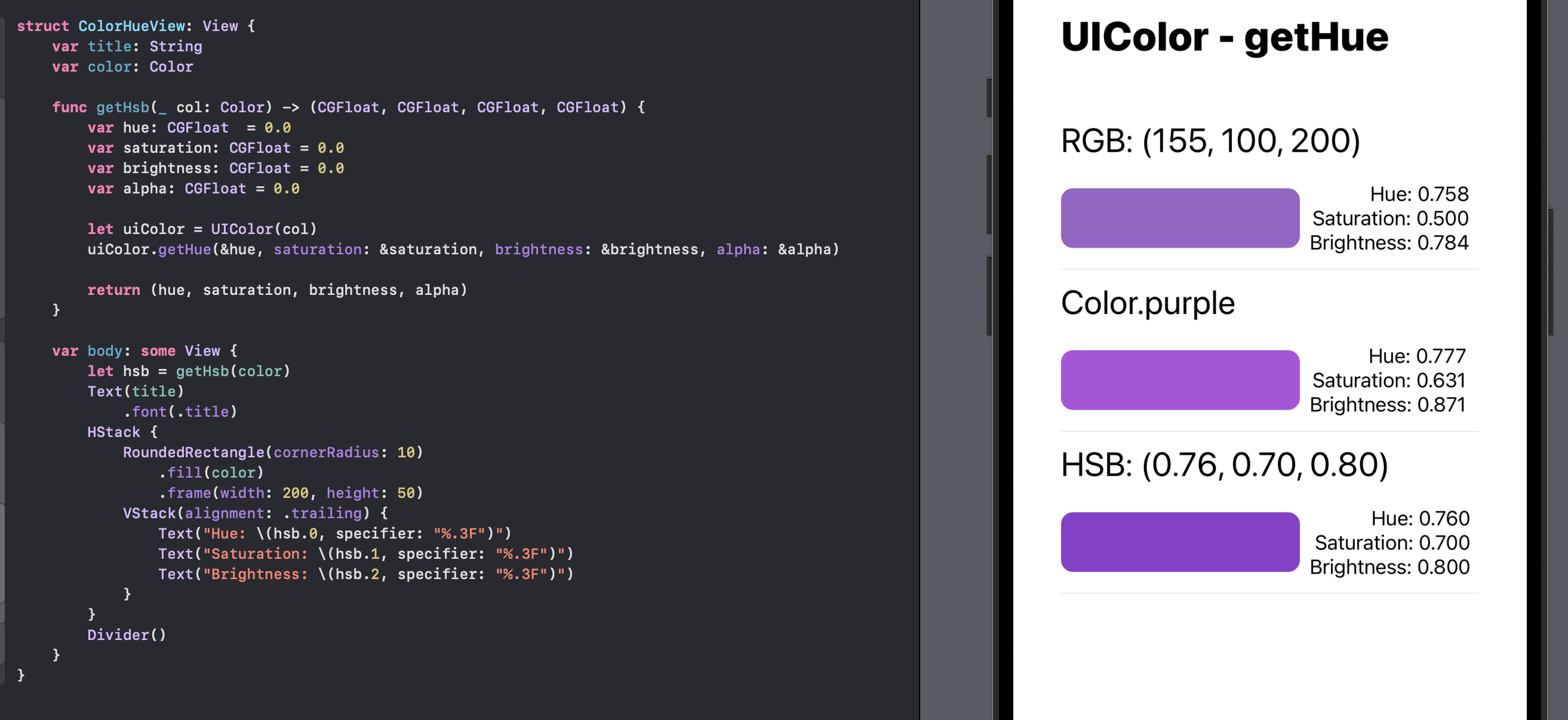
UIColor - getHue to get Hue, Saturation & Brightness
Conversion of color from any SwiftUI color to HSB values is more easily achieved with the use of UIColor from UIKit. The color is first converted to a UIColor and the getHue(_:saturation:brightness:alpha:) method is used to set in/out properties for the hue, saturation, brightness & alpha components of the color.
ColorHueView
 1struct ColorHueView: View {
 2    var title: String
 3    var color: Color
 4
 5    func getHsb(_ col: Color) -> (CGFloat, CGFloat, CGFloat, CGFloat) {
 6        var hue: CGFloat  = 0.0
 7        var saturation: CGFloat = 0.0
 8        var brightness: CGFloat = 0.0
 9        var alpha: CGFloat = 0.0
10
11        let uiColor = UIColor(col)
12        uiColor.getHue(&hue, saturation: &saturation, brightness: &brightness, alpha: &alpha)
13
14        return (hue, saturation, brightness, alpha)
15    }
16
17    var body: some View {
18        let hsb = getHsb(color)
19        Text(title)
20            .font(.title)
21        HStack {
22            RoundedRectangle(cornerRadius: 10)
23                .fill(color)
24                .frame(width: 200, height: 50)
25            VStack(alignment: .trailing) {
26                Text("Hue: \(hsb.0, specifier: "%.3F")")
27                Text("Saturation: \(hsb.1, specifier: "%.3F")")
28                Text("Brightness: \(hsb.2, specifier: "%.3F")")
29            }
30        }
31        Divider()
32    }
33}
GetHueView
 1struct GetHueView: View {
 2    var body: some View {
 3        let color1 = Color(red: 155/255, green: 100/255, blue: 200/255)
 4        let color2 = Color.purple
 5        let color3 = Color(hue: 0.76, saturation: 0.70, brightness: 0.8)
 6
 7        VStack(alignment: .leading) {
 8            Text("UIColor - getHue")
 9                .font(.largeTitle)
10                .fontWeight(.heavy)
11            Spacer().frame(height: 50)
12
13            ColorHueView(title: "RGB: (155, 100, 200)", color: color1)
14            ColorHueView(title: "Color.purple", color: color2)
15            ColorHueView(title: "HSB: (0.76, 0.70, 0.80)", color: color3)
16
17            Spacer()
18        }
19        .padding(40)
20    }
21}
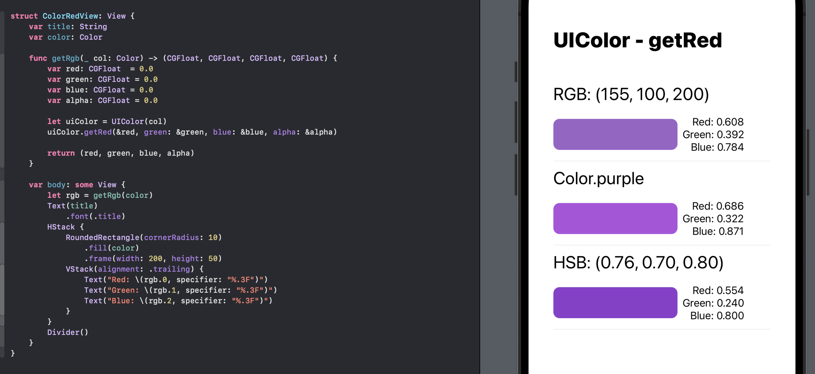
UIColor - getRed to get Red, Green & Blue
There is also a method getRed(_:green:blue:alpha:) to get the red, green, blue & alpha components from a UIColor.
ColorRedView
 1struct ColorRedView: View {
 2    var title: String
 3    var color: Color
 4
 5    func getRgb(_ col: Color) -> (CGFloat, CGFloat, CGFloat, CGFloat) {
 6        var red: CGFloat  = 0.0
 7        var green: CGFloat = 0.0
 8        var blue: CGFloat = 0.0
 9        var alpha: CGFloat = 0.0
10
11        let uiColor = UIColor(col)
12        uiColor.getRed(&red, green: &green, blue: &blue, alpha: &alpha)
13
14        return (red, green, blue, alpha)
15    }
16
17    var body: some View {
18        let rgb = getRgb(color)
19        Text(title)
20            .font(.title)
21        HStack {
22            RoundedRectangle(cornerRadius: 10)
23                .fill(color)
24                .frame(width: 200, height: 50)
25            VStack(alignment: .trailing) {
26                Text("Red: \(rgb.0, specifier: "%.3F")")
27                Text("Green: \(rgb.1, specifier: "%.3F")")
28                Text("Blue: \(rgb.2, specifier: "%.3F")")
29            }
30        }
31        Divider()
32    }
33}
GetRedView
 1struct GetRedView: View {
 2    var body: some View {
 3        let color1 = Color(red: 155/255, green: 100/255, blue: 200/255)
 4        let color2 = Color.purple
 5        let color3 = Color(hue: 0.76, saturation: 0.70, brightness: 0.8)
 6
 7        VStack(alignment: .leading) {
 8            Text("UIColor - getRed")
 9                .font(.largeTitle)
10                .fontWeight(.heavy)
11            Spacer().frame(height: 50)
12
13            ColorRedView(title: "RGB: (155, 100, 200)", color: color1)
14            ColorRedView(title: "Color.purple", color: color2)
15            ColorRedView(title: "HSB: (0.76, 0.70, 0.80)", color: color3)
16
17            Spacer()
18        }
19        .padding(40)
20    }
21}
Color Extension
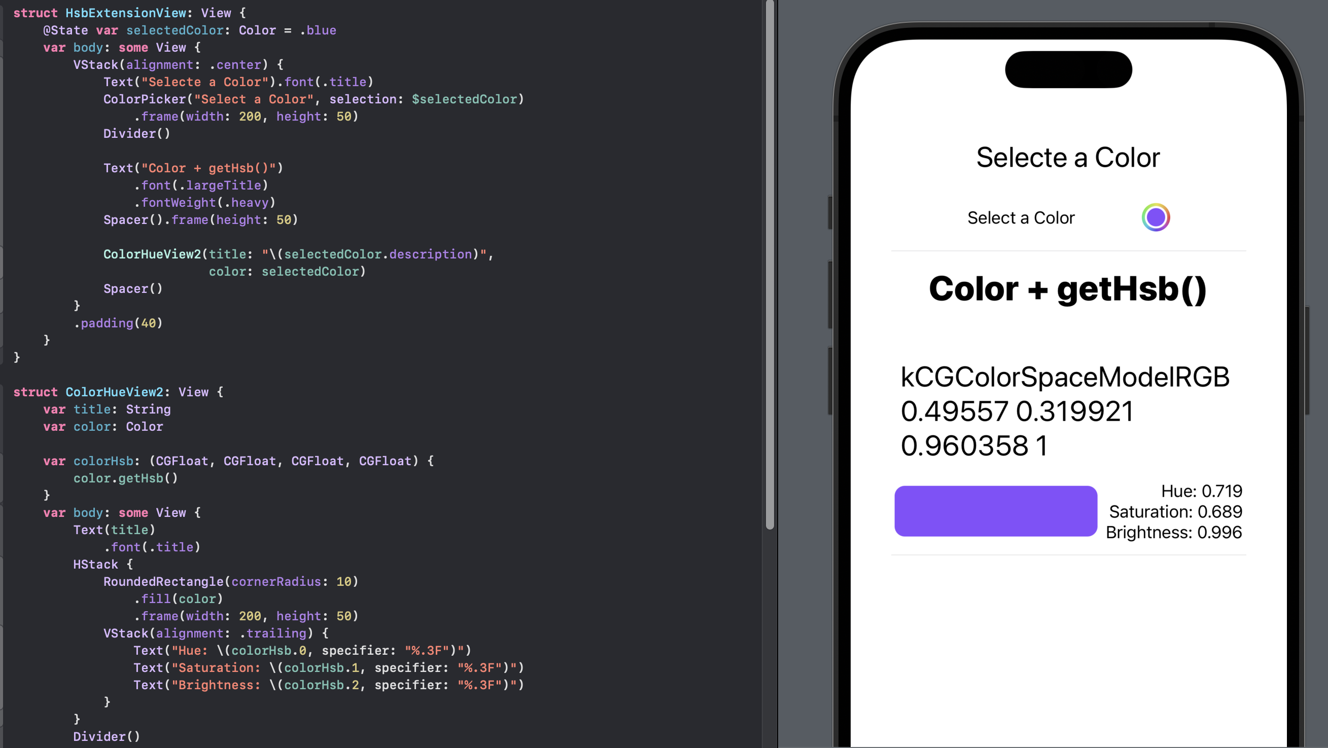
The methods to get the HSB components from a color could be added as extensions to the Color struct if they were to be used frequently in an App.
Color+Hsb+Rgb
 1extension Color {
 2    func getHsb() -> (CGFloat, CGFloat, CGFloat, CGFloat) {
 3        var hue: CGFloat  = 0.0
 4        var saturation: CGFloat = 0.0
 5        var brightness: CGFloat = 0.0
 6        var alpha: CGFloat = 0.0
 7
 8        let uiColor = UIColor(self)
 9        uiColor.getHue(&hue, saturation: &saturation, brightness: &brightness, alpha: &alpha)
10
11        return (hue, saturation, brightness, alpha)
12    }
13
14    func getRgb() -> (CGFloat, CGFloat, CGFloat, CGFloat) {
15        var red: CGFloat  = 0.0
16        var green: CGFloat = 0.0
17        var blue: CGFloat = 0.0
18        var alpha: CGFloat = 0.0
19
20        let uiColor = UIColor(self)
21        uiColor.getRed(&red, green: &green, blue: &blue, alpha: &alpha)
22
23        return (red, green, blue, alpha)
24    }
25}
ColorHueView2
 1struct ColorHueView2: View {
 2    var title: String
 3    var color: Color
 4
 5    var colorHsb: (CGFloat, CGFloat, CGFloat, CGFloat) {
 6        color.getHsb()
 7    }
 8    var body: some View {
 9        Text(title)
10            .font(.title)
11        HStack {
12            RoundedRectangle(cornerRadius: 10)
13                .fill(color)
14                .frame(width: 200, height: 50)
15            VStack(alignment: .trailing) {
16                Text("Hue: \(colorHsb.0, specifier: "%.3F")")
17                Text("Saturation: \(colorHsb.1, specifier: "%.3F")")
18                Text("Brightness: \(colorHsb.2, specifier: "%.3F")")
19            }
20        }
21        Divider()
22    }
23}
HsbExtensionView
 1struct HsbExtensionView: View {
 2    @State var selectedColor: Color = .blue
 3    var body: some View {
 4        VStack(alignment: .center) {
 5            Text("Selecte a Color").font(.title)
 6            ColorPicker("Select a Color", selection: $selectedColor)
 7                .frame(width: 200, height: 50)
 8            Divider()
 9
10            Text("Color + getHsb()")
11                .font(.largeTitle)
12                .fontWeight(.heavy)
13            Spacer().frame(height: 50)
14
15            ColorHueView2(title: "\(selectedColor.description)",
16                          color: selectedColor)
17            Spacer()
18        }
19        .padding(40)
20    }
21}
Color Saturation and Brightness
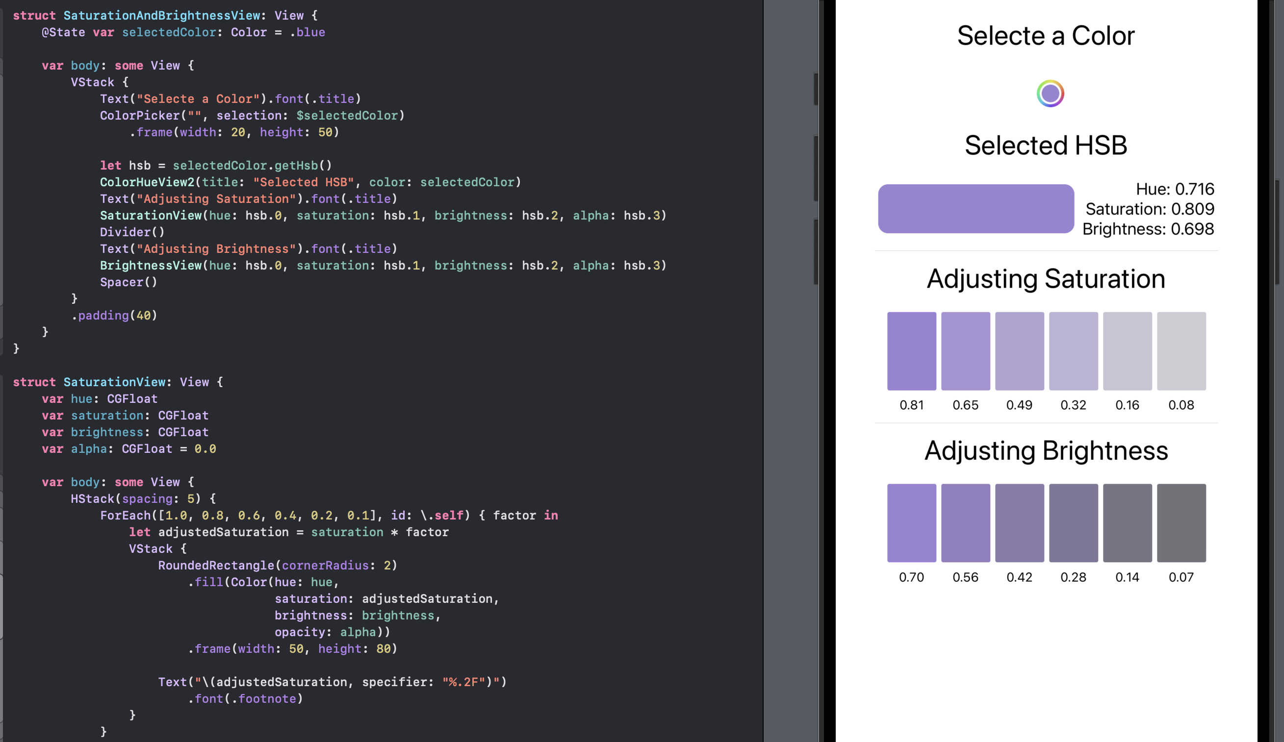
One reason to convert a color to HSB values is that it can be more intuitive to get similar colors based on the original Hue or keep the same Hue and alter the Saturation and/or brightness. This view allows the selection of any color and the effect of reducing the Saturation and Brightness relative to the selected color.
SaturationView
 1struct SaturationView: View {
 2    var hue: CGFloat
 3    var saturation: CGFloat
 4    var brightness: CGFloat
 5    var alpha: CGFloat = 0.0
 6
 7    var body: some View {
 8        HStack(spacing: 5) {
 9            ForEach([1.0, 0.8, 0.6, 0.4, 0.2, 0.1], id: \.self) { factor in
10                let adjustedSaturation = saturation * factor
11                VStack {
12                    RoundedRectangle(cornerRadius: 2)
13                        .fill(Color(hue: hue,
14                                    saturation: adjustedSaturation,
15                                    brightness: brightness,
16                                    opacity: alpha))
17                        .frame(width: 50, height: 80)
18
19                    Text("\(adjustedSaturation, specifier: "%.2F")")
20                        .font(.footnote)
21                }
22            }
23        }
24    }
25}
BrightnessView
 1struct BrightnessView: View {
 2    var hue: CGFloat
 3    var saturation: CGFloat
 4    var brightness: CGFloat
 5    var alpha: CGFloat = 0.0
 6
 7    var body: some View {
 8        HStack(spacing: 5) {
 9            ForEach([1.0, 0.8, 0.6, 0.4, 0.2, 0.1], id: \.self) { factor in
10                let adjustedBrightness = brightness * factor
11                VStack {
12                    RoundedRectangle(cornerRadius: 2)
13                        .fill(Color(hue: hue,
14                                    saturation: saturation,
15                                    brightness: adjustedBrightness,
16                                    opacity: alpha))
17                        .frame(width: 50, height: 80)
18
19                    Text("\(adjustedBrightness, specifier: "%.2F")")
20                        .font(.footnote)
21                }
22            }
23        }
24    }
25}
SaturationAndBrightnessView
 1struct SaturationAndBrightnessView: View {
 2    @State var selectedColor: Color = .blue
 3
 4    var body: some View {
 5        VStack {
 6            Text("Selecte a Color").font(.title)
 7            ColorPicker("", selection: $selectedColor)
 8                .frame(width: 20, height: 50)
 9
10            let hsb = selectedColor.getHsb()
11            ColorHueView2(title: "Selected HSB", color: selectedColor)
12            Text("Adjusting Saturation").font(.title)
13            SaturationView(hue: hsb.0, saturation: hsb.1, brightness: hsb.2, alpha: hsb.3)
14            Divider()
15            Text("Adjusting Brightness").font(.title)
16            BrightnessView(hue: hsb.0, saturation: hsb.1, brightness: hsb.2, alpha: hsb.3)
17            Spacer()
18        }
19        .padding(40)
20    }
21}
Conclusion
Working with the Hue, Saturation and Brightness of a color can be more intuitive that working with Red, Green & Blue values. Reducing the saturation of color can be used to improve readability such as using a desaturated shade of blue as a background color for a text box can improve the contrast with white or black text.
Modifying Saturation and Brightness can be used to create a minimalist design, with a consistent color scheme throughout the app, resulting in a more cohesive and polished design. Reduced brightness can be used to create a sense of depth or dimension in the UI, such as using a darker shade of a color for the background of a card or button to give the appearance of elevation or depth. Brightness can also be used to indicate that a UI element is active or selected, such as a button might darken when pressed, signifying the active state.
This article showed how to convert any color in SwiftUI to its Hue, Saturation & Brightness component values with the use of UIColor from UIKit.
The source code for ColorConverterApp is available on GitHub.