Define colors with Hue, Saturation and Brightness rather than Red, Green and Blue properties
There are multiple ways to define colors in code. The most commonly used method is to specify values for the three primary colors - red, green and blue (RGB). This article explores the use of an alternative mechanism by specifying values for hue, saturation and brightness (HSB). The HSB properties can be used in a more intuitive way to create palettes with colors that work well together.
Related articles on HSB:
There are numerous resources online about color, I found Learn about Hue, Saturation and Brightness colours by Jonathan particularly useful, as well as The HSB Color System: A Practitioner's Primer by Erik Kennedy.
Color by RGB (Red, Green & Blue)
The most common way to define colors is to specify the Red, Green and Blue properties for the color. Each property can be a value from 0 to 255 in decimal format, but are commonly given in hexadecimal format so the color can be expressed in 6 characters. The Digital Colour Meter on Mac can be used to inspect any area on screen and give the RGB values for the selected color. A color palette can be created in SwiftUI to display possible colors.
 1struct RgbColorPaletteView: View {
 2    var body: some View {
 3        VStack(spacing:5) {
 4            VStack {
 5                HStack {
 6                    Text("Red")
 7                        .frame(width: cellWidth)
 8                    Text("Green")
 9                        .frame(width: cellWidth * 11.0)
10                    Text("Blue")
11                        .frame(width: cellWidth)
12                    Spacer()
13                }
14                HStack(spacing:1) {
15                    Spacer()
16                        .frame(width:cellWidth)
17                    ForEach([0.0, 0.1, 0.2, 0.3, 0.4, 0.5, 0.6, 0.7, 0.8, 0.9, 1.0], id: \.self) { myGreen in
18                        Text("\(myGreen, specifier: "%0.1F")")
19                            .font(.footnote)
20                            .multilineTextAlignment(.center)
21                            .frame(width:cellWidth)
22                    }
23                    Spacer()
24                }
25            }
26
27            ForEach([0.0, 0.1, 0.2, 0.3, 0.4, 0.5, 0.6, 0.7, 0.8, 0.9, 1.0], id: \.self) { myRed in
28                HStack(spacing:1) {
29                    Text("\(myRed, specifier: "%0.1F")")
30                        .frame(width:cellWidth)
31                    ForEach([0.0, 0.1, 0.2, 0.3, 0.4, 0.5, 0.6, 0.7, 0.8, 0.9, 1.0], id: \.self) { myGreen in
32                        HStack {
33                            VStack(spacing:1) {
34                                ForEach([0.0, 0.1, 0.2, 0.3, 0.4, 0.5, 0.6, 0.7, 0.8, 0.9, 1.0], id: \.self) { myBlue in
35                                    Color(red: myRed, green: myGreen, blue: myBlue)
36                                }
37                                .frame(width:cellWidth)
38                            }
39                        }
40                    }
41                    VStack(spacing:13) {
42                        Text(myRed == 0.0 ? "0.0" : "")
43                        Image(systemName: "arrow.down")
44                            .foregroundColor(myRed == 0.0 ? Color.black : .clear)
45                        Text(myRed == 0.0 ? "1.0" : "")
46                    }
47                    .font(.footnote)
48                    .frame(width:cellWidth * 0.7)
49
50                    Spacer()
51                }
52            }
53            Spacer()
54        }
55        .padding()
56    }
57
58    let cellWidth: CGFloat = 100
59}
")
Color by HSB (Hue, Saturation & Brightness)
The HSB color model is thought to align more closely with the way we think of color. Here is code to display a color palette by varying the values for Hue, Saturation and Brightness. Note that Hue is usually given a value in degrees representing the angle around a color circle with values between 0 and 360, SwiftUI uses values between 0.0 and 1.0 where 1.0 represents 360 degrees.
The first image shows the colors with the Brightness values from 1.0 to 0.5, as the brightness gets below 0.5, it can make the color palette look very dark. The second image shows the complete range.
 1struct HsbColorPaletteView: View {
 2    var body: some View {
 3        VStack(spacing:5) {
 4            VStack {
 5                HStack {
 6                    Text("Hue")
 7                        .frame(width: cellWidth)
 8                    Text("Saturation")
 9                        .frame(width: cellWidth * 11.0)
10                    Text("Brightness")
11                        .frame(width: cellWidth)
12                    Spacer()
13                }
14                HStack(spacing:1) {
15                    Spacer()
16                        .frame(width:cellWidth)
17                    ForEach([0.0, 0.1, 0.2, 0.3, 0.4, 0.5, 0.6, 0.7, 0.8, 0.9, 1.0], id: \.self) { mySat in
18                        Text("\(mySat, specifier: "%0.1F")")
19                            .font(.footnote)
20                            .multilineTextAlignment(.center)
21                            .frame(width:cellWidth)
22                    }
23                    Spacer()
24                }
25            }
26
27            ForEach([0.0, 0.1, 0.2, 0.3, 0.4, 0.5, 0.6, 0.7, 0.8, 0.9, 1.0], id: \.self) { myHue in
28                HStack(spacing:1) {
29                    Text("\(myHue, specifier: "%0.1F")")
30                        .frame(width:cellWidth)
31                    ForEach([0.0, 0.1, 0.2, 0.3, 0.4, 0.5, 0.6, 0.7, 0.8, 0.9, 1.0], id: \.self) { mySat in
32                        HStack {
33                            VStack(spacing:1) {
34                                //ForEach([1.0, 0.9, 0.8, 0.7, 0.6, 0.5, 0.4, 0.3, 0.2, 0.1, 0.0], id: \.self) { myBright in
35                                ForEach([1.0, 0.9, 0.8, 0.7, 0.6, 0.5], id: \.self) { myBright in
36                                    Color(hue: myHue,
37                                          saturation: mySat,
38                                          brightness: myBright)
39                                }
40                                .frame(width:cellWidth)
41                            }
42                        }
43                    }
44                    VStack(spacing:13) {
45                        Text(myHue == 0.0 ? "1.0" : "")
46                        Image(systemName: "arrow.down")
47                            .foregroundColor(myHue == 0.0 ? Color.black : .clear)
48                        Text(myHue == 0.0 ? "0.5" : "")
49                    }
50                    .font(.footnote)
51                    .frame(width:cellWidth * 0.5)
52
53                    Spacer()
54                }
55            }
56            Spacer()
57        }
58        .padding()
59    }
60
61    let cellWidth: CGFloat = 100
62}
 down to 0.5 brightness")
 - lower brightness tend to be very dark")
Hue, Saturation and Brightness
- Hue: represents the base color from red to violet through the colors of the rainbow.
- Saturation: represents the intensity of the color. A saturation value of 0 will be white regardless of the specified Hue when the Brightness is 1.0.
- Brightness: represents the brightness or lightness of the color. A brightness of 0 will be black regardless of the specified Hue.
The image below shows different colors based on increasing Hue in the first row. The second and third rows have the same Hue and show the effect of increasing Saturation and Brightness respectively. Greyscale colors can be defined by keeping the Saturation at 0 and adjusting the Brightness.
 1struct ChangeHsbView: View {
 2    var body: some View {
 3        ZStack {
 4            Color(hue: 0.58, saturation: 0.17, brightness: 1.0)
 5                .edgesIgnoringSafeArea(.all)
 6
 7            VStack() {
 8                VStack {
 9                    Text("Colors defined with")
10                    Text("Hue, Saturation & Brightness")
11                }
12                .font(.title)
13                .fontWeight(.bold)
14
15                HueView()
16                    .frame(height:200)
17
18                SatView()
19                    .frame(height:200)
20
21                BrightView()
22                    .frame(height:200)
23
24
25                Spacer()
26            }
27            .padding(.horizontal, 150)
28        }
29    }
30}
 1struct HueView: View {
 2    var body: some View {
 3        VStack(alignment: .leading) {
 4            Text("1. Hue changes the Color")
 5                .font(.title2)
 6            HStack {
 7                ForEach([0.0, 0.2, 0.4, 0.6, 0.8, 1.0], id: \.self) { myHue in
 8                    VStack {
 9                        RoundedRectangle(cornerRadius: 20)
10                            .fill(Color(hue: myHue, saturation: 1.0, brightness: 1.0))
11                            .shadow(radius: 3, x:5, y:5)
12                        Text("H: \(myHue, specifier: "%0.2F")")
13                            .foregroundColor(.red)
14                        Text("S: 1.00")
15                        Text("B: 1.00")
16                    }
17                }
18            }
19        }
20        .padding(.vertical, 20)
21    }
22}
 1struct SatView: View {
 2    var body: some View {
 3        VStack(alignment: .leading) {
 4            Text("2. Saturation changes color Intensity")
 5                .font(.title2)
 6
 7            HStack {
 8                ForEach([0.0, 0.2, 0.4, 0.6, 0.8, 1.0], id: \.self) { mySat in
 9                    VStack {
10                        RoundedRectangle(cornerRadius: 20)
11                            .fill(Color(hue: 0.75, saturation: mySat, brightness: 1.0))
12                            .shadow(radius: 3, x:5, y:5)
13                        Text("H: 0.75")
14                        Text("S: \(mySat, specifier: "%0.2F")")
15                            .foregroundColor(.red)
16                        Text("B: 1.00")
17                    }
18                }
19            }
20        }
21        .padding(.vertical, 20)
22    }
23}
 1struct BrightView: View {
 2    var body: some View {
 3        VStack(alignment: .leading) {
 4            Text("3. Brightness changes whiteness")
 5                .font(.title2)
 6
 7            HStack {
 8                ForEach([0.0, 0.2, 0.4, 0.6, 0.8, 1.0], id: \.self) { myBright in
 9                    VStack {
10                        RoundedRectangle(cornerRadius: 20)
11                            .fill(Color(hue: 0.75, saturation: 1.00, brightness: myBright))
12                            .shadow(radius: 3, x:5, y:5)
13                        Text("H: 0.75")
14                        Text("S: 1.00")
15                        Text("B: \(myBright, specifier: "%0.2F")")
16                            .foregroundColor(.red)
17                    }
18                }
19            }
20        }
21        .padding(.vertical, 20)
22    }
23}

Color Wheel
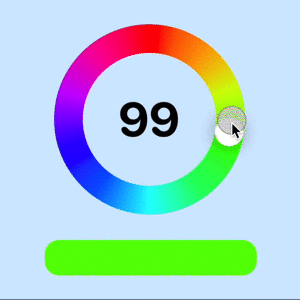
In the HSB color model, Hue represents the base color and can be specified by the angle in degrees around a color circle where red is at the top and the colors follow the colors of the rainbow in a clockwise direction. SwiftUI uses values between 0 and 1 to represent the hue values from 0 to 360 degrees. The following code displays the Hue options in a circular slider similar to the slider in Create a circular slider in SwiftUI. Moving the slider selects the Hue and the different Saturation and Brightness values are displayed for the selected Hue.
 1struct ColorWheelView: View {
 2    @State private var hue: Double = 180.0
 3
 4    var body: some View {
 5        ZStack {
 6            Color(hue: 0.58, saturation: 0.17, brightness: 1.0)
 7                    .edgesIgnoringSafeArea(.all)
 8
 9            VStack(spacing: 40) {
10                VStack(spacing: 5) {
11                    Text("Select Hue")
12                        .font(.system(size: 40, weight: .bold, design:.rounded))
13                    HStack {
14                        CircularSliderView(value: $hue, in: 0...360)
15                            .frame(width: 300, height: 300)
16                    }
17                }
18
19                VStack(spacing: 5) {
20                    Text("Selected Hue with decreasing Saturation")
21                        .font(.system(size: 40, weight: .bold, design:.rounded))
22                    HStack() {
23                        ForEach([1.0, 0.9, 0.8, 0.7, 0.6, 0.5, 0.4, 0.3, 0.2, 0.1, 0.0], id: \.self) { mySat in
24                            VStack {
25                                RoundedRectangle(cornerRadius: 10)
26                                    .fill(Color(hue: hue/360,
27                                                saturation: mySat,
28                                                brightness: 1.0))
29                                    .frame(height:100)
30                                    .overlay {
31                                        Text("\(mySat, specifier: "%0.1F")")
32                                            .font(.system(size: 30))
33                                }
34                                Text("H: \(hue/360, specifier: "%0.2F")")
35                                Text("S: \(mySat, specifier: "%0.2F")")
36                                Text("B: 1.00")
37                            }
38                        }
39                    }
40                    .padding(.horizontal, 100)
41                }
42
43                VStack(spacing: 5) {
44                    Text("Selected Hue with decreasing Brightness")
45                        .font(.system(size: 40, weight: .bold, design:.rounded))
46                    HStack() {
47                        ForEach([1.0, 0.9, 0.8, 0.7, 0.6, 0.5, 0.4, 0.3, 0.2, 0.1, 0.0], id: \.self) { myBright in
48                            VStack {
49                                RoundedRectangle(cornerRadius: 10)
50                                    .fill(Color(hue: hue/360,
51                                                saturation: 1.0,
52                                                brightness: myBright))
53                                    .frame(height:100)
54                                    .overlay {
55                                        Text("\(myBright, specifier: "%0.1F")")
56                                            .font(.system(size: 30))
57                                            .foregroundColor(myBright > 0.5 ? Color.black : .white)
58                                }
59                                Text("H: \(hue/360, specifier: "%0.2F")")
60                                Text("S: 1.00")
61                                Text("B: \(myBright, specifier: "%0.2F")")
62                            }
63                        }
64                    }
65                    .padding(.horizontal, 100)
66                }
67
68                Spacer()
69            }
70        }
71    }
72}
 1struct CircularSliderView: View {
 2    @Binding var progress: Double
 3
 4    @State private var rotationAngle = Angle(degrees: 0)
 5    private var minValue = 0.0
 6    private var maxValue = 1.0
 7
 8    init(value progress: Binding<Double>, in bounds: ClosedRange<Int> = 0...1) {
 9        self._progress = progress
10
11        self.minValue = Double(bounds.first ?? 0)
12        self.maxValue = Double(bounds.last ?? 1)
13        self.rotationAngle = Angle(degrees: progressFraction * 360.0)
14    }
15
16    var body: some View {
17        GeometryReader { gr in
18            let radius = (min(gr.size.width, gr.size.height) / 2.0) * 0.9
19            let sliderWidth = radius * 0.3
20
21            VStack(spacing:0) {
22                ZStack {
23                    Circle()
24                        .strokeBorder(hueAngularGradient,
25                                      style: StrokeStyle(lineWidth: sliderWidth))
26                        .rotationEffect(Angle(degrees: -90))
27                        .overlay() {
28                            Text("\(progress, specifier: "%.0f")")
29                                .font(.system(size: radius * 0.5, weight: .bold, design:.rounded))
30                        }
31                    Circle()
32                        .fill(Color.white)
33                        .shadow(radius: (sliderWidth * 0.3))
34                        .frame(width: sliderWidth, height: sliderWidth)
35                        .offset(y: -(radius - (sliderWidth * 0.5)))
36                        .rotationEffect(rotationAngle)
37                        .gesture(
38                            DragGesture(minimumDistance: 0.0)
39                                .onChanged() { value in
40                                    changeAngle(location: value.location)
41                                }
42                        )
43                }
44                .frame(width: radius * 2.0, height: radius * 2.0, alignment: .center)
45                .padding(radius * 0.1)
46            }
47            .onAppear {
48                self.rotationAngle = Angle(degrees: progressFraction * 360.0)
49            }
50        }
51    }
52
53    private var progressFraction: Double {
54        return ((progress - minValue) / (maxValue - minValue))
55    }
56
57    private func changeAngle(location: CGPoint) {
58        // Create a Vector for the location (reversing the y-coordinate system on iOS)
59        let vector = CGVector(dx: location.x, dy: -location.y)
60
61        // Calculate the angle of the vector
62        let angleRadians = atan2(vector.dx, vector.dy)
63
64        // Convert the angle to a range from 0 to 360 (rather than having negative angles)
65        let positiveAngle = angleRadians < 0.0 ? angleRadians + (2.0 * .pi) : angleRadians
66
67        // Update slider progress value based on angle
68        progress = ((positiveAngle / (2.0 * .pi)) * (maxValue - minValue)) + minValue
69        rotationAngle = Angle(radians: positiveAngle)
70    }
71
72    let hueAngularGradient = AngularGradient(
73        gradient: Gradient(colors: [
74            Color(hue: 0.0, saturation: 1.0, brightness: 1.0),
75            Color(hue: 0.1, saturation: 1.0, brightness: 1.0),
76            Color(hue: 0.2, saturation: 1.0, brightness: 1.0),
77            Color(hue: 0.3, saturation: 1.0, brightness: 1.0),
78            Color(hue: 0.4, saturation: 1.0, brightness: 1.0),
79            Color(hue: 0.5, saturation: 1.0, brightness: 1.0),
80            Color(hue: 0.6, saturation: 1.0, brightness: 1.0),
81            Color(hue: 0.7, saturation: 1.0, brightness: 1.0),
82            Color(hue: 0.8, saturation: 1.0, brightness: 1.0),
83            Color(hue: 0.9, saturation: 1.0, brightness: 1.0),
84            Color(hue: 1.0, saturation: 1.0, brightness: 1.0),
85        ]),
86        center: .center,
87        startAngle: .degrees(0),
88        endAngle: .degrees(360.0))
89}


Color wheel showing variations of Saturation & Brightness for each Hue
Matching Colors
One of the advantages of using HSB for colors is the ease of finding suitable colors that work well together. The first option could be to use the same Hue and change either the Saturation or the Brightness. This can work really well for gradients moving from a lower saturation to a higher saturation or for a darker border or frame using the same hue. The next option is to use adjacent or analogous colors by varying the hue by couple of degrees.
Complementary colors are colors that are opposite each other on the color wheel. These colors provide great contrast and work well together even before taking into account use of saturation and brightness. There is also a triadic color scheme, where the three colors are distributed evenly around the color wheel. These three colors work well together, but some care needs to be taken that the views don't appear overwhelming. It is usually better to have one dominant color.
A ColorModel is defined to create the various color schemes as the selected Hue is
changed. The MatchingColorView shows the different sets of matching colors as the
hue is changed using the circular slider.
model
 1struct ColorModel {
 2    var hueDegrees: Double
 3    private var sat: Double
 4    private var bright: Double
 5
 6    let totalDegrees = 360.0
 7
 8    init(hueDegrees: Double, sat: Double, bright: Double) {
 9        self.hueDegrees = hueDegrees
10        self.sat = sat
11        self.bright = bright
12    }
13
14    init() {
15        self.init(hueDegrees: 0, sat: 1.0, bright: 1.0)
16    }
17
18    var hueDouble: Double {
19        return Double(self.hueDegrees) / totalDegrees
20    }
21
22    var color: Color {
23        return Color(hue: hueDouble, saturation: sat, brightness: bright)
24    }
25
26    // Monochromatic
27    var monochromaticColors: [Color] {
28        return [
29            Color(hue: hueDouble, saturation: sat, brightness: bright),
30            Color(hue: hueDouble, saturation: (sat * 0.8), brightness: bright),
31            Color(hue: hueDouble, saturation: (sat * 0.6), brightness: bright),
32            Color(hue: hueDouble, saturation: (sat * 0.4), brightness: bright)
33        ]
34    }
35
36    private func adjustHue(_ value: Double, percent adjustment: Double) -> Double {
37        return Double((Int((value * 100) + adjustment)) % 100) / 100.0
38    }
39
40    // Analogous
41    var analogousColors: [Color] {
42        let hue1 = adjustHue(hueDouble, percent: 4)
43        let hue2 = adjustHue(hueDouble, percent: -4)
44        return [
45            Color(hue: hueDouble, saturation: sat, brightness: bright),
46            Color(hue: hue1, saturation: sat, brightness: bright),
47            Color(hue: hue2, saturation: sat, brightness: bright)
48        ]
49    }
50
51    // Complementary
52    var complementaryColors: [Color] {
53        let hue1 = adjustHue(hueDouble, percent: 50)
54        return [
55            Color(hue: hueDouble, saturation: sat, brightness: bright),
56            Color(hue: hue1, saturation: sat, brightness: bright)
57        ]
58    }
59
60    // Triadic
61    var triadicColors: [Color] {
62        let hue1 = adjustHue(hueDouble, percent: 33.33)
63        let hue2 = adjustHue(hueDouble, percent: 66.66)
64        return [
65            Color(hue: hueDouble, saturation: sat, brightness: bright),
66            Color(hue: hue1, saturation: sat, brightness: bright),
67            Color(hue: hue2, saturation: sat, brightness: bright)
68        ]
69    }
70}
viewmodel
 1class ColorViewModel: ObservableObject {
 2    @Published var colorModel: ColorModel
 3
 4    init() {
 5        self.colorModel = ColorModel()
 6    }
 7
 8    var selectedColor: Color {
 9        colorModel.color
10    }
11
12    var monochromaticColors: [Color] {
13        return colorModel.monochromaticColors
14    }
15
16    var analogousColors: [Color] {
17        return colorModel.analogousColors
18    }
19
20    var complementaryColors: [Color] {
21        return colorModel.complementaryColors
22    }
23
24    var triadicColors: [Color] {
25        return colorModel.triadicColors
26    }
27}
view
 1struct MatchingColorView: View {
 2    @ObservedObject private var colorVm = ColorViewModel()
 3
 4    var body: some View {
 5        ZStack {
 6            Color(hue: 0.58, saturation: 0.17, brightness: 1.0)
 7                .edgesIgnoringSafeArea(.all)
 8
 9            VStack(spacing:30) {
10                HStack {
11                    VStack(spacing: 5) {
12                        Text("Select Hue")
13                            .font(.system(size: 40, weight: .bold, design:.rounded))
14                        HStack {
15                            CircularSliderView(value: $colorVm.colorModel.hueDegrees, in: 0...360)
16                                .frame(width: 300, height: 300)
17                        }
18                    }
19
20                    Spacer().frame(width: 200)
21
22                    VStack {
23                        RoundedRectangle(cornerRadius: 20)
24                            .fill(colorVm.selectedColor)
25                            .frame(width: 300, height: 250, alignment: .center)
26                        Text("Selected Color")
27                            .font(.system(size: 30, weight: .bold, design:.rounded))
28                    }
29                }
30
31                VStack(spacing:20) {
32                    HStack {
33                        Text("Monochromatic")
34                            .frame(width: 300, alignment: .trailing)
35                        ForEach(colorVm.monochromaticColors, id: \.self) { col in
36                            RoundedRectangle(cornerRadius: 20)
37                                .fill(col)
38                        }
39                    }
40                    HStack {
41                        Text("Analogous")
42                            .frame(width: 300, alignment: .trailing)
43                        ForEach(colorVm.analogousColors, id: \.self) { col in
44                            RoundedRectangle(cornerRadius: 20)
45                                .fill(col)
46                        }
47                    }
48                    HStack {
49                        Text("Complementary")
50                            .frame(width: 300, alignment: .trailing)
51                        ForEach(colorVm.complementaryColors, id: \.self) { col in
52                            RoundedRectangle(cornerRadius: 20)
53                                .fill(col)
54                        }
55                    }
56                    HStack {
57                        Text("Triadic")
58                            .frame(width: 300, alignment: .trailing)
59                        ForEach(colorVm.triadicColors, id: \.self) { col in
60                            RoundedRectangle(cornerRadius: 20)
61                                .fill(col)
62                        }
63                    }
64                }
65                .padding(.horizontal, 100)
66                .font(.system(size: 30, weight: .bold, design:.rounded))
67            }
68            .padding(50)
69        }
70    }
71}


Color wheel showing matching colors for each Hue
Conclusion
I find that defining colors with HSB is a more intuitive way of defining colors. There is nothing wrong with using RGB color model and if you have RGB values, then use them. However, it can sometimes be difficult to identify colors that go well together when starting with RGB values. It can be easier to stick with the same hue and adjust either saturation or brightness to add some variation to screen layout without changing color. It is also easier to identify adjacent colors or complementary colors with HSB than with RGB.
The code for ColorSelectionHsbApp is available on GitHub.