COVID-19 is the disease caused by a new coronavirus called SARS-CoV-2. World
Health Organisation (WHO) first learned of the virus on 31 December 2019. The
WHO declared the coronavirus outbreak a pandemic in March 2020.
This article will show how to create a bar chart race depicting the countries with
the highest number of deaths from coronavirus as they change from day to day.
The data is available on John Hopkins GitHub page. The data for the daily deaths
from corona virus is in time_series_covid19_deaths_global.csv file. This file can
either be downloaded and loaded into a dataframe or it can be loaded directly from
GitHub as in the code below. Load and review the data.
1# raw csv files from Github 2deaths_path='https://raw.githubusercontent.com/CSSEGISandData/COVID-19/master/csse_covid_19_data/csse_covid_19_time_series/time_series_covid19_deaths_global.csv' 3deaths_df=pd.read_csv(deaths_path) 4 5deaths_df.shape 6"""
7(312, 171)
8""" 910deaths_df.iloc[[0,1,2,3,-4,-3,-2,-1],[0,1,2,3,4,5,6,-3,-2,-1]]11"""
12 Province/State Country/Region Lat Long 1/22/20 1/23/20 1/24/20 11/23/20 11/24/20 11/25/20
130 NaN Afghanistan 33.939110 67.709953 0 0 0 1695 1712 1725
141 NaN Albania 41.153300 20.168300 0 0 0 716 735 743
152 NaN Algeria 28.033900 1.659600 0 0 0 2294 2309 2329
163 NaN Andorra 42.506300 1.521800 0 0 0 76 76 76
17267 NaN Western Sahara 24.215500 -12.885800 0 0 0 1 1 1
18268 NaN Yemen 15.552727 48.516388 0 0 0 609 609 611
19269 NaN Zambia -13.133897 27.849332 0 0 0 357 357 357
20270 NaN Zimbabwe -19.015438 29.154857 0 0 0 273 274 274
21"""
Group the data by Country/Region
The data in the Country/Region is further broken down by Province/State for some
countries such as China or United Kingdom. The data is grouped by Country/Region
summing up the number to provide a single total for each country.
It is necessary to map a set of colors to this set of 24 countries to maintain consistent
colors for each country. This is necessary as each bar chart created in the bar chart
race is independent of the previous bar chart and the default would reuse the same ten
colors. Display the 24 countries with their assigned color.
Colors for countries with highest deaths from Covid-19Colors for countries with highest deaths from Covid-19
Create bar chart for top 10 countries for latest day
Extract the data for the country list on the latest date. Sort the data by the number
of deaths and create a bar chart of the top ten countries with the highest number of
deaths. Add labels to the end of each bar showing the number of deaths for each
country and add a label for the date.
1top_df=(sel_df.iloc[:,[-1]] 2.sort_values(by=sel_df.columns[-1],ascending=False) 3.head(10)) 4fig,ax=plt.subplots(nrows=1, 5ncols=1, 6figsize=(10,7), 7facecolor=plt.cm.Blues(.2), 8tight_layout=True) 9bars=ax.barh(y=range(1,len(top_df.index)+1),10tick_label=top_df.index,11width=top_df.iloc[:,0],12color=[color_dict[col]forcolintop_df.index])13day=pd.to_datetime(top_df.columns[0]).strftime('%b %d %Y')14ax.set_title(f'Top ten countries with highest deaths from Covid-19 - {day}',15fontsize='xx-large',16fontweight='bold')17ax.set_ylim(10.8,0.2)18ax.set_facecolor(plt.cm.Blues(.2))19ax.tick_params(labelsize='medium')20ax.grid(True,axis='x',color=plt.cm.Blues(0.05))21[spine.set_visible(False)forspineinax.spines.values()]2223forbarinbars:24width=bar.get_width()25ax.annotate(f'{width:,.0F}',26xy=(width,bar.get_y()+bar.get_height()/2),27xytext=(25,0),28textcoords="offset points",29fontsize='x-large',30fontweight='bold',31ha='left',32va='center')3334# Add large Date in bottom right on chart35ax.annotate(pd.to_datetime(top_df.columns[0]).strftime('%b %d'),36xy=(1.05,0.1),37xycoords='axes fraction',38fontsize=40,39fontweight='bold',40ha='right',41va='bottom')4243plt.show()
Top ten countries with highest deaths from Covid-19 on November 23Top ten countries with highest deaths from Covid-19 on November 23
Transpose the data to wide format and expand the data
The data is transposed and the date is set as the index so that each row represents the
data for a particular date and can be shown in a bar chart.
1# Transpose the data for the countries of interest 2wide_df=sel_df.T[countries].copy() 3 4# Remove the column name 5wide_df.rename_axis(None,axis=1,inplace=True) 6 7# Set index to datetime 8wide_df.index=pd.to_datetime([f"{x}"forxinwide_df.index]) 910wide_df.iloc[[0,1,2,3,-4,-3,-2,-1],[0,1,2,3,-3,-2,-1]]11"""
12 United Kingdom Netherlands Iran Italy US Brazil Peru
132020-01-22 0 0 0 0 0 0 0
142020-01-23 0 0 0 0 0 0 0
152020-01-24 0 0 0 0 0 0 0
162020-01-25 0 0 0 0 0 0 0
172020-11-21 54721 8946 44327 49261 255946 168989 35549
182020-11-22 55120 8967 44802 49823 256866 169183 35549
192020-11-23 55327 9021 45255 50453 257779 169485 35595
202020-11-24 55935 9111 45738 51306 259925 170115 35641
21"""
Expand the data to plot a smooth transition so the bars on the chart do not jump
around, but slide smoothly.
1expanded_df=wide_df.asfreq('4h') 2 3expanded_df.shape 4"""
5(1843, 24)
6""" 7 8expanded_df.iloc[-8:,[0,1,2,3,-3,-2,-1]] 9"""
10 United Kingdom Netherlands Iran Italy US Brazil Peru
112020-11-22 20:00:00 NaN NaN NaN NaN NaN NaN NaN
122020-11-23 00:00:00 55327.0 9021.0 45255.0 50453.0 257779.0 169485.0 35595.0
132020-11-23 04:00:00 NaN NaN NaN NaN NaN NaN NaN
142020-11-23 08:00:00 NaN NaN NaN NaN NaN NaN NaN
152020-11-23 12:00:00 NaN NaN NaN NaN NaN NaN NaN
162020-11-23 16:00:00 NaN NaN NaN NaN NaN NaN NaN
172020-11-23 20:00:00 NaN NaN NaN NaN NaN NaN NaN
182020-11-24 00:00:00 55935.0 9111.0 45738.0 51306.0 259925.0 170115.0 35641.0
19"""
Create ranking dataset to rank the countries in each row. The rank order is used to
position the bars on the bar chart so that the color remains consistent for each
country.
1rank_df=expanded_df.rank(axis=1,method='first',ascending=False) 2 3rank_df.shape 4"""
5(1843, 24)
6""" 7 8rank_df.iloc[-8:,[0,1,2,3,-3,-2,-1]] 9"""
10 United Kingdom Netherlands Iran Italy US Brazil Peru
112020-11-22 20:00:00 NaN NaN NaN NaN NaN NaN NaN
122020-11-23 00:00:00 5.0 16.0 8.0 6.0 1.0 2.0 11.0
132020-11-23 04:00:00 NaN NaN NaN NaN NaN NaN NaN
142020-11-23 08:00:00 NaN NaN NaN NaN NaN NaN NaN
152020-11-23 12:00:00 NaN NaN NaN NaN NaN NaN NaN
162020-11-23 16:00:00 NaN NaN NaN NaN NaN NaN NaN
172020-11-23 20:00:00 NaN NaN NaN NaN NaN NaN NaN
182020-11-24 00:00:00 5.0 16.0 8.0 6.0 1.0 2.0 11.0
19"""
Interpolate the results to create a smooth transition from one day to the next. Add
incremental values every 4 hours between the given values.
Remove duplicate ranks so that one country does not hide another when they have the
exact same rank.
1# Remove any duplicate ranks from the same row2while((rank_df.where(~rank_df.apply(pd.Series.duplicated,axis=1),-1))==-1).any(axis=None):3rank_df=rank_df.where(~rank_df.apply(pd.Series.duplicated,axis=1),rank_df*1.01)
Display a sample bar chart from the expanded dataframe using the ranking to order the
bars. Add annotations to each bar to display the number of deaths. Add a large
display of the current day, which will make the animation more understandable.
1fig,ax=plt.subplots(nrows=1, 2ncols=1, 3figsize=(10,7), 4facecolor=plt.cm.Blues(.2), 5tight_layout=True) 6p=expanded_df.columns.map(len).max() 7bar_num=10 8i=1117 9sel_df=expanded_df.iloc[:,list(rank_df.iloc[i]<=bar_num)]10bars=ax.barh(y=rank_df.iloc[:,list(rank_df.iloc[i]<=bar_num)].iloc[i],11tick_label=[x.rjust(p,' ')forxinsel_df.columns],12width=sel_df.iloc[i],13color=[color_dict[col]forcolinsel_df.columns],14alpha=0.8)1516plt.setp(ax.get_xticklabels(),fontsize='small')17plt.setp(ax.get_yticklabels(),fontsize='medium',fontfamily='monospace')18cur_day=expanded_df.index[i].strftime('%Y-%m')19ax.set_title(f'Countries with highest deaths from Covid-19 on {cur_day}',20fontsize='xx-large',21fontweight='bold')22ax.set_ylim(10.8,0.2)23ax.set_facecolor(plt.cm.Blues(.2))24ax.grid(True,axis='x',color=plt.cm.Blues(.05))25ax.set_axisbelow(True)26[spine.set_visible(False)forspineinax.spines.values()]2728forbarinbars:29width=bar.get_width()30ax.annotate(f'{width:,.0F}',31xy=(width,bar.get_y()+bar.get_height()/2),32xytext=(25,0),33textcoords="offset points",34fontsize='large',35fontweight='bold',36ha='left',37va='center')3839plt.show()
Countries with highest deaths from Covid-19 on sample dateCountries with highest deaths from Covid-19 on sample date
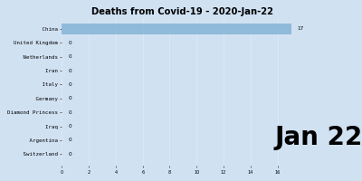
Display a sample of the bar charts for random dates to ensure the bar charts are
displaying correctly with the correct ranking and countries maintain their color.
Sample of bar charts for countries with highest deaths from Covid-19Sample of bar charts for countries with highest deaths from Covid-19
Create the animation
The animation is created by generating a bar chart for each of the rows in the expanded
dataframe using the rankings dataframe for bar positions. These images are then
combined into sequence using the FuncAnimation function in Matplotlib.
1defupdate(i): 2ax.clear() 3 4p=expanded_df.columns.map(len).max() 5bar_num=10 6sel_df=expanded_df.iloc[:,list(rank_df.iloc[i]<=bar_num)] 7bars=ax.barh(y=rank_df.iloc[:,list(rank_df.iloc[i]<=bar_num)].iloc[i], 8tick_label=[x.rjust(p,' ')forxinsel_df.columns], 9width=sel_df.iloc[i],10color=[color_dict[col]forcolinsel_df.columns],11alpha=0.8)12plt.setp(ax.get_xticklabels(),fontsize='x-small')13plt.setp(ax.get_yticklabels(),fontsize='small',fontfamily='monospace')1415cur_day=expanded_df.index[i].strftime('%Y-%b-%d')16ax.set_title(f'Deaths from Covid-19 - {cur_day}',17fontsize='x-large',18fontweight='bold',19loc='center')20ax.set_ylim(10.8,0.2)21ax.set_facecolor(plt.cm.Blues(.2))22ax.grid(True,axis='x',color=plt.cm.Blues(.1))23ax.set_axisbelow(True)24[spine.set_visible(False)forspineinax.spines.values()]2526forbarinbars:27width=bar.get_width()28ax.annotate(f'{width:,.0F}',29xy=(width,bar.get_y()+bar.get_height()/2),30xytext=(10,0),31textcoords="offset points",32fontsize='small',33ha='left',34va='center')3536# Add large Date in bottom right on chart37ax.annotate(expanded_df.index[i].strftime('%b %d'),38xy=(1.25,0.1),39xycoords='axes fraction',40fontsize=40,41fontweight='bold',42ha='right',43va='bottom')4445fig,ax=plt.subplots(figsize=(8,4),46facecolor=plt.cm.Blues(.2),47dpi=50,48tight_layout=True)4950covid_anim=anim.FuncAnimation(51fig=fig,52func=update,53frames=len(expanded_df),54interval=100)555657covid_anim.save('COVID_bar_chart_race_2020.gif')
Bar chart race for Countries with highest deaths from Covid-19 Countries with highest deaths from Covid-19
The animation can also be converted to HTML5 video or saved as MP4.
A bar chart race can be an effective way to visualise the increase in deaths from
COVID-19 in different contries. There is a bit of work in creating the animated chart,
which has been laid out in this article. The concept is straight forward, simply
sequence through the data and display a bar chart for each day and the Matplotlib
FuncAnimation is great for creating the animation. Some of the things to keep in
mind are to implement intermediary data to give a smooth transition and to maintain
consistent color for each country.