Customise a line chart with SwiftUI Charts in iOS 16
SwiftUI Charts introduced in iOS 16, can present data in an intuitive visual format and can be created quickly using SwiftUI Charts. This article demonstrates a couple of ways to customise a line chart and combine with an area chart to present data.
Default line chart
Start with the default line chart created with SwiftUI Charts in Create a line chart with SwiftUI Charts in iOS 16. This shows Step count data for two different weeks comparing steps taken on each weekday.
 1struct ChartView1: View {
 2    var body: some View {
 3        VStack {
 4            GroupBox ( "Line Chart - Daily Step Count") {
 5                Chart {
 6                    ForEach(stepData, id: \.period) { steps in
 7                        ForEach(steps.data) {
 8                            LineMark(
 9                                x: .value("Week Day", $0.shortDay),
10                                y: .value("Step Count", $0.steps)
11                            )
12                            .foregroundStyle(by: .value("Week", steps.period))
13                            .accessibilityLabel("\($0.weekdayString)")
14                            .accessibilityValue("\($0.steps) Steps")
15                        }
16                    }
17                }
18                .frame(height:400)
19            }
20            .padding()
21
22            Spacer()
23        }
24    }
25}

Change the background behind the chart
Technically, not related to Charts, but the GroupBox background can be set using a color or a GroupBoxStyle.
 1struct YellowGroupBoxStyle: GroupBoxStyle {
 2    func makeBody(configuration: Configuration) -> some View {
 3        configuration.content
 4            .padding(.top, 30)
 5            .padding(20)
 6            .background(Color(hue: 0.10, saturation: 0.10, brightness: 0.98))
 7            .cornerRadius(20)
 8            .overlay(
 9                configuration.label.padding(10),
10                alignment: .topLeading
11            )
12    }
13}
 1struct ChartView2: View {
 2    var body: some View {
 3        VStack {
 4            GroupBox ( "Line Chart - Daily Step Count") {
 5                Chart {
 6                    ForEach(stepData, id: \.period) { steps in
 7                        ForEach(steps.data) {
 8                            LineMark(
 9                                x: .value("Week Day", $0.shortDay),
10                                y: .value("Step Count", $0.steps)
11                            )
12                            .foregroundStyle(by: .value("Week", steps.period))
13                            .accessibilityLabel("\($0.weekdayString)")
14                            .accessibilityValue("\($0.steps) Steps")
15                        }
16                    }
17                }
18                .frame(height:400)
19            }
20            // Add a style to the GroupBox
21            .groupBoxStyle(YellowGroupBoxStyle())
22            .padding()
23
24            Spacer()
25        }
26    }
27}

Set the plot or chart background
It is possible to set the background for the chart plot using chartPlotStyle or set a background for the entire chart using chartBackground.
Set the plot background
 1            GroupBox ( "Line Chart - Plot Background") {
 2                Chart {
 3                    ForEach(stepData, id: \.period) { steps in
 4                        ForEach(steps.data) {
 5                            LineMark(
 6                                x: .value("Week Day", $0.shortDay),
 7                                y: .value("Step Count", $0.steps)
 8                            )
 9                            .foregroundStyle(by: .value("Week", steps.period))
10                            .accessibilityLabel("\($0.weekdayString)")
11                            .accessibilityValue("\($0.steps) Steps")
12                        }
13                    }
14                }
15                .chartPlotStyle { plotArea in
16                    plotArea
17                        .background(.orange.opacity(0.1))
18                        .border(.orange, width: 2)
19                }
20                .frame(height:200)
21            }
22            .groupBoxStyle(YellowGroupBoxStyle())
Set the chart background
 1            GroupBox ( "Line Chart - Chart Background") {
 2                Chart {
 3                    ForEach(stepData, id: \.period) { steps in
 4                        ForEach(steps.data) {
 5                            LineMark(
 6                                x: .value("Week Day", $0.shortDay),
 7                                y: .value("Step Count", $0.steps)
 8                            )
 9                            .foregroundStyle(by: .value("Week", steps.period))
10                            .accessibilityLabel("\($0.weekdayString)")
11                            .accessibilityValue("\($0.steps) Steps")
12                        }
13                    }
14                }
15                .chartBackground { chartProxy in
16                    Color.red.opacity(0.1)
17                }
18                .frame(height:200)
19            }
20            .groupBoxStyle(YellowGroupBoxStyle())
Set both the plot and chart background
 1            GroupBox ( "Line Chart - Plot & Chart Backgroundt") {
 2                Chart {
 3                    ForEach(stepData, id: \.period) { steps in
 4                        ForEach(steps.data) {
 5                            LineMark(
 6                                x: .value("Week Day", $0.shortDay),
 7                                y: .value("Step Count", $0.steps)
 8                            )
 9                            .foregroundStyle(by: .value("Week", steps.period))
10                            .accessibilityLabel("\($0.weekdayString)")
11                            .accessibilityValue("\($0.steps) Steps")
12                        }
13                    }
14                }
15                .chartBackground { chartProxy in
16                    Color.red.opacity(0.1)
17                }
18                .chartPlotStyle { plotArea in
19                    plotArea
20                        .background(.orange.opacity(0.1))
21                        .border(.orange, width: 2)
22                }
23
24                .frame(height:200)
25            }
26            .groupBoxStyle(YellowGroupBoxStyle())
27}

Move y-axis to leading edge
It is possible to hide the axes or reposition the axes, such as placing the y-axis on
the leading edge of the plot. The y-axis is displayed by default on the trailing side
of the chart. This can be placed on the leading side using the AxisMarks of
chartYAxis. It is also possible to hide the axes completely by setting the
visibility property to hidden.
 1struct ChartView4: View {
 2    var body: some View {
 3        VStack {
 4            GroupBox ( "Line Chart - Y-axis on leading edge") {
 5                Chart {
 6                    ForEach(stepData, id: \.period) { steps in
 7                        ForEach(steps.data) {
 8                            LineMark(
 9                                x: .value("Week Day", $0.shortDay),
10                                y: .value("Step Count", $0.steps)
11                            )
12                            .foregroundStyle(by: .value("Week", steps.period))
13                            .accessibilityLabel("\($0.weekdayString)")
14                            .accessibilityValue("\($0.steps) Steps")
15                        }
16                    }
17                }
18                .chartPlotStyle { plotArea in
19                    plotArea
20                        .background(Color(hue: 0.12, saturation: 0.10, brightness: 0.92))
21                }
22                // Place the y-axis on the leading side of the chart
23                .chartYAxis {
24                   AxisMarks(position: .leading)
25                }
26                .frame(height:400)
27            }
28            .groupBoxStyle(YellowGroupBoxStyle())
29            .padding()
30
31            Spacer()
32        }
33    }
34}

Move the chart legend
The chart legend is displayed on the bottom leading edge of the chart by default. The legend can be placed on any side of the chart, or it can be placed over the chart in a number of locations.
 1        GroupBox ( "Line Chart - legend overlay on top center") {
 2            Chart {
 3                ForEach(stepData, id: \.period) { steps in
 4                    ForEach(steps.data) {
 5                        LineMark(
 6                            x: .value("Week Day", $0.shortDay),
 7                            y: .value("Step Count", $0.steps)
 8                        )
 9                        .foregroundStyle(by: .value("Week", steps.period))
10                        .accessibilityLabel("\($0.weekdayString)")
11                        .accessibilityValue("\($0.steps) Steps")
12                    }
13                }
14            }
15            // Position the Legend
16            .chartLegend(position: .overlay, alignment: .top)
17
18            .chartPlotStyle { plotArea in
19                plotArea
20                    .background(Color(hue: 0.12, saturation: 0.10, brightness: 0.92))
21            }
22            .chartYAxis() {
23                AxisMarks(position: .leading)
24            }
25            .frame(height:200)
26        }
27        .groupBoxStyle(YellowGroupBoxStyle())
 1        GroupBox ( "Line Chart - legend trailing center") {
 2            Chart {
 3                ForEach(stepData, id: \.period) { steps in
 4                    ForEach(steps.data) {
 5                        LineMark(
 6                            x: .value("Week Day", $0.shortDay),
 7                            y: .value("Step Count", $0.steps)
 8                        )
 9                        .foregroundStyle(by: .value("Week", steps.period))
10                        .accessibilityLabel("\($0.weekdayString)")
11                        .accessibilityValue("\($0.steps) Steps")
12                    }
13                }
14            }
15            // Position the Legend
16            .chartLegend(position: .trailing, alignment: .center, spacing: 10)
17
18            .chartPlotStyle { plotArea in
19                plotArea
20                    .background(Color(hue: 0.12, saturation: 0.10, brightness: 0.92))
21            }
22            .chartYAxis() {
23                AxisMarks(position: .leading)
24            }
25            .frame(height:200)
26        }
27        .groupBoxStyle(YellowGroupBoxStyle())

Change the line curve
The line chart connects the data points on the chart with a straight line. The interpolationMethod function can be used to round the connection curve in a variety of ways.
 1struct ChartView6: View {
 2    var body: some View {
 3        VStack(spacing:30) {
 4            GroupBox ( "Line Chart - Curved line connector") {
 5                Chart {
 6                    ForEach(stepData, id: \.period) { steps in
 7                        ForEach(steps.data) {
 8                            LineMark(
 9                                x: .value("Week Day", $0.shortDay),
10                                y: .value("Step Count", $0.steps)
11                            )
12                            .foregroundStyle(by: .value("Week", steps.period))
13                            // Use curved line to join points
14                            .interpolationMethod(.catmullRom)
15                            .accessibilityLabel("\($0.weekdayString)")
16                            .accessibilityValue("\($0.steps) Steps")
17                        }
18                    }
19                }
20                .chartLegend(position: .overlay, alignment: .top)
21                .chartPlotStyle { plotArea in
22                    plotArea
23                        .background(Color(hue: 0.12, saturation: 0.10, brightness: 0.92))
24                }
25                .chartYAxis() {
26                    AxisMarks(position: .leading)
27                }
28                .frame(height:300)
29            }
30            .groupBoxStyle(YellowGroupBoxStyle())
31
32            GroupBox ( "Line Chart - Step line connector") {
33                Chart {
34                    ForEach(stepData, id: \.period) { steps in
35                        ForEach(steps.data) {
36                            LineMark(
37                                x: .value("Week Day", $0.shortDay),
38                                y: .value("Step Count", $0.steps)
39                            )
40                            .foregroundStyle(by: .value("Week", steps.period))
41                            // Use step line to join points
42                            .interpolationMethod(.stepCenter)
43                            .accessibilityLabel("\($0.weekdayString)")
44                            .accessibilityValue("\($0.steps) Steps")
45                        }
46                    }
47                }
48                .chartLegend(position: .overlay, alignment: .top)
49                .chartPlotStyle { plotArea in
50                    plotArea
51                        .background(Color(hue: 0.12, saturation: 0.10, brightness: 0.92))
52                }
53                .chartYAxis() {
54                    AxisMarks(position: .leading)
55                }
56                .frame(height:300)
57            }
58            .groupBoxStyle(YellowGroupBoxStyle())
59
60
61            Spacer()
62        }
63        .padding()
64    }
65}

Change the line colors
The default colors for the lines in the line chart can be set using chartForegroundStyleScale
 1struct ChartView7: View {
 2    var body: some View {
 3        VStack() {
 4            GroupBox ( "Line Chart - Custom line colors") {
 5                Chart {
 6                    ForEach(stepData, id: \.period) { steps in
 7                        ForEach(steps.data) {
 8                            LineMark(
 9                                x: .value("Week Day", $0.shortDay),
10                                y: .value("Step Count", $0.steps)
11                            )
12                            .foregroundStyle(by: .value("Week", steps.period))
13                            .interpolationMethod(.catmullRom)
14                            .symbol(by: .value("Week", steps.period))
15                            .symbolSize(30)
16                            .accessibilityLabel("\($0.weekdayString)")
17                            .accessibilityValue("\($0.steps) Steps")
18                        }
19                    }
20                }
21                // Set color for each data in the chart
22                .chartForegroundStyleScale([
23                    "Current Week" : Color(hue: 0.33, saturation: 0.81, brightness: 0.76),
24                    "Previous Week": Color(hue: 0.69, saturation: 0.19, brightness: 0.79)
25                ])
26                .chartLegend(position: .overlay, alignment: .top)
27                .chartPlotStyle { plotArea in
28                    plotArea
29                        .background(Color(hue: 0.12, saturation: 0.10, brightness: 0.92))
30                }
31                .chartYAxis() {
32                    AxisMarks(position: .leading)
33                }
34                .frame(height:400)
35            }
36            .groupBoxStyle(YellowGroupBoxStyle())
37
38            Spacer()
39        }
40        .padding()
41    }
42}

Change the line style
The line on the line chart can be modified by setting a lineStyle using StrokeStyle. Two different styles are used in the step data to distinguish the previous week data from the current data. In addition, a custom symbol is set for the data points on the chart.
 1struct ChartView8: View {
 2
 3    let prevColor = Color(hue: 0.69, saturation: 0.19, brightness: 0.79)
 4    let curColor = Color(hue: 0.33, saturation: 0.81, brightness: 0.76)
 5
 6    var body: some View {
 7        VStack() {
 8            GroupBox ( "Line Chart - Line color and format") {
 9                Chart {
10                    ForEach(previousWeek) {
11                        LineMark(
12                            x: .value("Week Day", $0.shortDay),
13                            y: .value("Step Count", $0.steps)
14                        )
15                        .interpolationMethod(.catmullRom)
16                        .foregroundStyle(prevColor)
17                        .foregroundStyle(by: .value("Week", "Previous Week"))
18                        .lineStyle(StrokeStyle(lineWidth: 3, dash: [5, 10]))
19                        .symbol() {
20                            Rectangle()
21                                .fill(prevColor)
22                                .frame(width: 8, height: 8)
23                        }
24                        .symbolSize(30)
25                        .accessibilityLabel("\($0.weekdayString)")
26                        .accessibilityValue("\($0.steps) Steps")
27                    }
28
29                    ForEach(currentWeek) {
30                        LineMark(
31                            x: .value("Week Day", $0.shortDay),
32                            y: .value("Step Count", $0.steps)
33                        )
34                        .interpolationMethod(.catmullRom)
35                        .foregroundStyle(curColor)
36                        .foregroundStyle(by: .value("Week", "Current Week"))
37                        .lineStyle(StrokeStyle(lineWidth: 3))
38                        .symbol() {
39                            Circle()
40                                .fill(curColor)
41                                .frame(width: 10)
42                        }
43                        .symbolSize(30)
44                        .accessibilityLabel("\($0.weekdayString)")
45                        .accessibilityValue("\($0.steps) Steps")
46                    }
47                }
48                // Set the Y axis scale
49                .chartYScale(domain: 0...30000)
50                .chartForegroundStyleScale([
51                    "Current Week" : curColor,
52                    "Previous Week": prevColor
53                ])
54                .chartLegend(position: .overlay, alignment: .top)
55                .chartPlotStyle { plotArea in
56                    plotArea
57                        .background(Color(hue: 0.12, saturation: 0.10, brightness: 0.92))
58                }
59                .chartYAxis() {
60                    AxisMarks(position: .leading)
61                }
62                .frame(height:400)
63            }
64            .groupBoxStyle(YellowGroupBoxStyle())
65            Spacer()
66        }
67        .padding()
68    }
69}

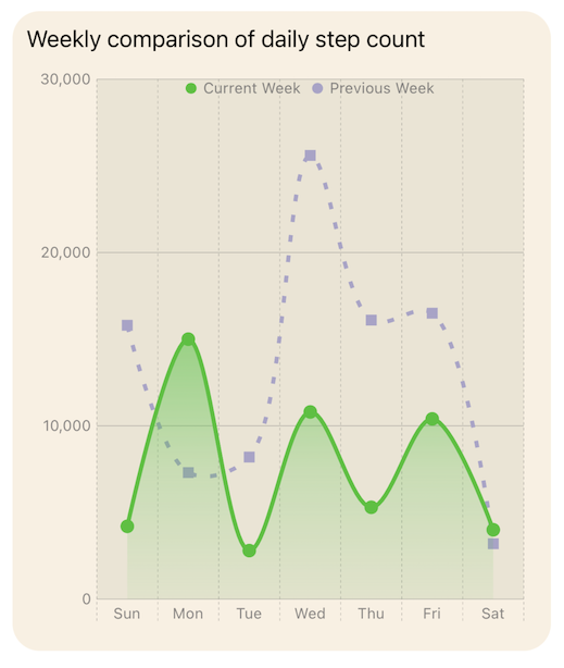
Combine Area and Line plots
Finally, combine the line chart with an area chart to help differentiate one data set from another. Area chart is only added for the current week data and the color of the area is set to a gradient fading below the line.
 1struct ChartView9: View {
 2
 3    var body: some View {
 4
 5        let prevColor = Color(hue: 0.69, saturation: 0.19, brightness: 0.79)
 6        let curColor = Color(hue: 0.33, saturation: 0.81, brightness: 0.76)
 7        let curGradient = LinearGradient(
 8            gradient: Gradient (
 9                colors: [
10                    curColor.opacity(0.5),
11                    curColor.opacity(0.2),
12                    curColor.opacity(0.05),
13                ]
14            ),
15            startPoint: .top,
16            endPoint: .bottom
17        )
18
19        VStack() {
20            GroupBox ( "Line Chart - Combine LIne and Area chart") {
21                Chart {
22                    ForEach(previousWeek) {
23                        LineMark(
24                            x: .value("Week Day", $0.shortDay),
25                            y: .value("Step Count", $0.steps)
26                        )
27                        .interpolationMethod(.catmullRom)
28                        .foregroundStyle(prevColor)
29                        .foregroundStyle(by: .value("Week", "Previous Week"))
30                        .lineStyle(StrokeStyle(lineWidth: 3, dash: [5, 10]))
31                        .symbol() {
32                            Rectangle()
33                                .fill(prevColor)
34                                .frame(width: 8, height: 8)
35                        }
36                        .symbolSize(30)
37                        .accessibilityLabel("\($0.weekdayString)")
38                        .accessibilityValue("\($0.steps) Steps")
39                    }
40
41                    ForEach(currentWeek) {
42                        LineMark(
43                            x: .value("Week Day", $0.shortDay),
44                            y: .value("Step Count", $0.steps)
45                        )
46                        .interpolationMethod(.catmullRom)
47                        .foregroundStyle(curColor)
48                        .foregroundStyle(by: .value("Week", "Current Week"))
49                        .lineStyle(StrokeStyle(lineWidth: 3))
50                        .symbol() {
51                            Circle()
52                                .fill(curColor)
53                                .frame(width: 10)
54                        }
55                        .symbolSize(30)
56                        .accessibilityLabel("\($0.weekdayString)")
57                        .accessibilityValue("\($0.steps) Steps")
58
59                        AreaMark(
60                            x: .value("Week Day", $0.shortDay),
61                            y: .value("Step Count", $0.steps)
62                        )
63                        .interpolationMethod(.catmullRom)
64                        .foregroundStyle(curGradient)
65                        .foregroundStyle(by: .value("Week", "Current Week"))
66                        .accessibilityLabel("\($0.weekdayString)")
67                        .accessibilityValue("\($0.steps) Steps")
68
69                    }
70                }
71                // Set the Y axis scale
72                .chartYScale(domain: 0...30000)
73
74                .chartForegroundStyleScale([
75                    "Current Week" : curColor,
76                    "Previous Week": prevColor
77                ])
78                .chartLegend(position: .overlay, alignment: .top)
79                .chartPlotStyle { plotArea in
80                    plotArea
81                        .background(Color(hue: 0.12, saturation: 0.10, brightness: 0.92))
82                }
83                .chartYAxis() {
84                    AxisMarks(position: .leading)
85                }
86                .frame(height:400)
87            }
88            .groupBoxStyle(YellowGroupBoxStyle())
89            Spacer()
90        }
91        .padding()
92    }
93}

Conclusion
SwiftUI Charts is currently in beta, and there can be some issues with Xcode performance and compiling some chart options, but it is easy to get started with charts. The help documentation is available and is good, but I would like to see more code examples. There is great potential to customise charts to present data in an intuitive manner to customers of an App.
Code for Line and Area Chart is available on GitHub.